- Best for
- Renter-friendly, layered “mid-century meets greenery” living rooms
- Cost
- Under $700 total (7 layers)
- Difficulty
- Easy to DIY-heavy for wall art; everything else is swap-and-style
- Time
- 1 weekend for placement + styling; ~20 minutes for the DIY wall art
Why this plant-filled living room is the living room of 2026
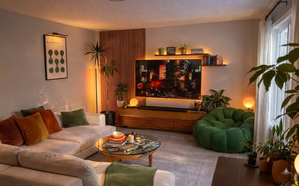
The starting point here is already doing the heavy lifting: a deep green tufted sofa, a walnut media console, and a Bauhaus-style poster pull the room into a cohesive, mid-century-leaning mood. What makes the look feel current is the way it layers contrast—velvet tufting beside a glass tabletop, warm wood beside cool gray rug tones, and flat graphic art balanced with three-dimensional greenery. You’re basically recreating that “gallery-meets-people-living-here” vibe I keep seeing in design spreads, where the mix of materials does the work instead of expensive renovations. For renters, this is achievable because everything can be swapped out at move-out: textiles, freestanding furniture, plug-in lighting, and command-hung art. Total budget for the seven refresh layers below lands under $700.
I noticed the glow first: the room doesn’t rely on one bright overhead source (because most rentals don’t even have a flattering one). Instead, the lamps create a soft pool of light that makes the sofa look richer and the glass coffee table less “cold.” The other turning point for me was the rug size—when I went even slightly larger in my own space, the whole seating area started reading as one intentional zone. Don’t copy the exact palette if your room fights it; copy the system: one grounded textile layer, one reflective surface, and then warm, low lighting plus plants to keep it from feeling flat.
Layer 1 — Green tufted sofa ($250) Seat-deep comfort in one piece
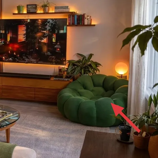
This deep green tufted sofa is the room’s visual anchor, with rounded, pillow-like seams and a low profile that reads modern and cozy at once. It sits on top of the gray rug, so the sofa color stays vivid instead of blending into the floor. Two throw pillows in warmer tones add contrast at the left arm, while the overall silhouette stays clean enough to feel intentional rather than cluttered.
I’d pick the tufted look over a slipcovered or fully smooth sofa here because the raised texture gives you dimension even when you keep the rest of the styling simple. The trade-off is you’ll want to treat it like velvet—vacuum gently and keep abrasive items (like rough tote straps) from snagging the fabric. Still, a single great sofa does more for renter aesthetics than trying to “decorate your way out” of a bland couch.
Make it look styled, not staged
Use two cushion sizes (one larger, one smaller) and stop there. In rooms like this, fewer pillows look more expensive than a full decorative stack.
Layer 2 — Walnut media console ($120) Warm wood that holds the TV area
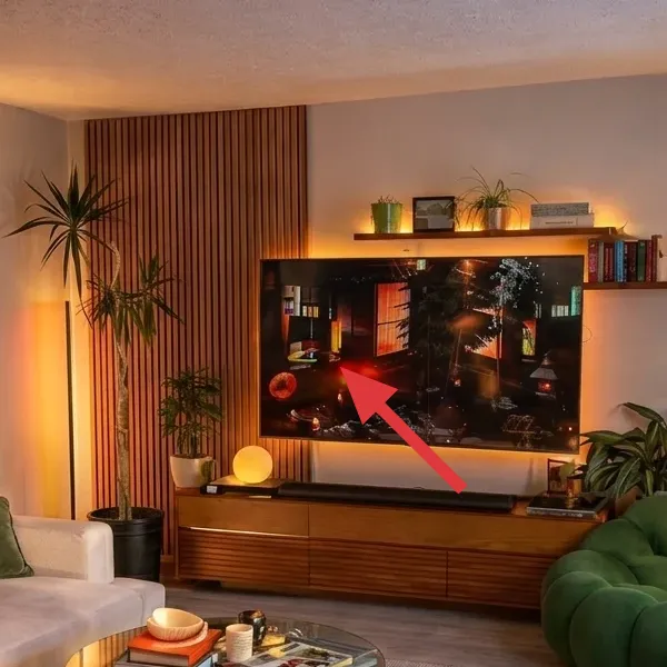
The media console is a low, horizontal walnut-toned unit with an open-and-drawer layout that keeps the TV zone tidy. Even with a TV on top, the wood frame gives the wall a grounded “object” to build around, and the clean lines echo the mid-century poster on the left wall. On either end, small décor and lighting help the console feel like a curated surface instead of just storage.
Why not go for a taller bookshelf setup? Because this room already has strong vertical rhythm from the wall art and the plants. A low console keeps sightlines relaxed and makes the seating feel centered. If you’re buying this piece for your rental, prioritize legs (or at least a little clearance) so you can vacuum underneath and keep the look fresh without feeling stuck with one arrangement forever.
Don’t trap your cables in a closed box
If your console has enclosed compartments, plan cable routing before you commit. You want the TV, lamp cords, and power strips to stay accessible for unplugging at lease end.
Layer 3 — Round glass coffee table ($70) Light-catching top, small-space friendly
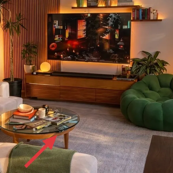
The coffee table is round with a glass top that reflects the room’s warm lamps, which is why the area never feels dark even at night. The base reads mid-century—wood-toned and simple—so it doesn’t compete with the sofa’s tufting or the poster’s graphic shapes. Because the tabletop is transparent, it visually “thins out” the furniture cluster in front of the sofa.
I’d choose a glass-top table like this over a heavy solid wood coffee table when you want the room to feel airy while still being comfortable. The trade-off is you’ll wipe it more often—prints, water rings, and fingerprints show up faster than on matte surfaces. Still, the benefit is real: glass helps the styling read cleaner, and in a renter budget it’s an easy way to make a single piece look designer without buying three matching tables.
Style it with height, not more objects
Use one small tray or stack of books and then add one taller item (like a candle jar or small plant). That keeps the reflections from turning into visual noise.
Layer 4 — Soft gray area rug ($85) Defines the seating zone without stealing focus
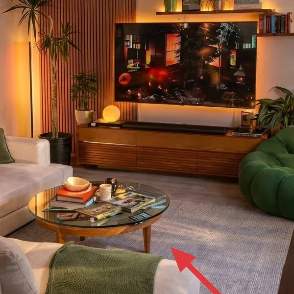
The gray rug anchors the entire seating arrangement, with a soft, woven texture that sits comfortably underfoot. Its neutral tone is what makes the green sofa feel saturated instead of muted, and it also gives the room a subtle, modern backdrop for the warm wood console and glowing lamps. The rug covers enough floor to “connect” sofa, coffee table, and the plant side of the room.
Yes, you could choose a bolder pattern, but neutrals are the renter cheat code here: they work with multiple sofa colors and don’t lock you into one palette for years. The trade-off is you have to be a little intentional with layering, otherwise a plain rug can look flat. If you want this look, focus on pile feel and rug pad thickness—those two details are what make it look cozy rather than temporary.
Rug pad is part of the design
A thin rug pad still changes how the rug sits, which affects how the room photographs—especially with low seating like this.
Layer 5 — Plug-in table lamps ($60) Warm 2700K glow without hardwiring
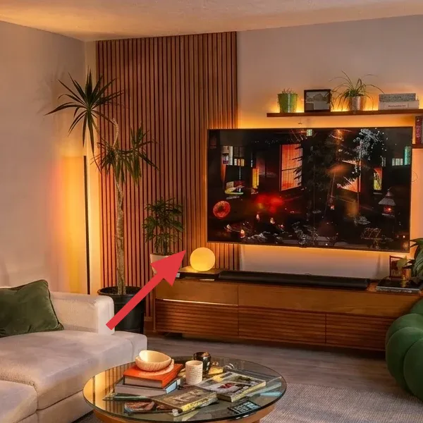
Two matching plug-in lamps add warm light at sofa height, with soft shades that diffuse glare. Instead of flattening everything into one color, the lamps create gentle contrast around the walnut console and the poster wall. That matters here because the room already has strong visual texture: tufting, wood grain, and plants. The lighting ties those textures together into one calm scene.
I’d skip overhead replacement entirely in a rental. The trade-off with plug-in lamps is you need a clear spot for them and you’ll want to keep cords tidy, but the upside is huge: no wall work and no move-out damage. If you want the same effect, use warm 2700K bulbs and keep the lamps tall enough that the light doesn’t feel like it’s coming from “under” the design.
Match bulb temp, not lamp shade color
Different shades can still look cohesive if the bulbs are the same warmth; that’s the secret to a layered glow.
Layer 6 — Bauhaus-style framed wall art ($30) Painted dots that read graphic, not busy
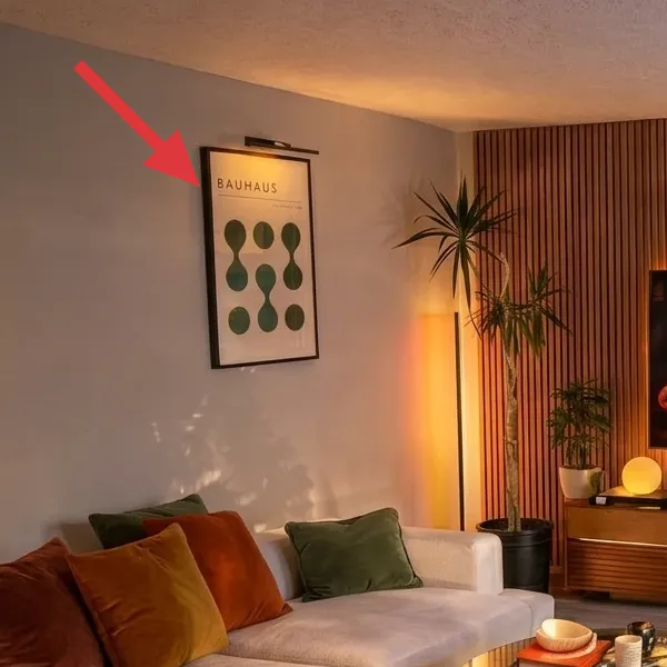
The left wall poster is a framed Bauhaus-inspired composition with repeating dot-and-oval shapes in a pared-down color palette. It’s important because it brings structure to a room that otherwise has lots of organic shapes—plants, tufted upholstery, and rounded furniture edges. The frame also gives your wall a “finish,” so the room doesn’t feel like it’s missing something once you reduce extra décor.
I’d pick a graphic print like this over something scenic because this room already has strong warmth from the wood console and lamps. A geometric poster adds a cool, orderly counterpoint that makes the sofa and coffee table feel more intentional. If you’re budget-conscious, this is also one of the easiest layers to DIY without tools or wall mounting changes—just create the artwork and slide it into the frame you already have or plan to buy.
Make it instead of buying it
DIY a Bauhaus-style dot-and-oval print on cardstock, then swap it into a simple 8x10 frame (or any frame size your wall art is).
Materials
- Cardstock (white) — 9x12 or letter pack — Walmart — $3
- Acrylic craft paint set (assorted colors) — 8-color — Michaels — $10
- Small round paintbrush — size 2 — Amazon — $3
- Painter’s tape — 1-inch roll — Home Depot — $2
Steps
- Measure the inside opening of your frame (or the glass/paper size) and trim cardstock with scissors so it fits cleanly.
- Tape off a few straight guide lines on the cardstock so your dot grid stays aligned across the page.
- Paint ovals and circles in two or three colors, working in rows and leaving small gaps for the “Bauhaus spacing” to show.
- Let the paint dry to a touch-dry finish (about 10 minutes), then remove the tape and add any small corrections with the brush tip.
- Test the paper against the frame opening, then slide it in and reassemble the frame so it sits flat and centered.
- Hang using the frame’s existing hardware (Command Strips or removable hooks) so you don’t mark the wall.
Total DIY cost: ~$18 — saves about $12 versus buying a new framed print.
Layer 7 — Potted plant cluster ($65) Adds volume and an earthy counterweight
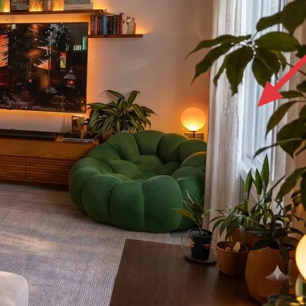
The plant layer is a mix of sizes and pot shapes, with tall, arching leaves on one side and fuller, foreground greenery in smaller containers. The variety matters: it echoes the room’s mixed textures while also softening the straight lines of the console and the poster frame. Because the plants sit on the floor (not on surfaces you’ll need for styling), they keep the coffee table area clear.
I’d choose plants over extra wall décor in a room like this because plants add movement without adding clutter. The trade-off is maintenance—if you travel or forget watering, choose a hardier variety and group them so you can water efficiently. Visually, you get an immediate “lived-in” depth that even a perfect poster can’t provide on its own. For renters, make sure your pots are sturdy enough to move when it’s time to pack.
Group by water needs, not by looks
Keep the thirstiest plant closest to where you’ll remember to water it, then let the pots do the styling.
The cost, layer by layer
| Layer | Item | Cost |
|---|---|---|
| 1 | Thrifted green tufted sofa | $250 |
| 2 | Walnut media console/TV stand | $120 |
| 3 | Round glass-top coffee table | $70 |
| 4a | 5x7 light gray area rug | $80 |
| 4b | Rug pad (thin, non-slip) | $5 |
| 5a | Pair of plug-in table lamps | $50 |
| 5b | Two warm 2700K LED bulbs | $10 |
| 6a | 8x10 frame (black or natural wood) | $15 |
| 6b | Printed Bauhaus-style art insert | $15 |
| 7a | Tall potted palm (4–6 ft) | $35 |
| 7b | Smaller leafy plant (tabletop to floor) | $15 |
| 7c | Two planters/pot covers | $15 |
| Total | $680 | |
If you need to shave the budget, keep the sofa and rug as-is and downsize the lamps to one table lamp plus one floor option that’s still plug-in. Then swap the second plant for one larger statement plant (one tall, full pot instead of two smaller ones). You’ll keep the same “warm glow + grounded seating” system while spending closer to $520–$560.
What worked, what didn't (across the whole room)
The overall verdict: the room works because it’s layered in sensible, renter-safe ways—textiles on the bottom, reflective surfaces at center height, and warm, plug-in light to tie it all together. The couple of trade-offs are mostly about maintenance and cleaning, not design.
What worked
- The deep green sofa stays the hero because the gray rug reduces visual noise and keeps the upholstery color looking saturated.
- The walnut media console frames the TV zone with warm wood grain, so the room reads intentional even with minimal décor.
- A round glass coffee table adds reflection without adding bulk, which keeps the seating area from feeling closed in.
- Plug-in lamps at sofa height create a soft glow that makes tufting, wood, and plants look richer after dark.
- The Bauhaus-style poster adds graphic structure, balancing the organic shapes from greenery and the sofa’s rounded lines.
- The plant cluster brings depth and movement, and it softens straight lines without requiring wall changes.
- Using a few materials repeatedly (tufted upholstery, glass, wood, woven rug) makes the styling look curated instead of accidental.
What didn't
- The glass tabletop shows fingerprints and water marks faster than matte options, so quick wiping becomes part of the routine.
- Too many small décor pieces on the coffee table fights the rug pattern and makes the room feel busy instead of calm.
- If lamp cords aren’t managed, the warm glow can still look visually messy when you’re not facing straight-on.
- Plants look best when they’re spaced for light; cramming them together makes them leggy and reduces the lush effect.
- Graphic wall art needs enough negative space; if you add more wall décor nearby, the poster stops feeling like an anchor.
- A too-thin rug pad makes the rug bunch slightly, which subtly cheapens how “put-together” everything feels.
What we'd skip if we did it again
Skip adding more “sets” that match perfectly. In rooms like this, people often reach for a second coffee-table accessory that’s the same tone as the console, then a third pillow that matches the first two. That’s how the look turns into a bundle from one retailer instead of a lived-in, layered mix. Keep it to one table surface story (tray or books) and one couch cushion plan (two sizes).
Skip using a cool-white bulb just because it’s brighter. The whole point of this layout is that the lamps create a warm pool of light that makes tufting look dimensional and wood look cozy. When bulbs shift cooler, the green reads harsher and the glass top looks more “sterile” than glossy. If you’re replacing bulbs, aim for warm 2700K across every lamp.
Skip undersizing the rug pad and rug. If the rug shifts or the fibers feel flat underfoot, everything looks temporary, even if your furniture is thrifted and your wall art is perfect. In my own rentals, the fastest improvement has always been upgrading the underlayer—then styling the top becomes easier because the room feels anchored. If you’re torn between rug size and rug quality, go bigger for the room first and then upgrade what you can.
Frequently asked
How can I hang the wall art in a rental without drilling?
Use removable hanging methods that don’t damage paint: Command Strips for the framed poster (if the frame back is suitable) or 3M removable hooks if the frame has a hook already. Test weight limits before applying anything, and press firmly for the recommended hold time so it bonds well. If your frame is heavier, consider using multiple strips on the frame’s back rather than one point of contact. Always remove slowly at move-out—warm the adhesive with a hair dryer on low if you need to, then pull parallel to the wall.
How long does this kind of living room refresh take?
Most of the work is placement and styling, not construction. In practice, plan for about 2–4 hours to set up the rug, position the coffee table, and move the plants into their final spots. Then add lamps: about 30–60 minutes to get cords tidy and bulbs set to warm. The framed art is quick—if you’re buying it, it’s essentially 15 minutes to hang. If you DIY the cardstock artwork, budget ~20–45 minutes depending on how crisp you want the dot spacing.
What if my living room is smaller than the photo?
Keep the system, but shrink the furniture footprint and simplify the styling. For a smaller room, go for a slightly smaller round coffee table and prioritize a rug that still reaches under the front legs of the sofa—this is what keeps the seating zone cohesive. If you can’t fit a pair of lamps, choose one lamp and place it so the light reaches the coffee table area. On the wall, use one statement piece (the Bauhaus-style poster) and skip extra prints to preserve negative space.
What if my living room is bigger—how do I scale the look?
In a larger room, you usually need more “breathing room” between pieces rather than more décor on top. Use a rug size that extends further past the coffee table so it visually connects the seating area—think larger than 5x7 if you have the floor space. Add height with a taller plant and keep the console low and centered for balance. If you want lamps, having two at opposite sides of the console works well because it reinforces the room’s symmetry without making it feel formal.
Where would you shop differently in 2026 for this look?
For budget and speed, I’d mix three lanes: thrift for the heavy items (sofa and coffee table), big-box for flexible basics (rug pads and plug-in lamps), and marketplaces for the “personality” layer (plants and graphic art). In 2026, I’d also check Habitat for Humanity ReStore and Facebook Marketplace for walnut-toned media consoles—those are common and often underpriced versus retail. For the Bauhaus-style art, Etsy and small print shops are easiest, but DIY cardstock is a smart fallback when you want to match the exact spacing.
What’s the single biggest mistake people make in a renter living room like this?
They buy one hero piece (often a sofa) and then stop. A room like this needs three supporting acts: one grounded textile (the rug), one reflective or “light” surface (the glass coffee table), and one warm light source at a human height (plug-in lamps). Without those, the sofa color can feel too loud or too flat depending on lighting. If you want this specific vibe, prioritize lamp warmth and rug size before adding more décor.
Is this look safe for renters over time—especially with plants and rug?
Yes, because the key components are freestanding and removable. A good rug pad protects floors and reduces shifting, which helps the rug stay looking smooth instead of wrinkled. For plants, keep pots stable in saucers or covers so you’re not dealing with leaks right next to the sofa or console. If you’re moving plants during re-staging, lift and carry rather than drag to protect the rug pile and floor. At lease end, the whole setup packs up without leaving holes or fresh marks behind.
