- Best for
- Eat-in kitchens that need a color-and-light focal point
- Time
- 1–2 weekends (about 6–8 hours)
- Difficulty
- Moderate DIY
- Cost
- About $624 (under $700)
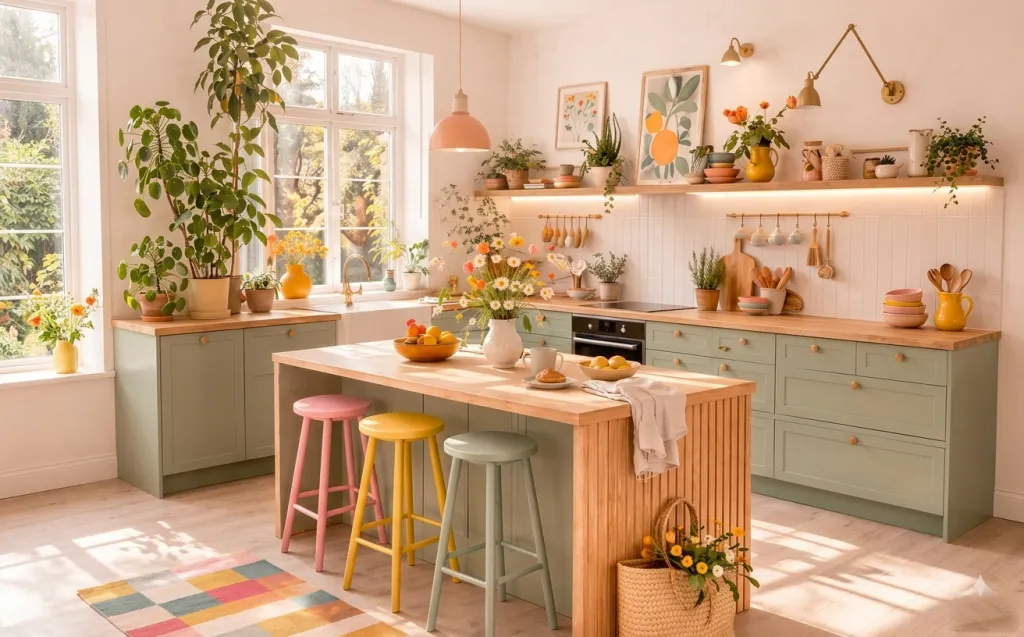
Why this eat-in kitchen is the eat-in kitchen of 2026
The quickest way to get that “designer kitchen” feeling isn’t new cabinetry—it’s the styling system around it. Here, the existing sage cabinetry, light wood island, white tile backsplash, and big windows create a great base, and the rest is layered decisions: a pink pendant overhead, a brass utensil rail, framed botanical prints, and a counter that’s kept deliberately tidy with cloth and flowers. This fits the broader “cottage garden meets scandi pastels” trend you’ve probably been seeing in home magazines, where warm woods and muted paint tones get punctuated by one joyful accent color. In practice, a pendant kit often comes with a pre-set cord length (commonly around 6 feet), so you can dial in drop height without major electrical planning. You’ll notice the mix of wood grain, matte-painted surfaces, and ceramic/glass shine that makes the whole room look pulled-together for US homeowners who want weekend wins.
I tried to copy this look in my own place the first time by buying matching sets—two “nice” frames, two “nice” stools, one “nice” rug. It looked fine at noon, then fell apart after dinner because the counter was busy and the lighting didn’t feel balanced. What finally clicked was choosing mismatched stools on purpose (same height, different colors), keeping the wall art to a tight botanical story, and anchoring the island with one real fabric layer plus a small DIY flower moment. Also: I learned not to overhang décor in front of hanging utensils—leave a clean visual lane from the window to the island edge.
Layer 1 — Colorful bar stools ($210) Three painted seats with matching-but-not-same charm
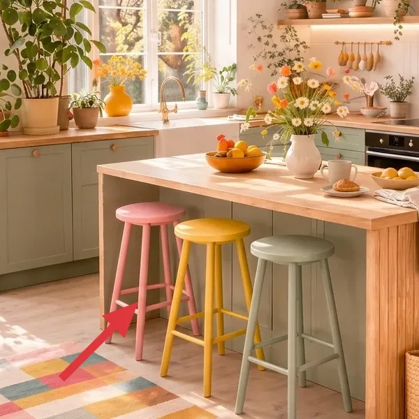
In the foreground, three bar stools sit around the island—each with a different painted finish. The seats read as matte and slightly chalky, while the legs keep a simple silhouette so the colors stay the main event. They’re positioned close enough that you can move between the island and the seating without bumping into clutter. Even though the stools are playful, the palette stays cohesive because the cabinet green and the warm wood pull everything into one family.
This works better than buying one “safe” matching stool set because your kitchen already has a lot of fixed geometry—cabinet lines, tile grid, window frames. Color variation lets you soften those straight edges while keeping the room feeling coordinated. I’d skip the obvious approach of all-neutral stools, because the look you’re chasing here relies on contrast. The trade-off is that you need to be picky about tone (pastel-leaning rather than neon) so the island doesn’t look accidental.
Pick one height, then mix paint colors
Before you shop, measure from the floor to your counter edge and aim for a consistent stool height. Once height matches, you can go wild with color without the room feeling visually “off.”
Layer 2 — Flower centerpiece in a white vase ($19) DIY-mix bouquet that reads full, not fussy
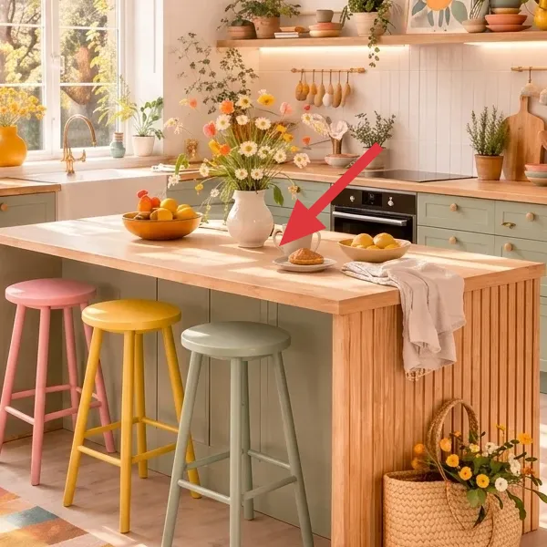
The centerpiece is a small cluster of fresh-cut flowers arranged in a white ceramic vase on the island. The stems create a rounded, slightly loose profile—tall enough to be seen over the tabletop, but low enough to keep the counter practical. The colors are bright (think orange, yellow, and white) and they mirror the springy palette from the botanical art and kitchen ceramics. It’s the kind of detail that makes the whole countertop look intentionally styled rather than “whatever was left in a bowl.”
I’d choose this over buying a pre-styled centerpiece because real-cut blooms bring movement and soften the straight cabinet-and-tile backdrop. The trade-off is maintenance: flowers won’t last forever, so you’re designing for a “few days to a week” moment. The good news is that your vase placement doesn’t have to be perfect—what matters is trimming stems so the shape stays airy and the vase stays steady on the island.
Make it instead of buying it
DIY a similar white-vase floral centerpiece by combining two affordable spring bouquets, then trimming and arranging for a rounded, counter-ready shape.
Materials
- Ceramic vase (small, ~6–8 in tall) — 1 — Dollar Tree — $5
- Spring bouquet (daisy-like blooms) — 1 bunch — Trader Joe's — $8
- Wildflower/mini-floral bouquet — 1 bunch — Trader Joe's — $6
Steps
- Fill the vase with cool water and remove any packaging that’s touching the stems.
- Unwrap both bouquets and trim stems so they’re different heights (short, medium, tall) rather than all the same length.
- Strip leaves that would sit below the waterline to keep the water cleaner for longer.
- Start by building a “core” with the biggest blooms, then tuck in smaller stems around the outside for a soft oval shape.
- Adjust the final heights so the tallest stems sit in the center and the edges look airy; wipe the vase and set it on a dry island spot.
Total DIY cost: $19 — saves about $10–$20 versus buying a styled centerpiece bowl-and-floral set.
Layer 3 — Pink glass pendant ($105) Pink dome glow, choose the right drop height
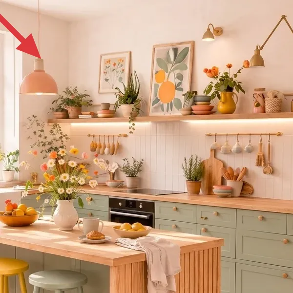
Over the island hangs a pink glass pendant with a warm-toned glow. The shade is a smooth, translucent dome that diffuses light and adds color without overwhelming the room. It’s suspended by a simple cord, which keeps the look airy and lets your eyes focus on the island below. Visually, it’s the main “celebration” color in the ceiling area, tying in with the playful bar stool finishes and the flower palette.
This lighting choice works because your backsplash and cabinetry already do the hard work of setting the background. A glass pendant adds a focal point that feels intentional, and the pink tint warms the white tile and ceramic surfaces. I’d skip a bulky chandelier here—your kitchen is busy with storage, art, and plants, and you don’t want a second heavy visual layer competing with the island. If your ceiling doesn’t have a fixture box ready, call an electrician for wiring, or choose a plug-in pendant option instead of trying to DIY electrical.
Dial in the drop so it frames the island, not the backsplash
Hang the pendant so the shade sits above counter working height and keeps the light focused on the center of the island surface.
Layer 4 — Brass utensil rail ($80) Wall-mounted rack that lets tools look like décor
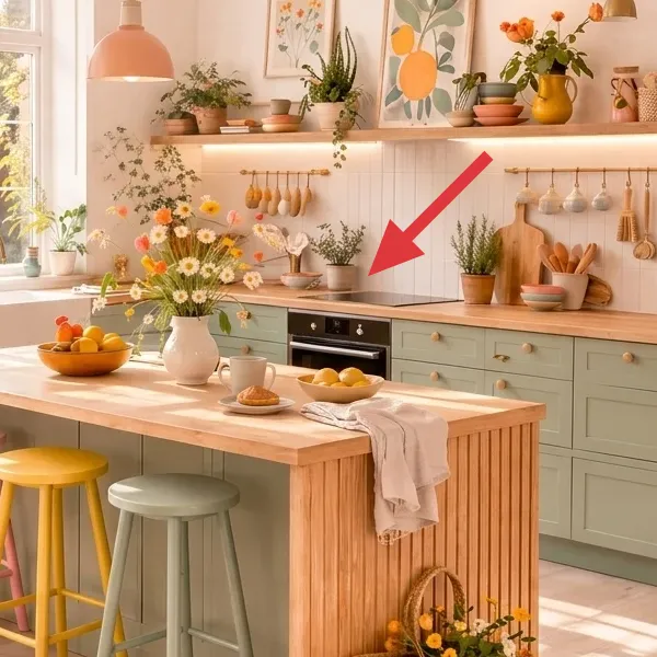
A brass-toned rail runs along the backsplash area, with wooden-handled utensils and small hanging items spaced underneath. It’s both practical and visual: every tool has a place, but the arrangement also reads like a curated display. The rail’s warm metal finish balances the cooler cabinet green and keeps the area from looking too “plain white tile and wood.” The utensils themselves add texture—wood grain with simple shapes—so the wall feels finished even when the counter is cleared.
Why it works here: you’re borrowing the “open shelving” logic without turning the whole wall into clutter. The trade-off is that you have to commit to spacing—too tight and it looks messy, too far and it looks like an accessory you forgot. The cheaper option (hanging a random hook grid) usually fails because the rail line looks intentional and continuous, and that continuity is what makes the backsplash feel designed.
Plan clearance before you mount
Check that cabinet doors, drawers, and any backsplash outlets won’t interfere with the rail height or with what you’ll hang from it.
Layer 5 — Botanical framed art ($95) Two botanical prints that echo the flower colors
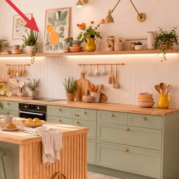
On the wall above the backsplash, framed botanical prints add a soft, illustrated layer. The artwork includes leaf-and-flower shapes in warm tones and bright accents, and the frames are light enough to keep the area feeling open. The art is positioned so it sits visually near the utensil rail and the countertop styling, meaning it supports the whole story rather than floating alone. It also gives the eye a place to land when you look from the windows toward the island.
I’d skip buying art that’s too matchy—like printing a single-size set with identical frames—because your kitchen already has pattern from the rug, flowers, and hanging accessories. The better approach is to repeat one theme (botanicals) and keep the color story aligned with the centerpiece and ceramics. The trade-off is you’ll need to be deliberate about spacing so the frames feel like a “curated cluster,” not random thrift finds stacked together.
Use consistent frame sizes, then vary the print
When frames match in dimensions, you get a calmer, gallery-like look even if the prints have different focal points.
Layer 6 — Linen runner and towel drape ($30) Soft neutral cloth that breaks up the cabinet color
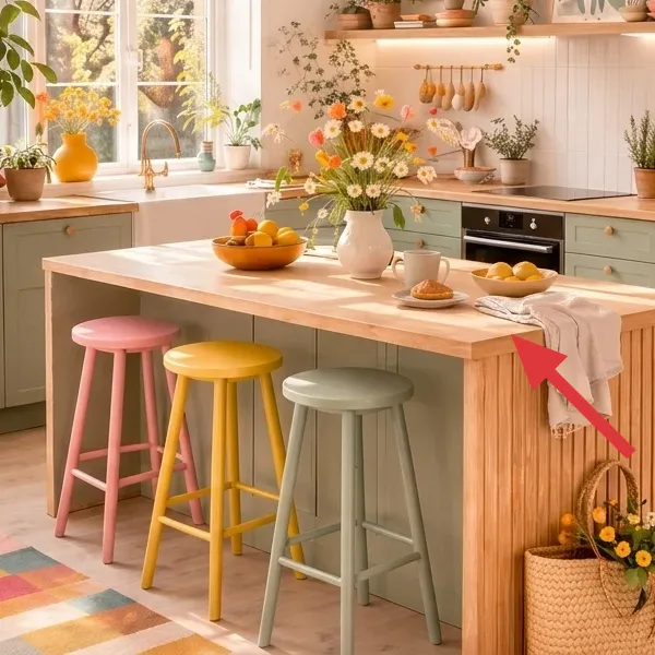
On top of the island, a light linen-style runner and a towel drape create a relaxed, staged texture. The fabric sits across the tabletop with gentle folds, adding softness that contrasts with the smooth countertop and the straight cabinet edges. It’s not a heavy blanket layer—more like a “breathing” strip that makes the island feel styled for everyday use, not just for photos. In the overall composition, it helps the flowers look intentional instead of visually landing on bare wood.
This works because textiles are how you make painted cabinetry feel cozy. If you skip the cloth and let the island be only hard surfaces, the room can feel too crisp and slightly sterile. The trade-off is laundry management: fabric will pick up kitchen life, so choose a washable option and swap it as needed. I’d rather spend $30 on one good cloth layer than buy another decorative object that competes with the utensil rail and framed art.
Keep it low-key so the flowers stay the hero
Choose a pale neutral cloth and let the pattern/colors in the centerpiece do the talking.
Layer 7 — Patchwork area rug ($85) Warm multicolor blocks anchored under the stools
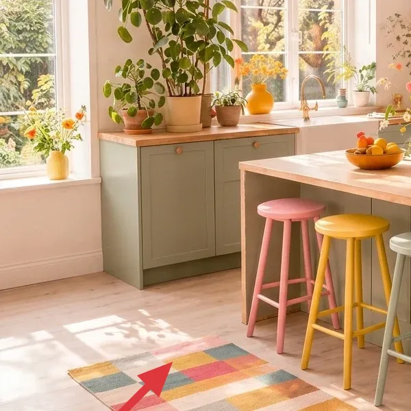
The area rug sits in the foreground beneath the stools, with warm multicolor blocks and a patchwork-like pattern. The colors stay compatible with the room’s palette—earthy and cheerful rather than loud—and the rug helps define a “landing zone” between the kitchen island and the rest of the open floor. It also adds texture underfoot, making the space feel less like a showroom and more like a room you actually live in. From a styling standpoint, the rug is doing what the backsplash can’t: creating warmth at floor level.
This is a better choice than a single solid rug because your kitchen already has multiple small visual beats (hanging utensils, framed prints, stacked ceramics). A patterned rug holds those beats together by giving the eye a consistent rhythm. The trade-off is vacuuming: with more pattern and color variation, dust shows less, but you still want regular upkeep to prevent grit from dulling the pile. If you want this look on a weekend, prioritize rug placement first—then build the rest of the styling around it.
Angle the rug slightly to “follow” the room
Even a subtle angle can make a kitchen feel less square-off, especially when stools are clustered around the island.
The cost, layer by layer
| Layer | Item | Cost |
|---|---|---|
| 1 | Three colorful bar stools | $210 |
| 2a | Small ceramic vase | $5 |
| 2b | Spring bouquet (daisy-like blooms) | $8 |
| 2c | Wildflower/mini-floral bouquet | $6 |
| 3a | Pink glass pendant fixture | $90 |
| 3b | Replacement bulb (warm 2700K LED) | $15 |
| 4a | Brass utensil rail kit + mounting hardware | $55 |
| 4b | Extra hooks for utensil spacing | $10 |
| 4c | Small hanging utensil/mug assortment | $15 |
| 5a | Two matching frames | $60 |
| 5b | Botanical print set | $35 |
| 6 | Linen runner + kitchen towel drape | $30 |
| 7 | Warm patchwork area rug | $85 |
| Total | $624 | |
If you want a cheaper variant, thrift or Facebook Marketplace your stools first (often $60–$90 each instead of full price) and choose a smaller rug budget by shopping end-of-season sales—then keep the pendant and the wall rail. That lets you protect the two highest-visibility “must-haves” (ceiling color + backsplash organization) while shaving the rest down with secondhand sourcing.
What worked, what didn't (across the whole room)
When everything is working together, the kitchen looks designed without feeling precious. The wins are mostly about hierarchy: lighting overhead, storage organized on the backsplash, then soft comfort on the floor and island.
What worked
- The pink glass pendant became the room’s color anchor, making the island feel like the focal point even with lots of wall styling.
- The brass utensil rail keeps frequently used items visible, so the backsplash reads intentional rather than blank tile.
- Mixing stool colors (same height, different shades) softened the cabinet grid and made the kitchen feel playful without chaos.
- Botanical framed art tied the flowers, utensils, and ceramics into one story, so nothing looked randomly placed.
- The linen runner added “soft pause” between the hard countertop and the busy rug pattern.
- The patchwork rug grounded the stool cluster at floor level, stopping the room from feeling showroom-cold.
- The DIY white-vase centerpiece is small but high impact—when it’s there, the whole island looks styled; when it’s gone, you still have structure.
What didn't
- Ordering all three stools from the same collection felt too uniform, and the room lost the charming “curated mismatch” vibe.
- Hanging the utensil rail too high made the tools feel disconnected from the counter; the sweet spot is visually aligned with the island workspace.
- Overfilling the island with extra décor crowded the line of sight from the window—one flower moment plus one cloth layer looks best.
- Using a rug with only cool grays made the sage cabinets read flat; warm multicolor blocks keep the palette breathing.
- Picking a pendant shade that’s too small made the island underlit; match pendant scale to the island surface and stool height.
- Trying to hide everything by going all neutral resulted in a “staged but not lived-in” feel—color pops are part of the look.
What we'd skip if we did it again
Skip buying a full matching dining-stool set in one finish. The room’s current charm comes from controlled mismatch: same silhouette and height, different pastel-ish colors. Matching everything can make the kitchen feel like it borrowed furniture-store styling instead of reflecting your taste. If you love a set, use it as a starting point—but repaint or swap one stool color so you keep the designed contrast that makes the island feel alive.
Skip the “cheap-and-too-small” pendant approach. A pendant that’s underscaled won’t give you the same overhead focal point, and you’ll end up stacking extra décor to compensate. If your ceiling box isn’t ready, don’t improvise electrical work—call an electrician, or choose a plug-in pendant style instead. Spending a little more on the glass shade you can see clearly pays off every time you walk in.
Skip the urge to fill the counter and backsplash equally. This look works because the backsplash has organization (the rail and hanging pieces), while the island has one soft moment (runner + flowers). When you add too many small objects, the wall art and utensils fight for attention. If you want to “keep things cute,” rotate in one new element per week—one vase, one cloth, or one framed print update—not all at once.
Frequently asked
How long does this kitchen refresh take on a weekend?
For most homeowners, plan for 6–8 hours across one weekend (or split into two short days). The quickest wins are styling (towel/runner and rug placement) and setting up a DIY flower moment. The longest part is usually hanging wall art and mounting the brass utensil rail—measure, mark, and level take time. If you’re swapping a hardwired pendant, count extra time for safely turning power off and coordinating any necessary electrician help.
What if I rent—can I still do this look?
Some pieces are easy to rent-friendly, but two parts are the tricky ones: mounting a rail and changing a ceiling fixture. If your lease allows temporary mounting, use removable hooks/anchors only where your landlord won’t object, and keep holes minimal. For lighting, look for a plug-in pendant solution if you don’t already have an adjustable drop. The easiest renter version is: rug + stools (if allowed) + framed botanical art on existing nail points + a DIY centerpiece and cloth layer.
My kitchen is smaller—how do I avoid overwhelming the space?
Go lighter on visual “volume” while keeping the hierarchy: keep the pendant and one wall focal point (the framed art) and reduce countertop clutter. For smaller islands, consider choosing slimmer stool silhouettes or fewer stools—still keep the same stool height so the seating feels functional. On the rug, prioritize warm, medium-scale pattern rather than tiny micro-bits that can look busy up close. The key is negative space: a clean island edge and a single cloth layer make the room feel bigger.
What if my kitchen has a different cabinet color?
You can keep the same system even if the cabinet color isn’t sage. The guiding idea is contrast: pair a calm cabinet backdrop with one warm wood element (like a utensil rail display) and one joyful accent color (the pink pendant or a stool color). Then repeat the accents in two places: the artwork and the centerpiece. That repetition is what makes the look feel cohesive rather than like unrelated purchases.
Where would you shop differently in 2026 for these items?
For the most value, I’d treat bar stools and the rug as “hunt items” (thrift, ReStore, Facebook Marketplace, and clearance) because price swings are huge and you’re matching color families, not exact brands. Pendant fixtures and mounting rail kits are more consistent, so they’re better bought new when you need an exact shade and finish. For botanical prints, Etsy or art marketplaces are great, but stick to a small set of print sizes so your gallery cluster looks intentional.
What’s the single biggest mistake people make on kitchens like this?
It’s adding too many competing décor moments at once—especially when the backsplash already has storage and the island already has flowers. If your rail is filled, your framed art is up, and your island is also crowded, the room starts to feel busy instead of curated. Keep one countertop hero (flowers) plus one fabric layer (runner), and let the backsplash organization do the rest of the styling work.
How do I keep the rug and centerpiece looking good in real kitchen life?
For the rug, vacuum regularly and use a rug pad to prevent shifting under the stools—less movement means fewer worn spots. For the centerpiece, trim stems so the vase stays stable and doesn’t tip, and refresh water daily for a cleaner look. If you’re using blooms you bought from a store bouquet, remove any leaves that sit below the waterline to slow water-clouding. The goal is to keep the “styled” look effortless, not fussy.
