- Best for
- Textiles and style objects on a wall shelf
- Cost
- Under $300
- Difficulty
- Easy
- Renter-safe
- Yes (move-ready pieces, no wall changes required)
Why white-and-walnut ceramic vignette is the window-side shelf nook of 2026
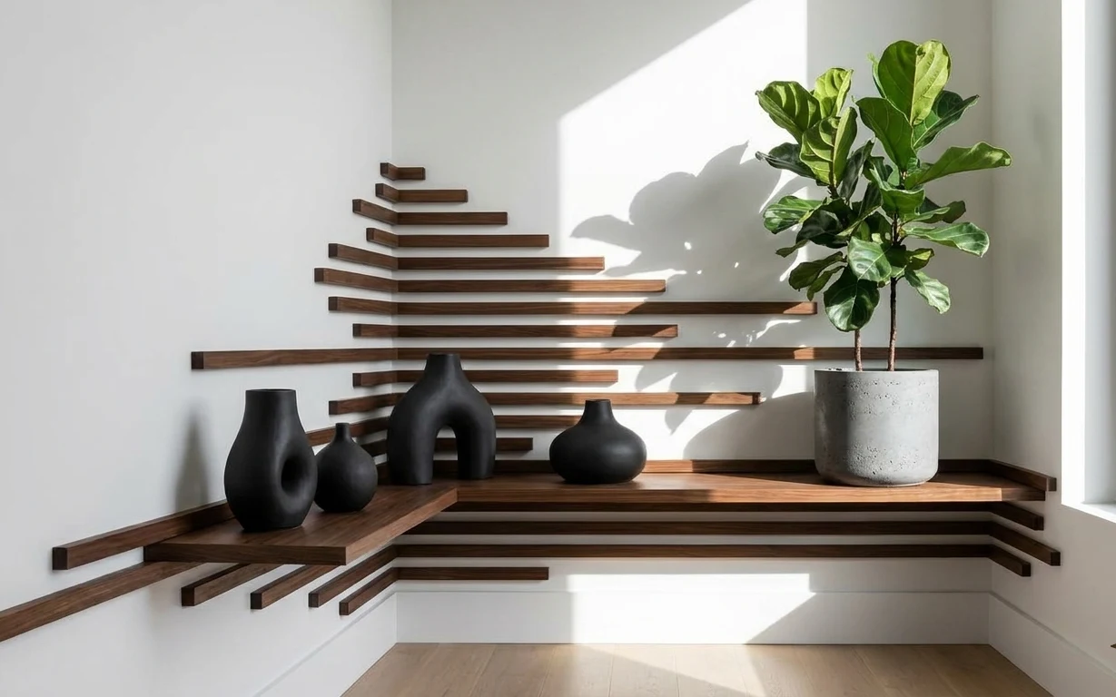
The hero here is basically a study in contrast: matte black ceramic against warm walnut wood, with a bright window giving the whole display sharp, clean edges. The textures do a lot of work—smooth ceramic curves, the speckled concrete pot, and the straight, slightly irregular lines of the wooden slat shelf. I’ve recreated versions of this setup in shared houses by treating it like a “portable still life” instead of chasing permanent wall changes. For move-friendly decorating, that mindset matters as much as the objects.
The first time I tried to copy a built-in look, I bought too many little pieces and ended up with clutter that fought the shelf’s lines. What fixed it for me was narrowing the palette to black + walnut + one plant, then varying only form: tall, round, arched. In this kind of nook, fewer, sculptural shapes read more intentionally—especially when daylight hits from the window.
Layer 1 — large matte black vase ($35) Tall ceramic anchors the left side
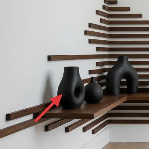
A large matte black vase gives the whole arrangement a visual “weight” on the left, and it doesn’t fight the wood’s straight slats. The finish matters here: that matte surface looks less shiny than many glossy ceramics, so it stays calm even under bright window light. The trade-off is that it reads bold, so it works best with a limited palette—black, warm wood, and concrete/green nearby—rather than mixed colors. Compared with using a clear or pale vase, the black one also hides dust and smudges better between moves.
Use height to echo the shelf lines
Pick a vase that’s tall enough to interrupt the horizontal rhythm of the slats, then leave breathing room on either side.
Layer 2 — small matte black vase ($25) Adds a second curve without crowding
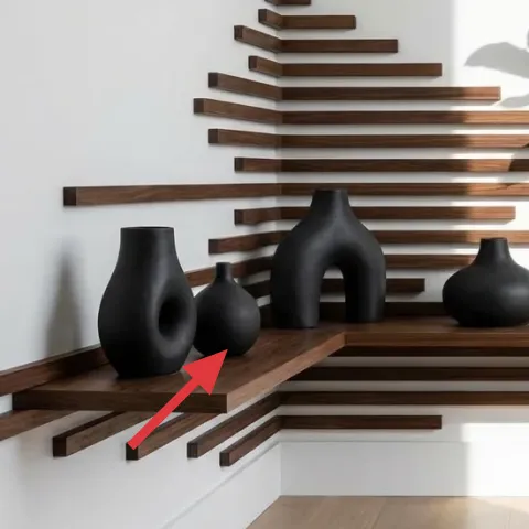
This smaller matte black vase is the “supporting actor” shape—still dark enough to match, but not tall enough to overpower the main anchor. It sits closer to the middle zone of the shelf, so it visually bridges between the left and the arched form. The matte texture keeps the cluster from looking like flat silhouettes. The trade-off: because it’s small, it can disappear if the display is too sparse, or if the plant and concrete pot get placed too aggressively close. It works best when spacing is consistent—one open gap, then the next object.
Match finish, not necessarily color
Even when pieces differ in color tone, keeping them matte (instead of mixing matte and gloss) keeps the vignette coherent.
Layer 3 — arched matte black vase ($45) The sculptural silhouette adds movement
The arched matte black vase is what makes the arrangement feel designed instead of random. Its opening and curved profile echo the way the shelf’s slats feel—structured, but not rigidly uniform. Under daylight, that arch catches subtle highlights along its edges, giving the display depth without adding a new material. The trade-off is scale: if the arch vase is too large compared with the shelf ledge, it can block sightlines. Here, it’s placed so you can still see the wooden ledge line underneath, which makes the whole scene feel airy rather than heavy.
Angle the “best face” to the window
Rotate the vase so the opening/curve is visible from the spot you’ll usually look from.
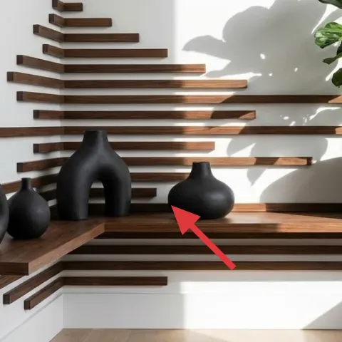
Layer 4 — small round matte black vase ($25) A low circular punctuation mark
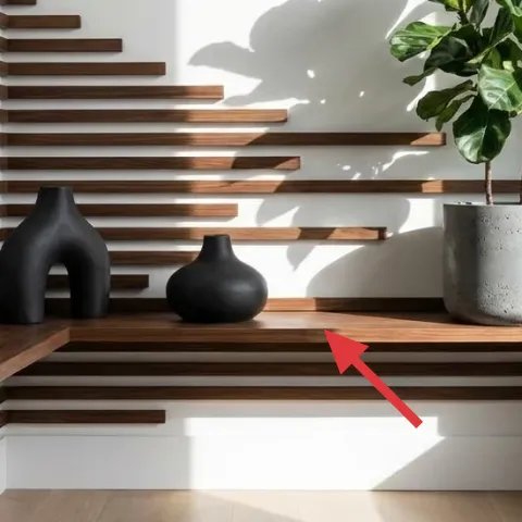
This small round matte black vase works like punctuation: it’s lower, tighter, and easier to pack than a taller accessory. It also balances the arched silhouette by adding a calmer, closed shape near the center-right. Keeping it matte keeps the cluster from getting too shiny and visually loud next to the speckled concrete pot. The trade-off is that it can look redundant if the two other black vases are too similar in height, so use it to create one “low” moment in the lineup. When it’s placed with intention, it helps the display read as a trio, not a pile.
Don’t add a fourth black shape
In a shelf with strong horizontal slats, extra small black pieces can turn the vignette into visual noise fast.
Layer 5 — concrete planter pot ($40) Speckling gives the ceramic cluster texture
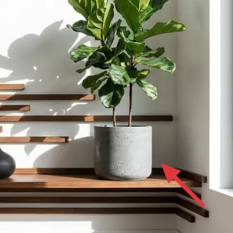
The concrete planter pot adds a tactile, speckled texture that makes the black ceramics feel more grounded. It’s also a smart move-friendly choice because it’s a single, sturdy object that packs safely if wrapped with paper or a towel. Compared with a smooth ceramic pot, the concrete look hides minor chips and scratches better over time. The trade-off: concrete tends to be heavier than lightweight planters, so it’s worth planning how it’ll travel in a box. In this nook, the pot sits to the right where the shelf line meets the window light, which makes its texture show.
Let the pot do the “color work”
When the rest of the palette is black and walnut, the concrete’s gray speckle brings variation without adding new hues.
Layer 6 — green leafy indoor plant ($30) Fresh color offsets the neutrals
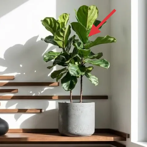
The green leafy indoor plant is the color interruption that keeps the vignette from reading monochrome. Leaf shape also matters: broad leaves soften the shelf’s hard geometry and make the arrangement feel less like decor and more like a lived-in corner. The trade-off is maintenance—plants need light and occasional watering—but it’s usually easier for shared housing than styling with lots of fragile objects. For move readiness, choose something compact enough to lift one-handed and pot-stable enough to survive a short commute. Here, placing it near the window lets the leaves catch natural light and hold their look.
Pick one plant, not an ecosystem
One main plant reads cleaner on slatted shelves than multiple smaller pots.
Layer 7 — wooden slat wall shelf ($80) Warm walnut lines create the built-in look
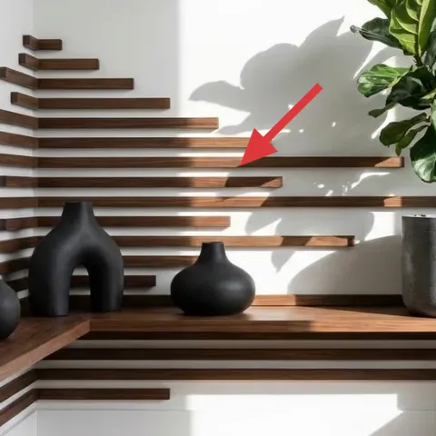
The wooden slat wall shelf supplies the structure that makes all the ceramic pieces feel curated. The warm walnut tone ties directly into the room’s natural-light vibe, while the slats create rhythm without needing any artwork. The trade-off is that wood shelves visually show spacing mistakes—too many objects or uneven placement becomes obvious. If the goal is a similar look in shared housing, keep objects aligned to the shelf ledge line so the eye reads one clean row. Compared with a solid shelf, the slats also add visual texture, so you can keep decor fewer and still get impact.
Keep the ledge line visible
Leaving a clear strip on the shelf keeps the vignette from feeling boxed-in.
The cost, layer by layer
| Layer | Item | Cost |
|---|---|---|
| 1 | Large matte black vase | $35 |
| 2 | Small matte black vase | $25 |
| 3 | Arched matte black vase | $45 |
| 4 | Small round matte black vase | $25 |
| 5 | Concrete planter pot | $40 |
| 6 | Green leafy indoor plant | $30 |
| 7 | Wooden slat wall shelf | $80 |
| Total | $280 | |
A cheaper variant keeps the same black + walnut + green formula: swap to thrifted matte black vases, choose a lighter planter pot, and go for a budget wooden shelf with fewer slats. The structure matters more than perfect shapes, so minor differences won’t ruin the look.
What worked, what didn't (across the whole room)
The strongest win here is the palette discipline: matte black ceramics plus walnut wood plus one plant keeps the shelf feeling intentional under daylight. The second win is shape mix—tall, arched, and low round forms read as a set instead of random accents.
What worked
- Matte black vases stay calm in bright window light and don’t compete with the wood slats.
- Varying height (tall, medium, low) prevents the cluster from flattening into a single line.
- The concrete planter pot adds speckled texture that replaces the need for extra decor.
- One main leafy indoor plant softens the shelf’s straight lines and brings color balance.
- A wood slat shelf creates built-in rhythm without needing framed wall art.
- Keeping the ledge line visible makes the nook feel lighter and more move-ready.
What didn't
- Glossy ceramics looked too reflective next to the window, making the display feel busy.
- Adding a fourth black object made the vignette read like clutter on horizontal slats.
- Plant placement too far from the window caused leaves to look sparse within a couple weeks.
- A smooth pot surface hid texture detail, so the shelf looked flatter from across the room.
- Too much decor packed onto one side blocked the line of sight across the ledge.
What we'd skip if we did it again
Skip a full set of matching vases from the same retailer. On a slatted shelf, identical silhouettes read like a decorative display, not a curated vignette—and it’s harder to pack and mix across moves.
Skip extra small filler objects (tiny figurines, multiple mini candles, lots of beads). The shelf’s built-in geometry already provides texture, so more “stuff” turns the look noisy fast.
Skip plant varieties that are hard to transport or require strict humidity. In shared housing, the easiest plant is the one that can survive changing light conditions and still look good in the next place.
Frequently asked
How long does this kind of shelf refresh take?
Plan for 45–90 minutes to shop your items, place them once, and adjust spacing. If sourcing is already done, the on-shelf styling itself usually takes under an hour. The main time sink is getting the heights right—tall + arched + low shapes need a quick re-check from the window angle.
Is this renter-friendly in shared housing?
Yes, as long as the focus stays on portable objects: vases, a planter pot, and a plant. The styling is about placement and spacing rather than permanent updates. If the wood slat shelf is fixed in the current apartment, the move-friendly version is simply recreating the same arrangement with your own decor.
What if my space is smaller or I don’t have a window close by?
Keep the palette even tighter: one main black vase, one smaller black piece, and the plant (or a single textured pot) to bring contrast. Without window light, matte finishes usually look better than glossy, and concrete texture still shows in softer light. Reduce the plant size so the leaves don’t look sparse.
Where should similar items be shopped for the best price?
Start with thrift stores and marketplace listings for matte black vases and concrete-look pots, since sculptural pieces pop up often. For the plant, local nurseries or big-box stores are usually cheaper than boutique florists. If you need a shelf look, compare budget woodworking sections or secondhand shelving before buying new.
What’s the biggest mistake people make on this type of nook?
Over-decorating. Slatted shelves already provide texture and rhythm, so piling on multiple small accessories makes the vignette feel accidental. Choose three main forms (tall, arched, low) and let the planter texture + one plant handle the rest.