- Best for
- renter bathroom vanity styling
- Cost
- under $350 for the full look
- Difficulty
- easy (no drilling or painting)
- Time
- about a weekend afternoon
Why warm-wood bathroom vanity wall is the bathroom vanity wall of 2026
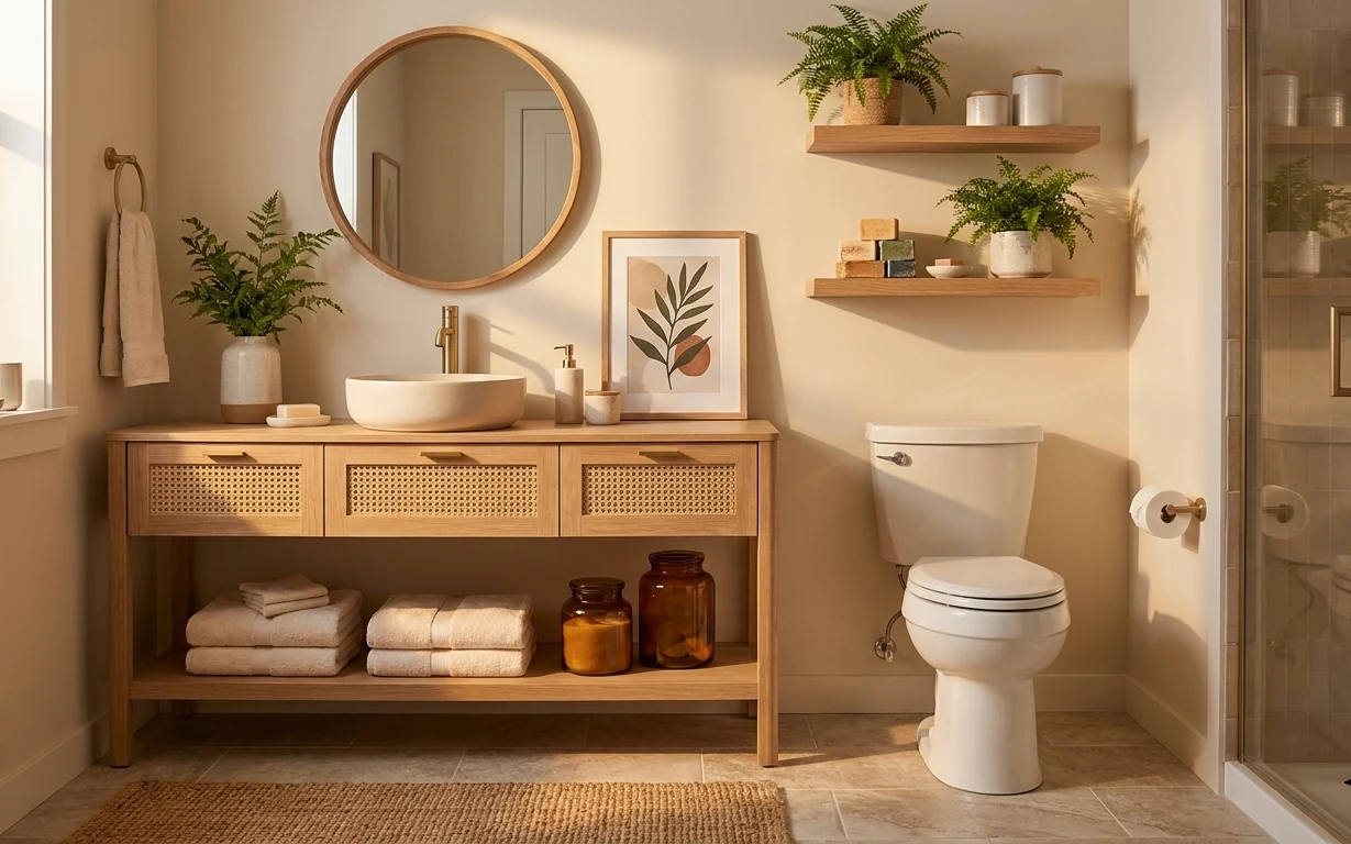
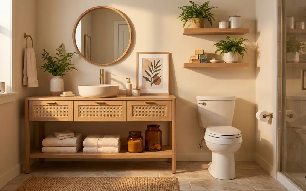
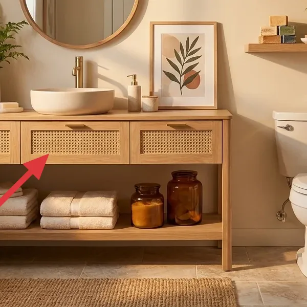
There’s a reason this setup reads “calm” even with a lot going on: the textures are doing the work. In the photo, warm wood, matte white towels, and a woven jute bath mat all sit together in the same color family. The framed botanical print adds a flat, graphic hit, while the round wood mirror and countertop styling keep everything balanced around the sink area. Best part for renters: you’re not touching the landlord-installed fixtures—you’re styling the surfaces and swapping in removable accessories.
I used to think bathrooms needed “one big statement,” so I’d end up chasing it—new shelves, bigger art, louder colors. What finally changed my mind was realizing a bathroom is already limited by tile and fixtures, so the winning move is layering small, removable pieces with the same warm tone. This is the version that feels like a spa without turning into a project that never ends.
Layer 1 — Woven jute bath mat ($80) Tames tile and adds texture at your feet
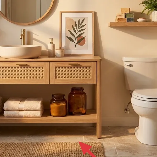
That woven jute bath mat changes how the whole floor reads. It’s textured, warm in tone, and visually softens the harder edges of the tile so the vanity wall feels less stark. Choosing a natural-fiber look also makes it easier to match wood tones and the amber glass on the shelf. The alternative—going for a slick, all-white mat—can look clean but it won’t add the cozy, spa-like friction you get from this weave. Trade-off: jute can show water or damp areas faster than synthetic, so keep it dry after showers and shake it out occasionally.
Anchor the color story with neutrals
When your wall and floor are fixed, natural fibers (like jute) keep your accessories from competing with each other.
Layer 2 — Stack of folded white towels ($30) Keeps the sink zone looking intentional
In this look, the folded towels aren’t just for function—they’re a visual rhythm. White towels bring a clean pause right where the eye lands near the vanity, and the folded stack reads tidy instead of accidental. I like using two or three neat layers so you get a little variation in height without clutter. The obvious alternative is open, loose towels on a hook, but that can tip into “laundry day” rather than “designed.” Trade-off: towel stacks need quick resets after guests or heavy use, but that’s a small price for how polished the room feels.
Go for contrast, not matching
White towels against warm wood and beige walls read crisp even when the rest of the bathroom is soft-toned.
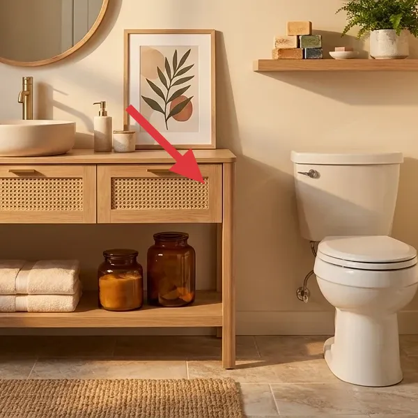
Layer 3 — Framed botanical print ($45) Adds a flat, calm graphic above the towels
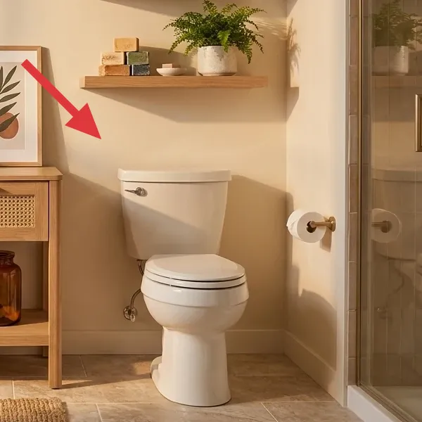
The framed botanical print is the easiest way to make the vanity wall feel styled without touching the big fixtures. The illustration is warm-leaning, and the frame color echoes the wood tones around the sink, which is why it doesn’t fight the mirror. A single, centered piece also avoids the “too many things” problem I run into—especially in smaller bathrooms. The alternative would be multiple small prints, but that often looks busy once you add plants and jars. Trade-off: you’ll want a frame size that feels proportional to the mirror and vanity; too small and it disappears.
Pick one print size and repeat the same frame tone
Matching the wood-ish frame color to the vanity keeps the whole wall reading cohesive.
Layer 4 — Round wood mirror ($90) Reflects light and softens the hard edges
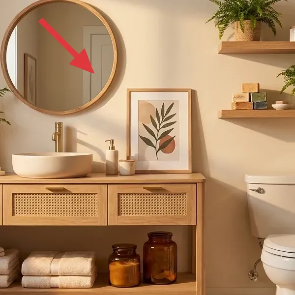
A round mirror does something rectangles can’t: it rounds off the visual geometry of the vanity and makes the sink wall feel friendlier. Here, the warm wood rim connects to the countertop and the open shelf, while the circular shape helps the framed print and vertical plants feel more balanced. If you go with an oval or an arched shape instead, you may get a similar effect, but round is the most forgiving with busy bathroom elements. Trade-off: mirrors can show streaks fast in bathrooms, so you’ll need an easy wipe-down, especially around the edges.
Skip anything that needs hard mounting
If your renter setup can’t be hung with removable hardware, choose a mirror that sits stably on the vanity or uses existing mounting.
Layer 5 — Stoneware vase pot on vanity ($25) Gives you the “fresh” texture without fuss
That stoneware vase pot is small, but it’s doing big work: it adds a matte, earthy surface that makes the greenery look intentional. Because it’s neutral and slightly textured, it doesn’t compete with the framed print or the amber jars. An obvious alternative is a clear glass container, but that tends to look utilitarian and can make the shelf feel accidental. Trade-off: stoneware can be heavier than you expect, so measure your vanity shelf space before you commit—especially if you’re rearranging for cleaning.
Match finish, not color
You don’t need the vase to be the same “wood” shade as the mirror—matching the matte/earthy finish is the trick.
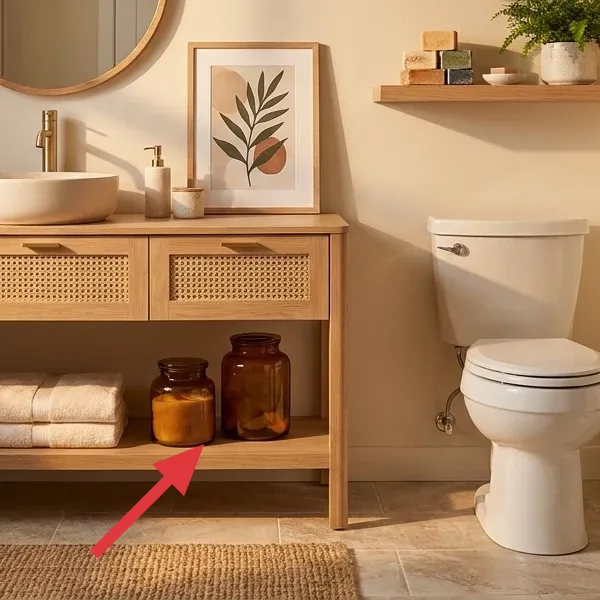
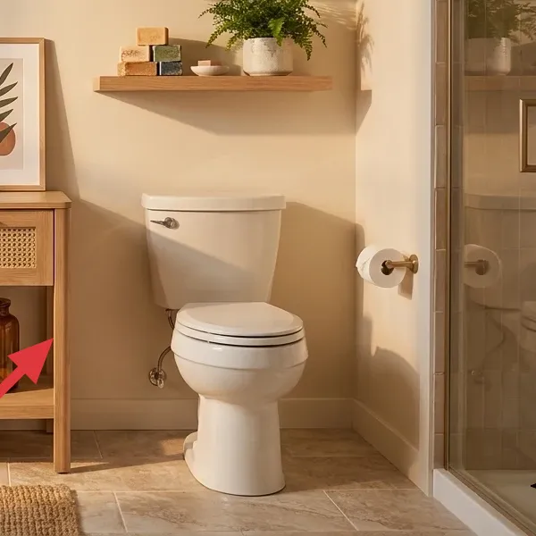
Layer 6 — Amber glass apothecary jars ($30) Organize the shelf while looking decorative
Make it instead of buying it
DIY apothecary jar labels let you turn simple amber jars into the exact “apothecary shelf” look without paying for a pre-made set.
Materials
- Printable jar label sheet (PDF/print) — 1 set — $4
- Amber glass jars (medium) — 2 jars — $18
- Clear label tape or book tape — 1 roll — $3
- Small funnel (optional) — 1 — $2
Steps
- Print label designs on label paper or regular cardstock sized for your jars.
- Cut labels carefully so the edges don’t catch the light.
- Wipe the jar glass so the tape grabs smoothly.
- Apply clear tape to seal and protect the printed labels from humidity.
- Fill jars and set them on the vanity shelf in a matching height pair.
- Re-center the label so the text faces forward from the doorway.
Total DIY cost: $27 — saves about $3 over buying.
Whether you buy labeled jars or make labels like above, this layer is what makes the open shelf feel styled rather than stocked. Amber glass adds warmth and a soft glow, and the uniform jar shape creates visual order next to the towels and plants. The alternative—storing everything in mismatched containers—breaks the calm effect and makes the shelf look like a catch-all. Trade-off: jars take a second to fill and label, but once they’re set, they stay looking “done” with minimal maintenance.
Use two heights for instant balance
Pair one jar slightly taller than the other so your shelf doesn’t look flat.
Layer 7 — Decorative ceramic tray on vanity ($20) Stops small clutter from spreading
A decorative ceramic tray gives the vanity a base layer for everything small—soap, everyday bottles, and a quick place to land items. In this photo, the tray’s shape and color help the countertop feel curated instead of randomly filled. Going tray-free is tempting, but then tiny items drift into the “where do I put this?” problem, especially in a rental where you’re rearranging often. A ceramic tray also plays nicely with warm wood and matte towels because it doesn’t add shine. Trade-off: you’ll want to keep the tray surface from getting too busy—two or three items max looks best.
Leave breathing room on the tray
Visual space makes the vanity feel calmer, even if you use it daily.
The cost, layer by layer
| Layer | Item | Cost |
|---|---|---|
| 1 | Woven jute bath mat | $80 |
| 2 | Stack of folded white towels | $30 |
| 3 | Framed botanical print | $45 |
| 4 | Round wood mirror | $90 |
| 5 | Stoneware vase pot on vanity | $25 |
| 6 | Amber glass apothecary jars | $30 |
| 7 | Decorative ceramic tray on vanity | $20 |
| Total | $320 | |
If you want a cheaper version, scale down the mirror and the framed print. Keep the jute mat and towels (they’re the biggest “feel” changes), then shop for a smaller frame size and a simpler tray so your look stays warm without the top-end pieces.
What worked, what didn't (across the whole room)
This bathroom vanity wall works because the styling pieces follow a consistent warm-material palette. The textures (jute, stoneware, matte towels) create softness, while the round mirror and one framed print keep the geometry calm.
What worked
- The woven jute bath mat made the tile floor feel less hard underfoot.
- White towels stacked neatly so the vanity zone looked put-together, not “leftover.”
- The framed botanical print added calm, graphic interest without adding visual clutter.
- The round wood mirror softened the sink area’s straight lines.
- Amber jars created shelf organization that still looks decorative.
- Stoneware and a ceramic tray kept small items from scattering across the countertop.
What didn't
- If the towels get too fluffy or too many, the stack reads messy against the clean lines.
- A shiny countertop tray can fight the matte towels and make the vanity feel busier.
- Too many jar labels (or different jar shapes) reduces the calm, spa-like order.
- Leaving wet jute mat edges can lead to darker spots after showers.
What we'd skip if we did it again
Skip adding multiple small art pieces around the mirror. In a bathroom, framed prints compete with plants, towels, and storage, so one centered botanical print usually looks more intentional.
Skip a tray that’s too large for your countertop. When the tray takes up most of the vanity, you lose space for cleaning and the look turns “decor on top of clutter” instead of functional.
Skip unlabeled mismatched containers on the shelf. Even if the jars are the same color family, different shapes break the order—labeled, matching jars keep the whole wall reading calm.
Frequently asked
How long does this bathroom vanity refresh take?
Plan for about 3–5 hours total. The biggest time chunk is styling: placing the bath mat, towel stack, countertop tray items, and getting the shelf objects to the right heights. Framing art and adding jars is quick, but I always budget a little extra to stand back, check symmetry around the mirror, and then tweak one object at a time.
What if I’m in a rental and can’t drill anything into the wall?
You’re covered with renter-safe layers that don’t require replacing fixtures. Use removable methods for hanging the framed botanical print (like existing hooks or renter-safe hanging options), and focus most of the look on countertop and shelf styling: the mat, towels, tray, mirror placement, and decorative jars. Those pieces pack up easily when you move.
Can this work in a smaller bathroom?
Yes—lean even harder into vertical order. Use a thinner bath mat size (still in a jute-like texture), keep towel stacks smaller, and choose a botanical print that doesn’t feel oversized compared to the mirror. If the shelf area is tight, reduce the jar count to two pieces and repeat the warm material palette (stoneware + amber glass) so it still reads cohesive.
What about a larger bathroom—should I add more decor?
Add proportion, not clutter. In bigger bathrooms, you can go up one step in scale (a slightly larger framed print or a wider tray) but keep the same “one focal print + repeat warm textures” structure. The goal is balance around the mirror and vanity; if you add too many small items, the shelf starts to look crowded.
Where should I shop differently for these pieces?
For textures, I like home goods and linen shops for bath mat and towels, since you can feel the weave. For the framed botanical print and mirror, thrift stores and discount home sites are great because frames and mirrors get rotated constantly. For jars and styling, look in kitchen storage or apothecary sections, then DIY the labels if you want a specific look.
Biggest mistake to avoid with this look?
Don’t mix too many finishes at once. If your tray is glossy, your jar glass is very different, and your towel color isn’t crisp white, the warm spa effect falls apart. Stick to matte stoneware/ceramic, warm amber glass, and natural-fiber textures, and you’ll keep the wall reading calm.