- Best for
- Making a shared kitchen feel curated without touching fixed fixtures
- Cost
- Under $400 for 7 move-friendly upgrades
- Time
- 1 afternoon + one dry period for paint
- Renter-safe
- All swaps are textiles and freestanding decor
Why this warm-wood kitchen counter corner is the move-friendly nook of 2026
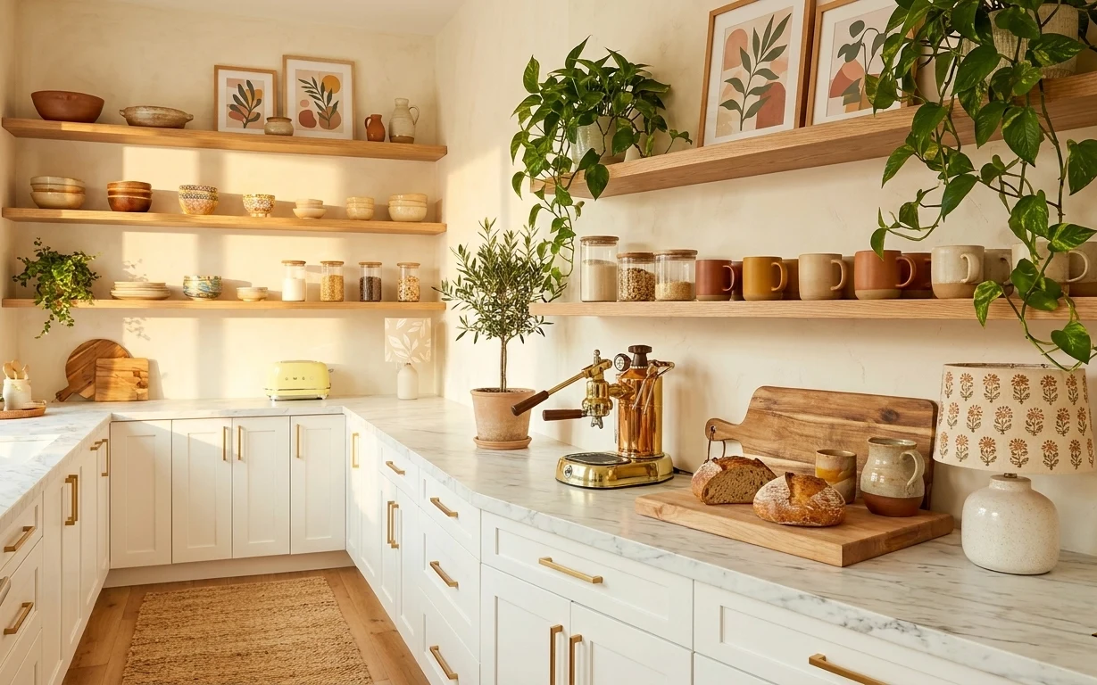
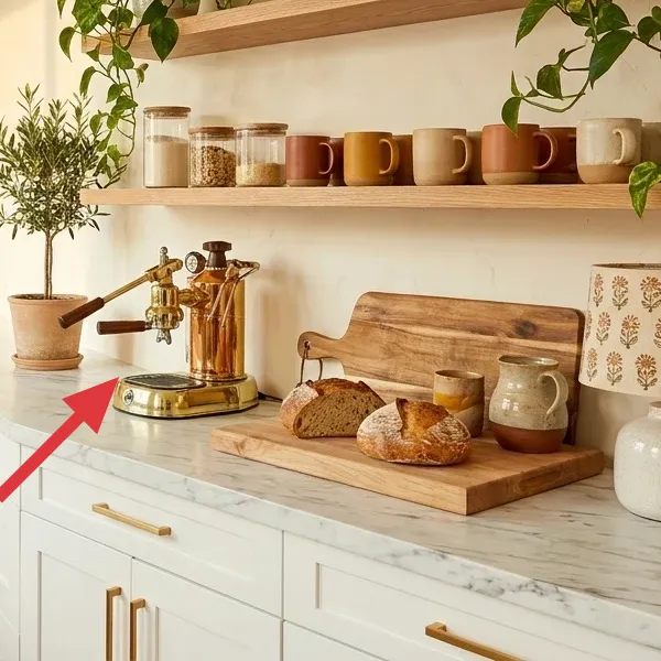
I’ve been chasing the same calm, “everything has a home” feeling since my first shared apartment—back when my kitchen looked like a storage unit. Here, the palette leans cream and warm wood, and the texture mix is doing most of the work: the marble-look counter surface, the woven rug, and the glossy ceramic jars on the shelves. It reminds me of the way Scandinavian kitchen styling in places like Design*Sponge keeps objects few and intentional, even when the room is busy. For shared housing, that’s key: you can refresh the parts you can pack.
The mistake I made early on? I bought decorative items I couldn’t realistically haul. This is the smarter version—one rug for the floor zone, one or two frames for visual order, and plants/ceramics that live happily in a box. When you choose pieces that match the countertop tones, your kitchen feels curated without changing any fixed fixtures.
Layer 1 — Area rug ($120) jute-style texture that zones the walkway
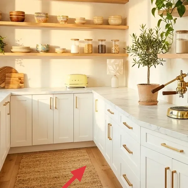
An area rug anchors this kitchen counter corner because it adds a woven, matte texture right where people step between the island and the sink. In the photo, the rug sits in front of the island cabinets and softens the marble-look counters with something warmer underfoot. The alternative is leaving the floor bare and relying only on decor, which usually looks a little too “temporary.” I’d rather spend here than on another small object—because a rug makes everything else read intentional. Trade-off: if the rug is too delicate, you’ll feel it with every spill.
Layering for comfort
If your rug is thin, add a simple non-slip pad so it lays flat and feels steadier for daily kitchen traffic.
Layer 2 — Framed botanical print ($60) warm-wood frames that repeat the shelf tone
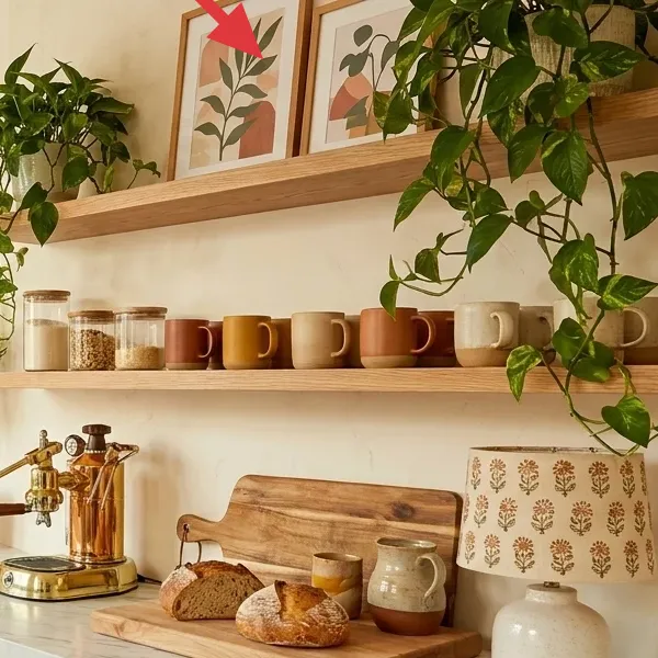
This framed botanical print works because it brings the same leaf shapes you see in the plants, but in a controlled, graphic way. It’s also framed in a warm wood tone that visually echoes the shelves, so the counter area feels “composed,” not random. The obvious alternative would be buying another small decor object for the counter, but that’s harder to group and tends to clutter quickly. With one frame, you create a simple vertical rhythm above the shelf line. Trade-off: framed art takes up a bit more space than a small accessory, so pick one statement and keep the rest minimal.
Why botanical prints fit this look
Leaves repeat the plants’ shapes, so your eye reads a theme even when you’re mixing ceramics, wood, and greenery.
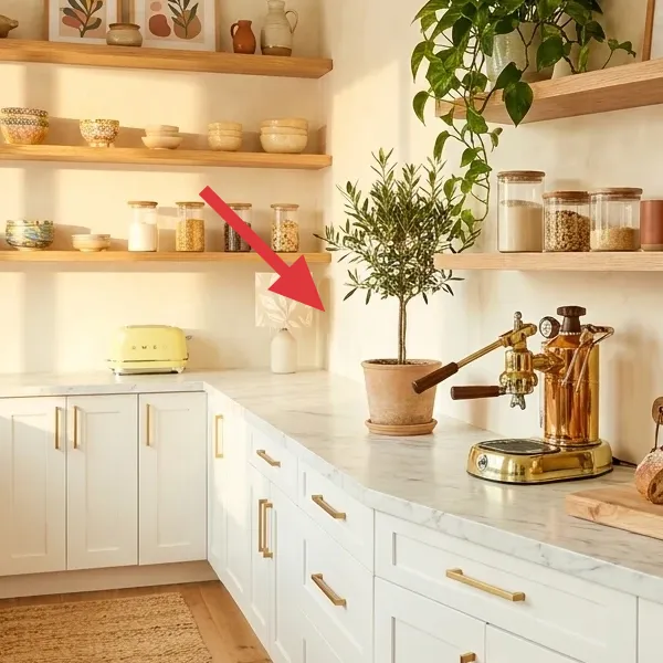
Layer 3 — Large leafy potted plant ($80) height that balances the long counter
The large leafy potted plant gives this kitchen counter corner the “air” it needs. Because it sits up off the counter (near the right shelf), it visually balances the horizontal length of the island and brings color to the cream walls without changing any fixed surfaces. A shorter plant or a bunch of small pots could work, but it usually looks piecemeal; one taller plant reads more styled from the doorway angle. Trade-off: you have to plan for light and watering, and you’ll want to lift the pot carefully so the leaves don’t snag when you pack.
Place it for sightlines
Set the pot where you’ll see it from standing height—not just at counter level—so it does real composition work.
Layer 4 — Terracotta planter pot with small plant ($25) a clay pop you can repaint for each move
Make it instead of buying it
DIY a small painted terracotta planter pot so you can swap colors to match your next kitchen’s palette.
Materials
- Terracotta planter pot — 1 medium pot — craft store — $12
- Acrylic paint (warm cream + earthy green) — 2 small bottles — craft store — $6
- Small foam brush — 1 pack — craft store — $3
- Fine-grit sandpaper — 1 sheet — hardware store — $2
- Painter’s tape — 1 roll — hardware store — $2
Steps
- Lightly sand the pot’s dusty areas so paint grips evenly.
- Tape off any bands you want to keep clean or crisp.
- Base-coat the pot with your warm cream color and let it dry.
- Paint the earthy green accent leaves/bands using a foam brush for soft edges.
- Peel the tape while the paint is still touch-dry so edges stay sharp.
- Let the final coat dry fully before watering and replanting.
This layer is about keeping the “plants are part of the decor” idea without overspending. The small terracotta pot gives you that earthy, craft-y look, and a painted finish lets you tune it to whatever your next place looks like. The reason this DIY fits shared housing: it’s light, it packs flat once empty, and the pot itself isn’t permanently married to a specific room. Trade-off: the painted finish is only as durable as your pot prep and drying time—so don’t rush the final dry before you put in water.
Don’t skip the dry time
If you water the plant before the paint fully dries, you risk smudging and uneven color that looks streaky on camera.
Layer 5 — Wood cutting board on counter ($25) warm grain that makes ceramics feel intentional
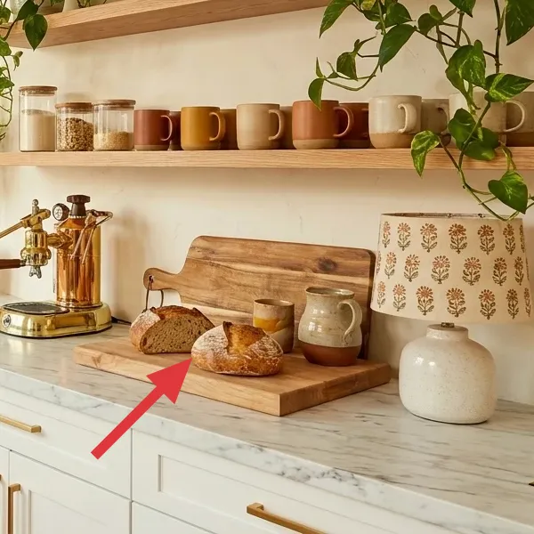
A wood cutting board on the counter is one of those underrated move-friendly styling tools. In the hero, the board creates a defined “display surface” for bread and small ceramics, so your countertop doesn’t feel like it’s holding random items. The trade-off is that you’ll need to keep it clean—crumbs and spills become part of the look if you don’t wipe quickly. The obvious alternative is using a plastic tray, but wood grain reads more natural alongside the marble-look counter and the warm shelves. I also like that you can swap what goes on top (bread one day, candles the next) without buying a whole new organizer.
Use the board like a mini stage
Style items in a line on the board so your countertop stays calm, even when the kitchen is in use.
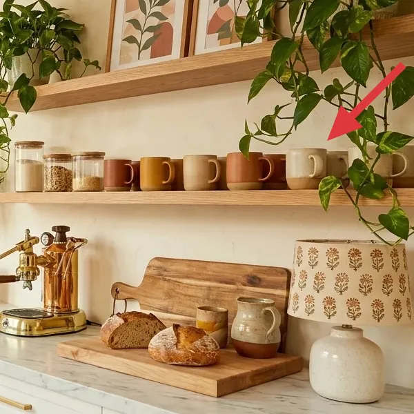
Layer 6 — Ceramic canisters and jars on shelves ($25) repeated shapes that calm the visual noise
These ceramic canisters and jars matter because they bring consistency to a shelf that could otherwise look like loose odds and ends. The photo shows multiple similar forms sitting on the wooden shelves, and that repetition is what makes the whole corner feel organized—like a set, not a collection. If you go the obvious route (buying one random jar and calling it “storage”), it often looks mismatched and busy. Trade-off: ceramics can be fragile, so pick a “good enough” set you don’t mind packing with padding. When you move, you’ll thank yourself for having a cohesive grouping rather than scattered containers.
Group by height
Place taller jars in the back row and shorter ones forward so the shelf reads layered, not crowded.
Layer 7 — White ceramic vase ($20) soft contrast against cream walls
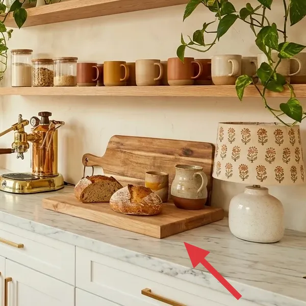
A white ceramic vase gives you that bright, clean contrast the cream walls can sometimes swallow. In the hero, it sits on the countertop and adds a smooth, glossy surface that contrasts with the matte textures of the rug and the dry-looking shelf ceramics. The alternative is adding another small object—like a candle holder—but those can skew the palette toward too much clutter. A vase also gives you flexibility: you can swap stems or greenery depending on the season and still keep the same silhouette. Trade-off: leave room around it so it doesn’t feel wedged among jars and utensils.
Pick one “shine” piece
White ceramic reads best when there’s only one highly reflective object per countertop cluster.
The cost, layer by layer
| Layer | Item | Cost |
|---|---|---|
| 1 | Area rug (jute-style look) | $120 |
| 2 | Framed botanical print (single) | $60 |
| 3 | Large leafy potted plant | $80 |
| 4a | Terracotta planter pot | $12 |
| 4b | Acrylic paint (warm cream + green) | $6 |
| 4c | Foam brush pack | $3 |
| 4d | Sandpaper + painter’s tape | $4 |
| 5 | Wood cutting board | $25 |
| 6a | Ceramic canister (small) | $10 |
| 6b | Ceramic canister (medium) | $15 |
| 7 | White ceramic vase | $20 |
| Total | $355 | |
If you want the cheaper variant, skip the plant and use two smaller potted greens instead, and choose an affordable 5×7 rug under $100. You can also look for secondhand framed botanical prints so Layer 2 lands closer to $40 while keeping the shelf-and-counter balance.
What worked, what didn't (across the whole room)
The overall win here is how many elements share a theme: warm wood, cream surfaces, and repeated leaf shapes. That repetition makes the kitchen feel styled even though everything is moveable. The main miss would be over-collecting small ceramics—if you add too many random jar shapes, the shelf stops reading as intentional.
What worked
- The area rug adds a warm, matte texture that softens the marble-look counter.
- The framed botanical print repeats leaf shapes so the shelves and plants feel connected.
- The large leafy plant balances the long island line from the right-hand sightline.
- The wood cutting board creates a defined countertop “display zone” for small everyday items.
- Ceramic canisters with similar shapes make shelves look organized instead of scattered.
- A single white vase provides light contrast against cream walls.
What didn't
- If the rug is too thin, it slides and the walkway zone feels less intentional.
- A too-colorful frame can fight the cream-and-wood palette and look out of place.
- Too many small ceramic pieces make the shelves feel busy instead of curated.
- Terracotta paint can look streaky if you skip sanding or don’t let coats dry fully.
- A crowded cutting board turns into visual clutter during real cooking days.
What we'd skip if we did it again
Skip buying decor for every shelf space. In shared kitchens, the shelf already has “storage pressure,” and you’ll end up with visual clutter that’s hard to pack and unpack every day. Pick a smaller set of canisters with repeated shapes, then let negative space do some work.
Skip matching sets from the same store. The photo’s look works because textures differ—rug weave, ceramic sheen, warm wood grain, and leafy greens. If you buy a matching kit, you lose that tactile mix and the corner can feel flat once the novelty wears off.
Skip delicate, high-maintenance plant choices. A large leafy plant is worth it, but only if it fits your lighting reality and you can transport it carefully during a move. Choose the plant you can keep alive, then style around it with one small painted planter pot.
Frequently asked
How long does this kitchen counter refresh take?
Plan for about 2–3 hours for the placement and styling (rug, frame, board, and shelf groupings). If you DIY the terracotta planter pot, add time for drying between paint steps and a final dry before you water the plant. Most of the work is “arrange, step back, adjust,” not building anything. The goal is a layout you can recreate quickly when you move.
Is this renter- or shared-housing friendly if we can’t change the kitchen?
Yes—this approach avoids touching fixed fixtures and focuses on textiles and freestanding decor that you can pack. Swap items that already live on the counter, shelves, and floor zone (rug, frame, cutting board, ceramics, and plants). When you move, empty and pack ceramics with padding and roll the rug. Plants are the only part that require a little care, but they’re still portable.
My kitchen is smaller—how do I scale this down?
Keep the same “roles” but shrink the quantities. Use one rug that covers the main walkway zone, one framed botanical print, and a single countertop board for a small grouping. Instead of a large plant, use two smaller pots on the shelf line (clustered by height). The key is repetition—similar jar shapes and one leaf theme—without adding extra clutter.
What if my kitchen has warmer wood or cooler countertops than the photo?
Match the palette by adjusting one element, not everything. If your wood is more orange, keep the rug neutral and choose ceramic pieces that lean off-white rather than bright white. If your countertops are cooler-toned, bring warmth through terracotta, oak-toned wood, or a warm-cream frame. The plants and leaf pattern help bridge small color differences.
Where should I shop for the rug, frame, and ceramics?
Start with home goods thrift, consignment, and marketplaces for the framed botanical print and ceramic canisters—those often show up in small sets. For the rug, look for a jute-style or low-pile option at big-box or online retailers, and prioritize size you can reuse in your next place. For plants and pots, local nurseries are worth it so you can choose healthier leaves and avoid pests.
What’s the biggest mistake people make with this kitchen look?
Over-collecting small decor items and trying to fill every shelf surface. In a shared kitchen, the visual noise builds fast, and it becomes hard to wipe and pack later. Instead, choose a limited set of repeated shapes (like matching canisters), add one frame, and let the plants provide the organic variation. Empty space is part of the aesthetic.