- Best for
- Roommates who want a warm, botanical look that doesn’t depend on permanent installs
- Time
- Plan 1–2 hours, then style in one afternoon
- Total cost
- $429
- Easy to pack
- Yes—bedding and textiles fold flat; frames and decor store in a few labeled boxes
Why this mustard-and-botanical setup is the bedroom of 2026
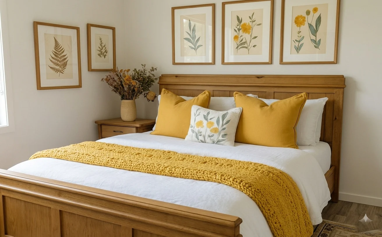
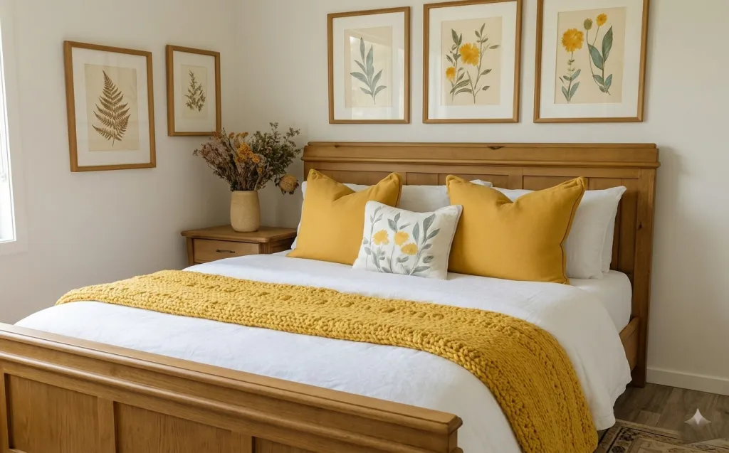
In shared housing, the best style choices are the ones that survive multiple moves—and this bedroom nails that rule. It leans into the 1970s-meets-botanical trend that’s showing up in everything from vintage-craft markets to recent home interiors spreads, but it stays wearable: a crisp white duvet, chunky yellow knit texture, and matte mustard pillows. You can see the mix of surfaces too—soft cotton bedding, a raised boucle-like throw, and a simple ceramic vase with dried stems. I’ve repeated versions of this “one warm accent + lots of white” formula because it looks intentional even when your furniture keeps changing. With clip-on lighting and renter-safe hanging methods, this is exactly the kind of refresh that’s achievable for roommates who pack up fast.
The thing I almost overdid the first time I tried a similar palette? I bought too many matching items at once—same yellow everywhere—and it ended up looking flat instead of layered. Here, the mustard shows up in the pillows and the throw, while the duvet stays bright white to keep the whole bed from feeling heavy. Another mistake I caught myself making was treating framed art like a “permanent wall moment,” then realizing I had no easy way to take it down later. This layout fixes that by spreading the botanical prints above the bed, so you can remove them and rehang (or reframe) without repainting.
Layer 1 — White duvet cover ($60) A crisp base that makes mustard look rich
The main bed surface is a white duvet cover with a smooth, clean finish. It stretches across the frame of the bed and acts like the visual reset button for everything else in the room. Over it, you can see a few pillow edges and the start of the mustard throw near the front. In a shared-house context, this “blank page” bedding matters because it makes your accent colors look styled instead of accidental.
Why I’d pick a bright duvet for this kind of move-friendly bedroom: white linens are the easiest to pack, and they’re also the easiest to reuse across seasons and roommates. If you tried to build the look around a patterned duvet, you’d spend more time matching the rest. The trade-off is that white shows wrinkles faster, but a quick shake-out and consistent folding after laundry is a small price to pay for how adaptable the palette is.
Choose a duvet cover you can fold like luggage
For moving, duvet covers beat thick comforters every time. Fold the cover first, keep inserts in a separate zip bag, and you’ll land with a clean “base layer” even when the rest is a work-in-progress.
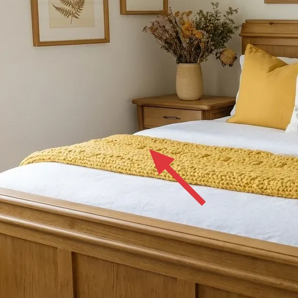
Layer 2 — Mustard knit throw ($35) Chunky texture that folds without bulk
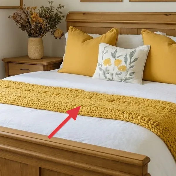
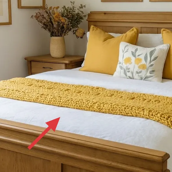
At the front of the bed is a mustard-yellow knit throw with a raised, boucle-like texture. It’s draped across the duvet and hangs in a long line, so it reads as one continuous accent. The yarn looks soft and dimensional, giving the bed a cozy edge without needing more furniture. Because it’s textile-only, it’s also one of the easiest “style movers” in the room.
This works better than adding a second blanket set because the throw is a texture moment, not another color block. If you choose a very thin throw, the color can look flat; if you choose something too heavy, it won’t pack nicely. The chunky knit here hits the sweet spot: it brings depth to the white bedding and gives the mustard a tactile reason to exist, even from across the room.
Keep the throw width consistent
When a throw runs along the front edge, aim for a drape that’s wide enough to show texture but not so wide it overwhelms the pillows. It should feel like one accessory, not multiple overlapping blankets.
Layer 3 — Dyed mustard pillow covers ($24) The DIY color pop
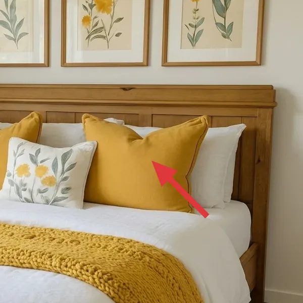
These pillows bring the room’s mustard tone without adding visual clutter. Two mustard covers sit in front of the white pillows, and the color reads warm against the crisp duvet. The fabric looks matte and soft, so it doesn’t reflect light too hard. In this bedroom setup, the pillows are the “repeat pattern” that ties the wall art palette to the bed.
Why pillow covers are the best move for shared housing: you can swap them in minutes, and covers pack flat. You also don’t have to replace a whole bedding set just to update color—covers let you keep the same white base and change the mood. The trade-off is that fabric color shows uneven dye results if you skip prep, so the DIY version below focuses on clean, pre-washed covers and a careful rinse.
Make it instead of buying it
DIY dyed pillow covers so your mustard lands in the same cozy zone as the throw—without spending on a full new bedding set.
Materials
- Plain white cotton pillow covers (2) — 18x18 in — Goodwill — $8
- Fabric dye, golden yellow/mustard — 1 box — Walmart — $8
- Table salt — 1 lb bag — Walmart — $2
- Dish soap — 16 oz bottle — Target — $2
Steps
- Pre-wash the covers in hot water so dye grabs evenly (skip fabric softener).
- Mix the dye in a bucket or large tub with hot water, then stir until fully dissolved.
- Add the salt to the dye bath and wet the covers completely before you lower them in.
- Stir or agitate the covers every few minutes so the color doesn’t pool in one area.
- Rinse in cool water until the rinse runs much lighter, then wash once with a little dish soap to cut any dye residue.
- Air-dry fully, then slip inserts back in and zip the covers closed.
Total DIY cost: ~$20 — saves about $4 versus buying dyed covers.
Layer 4 — Botanical wall art above the headboard ($150) Three matching frames, one cohesive band
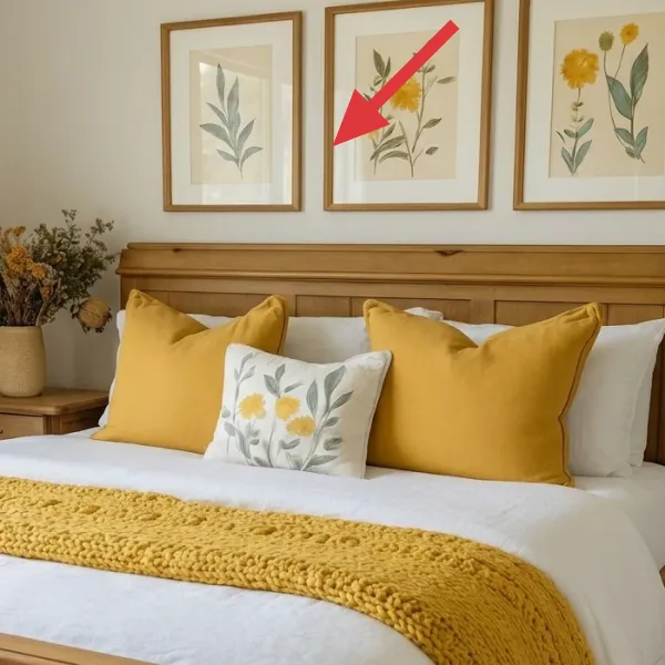
High on the wall, three larger botanical prints sit in warm wood frames above the headboard. The artwork uses greens and soft yellows, with leaf stems and flower shapes that echo the bed’s mustard accents. The frames are simple and similar, so your eye reads them as one “designed” cluster rather than random wall decor. They’re the visual ceiling that balances the big, white bedding area.
These work because the art is both colorful and structured: the greens anchor the palette, and the yellows pull the look toward the throw and pillows. I’d skip buying a totally different style of wall decor here—like a set of photos or abstract prints—because the botanical repeat is what makes the room feel like a set. The trade-off is you’ll need a renter-safe hanging plan, but you’re working with lightweight frames you can take down and store between leases.
Hang as a “band,” not as scattered frames
Place the three large prints close enough that they read as one row above the bed. When you keep spacing consistent, the room looks intentional even if your layout changes slightly later.
Layer 5 — Small fern prints on the left ($70) Less coverage, more rhythm
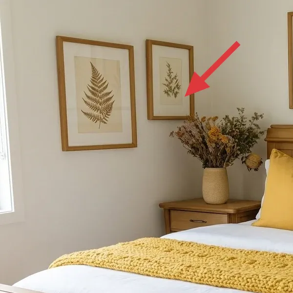
On the left side of the wall, two smaller framed botanical prints add extra visual movement. One features a fern-like leaf pattern, and the other shows a lighter botanical stem shape. They’re the same warm wood framing style as the larger pieces, which keeps everything cohesive even when the scale changes. This smaller pair fills negative space without competing with the bed.
The reason I’d include smaller prints in a shared-bedroom refresh: they help your eye travel, so the room doesn’t feel like “only a bed.” The easiest mistake is to mirror the large art everywhere—then the wall becomes a heavy block of color. Here, the trade-off is that you need good spacing: too far apart and they feel random, too close and the cluster can start to look cluttered.
Match frame color even if the prints differ
If you mix frame finishes, you often end up with “decor bargain energy.” Matching the frame tone is what makes small-scale prints look curated instead of pieced together.
Layer 6 — Dried stems in a beige vase ($30) Texture you can reuse between moves
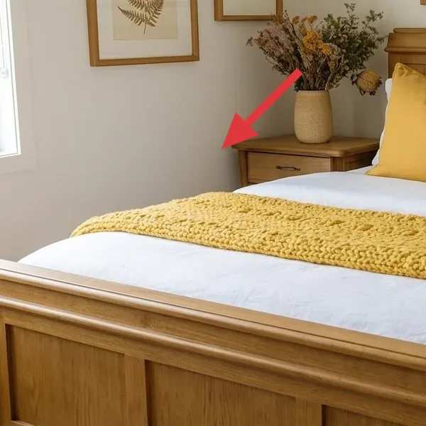
Next to the bed is a beige ceramic vase holding dried stems and small flower heads. The arrangement sits on the bedside surface and adds a warm, natural texture that matches the botanical wall art. The stems are airy, so they don’t block the view of the bed or the prints behind them. Because it’s dried, it won’t wilt during the weeks you’re juggling classes, group projects, and moving logistics.
Dried arrangements work especially well for impermanence because you can keep them in a box like any other home accessory. If you use fresh flowers, they become a time-based expense that’s hard to manage across semesters and roommates’ schedules. The trade-off is that dried stems can shed, so you’ll want to handle them gently and store the vase properly so the arrangement stays intact when you pack.
Pack dried stems like they’re fragile (because they are)
When moving, don’t just toss the vase and stems in the same tote. Wrap the stems so they don’t snap and so dust doesn’t coat the rest of your bedding in transit.
Layer 7 — Thrifted bedside table ($60) One small anchor for living-out-of-boxes
The bedside table is a warm wood tone with a simple rectangular top and a drawer on the front. It’s compact enough to fit beside the bed and gives you a place for the vase and small daily items. Visually, it ties into the wood frames on the wall, so the whole room feels “connected” even though the pieces are different sizes. For shared housing, a bedside table is also one of the few furniture refreshes that can still break down for transport.
This choice beats a larger dresser in a roommate bedroom because you don’t want the entire room to depend on one heavy item. A smaller table keeps the look intentional while staying practical for your next lease negotiation. If your room is tight, you can also treat the tabletop as styling space—just remember that a narrow surface means fewer items look better.
Keep the top mostly empty
For a move-friendly styling, style with one “hero” object (the vase) plus one functional item. Too many small things turn into unpacking clutter when you’re living out of boxes.
The cost, layer by layer
If you want this same vibe for less, keep the white duvet and mustard pillow concept, but go cheaper on frames: use thrifted frames and swap in affordable botanical prints (or print your own botanical artwork on cardstock). You’ll lose some “matchy” polish, but the warm, natural palette will still read intentional.
| Layer | Item | Cost |
|---|---|---|
| 1 | White duvet cover (queen) | $60 |
| 2 | Mustard knit throw blanket | $35 |
| 3 | Mustard pillow covers (2) | $24 |
| 4a | Warm wood frames (3) | $90 |
| 4b | Botanical prints (3) | $60 |
| 5a | Warm wood frames (2) | $40 |
| 5b | Fern/botanical prints (2) | $30 |
| 6a | Beige ceramic vase | $15 |
| 6b | Dried stems bundle | $15 |
| 7 | Bedside table (thrifted) | $60 |
| Total | $429 | |
What worked, what didn't (across the whole room)
Overall, the look holds because it’s built on repeatable textures—white bedding, mustard knit, and warm wood. The palette stays coherent thanks to botanical art that mirrors the same leaf-and-flower shapes, so nothing fights the bed.
What worked
- The white duvet cover keeps the room feeling clean, so the mustard throw reads cozy instead of overwhelming.
- Chunky knit texture on the throw adds depth in photos, even when you only style with bedding and frames.
- Mustard pillow covers repeat the throw color and make the bed look “set” without needing extra furniture.
- The botanical print palette connects wall art to bedding, so the whole room looks like one edit, not separate buys.
- Warm wood frames tie the wall cluster to the bedside table, which helps the bedroom feel grounded.
- Dried stems bring organic texture and last through busy semesters—no weekly flower refresh budgeting.
- A compact bedside table is a practical landing zone for daily items, which reduces the “where do I put my stuff?” stress.
What didn't
- If you add too many mustard items at once, the palette stops looking intentional and starts looking accidental.
- Using mismatched frame colors makes the wall feel like a collage instead of a cohesive band above the bed.
- Overloading the bedside tabletop makes the styling look busy—and it’s harder to pack and keep neat while you move.
- Skipping a bright duvet base can make the throw/pillows look heavier, especially in smaller bedrooms.
- If dried stems shed during transport, they can dirty bedding—so wrapping during packing matters more than you think.
What we'd skip if we did it again
Skip buying a full “coordinated bedding set” that matches the wall art exactly. In shared housing, you rarely keep everything for more than a couple of years, and matching sets can trap you into replacing pieces together. The white duvet plus mustard accents approach stays flexible: you can keep the base and swap only covers or a throw if your next room’s lighting or wall color changes.
Skip large, permanent-looking storage furniture as your first move. A bigger dresser might feel tempting, but it’s harder to move, harder to store during transitions, and it tends to dominate the bed area visually. A compact bedside table hits the sweet spot: it’s still functional, it photographs well next to the frames, and it breaks down more easily when the lease ends.
Skip wall art that requires wall-level commitment—think heavy gallery shelves or anything that leaves messy adhesive residue. Framed prints are the safer bet for impermanence, especially when you can pack them flat and hang them again elsewhere. If you want to DIY, make the artwork (or the inserts) rather than changing the wall system—your future self will thank you when you’re hunting for boxes instead of paint repair supplies.
Want the move-friendly version of “designed”? Keep your anchors lightweight (bedding, covers, frames) and let one warm texture—like this knit throw—do the heavy lifting.
Frequently asked
How long does this bedroom refresh take in real shared-housing time?
For most people, the actual refresh is a single afternoon: duvet and pillow styling (15–25 minutes), swapping in the throw (5 minutes), and placing the bedside table + vase (10 minutes). The part that adds time is wall art layout—spacing and centering the frames above the bed. If you already have frames, plan 45–75 minutes for test-holds and final placement. Total: about 2–3 hours. The reason it stays fast is that you’re not waiting on anything to cure or dry; everything is textiles and removable frames.
What if I rent and can’t drill—how do I hang the botanical prints safely?
Use renter-safe, removable hanging methods that don’t tear up paint. Since every building is different (drywall vs. plaster), test a small spot first with the hook/strip type you plan to use. For lightweight frames, removable adhesive hooks often work when used as directed and applied to a clean, dry wall. If you’re in plaster walls, consider foam-core based mounting options to reduce the chance of paint lift. The big pro tip: hang the large cluster first as a “band” above the bed, then place the smaller frames to balance the empty space.
Can this work in a smaller bedroom or a different bed size?
Yes—this palette is forgiving because the white duvet keeps the bed area visually calm. In smaller bedrooms, keep the wall art higher and closer together so it doesn’t crowd the bed visually. If you’re on a twin or full, choose a duvet cover that still reads mostly white and keep the mustard throw draped across the front edge. For wall prints, reduce the number only if you must, but keep the same frame finish so the wall still looks intentional. The whole system is about repeatable color and texture, not exact measurements.
Where would you shop differently in 2026 to keep this move-friendly?
In 2026, I’d prioritize places where you can buy light, removable items in sets: Target for basics like duvet covers and throw blankets, and Etsy or art print sellers for botanical images. For frames, I’d look at thrift stores and marketplace listings so you can match warm wood tones without paying retail. For the DIY pillow covers, Goodwill or local thrift shops are a great way to find plain covers cheaply, then you dye them for the exact mustard you want. This approach reduces both cost and the chance you’ll be stuck with something you can’t move.
What’s the single biggest mistake people make with this kind of bedroom look?
Overmatching. People tend to buy “a whole mustard set” (blanket, pillows, maybe even a patterned duvet) and then the room loses contrast—everything becomes the same value. The look in this room works because mustard appears in two places (pillows + knit throw) while the duvet stays bright white. That contrast is what makes the botanical prints look fresh instead of busy. Keep the palette tight: one warm accent, one clean base, and one texture moment.
Is the dyed pillow-cover DIY worth it, or should I just buy covers?
If you’re picky about the mustard tone, dyeing is absolutely worth it. Buying covers locks you into whatever shade a retailer picked, and “mustard” can swing toward olive or toward orange depending on the dye batch. The DIY in this post is also move-friendly because you only need pillow covers (which pack flat) rather than changing furniture. The biggest practical risk is uneven color if you skip pre-washing—so treat that step as non-negotiable. Once you get the first one right, the second cover is quick.