- Best for
- Weekend refreshes
- Cost
- Under $800
- Difficulty
- Moderate
- Time
- One long weekend + dry time
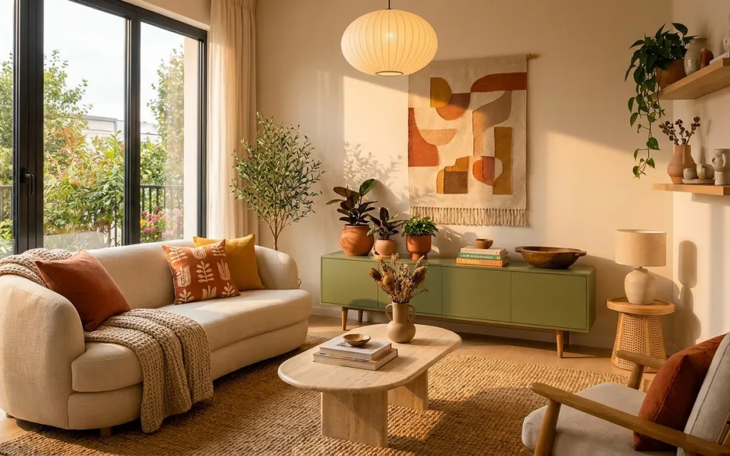
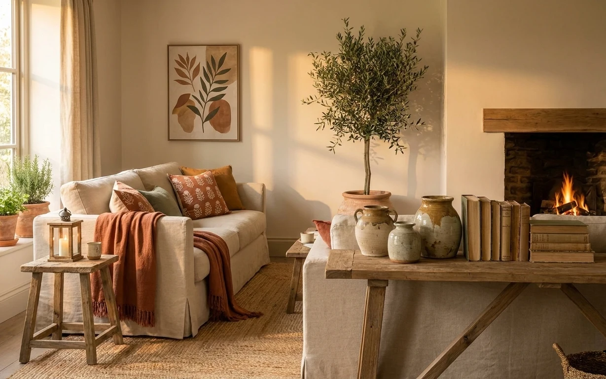
Why this terracotta-and-olive living room corner is the move-friendly nook of 2026
Start with what’s already working: the cream upholstery, the tan walls, and the big window glow. Then lean into the tactile mix—worn-looking jute underfoot, a woven throw on the sofa, and the warm cast from a white ribbed glass pendant. The framed abstract wall art brings in terracotta and earthy shapes without needing a full gallery. For homeowners with limited time, this is one of those weekend-friendly refreshes where each added piece supports the next instead of competing.
I used to overdo “perfect match” decor—same color, same intensity, same texture—until I realized the room felt flatter, not richer. Here, the terracotta pillow and the olive furniture act like two anchors, and the neutral cream upholstery keeps them from going loud. I’m also always tempted to skip the rug and rely on floorboards, but the moment you add the jute-style rug, the seating area stops floating. That’s the shift you want in a living room corner like this.
Layer 1 — woven throw blanket ($25) Texture for the sofa’s empty space
A woven throw blanket in a warm neutral gives the cream sofa somewhere to “land.” In the photo it’s draped over the front-left arm, which is exactly where a lot of new buyers feel the room looks unfinished—too smooth, too blank. The obvious alternative is a solid, heavier blanket, but texture reads more layered even when you keep the color family consistent. Trade-off: you’ll need to shake it out now and then, since woven throws catch dust. Still, it’s the easiest way to make the seating feel styled rather than just furnished.
Fold it where the arm meets the seat
That fold line hides the “end” of the blanket and makes the drape look intentional from both the sofa and coffee-table height.
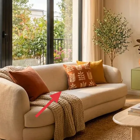
Layer 2 — throw pillows ($30) Terracotta warmth without changing the sofa
These throw pillows add color in small doses—terracotta and a warm patterned look—so the cream sofa stays the main base. The pillows sit near the center of the sofa, which matters: if they’re pushed to a corner, the room reads off-balance. The alternative is a single pillow, but that can feel thin next to the big window and the large sideboard. Trade-off: patterned pillows show lint and pet hair more, so keep a small lint roller nearby. Done right, the pillow mix brings the “boho” cue through styling, not through a full furniture overhaul.
Keep one warm color and one neutral pattern
Pairing a terracotta tone with a grounded pattern keeps the room cohesive even when the sideboard already brings olive green.
Layer 3 — jute-style area rug ($180) The anchor that makes the corner feel pulled together
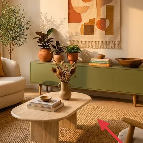
The jute-style area rug is what turns this seating zone into a defined corner. You can see it under the coffee table and extending toward the sofa, which visually connects the two main pieces—sofa and coffee table—like a stage. The obvious alternative is leaving the wood floor bare or choosing a slick low-pile rug, but that often makes the area look smaller and more echo-y. Trade-off: jute-style fibers can shed a bit early on; vacuuming gently and letting it settle fixes that. Once it’s in, the whole room reads warmer without extra color clutter.
Don’t skip rug placement by seat depth
If the rug doesn’t reach under the front legs of at least one seating piece, the corner will look like it’s “floating” on the floor.
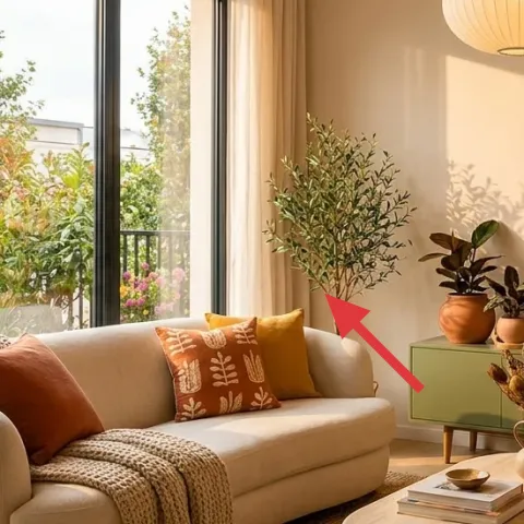
Layer 4 — framed abstract wall art ($60) A terracotta focal point that doesn’t fight the window
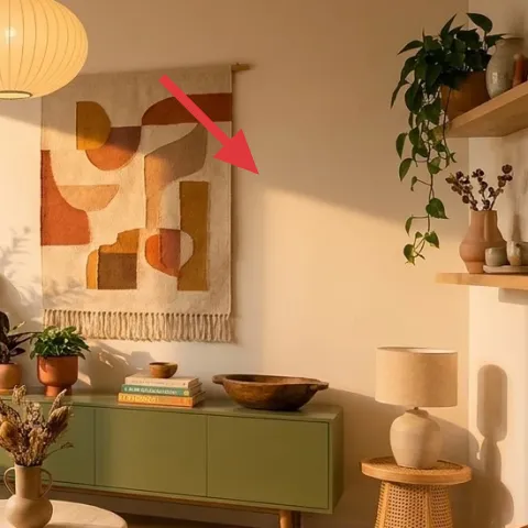
The framed abstract wall art gives the right wall a focal point that matches the room’s terracotta-and-olive palette. In the photo, it’s centered above/near the green sideboard, so it completes the vertical line created by the furniture and shelves. The alternative is a large mirror or a simpler print, but art with layered shapes fits boho styling better because it echoes the texture mix elsewhere. Trade-off: abstract pieces can feel busy if they’re too high-contrast, so choose a print with warm neutrals and muted shapes like the one shown. This keeps the room dynamic without turning it into a loud gallery.
Match art width to the furniture below
If the art feels wider than the sideboard, it can pull the eye away from the seating; if it’s too narrow, it looks accidental.
Layer 5 — white ribbed glass pendant lamp ($120) Soft, even light over the seating
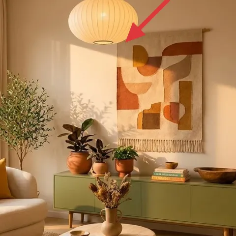
A white ribbed glass pendant lamp adds a glow that looks gentle in daylight and stays flattering at night. Hanging centrally makes it feel intentional over the room’s middle zone, especially where the coffee table and rug meet. The alternative is a floor lamp in a corner, but corners often cast uneven light and can make the sideboard and shelves feel separate from the seating. Trade-off: pendant placement needs to be right for sightlines; if it’s too low, it interrupts the vertical rhythm. If you’re swapping fixtures, plan around electrical work and consider calling an electrician for hard-wiring.
Ribbing matters more than bulb color
The texture inside the shade spreads light, so you’ll get warmth even with a standard bulb.
Layer 6 — green sideboard/credenza ($220) Paint to match the room’s earthy rhythm
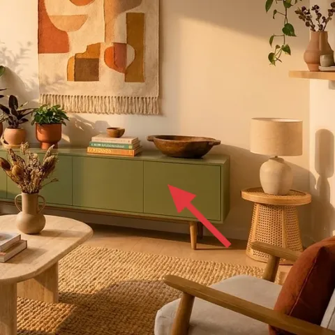
A green sideboard/credenza is already in the hero, but the fastest way to make it look newly styled is a deliberate paint refresh that matches the room’s terracotta-and-neutral palette. Here, the olive tone ties into the warm pillows and the terracotta accents, while the furniture height also balances the wall art above. The alternative is replacing the sideboard entirely, but that usually costs more than a paint refresh and creates a whole new shopping list. Trade-off: painting takes a weekend and extra prep, but it’s a high-impact change you can control—especially if you want the exact shade rather than whatever comes off the shelf.
Make it instead of buying it
DIY paint refresh the existing green sideboard/credenza so it reads warmer and more cohesive with the terracotta pillows and jute-style rug.
Materials
- Painter’s tape — 1 roll — store — $8
- Degreaser/cleaner (for furniture prep) — 1 quart — store — $12
- Bonding primer — 1 quart — store — $18
- Interior paint (satin) — 1 quart — store — $45
- Small foam roller kit — 1 set — store — $22
- Brushes (angled + touch-up) — 2 pack — store — $15
Steps
- Protect the floor and tape off edges, hardware areas, and trim where you don’t want paint.
- Clean the sideboard thoroughly with degreaser so the surface isn’t greasy or waxy.
- Lightly sand dull spots and wipe off dust with a tack cloth.
- Apply bonding primer in thin, even coats with a small foam roller for smoothness.
- Wait for primer to dry fully, then lightly sand any rough texture and wipe dust again.
- Roll on the first coat of satin paint, then brush edges for crisp lines.
- Let the first paint coat dry completely.
- Add a second paint coat, matching the direction of roller strokes for even sheen.
- Let the final coat cure fully before moving items back onto the sideboard.
- Remove tape slowly while the paint is still slightly flexible for cleaner lines.
Total DIY cost: $120 — saves about $100 over buying.
Layer 7 — floating wall shelves ($80) Style your ceramics in a repeatable rhythm
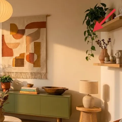
Floating wall shelves are doing real work here: they give the wall depth and a place for small objects that echo the room’s boho mix—ceramics, a vase, and plants. When shelves sit high and right, they also balance the weight of the sideboard and keep the room from feeling visually bottom-heavy. The obvious alternative is a single framed shelf or a large wall cabinet, but shelves are easier to style gradually and you can swap objects as seasons change. Trade-off: too many small items can look cluttered fast, so choose a repeat pattern—one planter, one vessel, one book stack, then stop. This is how the wall stays curated, not chaotic.
Build a “triangle” with objects
Place taller stems near one side, a bowl/vase near the middle, and a flatter object opposite so your eye moves smoothly.
The cost, layer by layer
| Layer | Item | Cost |
|---|---|---|
| 1 | Woven throw blanket | $25 |
| 2 | Throw pillows | $30 |
| 3 | Jute-style 5×7 area rug | $180 |
| 4 | Framed abstract wall art 16×20 | $60 |
| 5 | White ribbed glass pendant lamp | $120 |
| 6a | Cabinet repaint labor | $150 |
| 6b | Pro paint/primer materials | $70 |
| 7 | Floating wall shelves set | $80 |
| Total | $715 | |
If you want a cheaper variant, use a thinner textured blanket ($15), pick a smaller framed print (around $40), and choose a basic floating shelf kit (about $60) instead of a larger set. You’ll still get the same overall effect because the rug and wall art do most of the anchoring.
What worked, what didn't (across the whole room)
This corner works because every big change supports the next: the rug defines the seating, the pendant adds soft overhead light, and the terracotta cues repeat across pillows and art. The wall shelves also let small ceramics look intentional rather than random. The room still feels bright because the dominant materials stay neutral and warm.
What worked
- The jute-style rug grounds the cream sofa and keeps the coffee table visually connected to seating.
- Terracotta pillows pull warmth from the abstract art instead of competing with the window brightness.
- The framed print adds a readable focal point right where your eye travels from the sideboard.
- The white ribbed pendant spreads light softly over the middle zone, not just the corners.
- Olive-green sideboard styling benefits from vertical balance with wall art above it.
- Floating shelves create depth on the right wall while keeping styling flexible for future swaps.
What didn't
- If the blanket drape is too flat, the sofa reads more like fabric than furniture styling.
- Leaving wood floor bare next to the rug makes the seating area look slightly smaller.
- Too many tiny objects on the shelves can blur together instead of forming a styled sequence.
- A high-contrast art print would fight the warm neutral textiles and the sideboard’s muted green.
- If the pendant hangs too low, it can interrupt sightlines between chair backs and the wall art.
What we'd skip if we did it again
Skip a second area rug for “layering” if you’re already using a jute-style rug. In this corner, one textured base is enough, and extra rugs tend to shift the palette cooler and make the seating feel busy.
Skip a low-effort wall approach like hanging art with no regard for the sideboard width. Centering the framed abstract wall art and sizing it to the furniture below keeps the whole corner from looking accidental.
Skip adding more lighting sources before you’ve nailed the pendant. The pendant’s soft ribbed glow works with the window daylight; extra lamps often duplicate brightness and make the room feel flatter instead of layered.
Frequently asked
How long does this kind of living room corner refresh take?
Most of it is a day or two: rug placement, pillow styling, and hanging the framed abstract wall art can be done in an afternoon. The paint refresh on the green sideboard/credenza is the time-driver because you’ll wait for primer and multiple coats to dry and cure. Plan for one long weekend, then give the painted piece extra dry time before loading it with objects.
What if I rent—can I still get this look?
Yes. Prioritize renter-friendly changes: swap or add pillows and a woven throw, use a jute-style rug to define the seating zone, and use removable art hanging methods for the framed print. For shelves, look for a no-drill mounting system or choose freestanding shelving. The pendant swap depends on your lease; if you can’t change fixtures, keep the current light and focus on textiles and wall art.
My room is smaller—what would you adjust first?
In a smaller living room corner, scale down by placement rather than removing all warmth. Choose the right rug size so at least the front legs of the sofa sit on it, then keep the framed abstract wall art centered over the sideboard so the eye has one clear focal point. For shelves, use fewer ceramics so the wall doesn’t feel cluttered. Keep the same terracotta/olive palette, just reduce the number of objects per shelf.
Where should I shop for the rug and wall art without overspending?
For a jute-style area rug, look for sales on natural-fiber blends or sisal-look rugs from home retailers and marketplace brands—natural textures are forgiving and don’t need to be “perfect.” For framed abstract wall art, search for prints around 16×20 with warm neutrals and terracotta shapes. Buying a simple frame plus a cohesive print often lands in the same price range as a pre-framed option.
What’s the biggest mistake people make in this room type?
The biggest miss is skipping the rug or under-sizing it, which makes the sofa-and-coffee-table grouping feel disconnected. The second common mistake is hanging wall art that’s too small or off-center relative to the sideboard; the corner loses its focal rhythm. If you get rug size and wall-art placement right, the rest—pillows, blanket, shelves—can be adjusted easily.
More in Living Room

Under $800: a warm boho living room corner refresh
A warm boho living room corner refresh with a jute-style rug, layered textiles, and art. This $800 plan focuses on high-impact changes like…

Under $500: move-friendly boho living room refresh
A bright, boho living room look built from move-friendly layers. This $500 plan focuses on a woven rug, sofa textiles, warm wall art, and a…
Under $700: DIY-friendly cozy fireplace living room refresh
A warm, earthy fireplace living room refresh for homeowners under $700. Start with a cream sofa look and layer in curtains, a framed wall a…