
- Best for
- Moodier renters who want big impact with removable layers
- Cost
- About $700
- Difficulty
- Easy (textiles + frames + a DIY print)
- Time
- One weekend, plus drying time for paint
Why the maroon-and-cobalt look is the sunlit seating nook of 2026
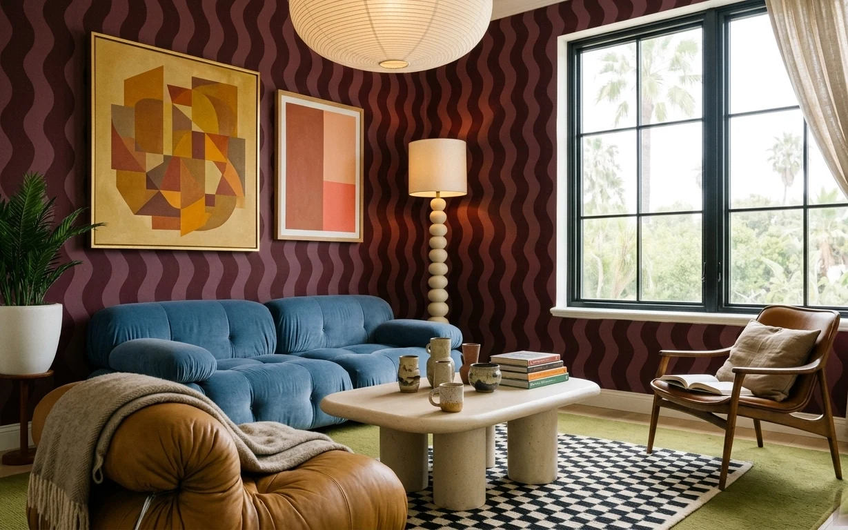
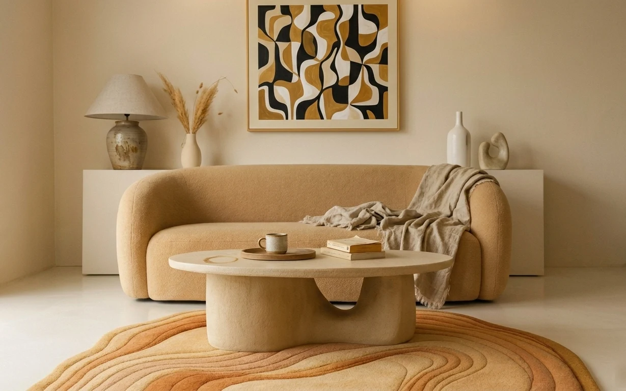
The photo does something I love: it pairs big graphic color with soft, tactile pieces. You’ve got a cobalt, tufted sofa, a checkered black-and-white rug under a pale coffee table, and framed abstract art that keeps repeating warm earth tones. Even the lighting reads intentional—the cream-shade lamp adds a warm pool of light against that deep maroon wall pattern. For renters, this is doable because the anchors are all removable: textiles, plug-in lighting, and frames hung with Command-style hardware.
I’ll admit something: the first time I tried a bold wall-and-rug combo, I overdid it with too many small objects on the coffee table, and it looked busy instead of curated. What changed here is spacing—leaving breathing room between the ceramics and the lamp—so the art and upholstery can do their job. Once the rug and the two prints are placed, the rest becomes easy styling, not frantic stacking.
Layer 1 — checkered black-and-white area rug ($150) Patterned base that grounds the sofa
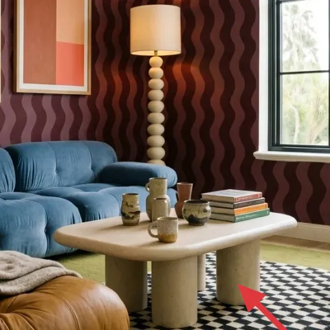
Choose a black-and-white checkered area rug with enough contrast to “seat” the whole zone. In the hero, the rug sits low and wide, tying the sofa, coffee table, and accent chair together while still letting the maroon wall stay the star. The trade-off with pattern is that you’ll want simpler solids on top—fewer competing prints—so the checks don’t fight your framed art. A slightly warmer cream background (instead of stark white) helps the room look less harsh in daylight and better at night.
Keep the checks crisp
Rug patterns read differently at different distances, so center it so the checks look straight from the sofa.
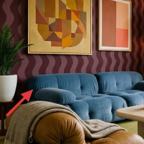
Layer 2 — blue tufted sofa ($250) Cobalt upholstery adds the “color story”
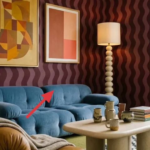
The cobalt tufted sofa is the anchor because its saturated blue shows up again in the whole room’s palette. You don’t need matching blue accents everywhere—just one strong anchor plus neutrals and a repeat of the warm tones from the art. If the sofa is the only big color move, the rest can stay renter-safe: rugs, frames, curtains, and tabletop styling. The trade-off is that a bold sofa can make the room feel visually heavy, so keep the coffee table light (light-colored surface) and add a warm lamp to soften the corners after dark.
Tufting helps texture
The raised, rounded upholstery makes the room feel plush even when the palette is graphic.
Layer 3 — large framed abstract print ($80) High-impact art for the main wall
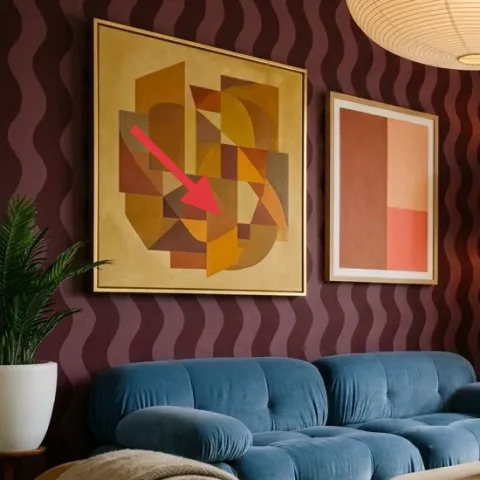
Go for a large framed abstract print with warm ochres and rusty accents, then place it as the first “stop” on the maroon wall. In the hero, the large frame balances the window on the right by adding weight on the left; it also echoes the geometric shapes in the rug so nothing feels random. The decision here is size: you want the art to feel intentional at sofa distance, not like a tiny add-on above the couch. If you’re tempted to choose a smaller print, resist—this look needs one bigger piece before you add a second frame.
Match scale to the sofa width
A large print positioned near eye level reads like architecture, even in a rental.
Layer 4 — smaller framed print ($25) DIY art that repeats the warm tones
The second framed print is what makes the wall feel styled instead of decorated. It’s smaller, but it keeps the palette consistent—warm peachy reds and muted earth colors—so the whole wall looks like one curated set. This layer is also the easiest to make move-out-friendly because frames can come with you, and the artwork can be swapped later without touching the walls. The trade-off is that the smaller print should be simpler than the main one; otherwise you’ll get competing geometry and the room loses its clean rhythm.
Make it instead of buying it
DIY a hand-painted abstract on cardstock and slide it into a small thrifted frame so the colors echo the larger print.
Materials
- Cardstock—2 sheets (8.5×11 or similar) — craft store — $3
- Acrylic craft paint set—small set (or 3–4 colors) — craft store — $8
- Small frame—8×10 or similar — thrift store — $8
Steps
- Cut cardstock to fit the frame opening and test-fit it without glue.
- Lightly sketch 2–3 bold geometric shapes with pencil (keep lines simple).
- Paint the largest shape in a warm base tone, using a flat brush for clean edges.
- Add 1–2 overlapping shapes in two complementary warm colors.
- Blend edges where needed with a barely-damp brush so the shapes look intentional, not streaky.
- Let the paint dry fully until the surface no longer looks glossy.
- Place the finished artwork into the frame backing and straighten it.
- Hang with removable frame hardware so the art can travel with the move.
Total DIY cost: $19 — saves about $6 over buying.
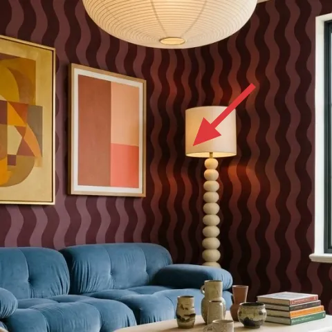
Layer 5 — cream-shade table lamp ($40) Warm light against deep maroon
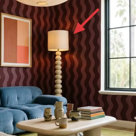
A plug-in table lamp with a cream shade is doing more than providing brightness—it’s balancing the room’s darkness and turning the ceramics into little highlights. In the hero, the lamp sits between the sofa and the coffee table area, so it creates a warm gradient across the wall instead of leaving the corner flat. If you go too white or too cool-toned, the maroon wall can start to feel dingy, especially at dusk. The trade-off with a lamp is cord management: pick a lamp with a long enough cord and route it where it won’t tug at the table’s edge.
Don’t use a harsh cool bulb
For this palette, choose a warmer bulb so the maroon reads rich, not gray.
Layer 6 — tall green potted plant ($30) A soft counterweight to geometric decor
That tall potted plant on the left is the breathing space between the heavy wall color and the graphic rug. It adds an organic vertical line that keeps the framed art from feeling too “flat” against the patterned wall. The plant also helps the room look lived-in because ceramics and books on the coffee table can look staged without a little life nearby. The trade-off is height: place it where it won’t crowd the art or block the window view—think “supporting actor,” not “new main character.”
Choose foliage, not florals
Green leaves keep the palette cohesive with the warm abstract art.
Layer 7 — beige curtain panels ($60) Frame the window and soften the day
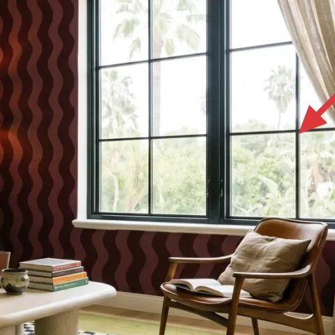
Beige curtain panels make the window feel finished and temper the wall’s bold maroon pattern. In the hero, the curtains are long and airy enough that the daylight stays bright, but they still add texture and movement—especially because the rod-to-floor length looks intentional. The trade-off with curtains is choosing the right hem length: short panels can make a room feel awkwardly “stopped halfway,” which pulls focus away from the art and sofa. If the landlord set-up isn’t changing, use tension-rod-friendly drapery hardware where applicable.
Hang them high for height
Mounting (or adjusting) to sit close to the ceiling line visually stretches the window area.
The cost, layer by layer
| Layer | Item | Cost |
|---|---|---|
| 1 | Checkered black-and-white area rug (5×7) | $150 |
| 2 | Blue tufted sofa (thrifted) | $250 |
| 3 | Large framed abstract print (16×20-ish) | $80 |
| 4 | Smaller framed print (DIY equivalent) | $25 |
| 5 | Cream-shade plug-in table lamp | $40 |
| 6 | Tall green potted plant (4–6 ft) | $30 |
| 7 | Beige curtain panel pair | $60 |
| Total | $635 | |
Cheaper variant: swap the blue sofa for a thrifted slipcovered version, choose a smaller framed set, and pull curtains from a home goods sale—keep the checkered rug as the main pattern anchor.
What worked, what didn't (across the whole room)
The standout win is how the pattern rug and the abstract art repeat shapes without making the room feel chaotic. Warm, cream lighting also keeps the maroon wall from reading too dark at night. The only miss is the temptation to add too many small ceramics on the coffee table—when the styling gets crowded, the geometric pieces start competing.
What worked
- The checkered rug anchors the seating zone and makes the sofa feel deliberately placed.
- The cobalt upholstery gives you a clear color story that the art can reference without matching.
- Two framed prints on the maroon wall create a gallery feel without needing a complex layout.
- The cream-shade lamp adds warm contrast, so the room stays flattering after dark.
- The tall plant softens sharp geometry with organic vertical shape.
- Beige curtains frame the window and make the daylight feel intentional, not harsh.
What didn't
- Too many coffee-table objects can steal attention from the art and the rug’s pattern.
- Cool white lighting would flatten the maroon wall and make the palette feel more gray than rich.
- If the smaller framed print is too busy, it competes with the larger abstract instead of echoing.
- Short curtains can make the window feel cropped and throw off the room’s proportions.
- A rug with low contrast makes the whole zone look less “zoned,” especially on light flooring.
What we'd skip if we did it again
Skip the urge to match every color exactly. The hero works because cobalt, warm terracotta, and cream repeat loosely; strict matching would flatten the art’s character and make the room feel costume-like.
Skip adding multiple small decor styles at once on the coffee table. Stick to 2–3 items with different textures (ceramic + book + candle) and leave negative space so the rug and framed prints stay the visual rhythm.
Skip buying frames that are all the same size and all the same mat color. A small “second stop” print with a different scale makes the wall feel designed; otherwise it reads like one long row of identical frames.
Frequently asked
How long does this renter-friendly refresh take?
Plan on one weekend for layout and shopping. Rug and curtains are fast, and framed art placement usually takes the most trial-and-error (measuring, re-centering, then hanging). The DIY hand-painted print adds drying time—so the hands-on part is quick, but it helps to give it a couple hours before you frame and hang.
Can I recreate this if my living room is smaller?
Yes—reduce scale, not style. Choose a narrower rug size and keep the large framed print as your anchor, then add one smaller print rather than multiple. The key is still contrast: a patterned rug against solid curtains and one strong sofa color. If the window feels dominant, move the plant to a nearby corner so it doesn’t squeeze the seating area.
What if my apartment doesn’t allow curtain rods?
If ceiling or wall mounting isn’t an option, use tension-rod-friendly solutions meant for renters and hang the panels from there. Keep the visual goal the same: long beige fabric that softens the window edges. Another workaround is to use the curtains mostly for texture on the sides of the window rather than trying to fully cover the glass.
Where should I shop for the framed abstract look on a renter budget?
Start with thrift stores and estate sales for frames, then buy the prints separately from art marketplaces or home decor retailers. For the DIY second print, cardstock + acrylic craft paint is the most budget-smart route. The big rule: choose frames you can take with you, not pieces that depend on permanent wall hardware.
What’s the biggest mistake people make with a bold wall like this?
Overcrowding. Deep walls and graphic rugs can handle bold, but the room needs negative space to feel intentional. If the coffee table is stacked, there’s nowhere for your eye to rest and the abstract prints start blending together. Use fewer objects, and let texture do the work—tufting, fabric, and the lamp’s warm glow.
More in Living Room
5 no-drill swaps for a renter-friendly living room nook, $700
A sunlit living room seating nook gets a maroon-and-cobalt makeover with no-drill renter upgrades. This $700 refresh leans on a patterned r…
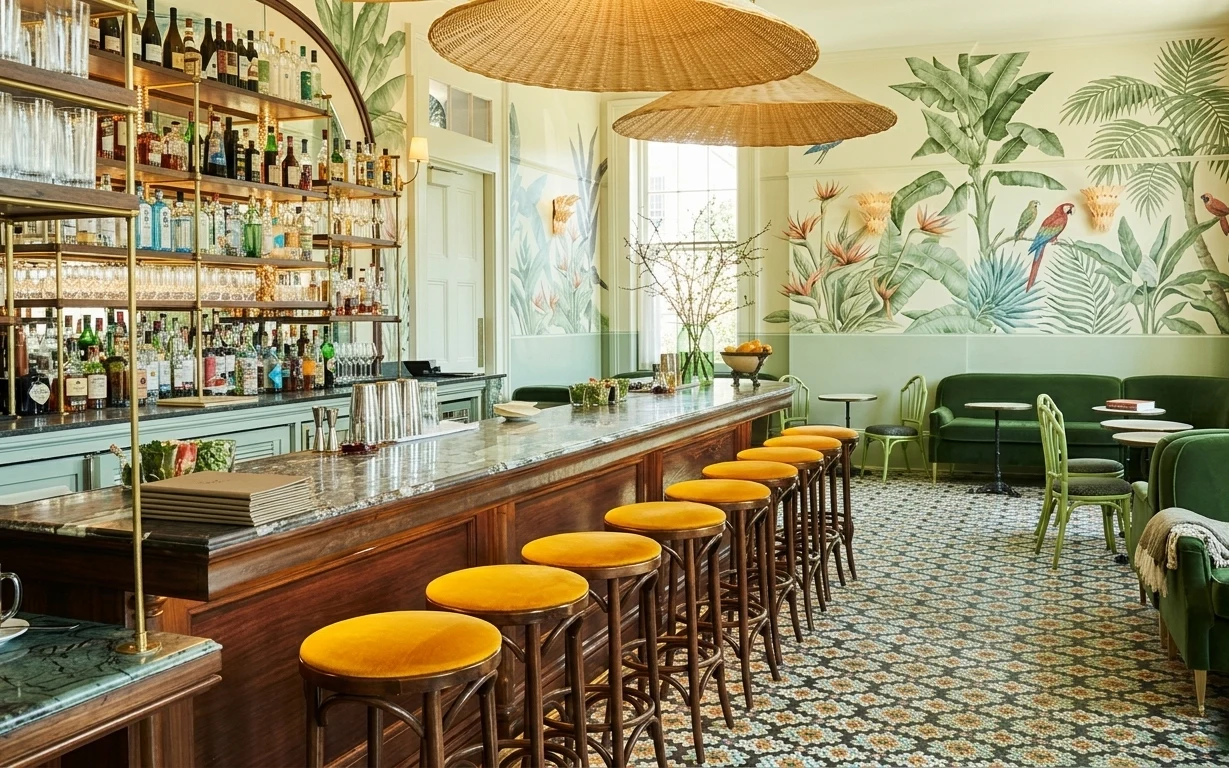
What $700 buys: a no-drill bar seating corner refresh
A move-friendly bar seating corner refresh built around peel-and-stick botanical wallpaper, a graphic rug, and renter-safe styling. This lo…
How to refresh a sofa lounge for under $400
A warm, move-friendly refresh for a sofa lounge built around an ochre striped area rug, framed abstract art, and soft lighting. This $400 p…