
- Best for
- textural, renter-safe vanity styling
- Cost
- about $200 (total)
- Difficulty
- easy (mostly swaps + styling)
- Renter-safe
- yes—no drilling, swaps pack up
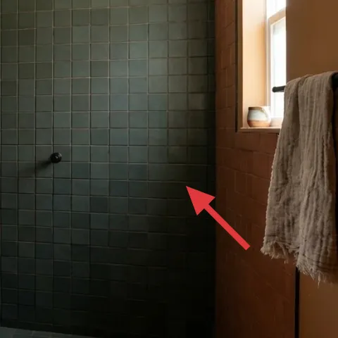
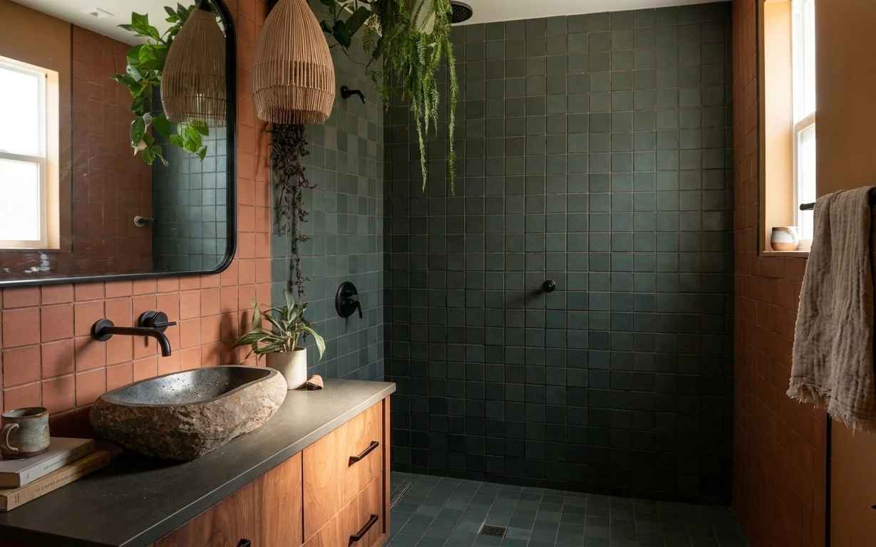
Why earthy terracotta tile is the vanity corner of 2026
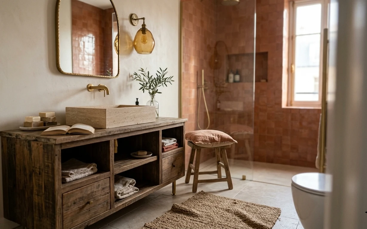
That green square-tile wall does the heavy lifting, but the “spa” feeling comes from how everything is staged in front of it. You’ve got warm wood at the vanity base, a smooth stone countertop, and a couple of soft textures—like a gray towel and the matte glow from candlelight. Hanging pendant lamp shades add height, while the small potted plant keeps the corner from feeling sterile. This is also a renter-friendly recipe because all the key upgrades are swap-in textiles and countertop styling pieces, not changes to the fixtures.
I used to think bathroom styling meant “more stuff,” and my corners always looked cluttered. Then I started copying the calmer balance you see in places like Architectural Digest bathroom spreads: one anchor tray, one small plant, one folded textile, and one scent element. The mistake I caught was adding tiny items in too many colors; the fix was sticking to warm browns, soft grays, and green tones so the tile stays the star.
Layer 1 — decorative ceramic mug for countertop styling ($12) small details, not clutter
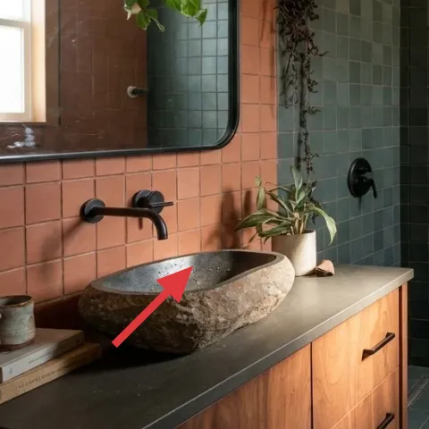
A ceramic mug on the vanity reads like lived-in care, not “I forgot to clean.” Keep it small and textured—this one echoes the earthy stone and terracotta tones already in the room. I like choosing a neutral glaze (not bright white) because the green tile can feel cool, and warm ceramics soften it without competing. The trade-off is that it takes a quick wipe-down before guests; the reward is a corner that looks intentional even with minimal objects. This also stays move-ready because mugs pack easily in a carry box.
Make it part of a set
Group one ceramic piece with the tray and the candle so the countertop looks styled, not scattered.
Layer 2 — gray bath towel for hanging on the vanity side ($20) folds that look neat in photos
A gray bath towel is one of the quickest ways to add softness in a tile-heavy bathroom. Here, the towel’s medium weight and relaxed drape contrast nicely with the smooth stone countertop and the geometric tile grid. The reason I’m picking towel color specifically is that gray bridges warm brown wood and the green wall without adding another strong hue. The trade-off: you’ll want one towel that can handle daily dampness—if it gets crunchy, it stops looking “hotel” fast. Swap in a fresh one when you travel, and roll it up for easy packing.
Choose the towel that dries fastest
Quick-drying cotton or linen-blend fabrics look good and won’t stay musty.
Layer 3 — small bath mat in front of the vanity ($25) keeps the floor zone calm
That small dark mat area matters more than it seems: it creates a visual landing spot at the exact spot your eye hits when you enter. For a bathroom like this, go for a low-profile bath mat so it doesn’t fight the tile lines, and pick a neutral that sits between the green wall and the warm wood vanity. This choice also helps with everyday comfort—bare feet on tile get cold fast. The trade-off is mat upkeep; you’ll need to shake it out and spot-clean. Still, it’s fully renter-safe and packable at lease end.
Match the mat to your towel
Keeping towel and mat in the same family makes the whole corner feel cohesive.
Layer 4 — decorative tray for the vanity countertop ($25) one container, tidy layout
A decorative tray turns a busy countertop into a controlled composition. In the hero, the styling already feels “edited,” and a tray is how you replicate that: it physically groups the mug, the books, and the candle so nothing drifts to the edges of the counter. The best trays for this look have warm tones—think wood, stoneware, or a matte finish—so they don’t reflect light harshly in the mirror. The trade-off is that you have to commit to a limit: one tray, a few items, done. When you move, you lift everything off in one go.
Avoid glossy finishes
High-gloss trays can catch the bathroom lighting and make the countertop look messy in photos.
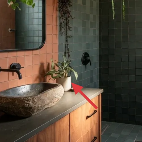
Layer 5 — small potted plant on the vanity ($20) botanical calm where you touch
A small potted plant in the same corner as the mirror makes the bathroom feel alive without adding visual noise. You already have green energy from the tile, so the plant’s leaves work like “color echoes,” pulling the look together. I’m choosing a compact pot-sized plant because it fits the vanity surface cleanly—too-large plants crowd the faucet zone and start to look heavy. Trade-off: you’ll need a simple lighting routine and occasional watering. Still, plants are an easy renter win because they can be moved with you, and they refresh the corner the moment they look healthy again.
Wipe the leaves, then style
If the leaves look dusty, the whole corner reads less fresh even with perfect objects.
Layer 6 — candle for the vanity ledge ($30) warm glow + one scent moment
Make it instead of buying it
This candle pour uses a simple jar + wick setup so you get the same warm amber vibe without paying for a pre-made label.
Materials
- Wax (soy wax flakes), ~1 lb — jar candle tin — $10
- Candle wick (cotton tabs), 2–3 wicks — craft store — $6
- Heat-safe glass jar (reused jar works), 1 jar — thrift/household — $9
Steps
- Measure your jar diameter and choose a wick that matches the width.
- Melt wax in a heat-safe container using a gentle water-bath method.
- Attach the wick to the jar center using wick tabs so it stays upright.
- Pour wax slowly, keeping the wick straight as the wax level rises.
- Let the candle set at room temperature until fully solid.
- Trim the wick to about 1/4 inch for a clean first burn.
- Burn test: light for about 1–2 hours to create an even melt pool.
- Let the candle cool fully, then repeat with a shorter burn if needed.
Total DIY cost: $25 — saves about $5 over buying.
Layer 7 — decorative book stack for the vanity ($15) height that makes the tray look intentional

A small book stack on the vanity gives you that “styled, not random” height difference. In this corner, the goal is balance: the plant adds organic volume, the candle gives a warm focal point, and the books create a subtle platform so the whole arrangement doesn’t look flat. Choose books with neutral covers or warm tones, since the tile already brings strong color. The trade-off is that books can look like clutter if they spill onto the counter—stick to two to three volumes maximum and keep the spine colors in the same palette. This is one of the easiest parts to pack and re-style in your next place.
Angle for depth, not mess
Fan the top book slightly so the stack reads as design, not storage.
The cost, layer by layer
| Layer | Item | Cost |
|---|---|---|
| 1 | Decorative ceramic mug | $12 |
| 2 | Gray bath towel | $20 |
| 3 | Small bath mat | $25 |
| 4 | Decorative tray for vanity | $25 |
| 5 | Small potted plant | $20 |
| 6 | Candle (DIY equivalent) | $30 |
| 7 | Decorative book stack | $15 |
| Total | $147 | |
A cheaper variant keeps the same layout: swap the tray for a basic wood serving platter, choose a lower-cost plant, and use a store-bought candle in a simple unlabeled jar.
What worked, what didn't (across the whole room)
The biggest win is that the vanity corner stays photo-ready because everything sits on purpose: one tray, one plant, one textile, and one candle moment. The second win is the color discipline—warm browns and grays let the green tile read as the main character.
What worked
- The gray towel softens the tile geometry without introducing a new bold color.
- A small bath mat creates a visual “zone” where the eye lands when you walk in.
- A decorative tray makes the countertop look edited even when daily items come and go.
- The small potted plant echoes the green wall and keeps the corner from feeling sterile.
- The candle adds warm, gentle light that pairs well with the vanity mirror.
- A compact book stack adds height so the styling looks layered, not flat.
What didn't
- Overloading the tray made the countertop look busy instead of intentional.
- Using too many textures at once (metal, glass, and glossy ceramics together) read chaotic.
- If the towel is too thick and bulky, it hides the clean line of the vanity side.
- A mat with a high-scrape texture collected lint and looked messy between cleanings.
- Skipping the book stack leaves the arrangement feeling one-dimensional and low.
What we'd skip if we did it again
Skip changing any tile or plumbing. In a bathroom like this, the green square-tile wall already sets the mood, and renter-safe decor does the “finished” work at a fraction of the effort.
Skip a matchy-matchy towel set in multiple shades. One gray towel tone plus one neutral mat is what keeps the corner calm against the strong tile pattern.
Skip adding more than one countertop height trick. If the tray already has books, keep the rest low; otherwise the vanity starts to read cluttered instead of curated.
Frequently asked
How long does this bathroom vanity corner refresh take?
Plan for about 60–90 minutes total. The swap-ins (towel, mat, tray items) are quick, and the longest part is arranging the order: tray first, then plant, then books, then candle. If you DIY the candle pour, add another day for the candle to fully set and for the first burn to establish an even melt pool.
Is this renter-safe if I can’t change the mirror or faucets?
Yes—the look is designed around what you can add on top. The numbered upgrades are all textiles and removable countertop objects (towel, bath mat, tray, plant, candle, ceramic mug, book stack). The landlord-installed mirror, tile, and fixtures stay exactly as-is, and everything can be packed away when the lease ends.
What if my bathroom is smaller or the vanity counter is narrower?
Go smaller rather than adding more pieces. Use a smaller tray footprint, one compact plant, and a two-book stack instead of three. Keep the candle only if it has stable footing on the tray; otherwise replace it with a single ceramic item. The goal is one height layer, not multiple competing ones.
Where can I shop for these pieces on a budget?
For the quickest wins, check discount home stores for a gray towel and neutral bath mat. Thrift shops are great for ceramic mugs, glass jars, and simple book stacks with neutral spines. For the tray and small plant, look for mid-priced options with matte finishes so they don’t reflect bathroom lighting.
What’s the biggest styling mistake people make in a bathroom like this?
Overstuffing the countertop. Bathrooms already have strong visual texture from tile, mirror shape, and lighting. If the tray has too many items—or if colors multiply—the corner stops looking intentional. Pick a tight palette (warm neutrals + gray + a little green) and limit the tray to a few roles: height (books), greenery (plant), texture (ceramic), and warmth (candle).
More in Bathroom
7 no-drill upgrades for a $200 vanity corner refresh
A warm, botanical bathroom vanity corner is achievable for $200 with move-friendly swaps: a softer towel, a better bath mat, a styled tray,…
What $400 buys: a no-drill bathroom vanity corner refresh
A warm bathroom vanity corner refresh built around towels, a terracotta planter, and a large framed mirror—move-ready and no-drill. This pl…
5 swaps for a $500 bathroom vanity nook refresh
A warm, earth-toned bathroom vanity nook that feels pulled-together without a full renovation. This $500 weekend refresh focuses on the bat…