
- Best for
- mid-century living room color refresh
- Cost
- $800 total refresh
- Difficulty
- Weekend DIY-friendly
- Time
- 1–2 weekends
Why olive-and-rust details are the living room seating corner of 2026
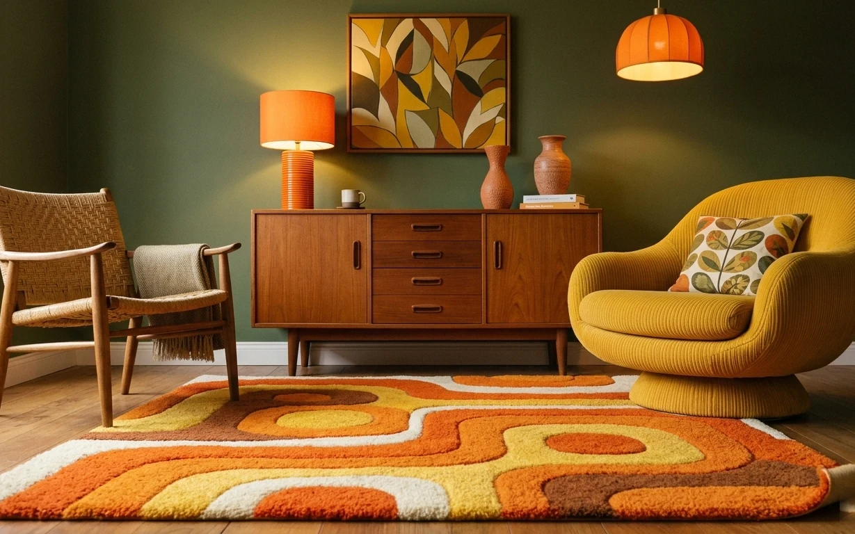
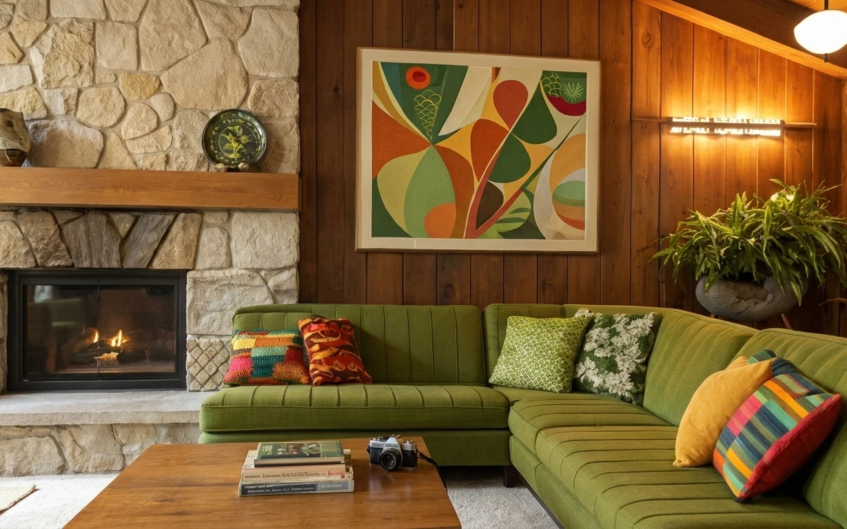
The green painted wall gives everything a calmer backdrop, then the rust orange lamp shade and warm chair tones do the cheering. In the foreground, the multicolor area rug has that soft, plush pile that reads cozy instead of busy. On top of that, the yellow corduroy swivel chair and its patterned pillow add texture the eye can grab. This is the kind of mid-century look that doesn’t need a full overhaul—just a few high-visibility pieces chosen with care.
I almost went the “neutral everything” route the first time I tried this style at home. But the minute I added one orange lighting note and kept the rug as the anchor, the corner stopped feeling flat. The mistake was thinking warmth had to mean matchy-matchy. The better move is using similar tones—olive green, mustard yellow, and rust orange—across different materials so they feel like they belong together.
Layer 1 — multicolor area rug 5×7 ($200) Grounds the color story underfoot
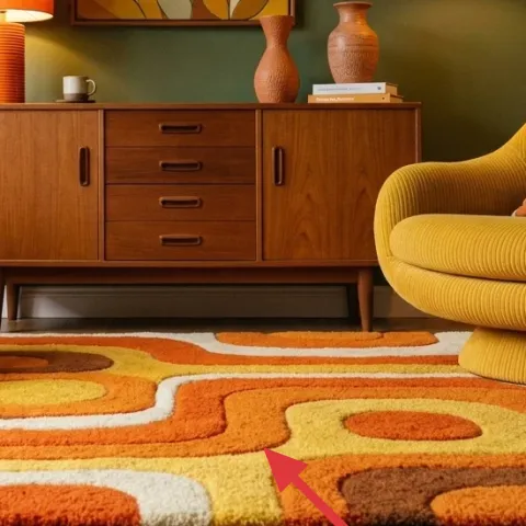
Put your money on the multicolor area rug first, because it’s the only element in the photo that touches every seating zone. The mix of rust, orange, and soft warm neutrals does the work of “tying” the rest of the corner together, even when the chairs and art aren’t the same exact palette. A solid alternative would make the room calmer, but it would also remove the mid-century punch that’s already happening here. Trade-off: you’ll need to vacuum more often than a darker, single-tone rug, but the payoff is a rug that reads like design, not decoration.
Match undertones, not exact colors
When a rug has three warm notes, pull those same undertones from the pillow and the lamp—not the same exact shade.
Layer 2 — mustard pillow on yellow chair ($30) Adds pattern without changing the silhouette
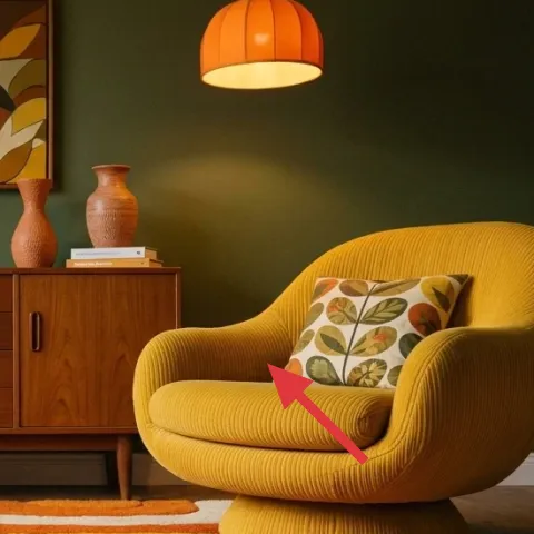
The pillow on the yellow corduroy swivel chair is small, but it’s doing heavy lifting. Its leafy pattern echoes the abstract art’s curves and keeps the chair from feeling like plain upholstery. The mustard tone also connects back to the rug’s warmer oranges, so the corner feels lit from inside rather than just “decorated.” A throw blanket could work, but a pillow keeps the color focus at eye level. Trade-off: pillows are the first thing pets and daily use show wear on—choose a cover you can swap or rotate.
Keep the pillow pattern scaled to the chair
A medium-scale print won’t compete with the chair’s rounded shape the way a tiny pattern might.
Layer 3 — framed abstract art print above credenza (DIY remake) ($80) Lets you control the palette in one night

The framed abstract art print above the wood credenza is the visual “stop sign” that makes the whole corner feel styled instead of accidental. In the photo, the warm orange and olive tones echo the lamp and wall, while the cream areas keep the composition breathable. Buying an art print is easy, but remaking one is faster and cheaper when you’re aiming for a specific color relationship. Trade-off: DIY art works best when you’re willing to embrace bold shapes rather than trying to replicate a perfect painting.
Make it instead of buying it
Remake the abstract art print by stenciling warm shapes onto paper, then slip it into a simple frame so it matches the rug and orange lamp tones.
Materials
- Sturdy cardstock or watercolor paper (one sheet) — 11×14 in — craft store — $14
- Abstract stencil set — sheet of shapes — craft store — $10
- Acrylic paint (olive, rust orange, cream) — 3 small tubes — craft store — $8
- Painters tape — roll — craft store — $9
- Mini foam roller or stencil brush — 1 — craft store — $4
Steps
- Clean the paper surface and tape down the corners to stop shifting.
- Lightly sketch where the largest olive and rust shapes will sit.
- Stencil the first shape color, then clean the stencil edge with a dry cloth before the next color.
- Add cream shapes as negative space so the print doesn’t feel heavy.
- Let the paint dry fully before stacking anything on top.
- Slip the finished paper into the frame mat opening and center it.
Total DIY cost: $45 — saves about $35 over buying.
Don’t over-blend the colors
Stenciled edges look intentional; muddying layers makes the print read “home printer” instead of graphic wall art.
Layer 4 — wood credenza/sideboard ($220) Creates the mid-century base under the art
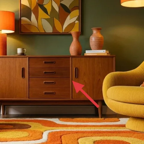
In this corner, the wood credenza/sideboard is the structural anchor, and it’s positioned where the eye naturally lands right after the wall art. Its warm wood finish repeats the rug’s earthy tones, and the flat top gives you a staging area for small objects. Swapping the credenza is the biggest “feel change” move you can make without touching walls or wiring—because the furniture’s height sets how the whole seating zone reads. Trade-off: keep the surface styling tight; too many small items will look cluttered next to the bold rug.
Repeat one finish across two pieces
If the credenza is warm wood, choose chair legs or frame tones that echo it.
Layer 5 — orange pendant lamp ($60) Adds the warm overhead note the corner needs
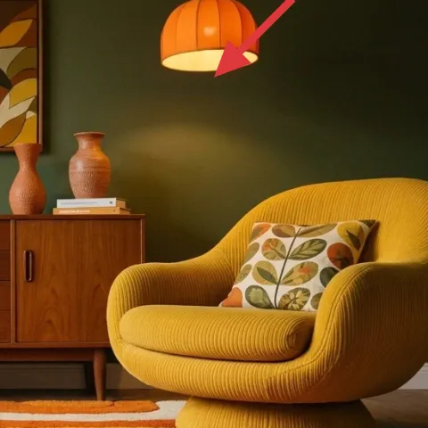
The orange pendant lamp above the seating area is what makes the green wall feel inviting instead of flat. It also pulls the rust orange from the rug up into the vertical space so the color story doesn’t stop at floor level. For this look, the pendant shade’s rounded silhouette matches the chairs’ curves, which is why it feels cohesive. Trade-off: pendant lighting is all about placement, so aim for a shade that hangs high enough not to crowd the art, but low enough to create a warm pool over the corner.
Warm bulbs help green walls
A warmer color temperature keeps olive green from looking harsh in daylight.
Layer 6 — wood armchair with woven seat ($180) Brings texture next to the corduroy chair
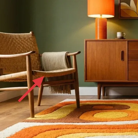
The wood armchair with woven seat on the left adds a different kind of texture than the yellow corduroy swivel chair. That woven pattern gives the corner rhythm, so the rug’s color mix doesn’t become the only thing the eye notices. It’s also a practical silhouette choice: with an open chair back and lighter visual weight than a bulky sofa, the corner stays airy even with bold decor. Trade-off: woven seats can collect dust, so regular vacuuming is part of the deal.
Use chairs as “texture layers”
When one chair is plush, pick the other for pattern or weave so they complement instead of compete.
Layer 7 — ceramic vase on credenza ($20) Makes the credenza feel styled, not staged
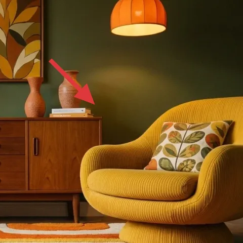
The ceramic vase on the credenza is a small purchase with a big visual payoff because it sits at eye level. Its earthy color warms the tabletop and connects back to the rug’s terracotta notes, while the shape adds height so the surface doesn’t read as one flat line. You could replace it with another object, but keep it ceramic or clay-textured for the same reason—it harmonizes with the wood and rug. Trade-off: a vase will never look “done” if it’s empty, so pick a quick filler you’ll actually use.
Pick one tall item, one low item
That simple height difference keeps the credenza from looking symmetrical or accidental.
The cost, layer by layer
| Layer | Item | Cost |
|---|---|---|
| 1 | Multicolor area rug 5×7 | $200 |
| 2 | Mustard pillow for yellow chair | $30 |
| 3 | Framed abstract art print remake (DIY) | $80 |
| 4 | Wood credenza/sideboard | $220 |
| 5 | Orange pendant lamp | $60 |
| 6 | Wood armchair with woven seat | $180 |
| 7 | Ceramic vase on credenza | $20 |
| Total | $790 | |
If the rug budget is tight, choose a smaller 5×7 look-alike with a similar rust-and-olive palette and keep it centered under the front legs of both chairs. For the art, print a large abstract image and frame it for a similar color relationship without paying gallery prices.
What worked, what didn't (across the whole room)
This corner succeeds because the rug sets the warm palette, then orange and olive show up again in lighting and wall art. The textures (woven chair + corduroy chair) keep the mid-century look from feeling flat. The only friction point is that bold color pieces demand a lighter touch on tabletop clutter.
What worked
- The multicolor rug makes the green wall feel more playful instead of muted.
- Orange lighting echoes the rug tones and adds warmth from above.
- The framed abstract print repeats olive and rust so the corner reads intentional.
- Woven chair texture balances the corduroy chair’s softness.
- Using one ceramic vase adds height and keeps the credenza surface from looking empty.
What didn't
- If the rug is off-center, the room can start feeling asymmetrical in an unplanned way.
- A too-busy credenza styling competes with the abstract print and multicolor rug.
- Swapping the pillow for a solid fabric can make the yellow chair look too “one-note.”
What we'd skip if we did it again
Skip replacing the green painted wall with a neutral off-white just to “calm things down.” The olive color is doing real work as a backdrop, and the warmth of rust orange and mustard yellow needs that contrast.
Skip buying a matching set of small decor for the credenza. One tall ceramic vase plus a couple of books looks styled; a bundle of coordinated trinkets reads cluttered against the bold rug.
Skip choosing art that’s the same colors but with the wrong shape language. This corner works because the abstract print has warm curves and negative-space cream, which mirrors the chairs’ silhouettes.
Frequently asked
How long does this kind of living room seating corner refresh take?
Plan on 6–10 hours total if you’re shopping first and then styling the corner in one session. The DIY framed abstract print usually takes about 1–2 hours including drying time, plus 30 minutes to swap it into the frame. If the rug needs repositioning and the pendant needs a basic placement check, add another half day.
I rent—can I still do the pendant lamp and wall art changes?
The pendant lamp itself may require electrician help depending on your setup, but the overall strategy still works: choose a warm orange light note that’s move-friendly. For the wall art, a framed print is renter-safe—swap it without damage. If you can’t change light fixtures, keep the orange color story through a table lamp instead.
What if my room is smaller than the photo?
Use the same hierarchy: rug anchor first, then art, then lighting. In a smaller room, keep the rug centered and consider a slightly smaller framed print so the wall doesn’t feel crowded. Stick with one main statement item (the rug or the art), and keep tabletop styling minimal so the corner stays open.
Can I use a different color rug but keep the same look?
Yes—just keep the relationship. The photo works because olive green, rust orange, and mustard yellow repeat across the rug, lamp, and art. If you change the rug palette, repeat at least two of those tones in the pillow and the wall art so the corner still reads intentional.
Where should I shop for pieces like the rug and abstract print?
For the rug, look for 5×7 options in online retailers with easy returns, then check the pile height and thickness in the product photos. For the abstract print, thrift a frame and remake the artwork, or buy a print that includes olive and rust tones. The credenza and chairs are often best found secondhand—focus on wood finish and shape first.
What’s the biggest mistake people make with this style?
The biggest miss is choosing one bold color and then going neutral everywhere else. Mid-century corners feel “right” when warm colors repeat across different materials—fabric, ceramic, and wood—so nothing looks like an afterthought. Also, avoid overcrowding the credenza; let the rug and art do the talking.
More in Living Room
7 practical weekend swaps for a living room seating corner, $800
A mid-century living room seating corner, refreshed with 7 budget-friendly swaps totaling $800. Focus on a bold multicolor rug, a remade ab…
What $700 buys: an earthy living room seating refresh
A weekend refresh for a living room seating area using 7 visible updates—patterned rug, floor-to-ceiling curtains, and warm lighting. The l…
How to style a rented fireplace lounge for under $500
A renter-friendly fireplace lounge refresh built around olive-green seating, warm wood tones, and framed art. For about $500, swap in a sta…