- Best for
- Color-and-light bedroom refresh
- Cost
- $585 (about $600 budget)
- Difficulty
- Moderate
- Time
- Half-day to 1 weekend
Why warm olive-and-amber details are the bedroom refresh of 2026
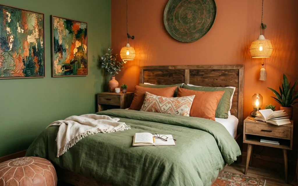
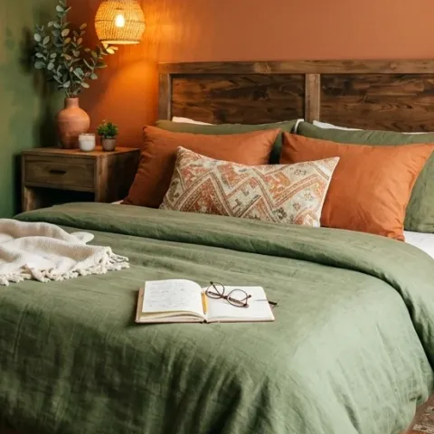
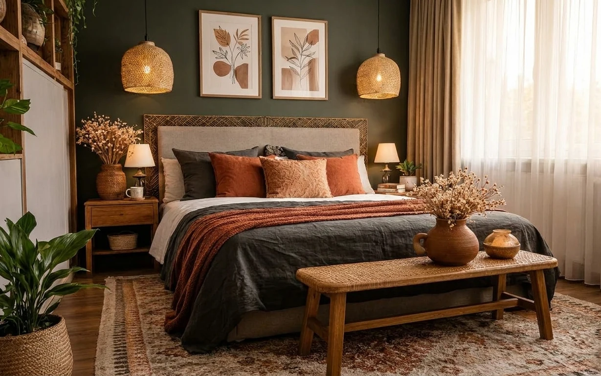
That deep olive wall and the burnt-amber lighting do most of the heavy lifting here. You can see how the woven rug’s pattern grounds the bed, while the wood headboard and nightstand keep everything feeling grounded instead of precious. I’ve done this exact mix in a couple apartments—my mistake was buying “cozy” lamps that didn’t actually read the same color temperature. In this setup, the green bed cover and the tan-and-green pillows create a clear texture rhythm: soft fabric, then warm wood, then art with crisp edges.
The first time I tried to copy a look like this, I focused on the bedding and called it a day. Everything looked fine in daylight, then fell flat after dark because I hadn’t matched the lighting mood. What changed it for me was choosing warmer bulbs and letting the lamp glow repeat the wall’s orange undertone. Once that amber tone showed up twice—then once in the art—you could feel the whole room click.
Layer 1 — Woven rug ($200) Pattern you can build the palette on
A woven rug with an earthy pattern gives the bedroom its visual “anchor,” especially when the bed cover is a solid color. Here, the rug sits under the bed and reaches toward the nightstand side, which makes the whole zone feel intentional instead of like furniture floating on bare floor. The trade-off with buying a patterned rug is you can’t be too precious about matching every color—your job is to pick one repeat (olive, tan, or warm orange) and let the rest be supporting notes.
Let the rug pick your accent
Pull one color from the rug (olive or terracotta) and repeat it in the wall or pillows so the room reads as one scene.
Layer 2 — Wood bed frame ($120) A warm base that doesn’t fight the colors
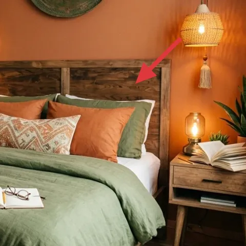
A wood bed frame with a sturdy, simple shape keeps the olive bedding from looking like it’s “too much paint” and turns it into a grounded, lived-in backdrop. In the photo, the headboard’s warm tone echoes the nightstand wood, which is the easiest way to create cohesion without matching everything perfectly. Choosing a thrifted-looking frame (the kind that already has grain and dents) is the practical move—new beds can feel sterile unless you add texture elsewhere.
Keep the silhouette simple
If the bed is already ornate, skip extra busyness in the pillows so the palette stays calm.
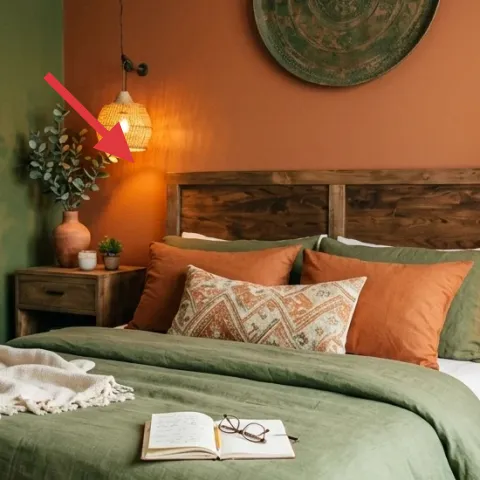
Layer 3 — Amber table lamp with exposed bulb ($60) Warm light that flatters the green
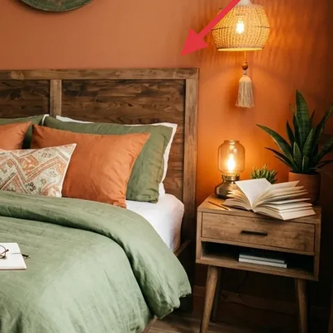
The amber table lamp is the piece that makes this room work after dark. The exposed bulb style adds a small, visible “sun” glow, and that warm tone helps the olive bed cover look rich instead of flat. The obvious alternative is a bright white LED or a shade that hides the bulb—both make the room read cooler and more temporary. With an amber bulb and a warm metal/wood base vibe, your bedside light becomes part of the color scheme, not just a utility fixture.
Don’t mix cool bulbs with warm walls
If you use daylight bulbs in a room with orange undertones, the green can look muddy fast.
Layer 4 — Patterned throw pillow ($30) Adds rhythm without changing the bed cover
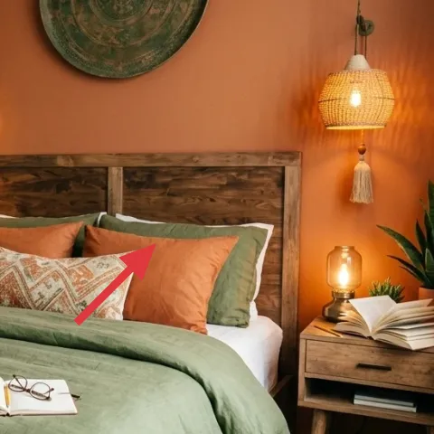
This patterned throw pillow gives the bed a “third texture,” sitting between smooth fabric and the structured geometric rug. It’s also a way to bring in pattern without switching the whole bedding set. The trade-off is that you have to be selective: one pattern reads intentional, while three different patterns start to compete with the framed art. Aim for a pillow that repeats a color you already used—here, tan and olive tones land naturally with the rug and wall.
Choose pattern that repeats, not clashes
Find a pillow pattern that repeats the rug’s undertone so your bed stays cohesive.
Layer 5 — Olive-green wall paint ($70) The weekend-ready color that sets the mood
An olive-green painted wall is the clearest way to get the same warm, grounded atmosphere shown in the photo. You don’t need to repaint the whole room—this look works when one side is colored and the rest of the space supports it with warm wood and tan textiles. I’m including this as the biggest visible lift, because lighting and fabrics can be swapped later, but paint is what creates that instant backdrop. The trade-off: color decisions feel permanent, so test on poster board and live with it for a day.
Test the green at two times of day
Olive reads differently in morning light versus amber lamp light—paint samples make the choice obvious.
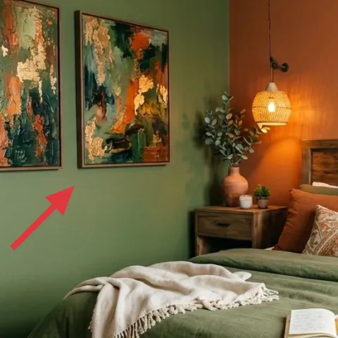
Layer 6 — Framed abstract wall art print ($80) Color blocks that echo the textiles
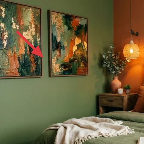
Abstract framed prints with green and rust tones pull the bedroom palette up to eye level. In the photo, the art also breaks up the big wall fields, so the room doesn’t feel like “paint + furniture” only. I’d choose one larger print or two medium prints and keep frames consistent in color and thickness to avoid visual noise. The trade-off is that cheaper prints can look flat—spend just enough to get real color depth, or the wall will feel dull beside the warm lighting.
Hang art so it sits above the nightstand line
Height matters: eye-level placement keeps the art from competing with the lamp glow.
Layer 7 — Ceramic vase with green stems ($25) A small plant moment for height and softness
A ceramic vase with green stems adds vertical softness on the nightstand side and gives the room a “natural” counterpoint to the painted wall. The key is scale: a small plant reads cute but doesn’t balance the size of the framed art and bed headboard. In this photo, the stems sit beside the lamp and help the amber light feel less harsh. The trade-off with real stems is upkeep, but that’s why this is a weekend-friendly refresh—swap stems when they fade and the whole scene stays fresh.
Let the stems reach toward the lamp
Angle the stems so they visually lift the space instead of dropping straight down.
The cost, layer by layer
| Layer | Item | Cost |
|---|---|---|
| 1 | Woven rug 5×7 | $200 |
| 2 | Wood bed frame | $120 |
| 3 | Plug-in table lamp with exposed amber bulb | $60 |
| 4 | Patterned throw pillow cover | $30 |
| 5 | Olive-green wall paint (1 gallon) | $70 |
| 6 | Framed abstract wall art print 16×20 | $80 |
| 7 | Ceramic vase with green stems | $25 |
| Total | $585 | |
If you want a cheaper variant, start by buying the rug first, then choose one statement framed print instead of two, and pick a simpler pillow pattern. You can also keep the lamp but switch to a warmer bulb so the green reads rich without changing the whole lighting setup.
What worked, what didn't (across the whole room)
The biggest wins came from repeating warmth: amber light, warm wood tones, and a green color story that ties the textiles to the wall. The room looks collected because the rug pattern and the art palette both echo those undertones.
What worked
- The woven rug’s pattern keeps the bed from feeling like it floats in open space.
- Warm wood on the bed frame and nightstand creates cohesion even when colors change.
- The amber table lamp makes olive look deeper instead of gray or dull.
- One patterned throw pillow adds rhythm without competing with the framed art.
- Green-and-rust framed prints pull the palette to eye level and balance the wall.
- The ceramic vase with stems adds vertical softness that matches the lighting’s glow.
What didn't
- When the bulbs run too cool, the olive can turn muddy and the room feels less warm.
- Adding multiple busy pillow patterns at once makes the bed look cluttered next to art.
- If the rug pattern is too far from the wall undertones, the room stops feeling intentional.
- Oversized frames placed too low can compete with the lamp and make the wall feel crowded.
What we'd skip if we did it again
Skip buying a full bedding “set” first. In a room like this, the bed cover color and pillow textures matter more than matching brand names, and you’ll end up swapping pieces anyway once you pick the wall and lighting mood.
Skip using cool daylight bulbs just because they’re bright. Warm walls and olive textiles look best with amber-toned light, and the easiest fix is bulb choice, not replacing fixtures.
Skip hanging art that’s either too low or too high. Eye-level placement above the nightstand line keeps the framed prints readable and stops the whole wall from feeling like it’s leaning away from the bed.
Frequently asked
How long does this kind of bedroom refresh usually take?
Most of this look is “move-and-decorate” work. If you’re only buying the rug, lamp, pillows, and art, expect 4–8 hours spread over a day or two. Painting (if you’re doing it) turns it into a true weekend project: roller time is quick, but drying and sample decisions add a few extra blocks. The key time sink is choosing wall color under both daylight and lamp light.
If I rent, what can I do without repainting?
You can still get the same mood without paint. Start with a warm amber bulb in the table lamp, then anchor the floor with the woven rug and add olive-and-tan pillows for texture. For wall art, use removable frames or hanging hooks that match the frame weight, and choose prints with green-and-rust tones so the palette matches the bedding. The lighting + textiles combination carries most of the look.
My bedroom is smaller—will the rug and art scale still work?
Scale matters, but you can downsize without losing the vibe. Use a smaller rug that still fits under the front legs of the bed (or at least reaches beyond the sides), and swap to one larger framed print instead of two. Keep pillow layering to one pattern plus one solid, so the bed doesn’t get visually crowded. With smaller rooms, vertical height from the vase and art becomes even more important.
What’s the biggest mistake people make with this olive-and-amber palette?
The most common mistake is letting the lighting go cool while the walls and textiles go warm. Olive reads differently under different bulbs, and cool light can make it look gray. The second mistake is adding too many competing patterns—more than one pillow pattern plus multiple wall motifs can feel busy. Pick one pattern repeat (olive or rust) and let the rest be supporting neutrals and textures.
Where should I shop differently if I’m on a budget?
Prioritize spending on the rug, then go budget-friendly on pillows and wall frames. Rugs are the anchor because they cover the largest surface and hide small messes. For framed abstract art, look for quality prints in a consistent frame color, or buy one and add a second later if the wall feels unfinished. For lighting, keep it simple but don’t skimp on warm bulb compatibility.
Can I get this look with a different bed cover color?
Yes—use the rug and art as the palette guide. If you switch the bed cover away from green, grab pillows that pick up at least one rug tone and keep the same warm lighting. The room’s “cozy” effect comes from texture repetition (woven rug, fabric pillows, wood furniture) plus warm amber light. Color is flexible; texture and undertone matching do the real work.
More in Bedroom

7 weekend swaps for a warm bedroom refresh
A warm bedroom refresh under $600 starts with one visible wall color, then builds the look with a woven rug, layered pillows, and bedside l…
What $350 buys: a warm boho bed nook refresh
Turn a plain rental bed nook into this warm boho setup with 7 renter-friendly swaps: two pillow covers, a fringed throw, a woven nightstand…
What $1000 buys: a boho bedroom refresh with 7 layered fixes
A boho bedroom refresh built from 7 specific swaps: a grounded rug, framed botanical prints, warm curtains, and layered textiles. The look …