
- Best for
- Weekend bedroom styling
- Time
- 2 weekends (or 1 long one)
- Total cost
- $745 total for the 7-layer refresh
- Renter-safe
- Most swaps; DIY art is completely removable
Why earthy rust-and-olive palette is the boho bedroom of 2026
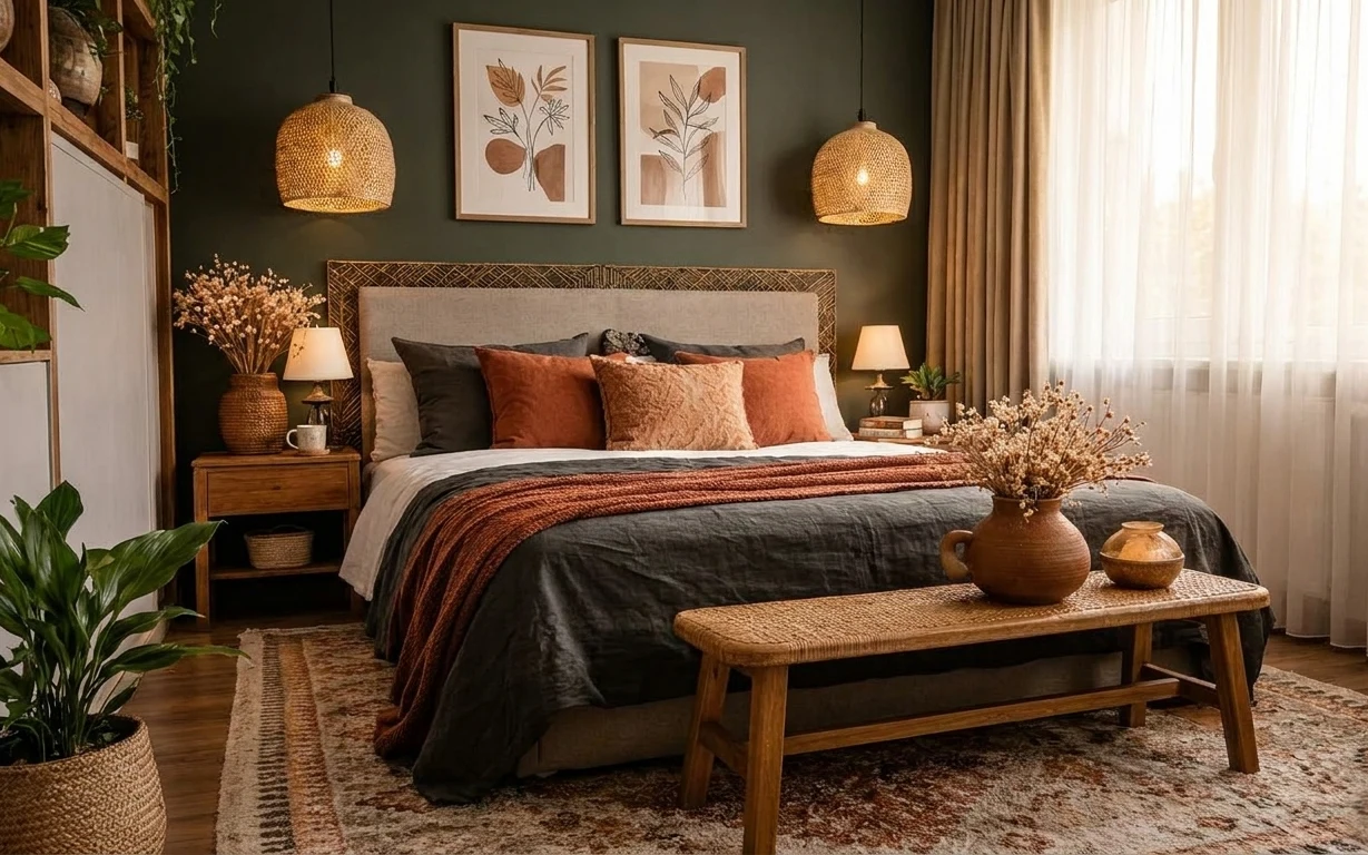
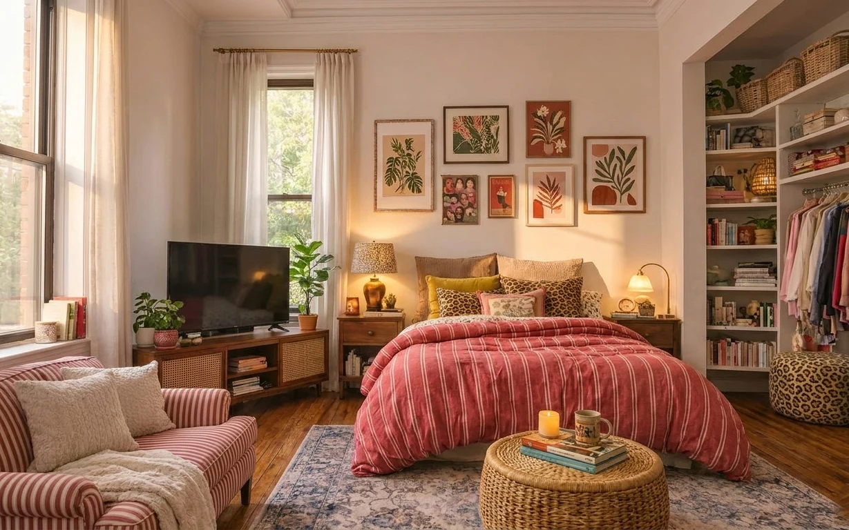
The fastest way I’ve found to make a bedroom feel styled (without a full remodel) is to start with big, tactile anchors: a grounded rug, warm curtains, and a bed that’s visually layered. In this photo, the dark olive-green wall makes the rust throw blanket and cognac pillows pop, while the woven pendant lights and wood coffee table keep everything feeling grounded. You can feel the mix of textures here—linen-like curtains, plush bedding layers, and the slight grain of natural wood—so the room reads cozy even in daylight. For homeowners working within a weekend budget, that “texture math” is the achievable part.
I used to overthink wall art placement and end up buying something that was either too matchy or too modern for the rest of the palette. The turning point for me was noticing how these botanical prints repeat the earthy tones already in the fabrics—brown, warm clay, and soft neutrals—so the wall looks intentional instead of random. Now, I build the story from the room’s color notes and only then pick the final frame size.
Layer 1 — area rug ($200) Grounds the bed in one swipe
This area rug sits under the bed and coffee table, so it does two jobs at once: it anchors the whole zone and it mutes the contrast of the dark wood floor. Choose a rug with rust-brown and warm taupe tones so it echoes the throw blanket without matching it stripe-for-stripe. The trade-off is size: if you go too small, the bed and coffee table float; if you go the full 5×7 range, you get that “furniture landing pad” effect. In a boho scheme, patterns also help soften straight lines—so even if your bed and table legs are simple, the rug adds visual movement.
Let the rug lead the palette
If the rug has warm rust in it, your throw and ceramics can be slightly different shades and still feel coordinated.
Layer 2 — two framed botanical prints above the bed ($100) Repeat the earth tones on the wall
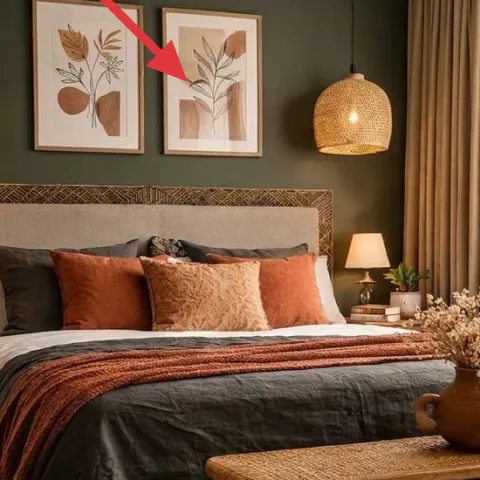
Those two framed botanical prints are the visual “breathing space” above the bed—lighter than the dark wall, but still grounded in the same warm-brown family as the coffee table and accessories. I’d rather see botanical art than a generic abstract here because the room already has organic texture: woven lamps, leafy plants, and dried-looking branches. The decision point is scale and spacing—keep both prints in the same vertical band so your eye reads them as a set. If the frames feel too busy in a future rental or sale, the neutral botanical lines make the swap easier than going with a high-contrast trend.
Make it instead of buying it
Replace the printed images inside the existing frames with your own painted botanical designs so the wall matches the rust-and-olive palette without paying for a pre-made set.
Materials
- Watercolor paper, 8×10 sheets (2) — craft store — $12
- Student-grade watercolor set in earth tones — craft store — $6
- Small round brush (size 6 or 8) — craft store — $20
- Pencil + eraser — office store — $8
- Clear matte spray (light coats) — craft store — $10
Steps
- Sketch simple leaf shapes in pencil (no perfect symmetry).
- Mix a warm brown and a muted terracotta wash, then paint one main stem.
- Add lighter green-brown leaves, using varied brush pressure for texture.
- Let each print fully dry, then paint a second layer for contrast.
- Erase any pencil lines gently once the paint is dry.
- Apply a very light matte spray coat and allow it to dry fully.
- Trim the paper to fit the frame opening if needed.
- Insert your prints into the frames and check alignment from bed height.
Total DIY cost: $56 — saves about $44 over buying.
Layer 3 — curtain panels on the right window ($80) Adds softness and hides visual clutter
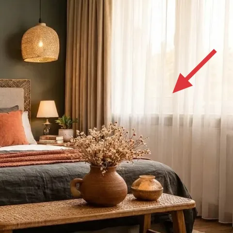
These curtain panels on the right window are doing quiet heavy lifting: they soften the sharp edges of wall and furniture, and they create a consistent vertical line that makes the bed wall feel calmer. For this look, go for a light, warm-neutral fabric so it doesn’t compete with the dark olive wall. The trade-off is maintenance—sheerer curtains show dust more easily—so plan for regular vacuuming or gentle washing. If you’re tempted to skip curtains and rely on blinds, don’t: you lose that “finished at a glance” softness. Keeping the curtain height consistent—close to ceiling height—also helps make the whole room feel taller.
Choose a warm white, not an icy one
A slightly creamy curtain keeps the rug and throw from looking washed out.
Layer 4 — pair of table lamps on the nightstands ($120) Makes the room feel styled after dark
Those table lamps with white shades balance the darker wall and the warm wood tones at night. Using two lamps keeps the bed wall symmetrical, which makes the whole palette read intentional instead of accidental. The trade-off is bulbs and shade warmth: use warm bulbs (roughly 2700K) so the room’s terracotta and olive tones glow rather than look greenish under cool light. If you tried to rely on the woven pendant lamps alone, you’d end up with shadows across the pillows—table light fills in the “reading area” visually. This is one of the easiest weekend upgrades because you’re not changing wiring or layout, just adding the right height and diffusion.
Keep the lamp shade centered over the nightstand
Even a few inches off makes the pair feel less balanced from the bed.
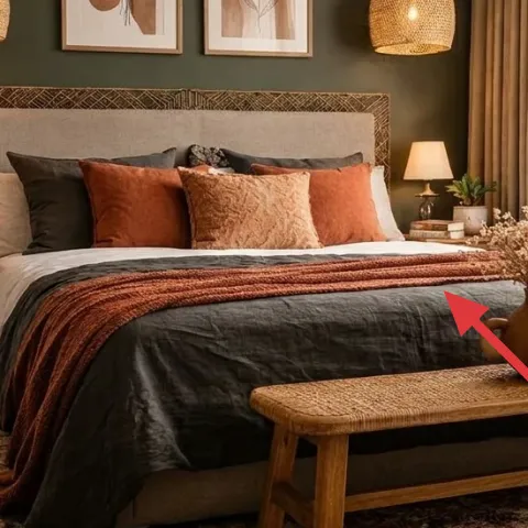
Layer 5 — rust throw blanket on the bed ($35) Adds the color that ties everything together

The rust throw blanket folded and draped across the bed is the color signal in this whole setup. It ties back to the rug’s warm rust-brown tones and gives the otherwise dark-and-wood palette a richer focal point. The trade-off is texture: a smoother blanket can look flat on top of textured pillows, but a woven or knit surface reads “intentional layering.” If you’re working on a budget, the better alternative to buying a whole new bedding set is buying one textured throw in a warm clay shade and styling it with a slight fold. Done right, it looks like you spent time; done wrong, it looks like a blanket you grabbed in a hurry—so aim for a consistent drape line.
Avoid matching exactly
If the throw and rug are the same exact shade, the room can look monochrome instead of earthy and layered.
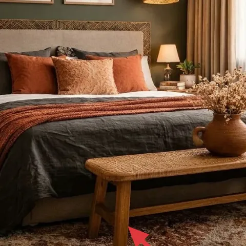
Layer 6 — wood coffee table in front of the bed ($180) Creates a natural “stage” for decor
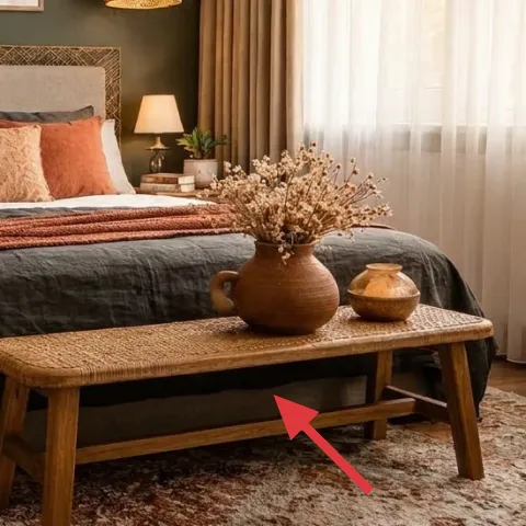
This wood coffee table sits in front of the bed like an everyday surface that also doubles as a styling anchor. The slatted legs and natural grain keep the look warm and grounded, so the room doesn’t feel too dark or too precious. The trade-off with going lighter wood is that it can show dust more easily; still, this setup works because the rug and wall already provide darkness. If you replace the table with something glossy or metal, the room loses that tactile boho balance created by woven lighting and plants. Keep the top surface clear enough that the vase and bowl have breathing room, which is why this table shape matters as much as the finish.
Style in odd numbers
A vase plus one small bowl reads calmer than clustering three or four items at random.
Layer 7 — ceramic vase with branches on the coffee table ($30) Brings “organic” movement to a still surface
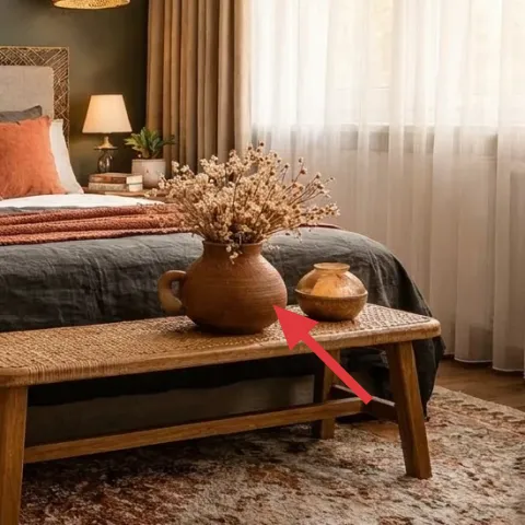
The ceramic vase with branches adds height and motion without pulling the palette into bright colors. This is the kind of small object that makes a bedroom feel lived-in—especially when the branches echo the botanical prints on the wall. The trade-off is realism: fresh stems won’t look like the dried texture in the photo for long, but dried or faux branches keep the same visual rhythm with less upkeep. If you don’t want to buy a full bouquet, you can build the look with a single branch arrangement and a simple ceramic form. Placing it on the coffee table (not the nightstand) also keeps the bed wall visually less busy while still bringing in that organic element.
Match ceramic warmth to the wood
Warm taupe or amber ceramics look right next to honey-toned tables.
The cost, layer by layer
| Layer | Item | Cost |
|---|---|---|
| 1 | Area rug (5×7, rust/taupe tones) | $200 |
| 2 | Two framed botanical prints set (DIY prints inside) | $100 |
| 3 | Curtain panel pair (84") | $80 |
| 4a | Plug-in table lamp (white shade) — left | $60 |
| 4b | Plug-in table lamp (white shade) — right | $60 |
| 5 | Rust throw blanket | $35 |
| 6 | Wood coffee table | $180 |
| 7 | Ceramic vase with branches + small bowl | $30 |
| Total | $745 | |
If you want a cheaper version, shrink the spend by choosing a smaller rug pattern and one statement lamp instead of two. Keep the rust throw and botanical wall prints, since those are the visual connectors that make the room feel cohesive.
What worked, what didn't (across the whole room)
This setup nails cohesion because warm rust and dark olive show up in multiple materials—fabric, art, and decor—rather than living in one “accent only” place. The lighting and rug sizes also matter, and they’re both doing more than decoration.
What worked
- The rug pattern anchors the bed and coffee table so the furniture feels intentionally placed.
- Botanical prints soften the dark wall while echoing the organic branch styling on the table.
- Double table lamps keep the pillow area evenly lit, which makes the bed look styled after dark.
- The curtain panels add vertical softness that balances the horizontal lines of the bed and coffee table.
- The rust throw blanket adds a clear color story without changing the whole bedding palette.
- The ceramic vase adds height variation, so the room doesn’t feel flat even with dark walls.
What didn't
- Trying to match the throw and rug too closely makes the palette look monochrome instead of layered.
- If the curtains hang too short, the room loses that taller, calmer framing effect.
- Skipping a second light source can leave one side of the bed shadowy, which reads unfinished.
- Overcrowding the coffee table makes the vase fight with the wall art instead of supporting it.
What we'd skip if we did it again
Skip swapping everything at once. The room already has enough structure (bed, wall color, wood furniture), so the higher-impact moves are the ones that add warmth and softness: rug, curtains, and layered textiles.
Skip buying a matching “set” of bedding or wall art just to look coordinated. That approach often lands flat; mixing close-but-not-identical rust and brown tones reads more intentional in boho spaces.
Skip going with cool-toned light bulbs. Under 4000K light, olive walls can skew green and rust fabrics can look muddy, so warm bulbs are the small choice that protects the whole palette.
Frequently asked
How long does this type of boho bedroom refresh take?
Plan for 4–8 hours for the big swaps (rug placement, curtain hang, table lamp styling) and another 3–6 hours for the framed botanical DIY prints. If you’re waiting on drying time for paint and spray, it spreads across a weekend without adding stress. Most of the “time” is just measuring and aligning frames from bed height, not complicated work.
What if I rent—can I still get this look?
Yes. Keep the anchors you can take with you: a rug, curtains (tension rod or properly installed rod if allowed), and table lamps. For the wall art, DIY prints inside existing frames or removable hooks keep everything move-friendly. The key is to choose earth tones that match what the room already has—especially your wall color—so you’re not forced into a full repaint.
My bedroom is smaller. What would you change first?
Go bigger on the rug than you think you should, but choose a thinner rug with similar rust/taupe tones if space is tight. If the prints feel too wide, keep the same style but reduce the frame width so the center stays visually aligned above the bed. Curtains should still hang high; that vertical line is what makes small rooms feel taller.
Where should I shop for these pieces if I want a budget version?
For the rug and curtains, look at big home stores and online “rug sale” sections first, then verify that the color palette is warm (rust and taupe) rather than cool beige. For framed prints, thrift frames or buy inexpensive frames and DIY the paper insert. Table lamps are often easiest from marketplaces where you can filter by shade color.
What’s the biggest styling mistake in this kind of bedroom?
Matching too perfectly. If the throw, rug pattern, and wall art tones all land on the exact same rust shade, the room can look one-dimensional. Aim for close neighbors—warm terracotta, brown, and soft taupe—so each layer reads distinct but still cohesive.
More in Bedroom
What $1000 buys: a boho bedroom refresh with 7 layered fixes
A boho bedroom refresh built from 7 specific swaps: a grounded rug, framed botanical prints, warm curtains, and layered textiles. The look …
5 renter swaps for a plant-filled bedroom for $600
A plant-filled bedroom makeover for renters: swap in a textured rug, a wood nightstand, framed botanical wall art, and a simple blanket-and…
What $600 buys: a bedroom corner refresh with warm boho texture
A bedroom corner refresh built for move-friendly shared housing: blue rug, striped throws and comforter, a framed botanical print, warm tab…