- Best for
- renters who want a teal-and-gold spa read
- Time
- about 2–3 hours
- Total cost
- $320–$350
- Renter-safe
- yes—no-drill swaps
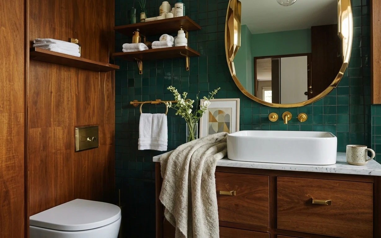
Why teal-and-gold contrast is the tub-and-vanity bathroom of 2026
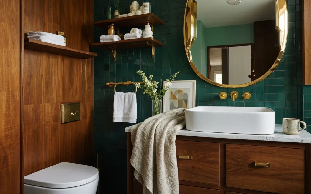
Start with what the room already gives you: teal tile, warm wood, and that gold mirror shape. Then style the surfaces like a mini spa—white towels folded to match, one “soft” beige towel for texture, and a framed abstract print that echoes the jewel tone. In the hero, you can see the mix of fluffy terry, smooth glass, and the cool look of the marble countertop, which is why the whole scene feels intentional instead of busy. This is renter-safe because everything here is movable and packable.
I used to think bathroom styling meant “more stuff,” but the shelves can get cluttered fast—especially with product bottles. The shift for me was choosing a strict material rhythm: one glass/vase moment, one framed focal point, and towels that look deliberate (not just thrown in a pile). Once I did that, the room stopped feeling like a bathroom got ready in a hurry and started feeling like it has a point of view.
Layer 1 — white bath towel on towel bar ($20) Make it look “folded, not dumped”
A single white bath towel on the towel bar is the quickest way to create order in a bathroom. In the photo it sits mid-height against the teal tile, so it reads as bright contrast instead of just “clean laundry.” I’d pick a thick terry towel like this because it holds shape and doesn’t look limp when it’s hanging. The trade-off is that it needs a quick reset after each use, but that’s why it’s worth it—people notice the towel first.
Use a towel color that fights the tile
White works because teal looks richer next to it, and it also hides small water spots better than darker towels.
Layer 2 — white hand towels on wall shelf ($25) Keep the shelf styling cohesive
Those rolled and folded white hand towels on the wooden shelf do two jobs: they add softness high up, and they visually connect to the towel bar so the room feels curated. The warm wood shelves and the cool teal wall can pull in opposite directions—towels bridge that gap with a neutral, textural layer. I like this approach over adding more decor because towels are functional, so the styling doesn’t feel performative. The only downside is storage space—shelf height can make towels look cramped if they’re overstacked.
Let the towels repeat, not compete
Keep towel colors the same family so the visual story stays “spa,” not “random assortment.”
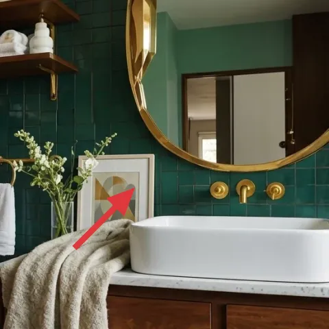
Layer 3 — framed abstract art print leaning against wall ($80) Use abstract shapes to echo the tile mood
This framed abstract print is the room’s focal point on the wall, and it works because the palette doesn’t fight the teal tile—it harmonizes with it. The geometric forms also feel modern against the warm wood and brass hardware. For renters, leaning framed art can be easier than trying to mount anything, and it keeps the look changeable whenever your taste shifts. The trade-off is that the frame needs to be stable, so choose weighty paper and a frame that sits flat against the surface.
Make it instead of buying it
DIY a similar abstract print on cardstock so you can match the teal-and-warm palette without paying for a gallery-style piece.
Materials
- Cardstock sheets — 2 pieces (8.5×11) — craft store — $6
- Acrylic paint set — 1 set — craft store — $18
- Small foam brush set — 1 pack — craft store — $10
- Simple frame (matte opening) — 1 frame — craft store — $12
- Painter’s tape — 1 roll — craft store — $8
Steps
- Pick a teal-friendly color mix (teal/green, warm beige, and a muted gold tone).
- Tape off 3–5 geometric sections on the cardstock using painter’s tape.
- Paint each section with a foam brush for clean edges and a slightly textured finish.
- Remove tape while the paint is still a little tacky so lines stay crisp.
- Fill any gaps with thin layers until the colors look evenly saturated.
- Let the artwork dry fully before handling.
- Trim cardstock to fit the frame mat opening if needed.
- Insert into the frame and lean it where you can see it from the doorway.
Total DIY cost: $54 — saves about $26 over buying.
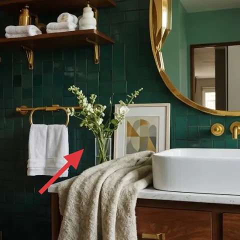
Layer 4 — clear glass vase with flower stems ($35) Add a fresh focal point without clutter
The clear glass vase is doing subtle work here: it keeps the center of the frame light, so the teal tile stays the background star. The flower stems add vertical movement, and the small blooms give a soft, airy counterpoint to brass hooks and sharp tile lines. This is also a renter-friendly “reset” piece—swap stems weekly, or use dried flowers later, without changing anything permanent. The trade-off is that stems can shed a bit of mess, so it helps to keep a small towel nearby for quick cleanup.
Choose slim stems for tight bathrooms
Thin stems read “elegant” instead of taking up visual space.
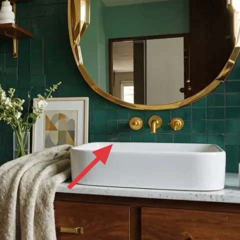
Layer 5 — ceramic mug on marble countertop ($15) Style with one small object, not a whole tray
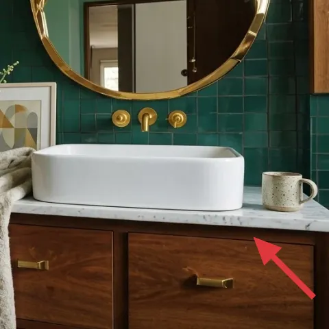
A single ceramic mug on the marble countertop looks intentional because it adds scale contrast: small, matte, and warm against glossy tile. In the photo it sits near the right side, balancing the heavier visual weight of the bathtub and keeping the countertop from feeling blank. You could replace it with a matching soap dish, but a mug gives you a more lived-in look. The downside is simple: mugs collect water rings, so pick a coaster-friendly spot and wipe after showers.
Let marble do the “shine” work
When the surface is already glossy, you don’t need extra reflective decor.
Layer 6 — gold wall mirror ($120) Use the brass tone as the color link
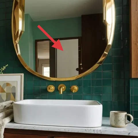
The gold mirror is the visual anchor in this bathroom refresh. Its warm metal tone ties directly into the brass fixtures and echoes the warm wood cabinetry, which is why the room feels cohesive even with teal tile as the dominant color. If the mirror is already there, you can keep it as-is and style around it; if you’re adding one for your own space, choose a rounded or sculptural frame that feels “architectural.” The trade-off is cost—mirrors can get pricey—but a statement mirror is one of the few decor items that also helps the room feel brighter.
Watch the reflection angle
A mirror that catches the wrong light can make shelves look messy—test it before committing.
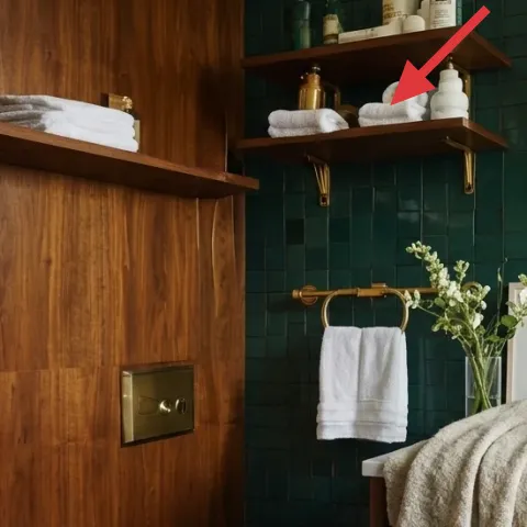
Layer 7 — toiletry bottles on wall shelf ($25) Make storage look styled
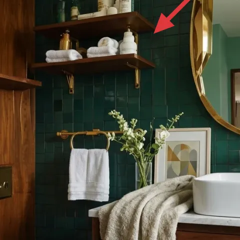
Toiletry bottles on the shelf give the bathroom a lived-in spa feel because they add vertical shape and small branding moments in a controlled way. The key is restraint: use bottles with a similar color temperature (cream/white tones read calm next to teal) and keep labels facing the same direction when possible. This layer beats adding extra ornaments because it supports the “day-to-day” story—your space looks styled even when it’s being used. The trade-off is that bottles can look cluttered if there are too many, so cap the number at a small cluster.
Group bottles in threes
Odd numbers feel natural, and grouping keeps the shelf from looking like a storage shelf.
The cost, layer by layer
| Layer | Item | Cost |
|---|---|---|
| 1 | White bath towel on towel bar | $20 |
| 2 | White hand towels on wall shelf | $25 |
| 3 | Framed abstract art print (DIY retail-equivalent) | $80 |
| 4 | Clear glass vase with flower stems | $35 |
| 5 | Ceramic mug on marble countertop | $15 |
| 6 | Gold wall mirror | $120 |
| 7 | Toiletry bottles on wall shelf | $25 |
| Total | $320 | |
A cheaper variant keeps the mirror idea but swaps it for a smaller round frame and uses one live-stem vase instead of bottles on the shelf. You can also DIY the framed abstract print even if you choose a bargain frame, and keep towels to one color family for the same visual payoff.
What worked, what didn't (across the whole room)
The overall win is how the styling follows the room’s geometry: bright towels against teal, warm wood shelf moments, and one framed abstract print as the focal point. When objects repeat—white textiles, warm metals, and a few small ceramics—the bathroom reads cohesive instead of staged. The only thing that can fall flat is over-stacking shelf items.
What worked
- The white towel on the brass bar creates clean contrast against the teal tile.
- Rolled and folded towels on the shelf add softness high up without cluttering the counter.
- The framed abstract print gives the eye a single focal point instead of chasing small objects.
- The clear vase keeps the center light while flower stems add vertical movement.
- The gold mirror echoes the brass tones and makes the room feel brighter.
- A single ceramic mug keeps the countertop styled, not crowded.
What didn't
- Too many toiletry bottles on the shelf makes the whole wall feel crowded.
- Skipping a towel reset can turn the spa look into a “laundry lives here” look.
- If the framed print leans unevenly, the composition looks accidental.
- Thick, bulky flower arrangements can overwhelm the narrow shelf and counter zones.
- Mixing towel colors with the wood-and-teal palette can read mismatched even if each item is nice.
What we'd skip if we did it again
Skip adding multiple countertop “tray” pieces at once. In a bathroom like this, marble and teal already create texture contrast—too many small objects turn into visual noise, especially near the faucet area.
Skip a second decorative focal point that competes with the framed abstract print. One wall-art moment is enough when the teal tile and gold mirror are already doing the heavy lifting.
Skip over-styling the shelves with more product bottles than you actually use. A tight cluster of toiletry bottles reads intentional; a larger lineup makes the shelf feel like storage rather than styling.
Frequently asked
How long does this bathroom refresh take?
Plan on 2–3 hours total. The towel swaps and countertop styling are fast, but the framed art DIY is where time goes—mainly taping, painting, and letting the acrylic fully dry. If the frame is already on hand, finishing and inserting the print is quick. If you’re buying materials for the DIY, add another 30–60 minutes for shopping.
Is this renter-friendly if I need to pack everything up at move-out?
Yes. Every layer here is either textile styling (towels), freely movable decor (vase, mug), or a removable visual accent (framed art). Even the shelf styling items—like toiletry bottles—are non-permanent. The gold mirror is the only potentially expensive piece; if you don’t want to transport it, keep the rest of the look and swap in your own movable mirror later.
What if my bathroom is smaller than the photo?
Keep the color palette, but reduce volume. Use one towel bar towel plus one shelf cluster, then stop—no extra décor layers. Choose slim flower stems so the vase doesn’t bulk up visually. If your counter is narrow, replace a second small object with a single mug or candle (if you already own one).
Where should I shop for the framed art and towels?
For the framed art, craft stores and discount home retailers are great for frames, then use acrylics on cardstock for the print. For towels, look for thick terry in a clean white, and buy two sets if your schedule is busy. Bath towels are a high-impact purchase because they affect the look every day, not just for photos.
What’s the biggest mistake people make with this style?
Over-stacking shelves. It’s tempting to fill every surface, but the teal tile and warm wood already have strong visual presence. When the shelf has too many bottles, rolled towels, and decorative items, the room stops looking like a deliberate spa and starts looking like storage.
More in Bathroom
A teal-and-gold tub-and-vanity bathroom for $350
A tub-and-vanity bathroom refresh built for renters, using teal-tile contrast, gold mirror shine, and layered towels. This look comes toget…
6 no-drill ways to refresh a bathroom, $1100
This bathroom refresh uses warm terracotta tones, rattan lighting, and simple styling swaps to make the space feel intentional. With a $110…
Boho bathroom refresh, $800
A weekend bathroom refresh with peel-and-stick tropical leaf wallpaper, two rattan pendant lights, and a new framed mirror. For about $800,…