
- Best for
- Gallery-wall refresh with warm lighting
- Cost
- Under $1,000
- Difficulty
- Confident DIY
- Time
- 2 days (mostly art + staging)
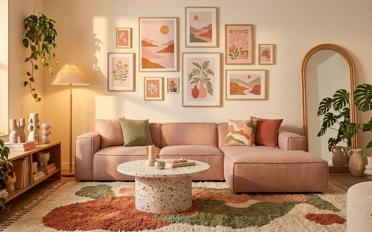
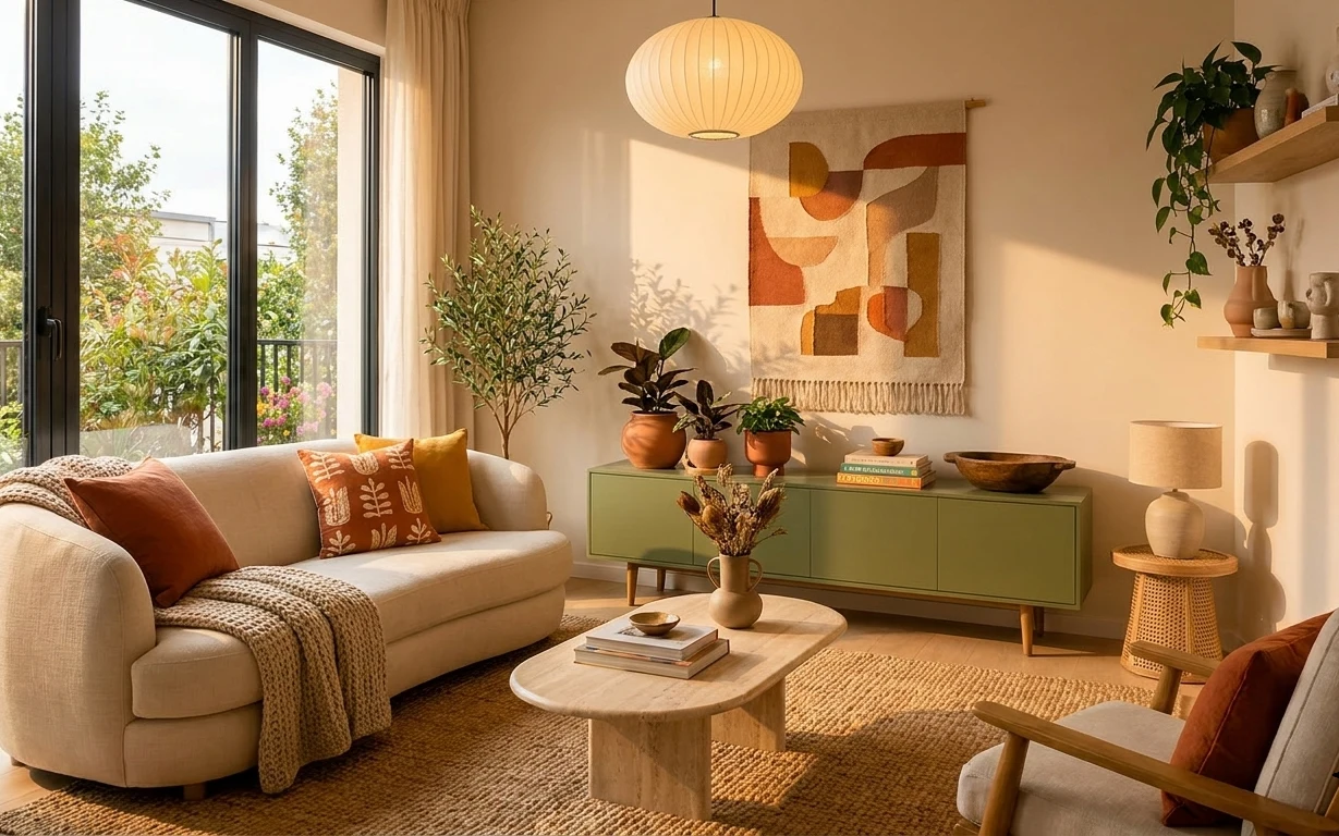
Why this beige-and-terracotta living room gallery wall is the weekend project of 2026
The trick in this kind of living room isn’t one “perfect” item—it’s the stack. You’ve got a multicolor rug under a round stone coffee table, a light-beige sofa with sage and terracotta throw pillows, and warm floor-lamp light that makes the whole gallery wall feel intentional. I’m especially drawn to the way the framed prints repeat earthy shapes, while the tall leafy plant adds height without clutter. For US homeowners working on a weekend, this is achievable because you can swap key pieces first, then build the wall art one frame at a time.
I once tried to “budget” my way through a gallery wall by buying random prints in different sizes. It looked fine from far away, then up close it felt like a collage instead of a plan. What changed my mind was treating the wall like a grid: same frame colors, related subjects, and spacing you can measure. After that, the room stopped looking like a set of purchases and started looking like a place.
Layer 1 — Area rug with multicolor abstract pattern ($120) Grounds the sofa and coffee table
This multicolor abstract area rug sits directly under the front edge of the light-beige sofa and under the round stone coffee table, so it does two jobs at once: it defines the seating zone and hides everyday wear. If you go with a solid rug, you’ll lose the “designed” rhythm the eye gets from the terracotta and sage tones. The trade-off is that patterned rugs are harder to match perfectly—so choose one where the colors already show up in your pillows or art. Start by centering it so the sofa feels intentional, not floating.
Pick a rug that repeats your wall-art colors
Match at least two tones you see in the framed prints so the gallery wall feels anchored, not separate.
Layer 2 — Ottoman footstool ($100) Adds a second soft landing point
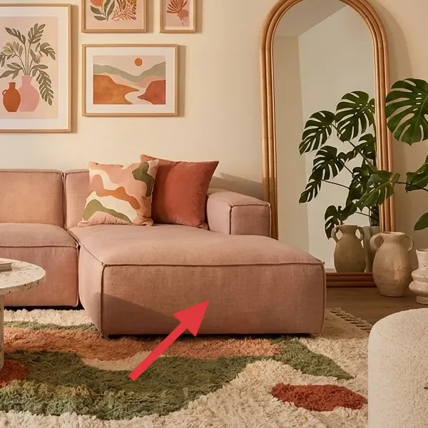
That ottoman footstool in the same light-beige family as the sofa is what makes the seating area feel flexible. It gives you somewhere to rest your feet without adding another big piece of furniture, which matters when your wall already has a lot going on. I’d rather add a footstool than another side table here because the coffee table is visually busy with the speckled stone top. The trade-off is practical: you’ll want to keep it clear of clutter so it still reads as “part of the set.”
Use the ottoman to keep the palette cohesive
If your throws and art lean warm (terracotta) and fresh (sage), a neutral ottoman prevents the colors from competing.
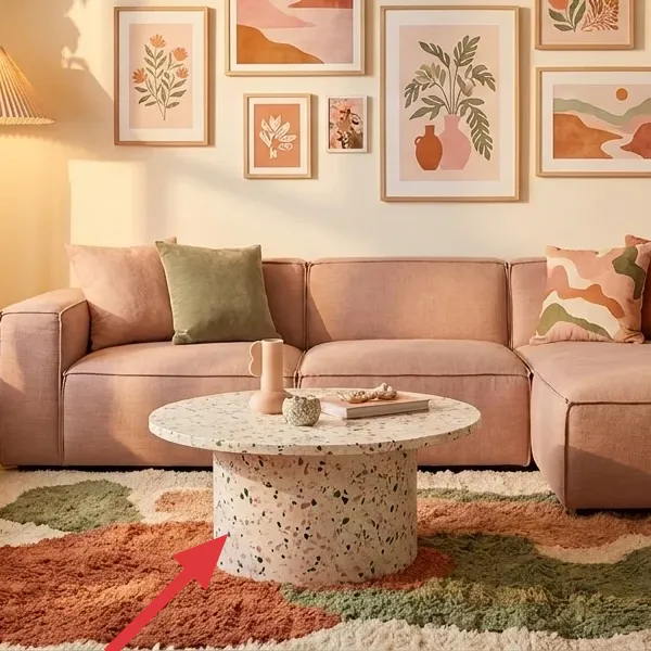
Layer 3 — Round stone coffee table ($100) Brings calm shape + tactile contrast
The round stone coffee table is the visual softener in a room with straight edges everywhere else—so it matters. The speckled, terrazzo-like texture reads earthy next to the plants and the beige wall color, and its shape helps the gallery wall feel less “strict.” If you choose a square coffee table, you’ll notice more corners pointing at the framed prints. The trade-off is weight and size: a stone-look top usually means you’ll plan delivery carefully and avoid moving it often. Let it set the room’s curve, and then repeat rounded shapes in accessories later.
Choose stone-speckle over glossy stone-look
The mottled finish hides dust and small scratches better, especially in a plant-forward living room.
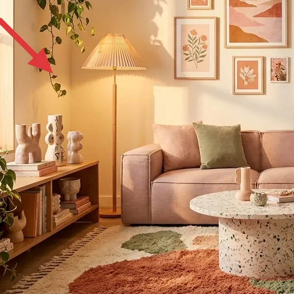
Layer 4 — Standing floor lamp ($80) Makes warm light do the heavy lifting
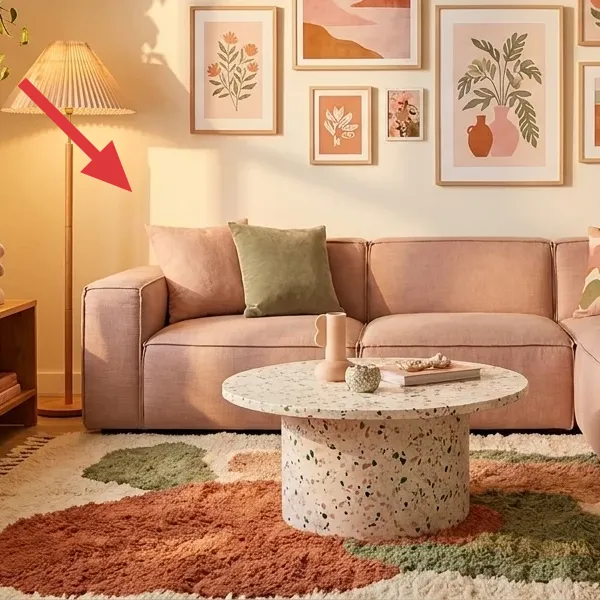
This standing floor lamp with a soft lampshade is what turns a beige room into something you want to linger in after dark. Placed near the sofa side, it washes the wall and frames without creating harsh glare, which is especially important when you have many framed art pieces. A bright overhead fixture would flatten the textures of the rug and coffee table, and it would make the gallery wall feel more like decoration than atmosphere. The trade-off: you’ll need to place it intentionally so the light hits the art and the seating zone, not the window. Do a quick test before you commit to bulb temperature.
Avoid cool bulbs with earthy neutrals
If your bulbs read blue-white, the terracotta tones in the art and pillows will look dull instead of warm.
Layer 5 — Arched wall mirror ($100) Adds shape and depth around the plants
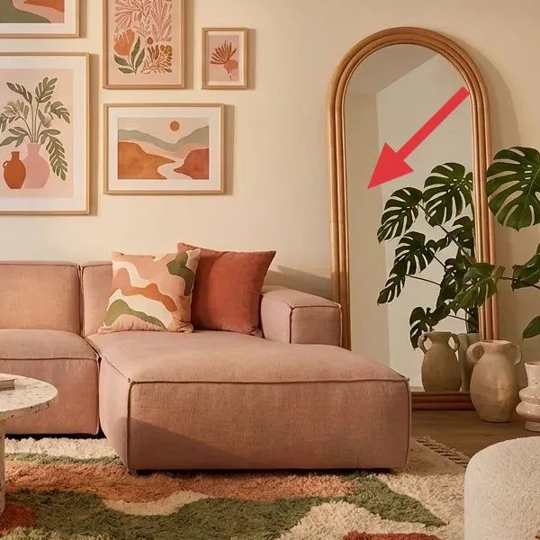
The arched wall mirror on the right balances the room’s more rectangular lines and gives the tall plant a “stage.” It also increases depth: you feel a second space behind the sofa even though the room layout is the same. If you replace it with a flat rectangle mirror, the wall loses that gentle arch that echoes the organic shapes in the framed prints. The trade-off is that arched mirrors can be slightly harder to center visually—so measure from the floor and aim for a height that makes the plant look framed, not crowded. Keep the mirror’s wood tone similar to the console table so everything reads cohesive.
Match the mirror’s finish to your wood console
That subtle coordination makes the plants and ceramics feel curated instead of scattered.
Layer 6 — Tall leafy plant ($60) Brings height without adding another furniture footprint
A tall leafy plant in the corner left of the lamp (and another plant near the mirror) is how this room gets volume without more furniture. The leaves add texture in a space that’s otherwise mostly textiles and paper art. I prefer a real, textured plant here because it works with the rug’s organic patterning and the speckled stone coffee table—both look more natural under greenery. The trade-off is upkeep: you’ll need light and occasional watering checks. If you’re between sizes, go taller rather than wider so the gallery wall still stays the visual focus.
Group plants with ceramics, not just greenery
Repeating vase shapes helps your plant styling look intentional even when the leaves change week to week.
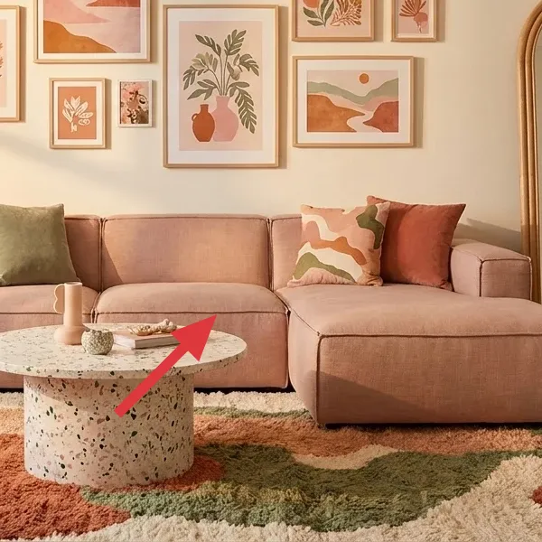
Layer 7 — Gallery wall of framed art prints ($440) Your DIY shortcut to a curated look
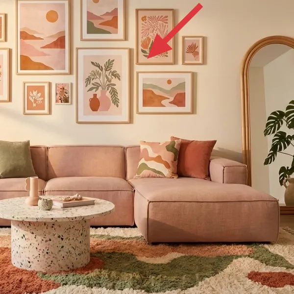
The gallery wall of framed art prints is the biggest “why this room feels finished” element. In a look like this, the frames share a similar light wood tone and the art themes repeat—earthy landscapes, botanical shapes, and warm abstract forms—so the wall reads like one collection rather than random purchases. Buying a full gallery set can add up fast, which is why making your own inserts is the smartest move you can make without redoing anything structural. The trade-off: your DIY prints won’t match store-perfect color every time, but if you keep the palette consistent (beige, terracotta, sage), the wall still looks cohesive.
Make it instead of buying it
Paint a set of mini gallery prints that fit your existing frame sizes, so you get the same “collection” look for less.
Materials
- Watercolor paper (or cardstock) — 8.5×11 sheets — craft store — $12
- Student acrylic paint set — 6–8 colors — art store — $22
- Small flat brush + fine liner brush — 2 brushes — craft store — $14
- Painter’s tape — 1 roll — hardware store — $6
Steps
- Pick a palette: beige/tan, terracotta, sage green, and a muted clay brown; mix test swatches on scrap paper.
- Tape a few simple composition rectangles (landscape band, plant sprig area, or abstract oval) on each sheet.
- Block in the largest shape first using diluted paint for a soft wash effect.
- Paint 1–2 secondary shapes (a leaf cluster, a small circle sun, or a curving hill) with medium paint coverage.
- Use the fine liner brush to add minimal details—avoid overworking any single print.
- Let the first batch dry fully, then clean edges with a damp paper towel.
- Repeat for 3–5 coordinating prints so the wall looks like a set, not a one-off.
- Insert finished prints into the frames, then step back to adjust spacing by moving frames on the wall before you lock them in.
- Take a quick photo in natural light to compare color consistency across the whole gallery wall.
Total DIY cost: $54 — saves about $386 over buying.
The cost, layer by layer
| Layer | Item | Cost |
|---|---|---|
| 1 | Area rug with multicolor abstract pattern | $120 |
| 2 | Ottoman footstool | $100 |
| 3 | Round stone coffee table | $100 |
| 4 | Standing floor lamp | $80 |
| 5 | Arched wall mirror | $100 |
| 6 | Tall leafy plant | $60 |
| 7 | Gallery wall of framed art prints | $440 |
| Total | $1,000 | |
If you want a cheaper variant, start with the rug and floor lamp, then swap the gallery wall cost by DIY-ing the prints and reusing basic frames. You can also choose a lightweight faux-stone coffee table instead of a heavier stone top.
What worked, what didn't (across the whole room)
This room’s formula is strong: one grounded rug, one tactile coffee-table surface, warm floor lamp light, and a gallery wall that repeats a consistent palette. The plant height keeps the composition from feeling flat, and the arched mirror adds breathing room around all the frames. The only weak point would be getting the lighting or frame spacing slightly off.
What worked
- The multicolor rug ties terracotta and sage together so the sofa pillows don’t feel random.
- The round stone coffee table softens the geometry created by the gallery wall’s rectangles.
- Warm floor-lamp light makes framed art look dimensional instead of flat against beige walls.
- The arched wall mirror adds depth and visually “relaxes” the dense wall of prints.
- Tall leafy plants introduce organic texture that matches the art themes and stone speckle.
- The ottoman footstool adds usable seating without adding another large visual block.
What didn't
- Too many unrelated frame styles would turn the gallery wall into a collage instead of a collection.
- A cool-toned bulb would fight the terracotta tones and make the beige walls read yellow.
- If the rug is too small, the sofa front edge looks disconnected from the coffee table.
- Oversized plants can crowd the mirror area and reduce the effect of the arch.
- If the coffee table is glossy, it highlights dust and reflections against framed art.
What we'd skip if we did it again
Skip buying a “matching” sofa-and-table set from the same retailer. You don’t need identical pieces—you need consistent color and texture, and that round stone coffee table does a better job of adding character than a generic set.
Skip cheap frame assortments with wildly different finishes. If your framed art prints don’t share a similar frame tone, the wall becomes busy for the wrong reasons, especially when there’s already a multicolor rug and plants in the room.
Skip adding more lamps just because the room has a lot of wall art. One standing floor lamp placed to wash the seating zone is enough; the gallery wall already brings complexity, and extra light sources can create glare on glass.
Frequently asked
How long does a weekend gallery-wall refresh like this usually take?
If you already have the frames, plan on about 4–6 hours for staging and spacing, plus 2–4 hours for DIY prints if you’re working in batches. The biggest time sink is not painting—it’s moving frames around on the wall until the spacing feels right. On day one, set up the rug and coffee-table placement first, then build the gallery around that layout.
If I rent, can I still get this look?
Yes—focus on the rug, sofa pillows, floor lamp bulb/placement, and removable plant styling first. For the gallery wall, use picture hooks/adhesives rated for your wall type, or hang fewer frames and concentrate on one cluster. You’ll still get that curated feel if the palette is consistent and the spacing is measured, even with smaller artwork.
My room is smaller—should I change the plan?
Shrink the number of framed prints before you shrink the rug. A smaller gallery can still look intentional if you keep the frames aligned and repeat the same frame finish. Choose a floor lamp with a narrower footprint and keep the ottoman in the same neutral tone so the seating area feels continuous. The arched mirror is especially helpful in small rooms because it adds depth.
What if my room is bigger and feels empty?
Go larger in one place instead of adding random pieces everywhere. Either increase the rug size so the coffee table sits fully on it, or add one or two more framed prints to the gallery wall while keeping frame tones consistent. For plants, add height first—one taller plant reads more cohesive than multiple small ones scattered around.
Where should I shop differently to stay under budget?
Shop for statement items like the arched mirror and floor lamp in secondhand markets, then reserve new purchases for the rug and any pieces that need to match sizing. For the gallery wall, DIY inserts are the cost lever. If buying frames, aim for a single finish—light wood or matching black—and reuse them as your art collection grows.
What’s the biggest mistake people make with this room type?
They buy lots of frames but don’t commit to a palette or a spacing method. Random subjects and mismatched frame tones make the wall feel busy, which clashes with the rug’s pattern. Pick 2–3 repeat colors from the rug and sofa pillows, then keep the frames consistent and measure spacing before you hang anything permanently.
More in Living Room
Under $1,000: a weekend living room gallery refresh with plants
A living room gallery wall, warm lamp light, and layered neutrals—refreshed with a DIY mini-art set. This weekend-friendly plan is designed…
Under $400: the earthy sofa seating corner refresh for shared renters
A move-friendly refresh for a living-room sofa seating corner with an earthy rug, knit throw, and warm terracotta accents. This is an under…