- Square footage
- Works in small kitchens and big islands
- Cost
- $350 total
- Difficulty
- Easy—mostly textile and styling swaps
- Renter-safe
- No drilling; everything boxes up
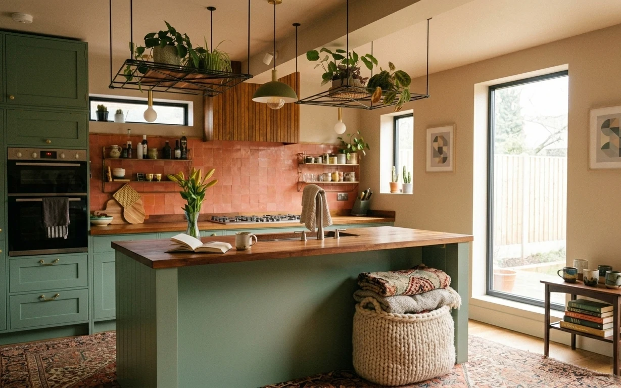
Why terracotta-and-ink shelves are the kitchen island of 2026
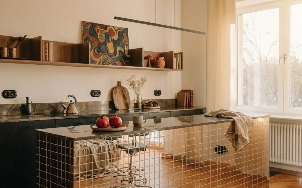
The first thing I notice is how much the island already “talks”: the black countertop, warm wood shelves, and that terracotta-leaning abstract print. The styling is built from textures—light beige fabric folded at the edge, matte ceramic fruit tones, and the slightly dry look of branches in a vase. That mix is the trick for shared spaces: you’re not competing with the room’s fixed surfaces; you’re adding soft, movable cues right on the island. For roommates and students, it’s a one-afternoon refresh that survives the next move because everything here comes off in boxes.
I used to overthink this and buy matching sets (the same tray in three places, the same neutral everywhere). In a rental, that’s how you end up with “decor clutter” instead of a focal point. What changed for me was treating the island like a still-life: one fabric moment, one sculptural plant/branch, one object cluster, and one piece of wall art. Once the island has a clear center, the rest of the kitchen feels calmer, even if the countertops are never perfectly empty.
Layer 1 — light beige throw blanket ($60) draped over island edge
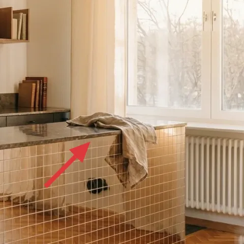
A light beige throw blanket draped over the island edge adds instant softness against the black countertop and tiled front. In this photo, the fabric sits like a casual fold—long enough to read as texture, not so long that it swallows the counter. I like this over a dedicated “kitchen towel rack” because cloth gives you warmth without adding more hardware to the room. The trade-off is that you’ll need a quick shake-out or laundering occasionally, but it’s still totally moveable and box-friendly for the next lease.
Use a fold, not a full hang
A short drape keeps the island visually light and makes the blanket easy to roll up before you pack.
Layer 2 — fruit bowl on kitchen island ($35) for a color-and-height anchor
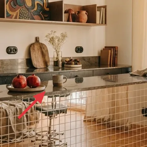
The fruit bowl is the island’s color cue—those warm reds and bronzes brighten up the dark counter without needing any paint or lighting changes. The bowl also brings height: it breaks up the flat plane of the countertop with a rounded silhouette, so the island feels styled even when you’re not actively “decorating.” I’m choosing a fruit bowl over a small coaster set because it reads as one intentional object, not five little items competing for attention. The trade-off is practical: the fruit is temporary, but the bowl stays, so swap in whatever you have on hand.
Keep it functional
If the fruit disappears, the bowl still works as a catchall for citrus, onions, or quick swaps.
Layer 3 — small vase with dried branches on the counter ($40) adds texture that doesn’t need watering
A small vase with dried branches gives you organic texture that holds its shape for weeks, which is perfect for shared schedules. The branches in the hero image look airy and slightly muted, so they soften the visual weight of the tiled backsplash and the straight lines of the island front. I’d rather do dried branches than fresh flowers here because fresh can go fast and becomes another chore. The trade-off is dust: expect a light wipe now and then, and pick a vase shape you can clean easily when it’s time to pack.
Choose matte over glassy
Matte ceramics and warm-toned vases photograph better and blend with wood shelves.
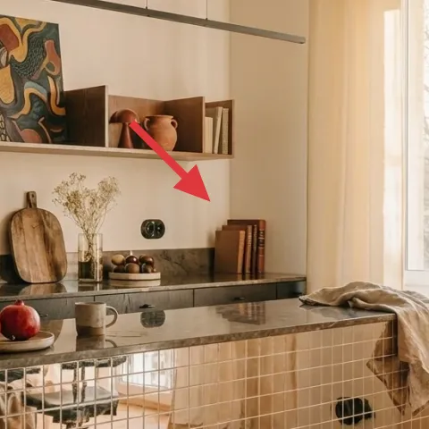
Layer 4 — stack of books on the upper shelf ($15) for a tight, shelf-height rhythm
The books on the upper shelf give you “designed” height without adding new objects to the island surface. In the photo, the stack sits near the right side and acts like a visual brace for the abstract art, balancing the darker countertop below. I’m calling this out because in rentals, a lot of people fill shelves with random knickknacks; a book stack is cleaner and easier to move. The trade-off is that book covers can clash, so choose covers that stay within the room’s palette—warm neutrals, charcoal, and terracotta-leaning accents.
Don’t overfill the top shelf
If everything on the shelf is tall, the island loses its center; keep the stack compact so the art stays readable.
Layer 5 — framed abstract wall art on the shelf wall ($80) one print with warm movement
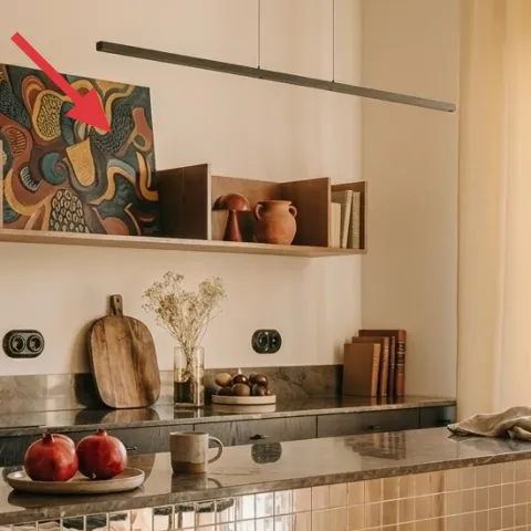
That framed abstract print is doing more than decoration—it’s the color bridge between the terracotta-toned countertop elements and the warm wood shelves. Because it’s vertical, it also “holds” the eye when the island objects are spread across the counter. For this layer, I like keeping the subject simple (one print) instead of going for a multi-print gallery wall that’s harder to pack and less forgiving if the landlord changes wall placement. A real move-friendly approach is to DIY the artwork on cardstock and pair it with a lightweight frame you can reuse later.
Make it instead of buying it
This hand-painted abstract on cardstock lets you match the terracotta-and-ink palette while keeping the frame lightweight for future moves.
Materials
- Cardstock sheet, A4 or letter size — 1 — craft store — $6
- Student acrylic paint set (small tubes) — 1 — art supply — $12
- Small foam brush pack — 1 — craft store — $6
- Lightweight tabletop/poster frame — 1 — discount store — $20
Steps
- Sketch 3–5 block shapes lightly on the cardstock (no perfection—just placement).
- Paint the largest shape first, then let it dry for a cleaner edge.
- Layer smaller brushy marks in ink-like dark tones, then add terracotta accents last.
- Let the paint fully dry, then trim the cardstock to fit inside the frame mat.
- Insert into the frame and secure with the frame’s back clips or tabs.
- Test it on the shelf wall placement, then pack the whole frame as one piece for moving day.
Total DIY cost: $44 — saves about $36 over buying.
Layer 6 — copper kettle on the countertop ($35) adds shine without extra clutter
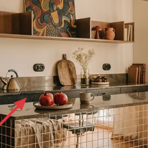
A copper kettle brings a reflective, slightly rustic note that plays well with the warm wood shelves and the black countertop. The shape also reads well at distance: the curved body and spout create a clear silhouette, so the island looks styled even when you’re not looking closely. I chose this over smaller single items because the kettle acts like a “statement tool” object—useful as well as decorative. The trade-off is that metal can show smudges, so keep a microfiber cloth nearby for quick wipe-downs, and pack it carefully so it doesn’t bump other objects.
Pair metals with matte textures
Let the kettle’s shine contrast with matte ceramics and the soft throw blanket.
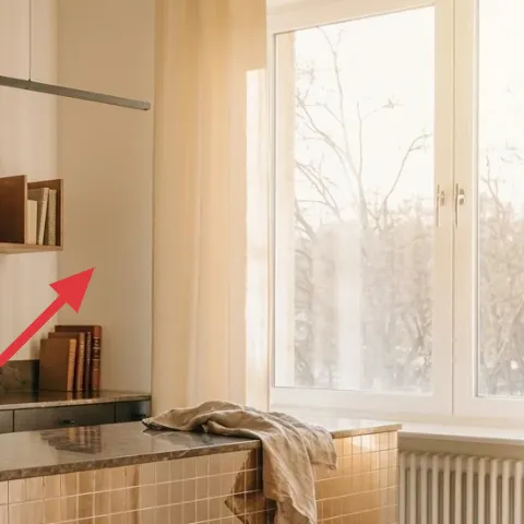
Layer 7 — sheer beige curtain panels for the window ($80) softens daylight and frames the island
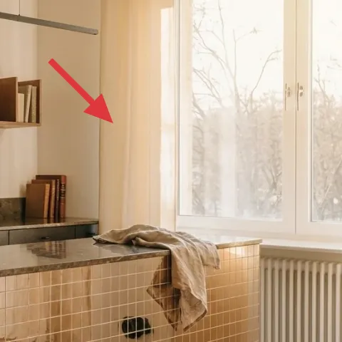
Sheer beige curtains soften the brightest part of the kitchen and make the island feel more “settled,” especially when sunlight is strong. In the photo, the light fabric keeps the window airy while adding a warm tint that harmonizes with the terracotta accents and wood tones. I’m choosing sheers instead of heavier drapes because they pack down smaller and don’t overwhelm the room’s lines. The trade-off is privacy: sheers are best when you want softness and can rely on daytime light, but if you need more coverage later, switch to a different panel set.
Fold for packing
Fold curtains like sheets so they slide into wardrobe boxes without creasing permanently.
The cost, layer by layer
| Layer | Item | Cost |
|---|---|---|
| 1 | Light beige throw blanket | $60 |
| 2 | Fruit bowl | $35 |
| 3 | Small vase with dried branches | $40 |
| 4 | Decorative book stack | $15 |
| 5 | Framed abstract wall art (DIY) | $80 |
| 6 | Copper kettle | $35 |
| 7 | Sheer beige curtain panel pair | $80 |
| Total | $345 | |
A cheaper variant keeps the same palette but swaps one bold piece for a budget version: choose an $40 curtain pair instead of $80, and buy a simpler frame while keeping the cardstock art handmade.
What worked, what didn't (across the whole room)
The island looks cohesive because the warm palette shows up in three places: fabric, ceramics, and one framed print. The system stays packable because nothing depends on drilling or permanent changes. The only area that can tip into clutter is when shelf items multiply.
What worked
- The beige throw adds softness that counterbalances the black countertop and tiled front.
- The fruit bowl gives color contrast and a readable focal point on a flat surface.
- Dried branches bring organic texture without daily maintenance.
- One framed abstract print anchors the warm-modern palette across shelves and counter.
- The copper kettle adds shine and silhouette, not another tiny object to manage.
- Sheer curtains keep daylight diffused so the island styling looks intentional.
What didn't
- Too many small shelf objects would crowd the abstract art and make the island feel busy.
- Highly glossy ceramics can show fingerprints under bright window light.
- Overlong fabric on the island edge can snag or drag during cooking and cleanup.
- If the book stack grows too tall, it steals attention from the framed print.
What we'd skip if we did it again
Skip a multi-print gallery wall in a kitchen this close to the window. Frames near daily sightlines get visually noisy faster than in a living room, and multiple pieces are harder to pack during move-outs.
Skip matching sets where every object comes from the same retailer. In this palette, one “anchor” (the abstract print) plus varied textures reads more lived-in than perfectly coordinated decor.
Skip super-delicate styling items that can’t handle quick cleaning. When a kitchen counter is part prep space, choose objects that can be wiped down and still look good after a rough week.
Frequently asked
How long does this kind of kitchen island refresh take?
Plan on 2–3 hours if the frame artwork is ready and you’re only swapping objects and styling the island. The DIY artwork adds another 45–90 minutes depending on drying time and trimming. Packing for move-out is usually just folding textiles and boxing the framed print and countertop items.
Is this workable if I can’t change anything on the walls?
Yes. The only wall element here is framed abstract art, which you can remove and transport. If your lease allows Command-strip style hanging, use a removable method that won’t damage paint. The rest—the throw, curtain set, and counter objects—can all be swapped without touching fixed surfaces.
What if my kitchen island is smaller or the counter runs shorter?
Scale by volume, not by number of items. Keep one fabric moment, one vase/plant texture, and one color object cluster (like the fruit bowl). If the island is tiny, reduce the book stack size and make the framed print the only larger “vertical” element.
What if my counters aren’t black—can I still copy the look?
The palette works with many counter colors as long as you keep the warmth in terracotta-leaning art and wood tones. Swap the copper kettle for another warm-metal object if needed, and use the beige throw to create the same soft contrast. The goal is texture and height, not exact materials.
Where should I shop for these kinds of move-friendly items?
Start with discount home stores for the curtain panels and lightweight frames, then check craft stores for cardstock and small acrylic paint sets. For ceramics and countertop objects, thrift and secondhand shops are great—look for items that already feel warm-modern and wipe-clean. Books can be sourced from your own stack or a quick thrift find.
What’s the biggest mistake on this type of kitchen refresh?
Overcrowding the island. If every spot has a different tiny object, the room starts to feel busy instead of curated. Limit the island to a few intentional pieces and let the framed wall art and curtains do the “big mood” work. Then keep the shelf styling tight enough to read clearly.
More in Kitchen & Dining

Under $350: terracotta-and-ink kitchen island styling refresh
A budget-friendly kitchen island refresh that leans warm and lived-in, using moveable swaps like a draped throw, styling-ready counter obje…
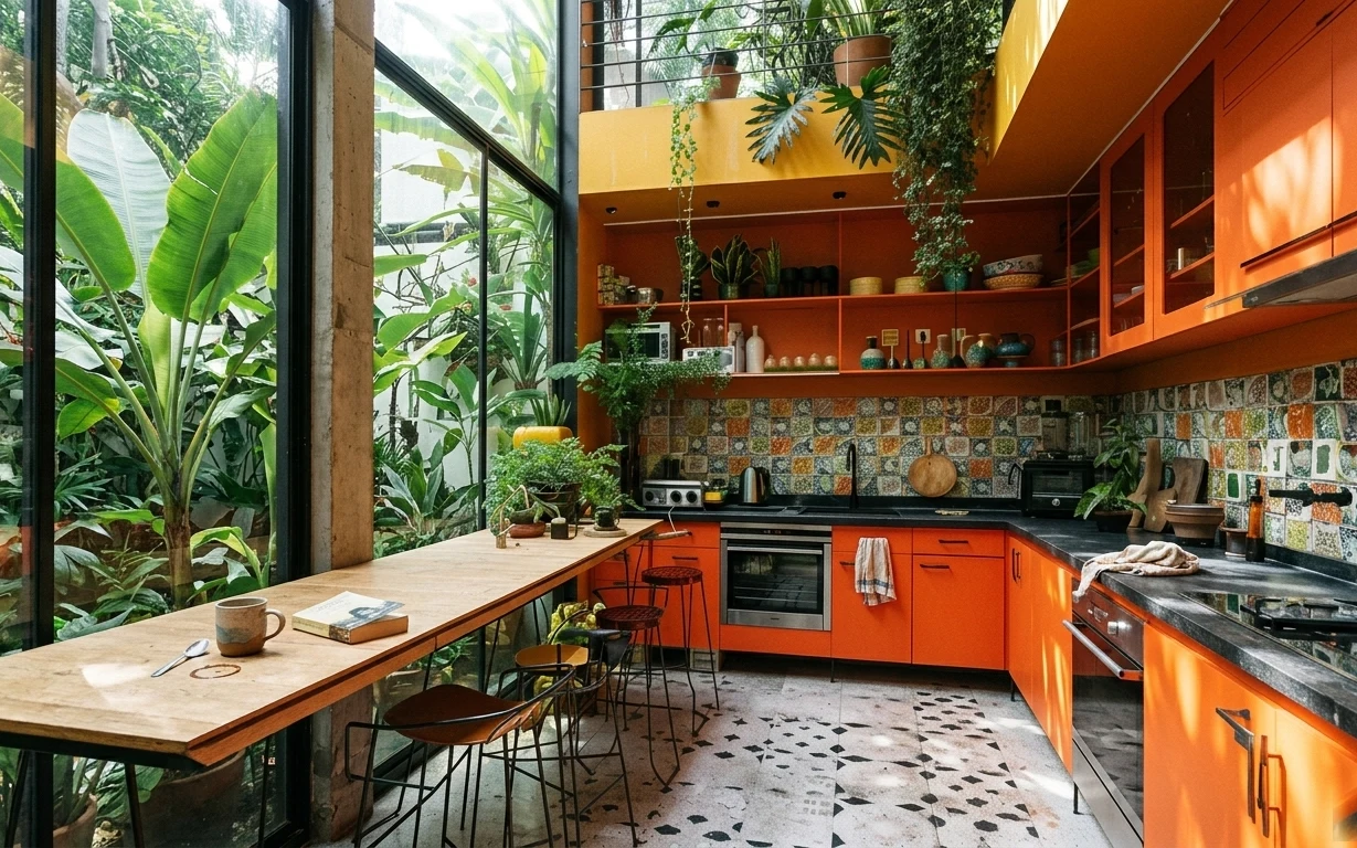
7 kitchen swaps for renters’ budgets ($400)
A bright, plant-filled kitchen refresh for shared housing with move-ready swaps. This $400 plan focuses on a patterned rug, bar stools, and…
Rust-and-sage island seating area refresh, $600
A move-friendly island seating area kitchen refresh for shared housing, built from 7 swap-in layers up to a $600 total. The look leans rust…