- Best for
- kitchen peninsula styling
- Time
- 2–4 hours (mostly styling + labels)
- Difficulty
- Easy (no drilling, mostly swaps)
- Cost
- Under $400
Why warm linen-and-wood kitchen peninsula ideas are the move-friendly kitchen peninsula of 2026
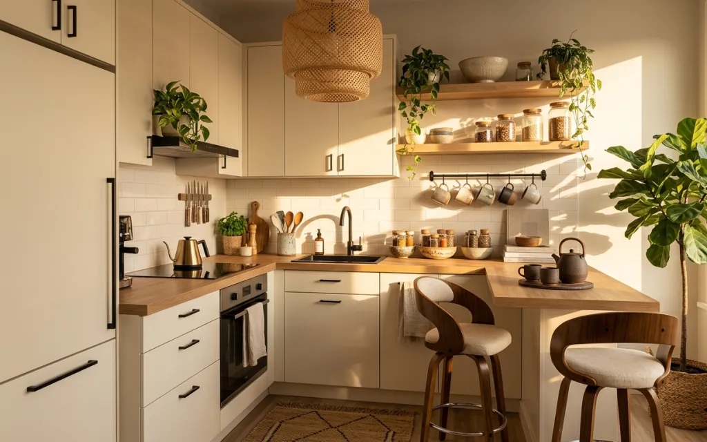
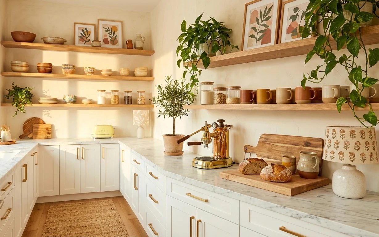
Start with what’s already working: the warm walnut tones, the white tiled backsplash, and the golden daylight hitting the peninsula make this style feel calm without trying too hard. The biggest visible “upgrade” is a small patterned area rug under the work zone, plus two soft textile moments—one hanging and one folded near seating. Then the pendant shade adds texture overhead, and the countertop stays intentional with a small plant, a tidy stack of cutting boards, and a kettle that looks good even when you’re mid-cook. For renters, all of this is doable on a budget and leaves with you.
I used to treat kitchen styling like it was either “practical” or “pretty,” and I’d end up with a counter full of clutter because I was afraid of making it staged. What changed for me was seeing how a few repeat materials—wood, cream fabric, and sage-green plants—create cohesion. When I brought in a rug that tied into the wood tones, the rest stopped feeling like separate items. This is that same idea, but with jar labels so the shelves look finished.
Layer 1 — small area rug ($120) Patterned underfoot, stays put
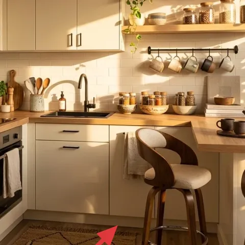
A small patterned area rug anchors the peninsula work zone and softens all that hard surface: white tile, smooth cabinet fronts, and clean counter lines. In the photo, the rug sits where you stand and move, so it earns its keep by visually “grounding” the wood chair and countertop. I like choosing a pattern with a warm neutral base because it won’t clash with everyday items like dish towels or jars. The trade-off is that you’ll want a rug you can shake out (not a thick shag) so it stays practical in a kitchen.
Go for a low-pile rug
Low pile reads clean in photos and is easier to sweep when flour, coffee grounds, or crumbs happen.
Layer 2 — hanging light-colored dish towel ($30) One repeat fabric note
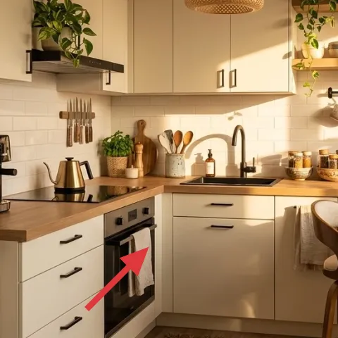
The hanging light-colored dish towel is a tiny styling move that makes the whole peninsula feel lived-in. It adds a soft, light texture right in the line of sight between backsplash and countertop, so the space looks warmer without changing any landlord-installed surfaces. I’d choose a towel in a cream or pale warm tone (not bright white) so it matches the light in the photo and doesn’t look stark next to tile. The trade-off is that towels need occasional washing and swapping—kitchen decor is honest like that.
Match the towel to the rug palette
If the rug has warm beiges or oatmeal tones, keep your towel in the same family to avoid “two separate themes.”
Layer 3 — woven pendant lamp shade ($60) Texture overhead, not a glare
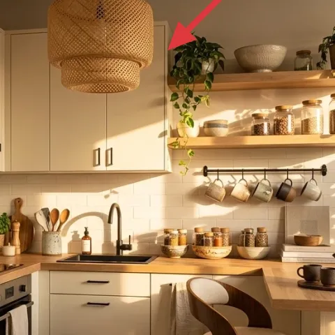
The woven pendant lamp shade brings texture where kitchens usually feel flat—right above the peninsula. In the hero image, the shade’s warm weave adds depth and filters the light into softer contrast across the countertop and open shelving. I’d pick a woven shade over a smooth glass one when you already have clean lines and light-colored cabinets, because the texture gives the room a bit of “handmade” character. The trade-off: woven shades can collect dust, so plan on wiping or vacuuming regularly.
Dust it gently, often
A soft brush attachment keeps the weave looking fresh without damaging the fibers.
Layer 4 — small potted plant on counter ($35) Sage-green warmth in a tight spot
That small potted plant on the counter is the color and life cue the peninsula needed. The sage-green tone repeats the natural palette already hinted by the large plant near the window, so the kitchen feels cohesive instead of randomly decorated. I like using a smaller plant where it can be reached and maintained easily—less risk of a “pretty plant that dies in the back corner.” The trade-off is you’ll need to rotate it for even growth and keep an eye on light near the window versus the darker parts of the counter.
Choose a plant that likes your light
Counter-top plants dry faster, so the right light conditions matter more than you’d think.
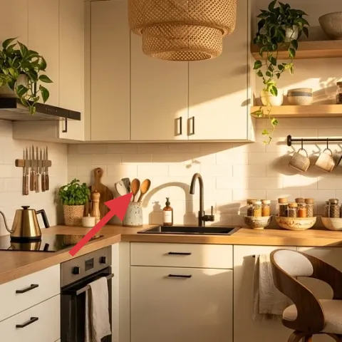
Layer 5 — stack of wooden cutting boards on counter ($20) Instant organization, no drilling
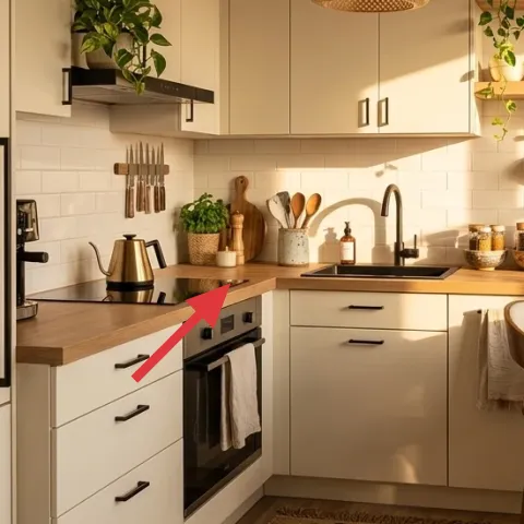
The stack of wooden cutting boards does double duty: it’s functional, and it looks curated. Set near the prep area like in the photo, the boards add warm wood texture and create a “designed” moment without needing shelves, hooks, or any hardware changes. I’d style them so the tallest piece sits slightly angled—enough variation to look intentional, not messy. The trade-off is space: stacking boards means you’re choosing what gets temporarily “put away” versus what stays on display.
Angle one board for movement
A slight lean makes the stack feel styled, not shoved in a corner.
Layer 6 — kettle on countertop ($25) A practical object that reads decorative
A kettle on the countertop turns a daily tool into decor because its shape and color sit visually between backsplash and countertop. In the hero image, the kettle’s warm tone and classic silhouette echo the wood elements and keep the space from feeling too “empty and sleek.” I like keeping the kettle where you can grab it without thinking—if it’s placed purely for aesthetics, it usually ends up moved once real life starts. The trade-off is that you’ll need to keep the surrounding items tidy so the kettle doesn’t feel like clutter.
Don’t park it beside the dish towel
If they’re too close, you’ll constantly have to adjust where towels, jars, or lids land when you cook.
Layer 7 — apothecary-style jar labels on ceramic jars with lids on open shelves ($45) DIY polish for the shelf jars
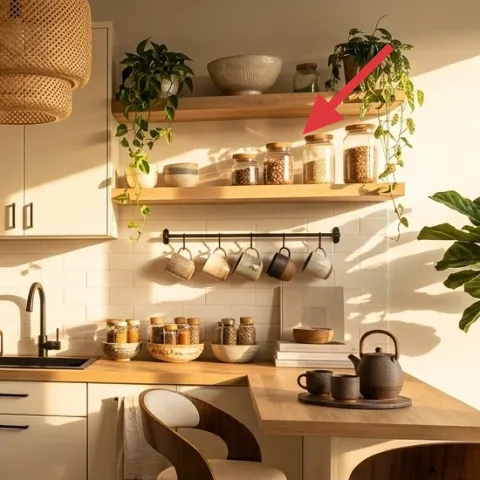
Those ceramic jars on the open shelves already look like they belong together; labels are the final step that makes them feel intentional instead of “randomly collected.” Apothecary-style labeling also makes everything easier to spot while you’re cooking, because you’re not guessing what’s in each container. I’d go for simple printed names in a consistent font, then vary the jar label density so the shelves don’t become one uniform block. The trade-off: labels require a little care when you clean the jars, but it’s a renter-friendly swap that you can peel off when you move.
Make it instead of buying it
DIY apothecary jar labels by printing coordinated names for the ceramic jars, then sealing them so they look crisp in daylight.
Materials
- Printable label sheets (laser or inkjet) — 1 pack — Staples — $10
- Sheet label protectors or clear transfer tape — 1 roll — Office supply store — $8
- White gel pen (for small details) — 1 — craft store — $6
- Microfiber cloth + jar-safe cleaner wipes — 1 set — grocery/online — $4
- Label design app template (optional) — 1 month — app store — $7
Steps
- Measure one jar’s label area using a soft tape or paper strip.
- Design a label layout in a simple template with one font style and varying text size.
- Print one test label on plain paper, then adjust margins until it sits straight on the jar.
- Print your final labels on label sheets.
- Clean the jar glass/ceramic area, then let it fully air-dry.
- Apply the label using a straight edge, smoothing from center outward.
- Seal with clear tape or a protector to keep the ink from smudging.
- Let everything set undisturbed so the edges stay flat in the kitchen light.
Total DIY cost: $35 — saves about $10 over buying.
The cost, layer by layer
| Layer | Item | Cost |
|---|---|---|
| 1 | Small area rug | $120 |
| 2 | Light-colored dish towel | $30 |
| 3 | Woven pendant lamp shade | $60 |
| 4 | Small potted plant | $35 |
| 5 | Stack of wooden cutting boards | $20 |
| 6 | Kettle | $25 |
| 7 | Apothecary-style jar labels | $45 |
| Total | $335 | |
If you want a cheaper version, swap the rug for a simpler flat-weave in the same warm neutral family, skip the gel-pen detail on jar labels, and choose a smaller plant. You’ll still get the textured pendant + softened textiles look, just with fewer “styling extras.”
What worked, what didn't (across the whole room)
The best results came from texture and repetition: the woven pendant shade, warm wood cutting boards, and the cream-toned textiles all share a similar palette. Styling the peninsula with a grounded rug also made everything feel intentional instead of temporary. The only weak spot is that open-shelf jars need occasional maintenance to keep labels neat and readable.
What worked
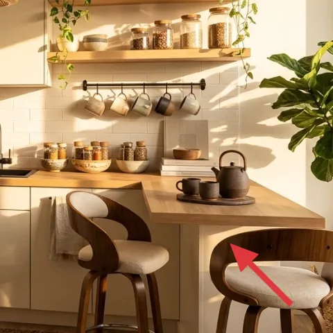
- The small patterned rug visually anchors the standing zone and makes the wood furniture feel planned.
- Two light textile moments (towel and folded towel) keep the peninsula from looking too sterile.
- The woven pendant shade adds depth overhead without fighting the cabinet lines.
- Wood cutting boards add warmth while still serving a practical cooking purpose.
- A countertop plant brings sage-green color closer to the action instead of only near the window.
- Jar labels make the open shelves look curated, not “collected over time.”
What didn't
- If the towel color is too bright, it highlights grout and tile contrast instead of softening it.
- When the kettle area gets messy, it’s harder to “hide” clutter than on a bare counter.
- Woven pendant shades show dust more quickly than smooth metal or glass.
- Open-shelf jars require quick wipes so labels stay crisp in daylight.
What we'd skip if we did it again
Skip a high-pile rug on a peninsula. It looks plush at first, but it’s harder to sweep and drags crumbs into the fibers—especially in a kitchen work zone.
Skip “too many small extras” on the counter. If there’s a kettle, towel, and boards all at once, pick one more object max so the space still reads calm.
Skip overly complex jar-label designs. One consistent font and clean spacing looks more expensive than lots of tiny typography, and it stays readable as the kitchen gets busy.
Frequently asked
How long does this renter-friendly peninsula refresh take?
Plan on 2–4 hours total. The rug positioning and towel swap are quick, and the pendant shade choice is the only part that can slow you down if you need to make sure it’s centered. The jar-label DIY is usually the biggest time sink—printing, measuring, and applying the labels cleanly takes the most patience.
Will this work in a smaller kitchen with less counter space?
Yes. In a smaller kitchen, go lighter on countertop volume: use a thinner rug or a smaller rug footprint, and keep the cutting boards stacked so they don’t sprawl. Choose one plant location—either counter or near the window—so you don’t crowd the peninsula. Jar labels still make sense because they add “order” without taking physical space.
What if I’m renting and can’t change the lighting?
You can still keep the vibe. If the woven pendant shade can’t be swapped in your rental, focus the budget on the rug, textiles, and jar labels—those do most of the visible work. The kitchen still reads warm and intentional because the palette (wood, cream fabric, sage greenery) is created through movable decor, not ceiling changes.
Where should I shop for the pieces without overspending?
For a similar look, shop for the rug and towels at big-box home stores or local TJ Maxx-style discount retailers when you’re balancing budget. The pendant shade can come from lighting departments online, while jar-label materials are easiest from office supply and craft stores. Plants are often cheaper at grocery garden centers than at dedicated nurseries.
What’s the biggest mistake people make on a kitchen peninsula refresh?
Over-styling the counter so it looks curated once and then becomes clutter within a week. The fix is simple: pick one “hero” object per zone (rug underfoot, one countertop plant, one functional display like boards or a kettle) and repeat the same warm materials across the set. Jar labels help because they create structure even when day-to-day stuff moves around.
More in Kitchen & Dining

Under $400: 7 renter-friendly kitchen swaps for a warmer peninsula
A renter-friendly peninsula refresh that leans japandi: a pattern rug, softer textiles, a woven pendant shade, and styled countertop plants…
Under $700: warm terracotta kitchen counter-and-shelf refresh
A bright, terracotta-accented kitchen counter-and-shelf corner built in one weekend. Use a jute runner, a brass faucet, and styled open woo…