- Best for
- textiles + framed art that renters can pack up
- Cost
- about $378 for 7 layers
- Difficulty
- easy weekend refresh
- Time
- 2–4 hours total
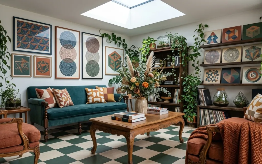
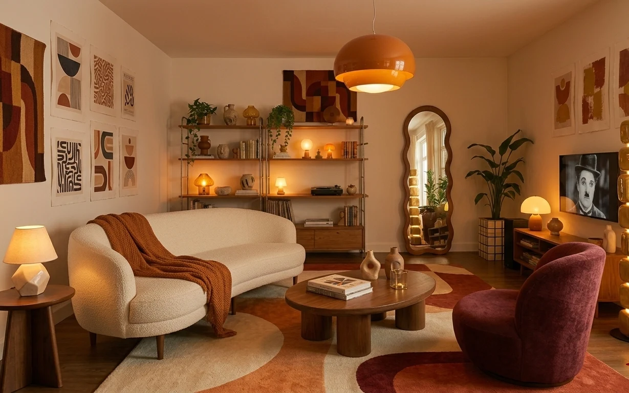
Why this teal-and-rust eclectic set is the living room of 2026
Bright daytime light from the skylight keeps everything feeling open, even with bold color. The teal sofa reads as the anchor, while the burnt orange throw and geometric frames give the room its pattern rhythm. The mix of textures—woven throw blanket, glassy vase surfaces, and leafy vines—stays cozy because the colors repeat in small doses. This is doable for renters because it leans hard on removable styling pieces: textiles, framed art, and potted plants that can travel with you.
I used to overthink “matchy” when I staged my own place, and I kept buying coordinating decor sets instead of choosing just a few anchors. What finally worked was copying the way this room layers: one strong furniture color (teal), one warm accent (burnt orange), and one visual theme (geometric circles) repeated across frames. You get a collected look without locking into a full theme at once.
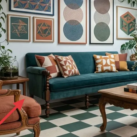
Layer 1 — woven throw blanket on right armchair ($35) Textural warmth for the darker corner
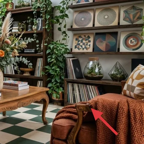
The woven throw blanket on the right armchair adds the room’s warm, textured contrast right where the light thins out. It’s the easiest way to bring in the burnt orange note without committing to a whole new upholstered piece, and it reads from across the checkered tile floor. I’d rather buy one throw like this than chase a matching “chair makeover” because a blanket is move-friendly and instantly adjustable. The trade-off is that you have to fluff and reposition it occasionally, but that’s also how you keep it looking styled.
Layering rule for throws
Drape the throw so one edge touches the seat cushion—doing that keeps it intentional instead of “overnight.”
Layer 2 — decorative throw pillow on teal sofa ($18) A quick hit of pattern inside the anchor color
This decorative pillow on the teal sofa brings pattern without changing the anchor color, which is exactly what a renter refresh needs. The geometric look works with the framed wall art because they share curved-circle + block shapes, even though the colors shift. If you tried to match everything perfectly, the sofa would feel busy; by choosing one pillow with strong pattern, you get balance. I like putting the pillow closer to the center of the sofa, not jammed into the arm, because it keeps the composition readable from the coffee table side.
Why one pillow is enough
On a busy wall, too many “statement textiles” start competing, so pick one hero pillow and repeat the idea elsewhere.
Layer 3 — wood coffee table ($160) Warmth + a place to style repeated shapes
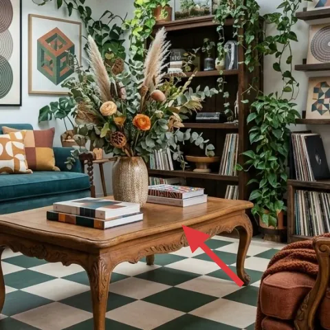
The wood coffee table is the grounding surface that makes teal and burnt orange feel connected instead of clashing. Its warm tone echoes the shelving and keeps the room from going too cool, especially on a white-wall background. I’d choose a statement table here over adding more decor to the wall because it gives you a large, walk-past area to style—vase, books, and objects—without changing the room’s layout. The trade-off is that a wood table shows dust, so styling looks best when the top is kept to a small cluster rather than spread out.
Don’t over-style the tabletop
If every inch is covered, the geometric wall art won’t have breathing room and the room reads heavier.
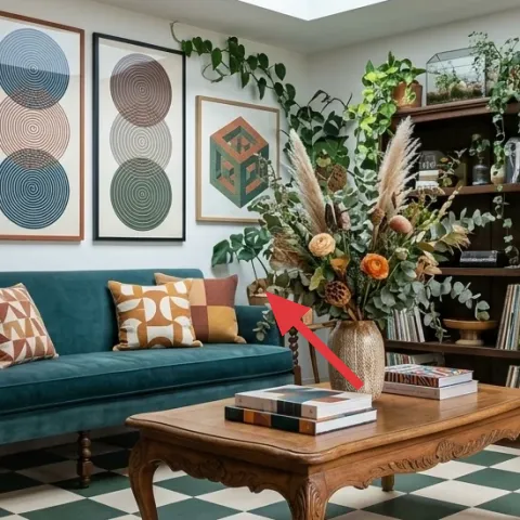
Layer 4 — tabletop potted indoor plant ($25) Living “green” that doesn’t require shelf changes
The tabletop potted indoor plant adds that leafy layer that makes the room feel grown-in instead of staged. In this setup, it also bridges between the wall art and the upholstered seating—so your eye doesn’t bounce only between colors and shapes. I picked a smaller tabletop plant option instead of a bigger floor plant because it’s easier to tuck into a rental space and it moves with you when furniture rearranges. The trade-off is scale: you’ll need to rotate the pot sometimes so it doesn’t look lopsided as it grows.
Angle the leaves, not just the pot
Turn the pot so the densest leaves face into the room—foliage should look like it’s “reaching.”
Layer 5 — framed geometric wall art print ($50) Repeat the circle motif with one removable piece
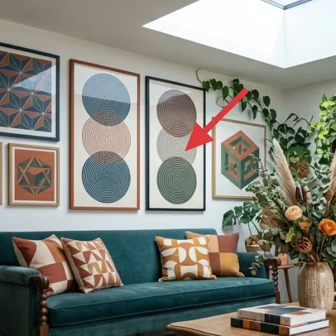
One framed geometric wall art print gives you the room’s signature pattern language without needing a full gallery wall from scratch. It also anchors the sofa color story by echoing the circle/line rhythm already in the scene, so the teal feels intentional instead of random. This layer works especially well for renters because a single frame is easier to hang with removable hooks and can be swapped out later. The trade-off is that choosing the right scale matters—too small looks lost, too large overwhelms the wall near the seating.
Make it instead of buying it
DIY a framed geometric print on cardstock so you can match the circle pattern vibe while keeping the cost under the retail price.
Materials
- Cardstock (8.5×11 or similar) — 2 sheets — craft store — $4
- Acrylic craft paint (2–3 colors) — set — craft store — $12
- Fine-tipped paint marker or small detail brush — 1 — craft store — $6
- Black paint marker or ink liner — 1 — craft store — $8
- Pre-cut frame mat or backing paper (if needed) — 1 — craft store — $8
- Removable clear acrylic spray (optional for protection) — 1 small can — craft store — $4
Steps
- Sketch a simple composition of circles and angular blocks lightly in pencil.
- Paint the background shape areas first, then set the cardstock aside to dry fully.
- Paint concentric circles or arc motifs with one color, letting dry between layers if you want crisp edges.
- Go back in with the detail brush/marker to add the thin lines and accents.
- Let the entire piece dry, then check the contrast from a few feet away.
- If you’re using the optional clear spray, apply a light coat and allow it to fully dry.
Total DIY cost: $38 — saves about $12 over buying.
Layer 6 — decorative ceramic vase on coffee table ($30) A small “still life” that echoes the greenery
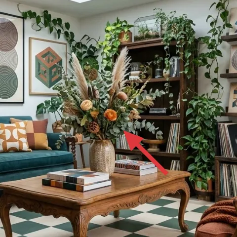
The decorative ceramic vase on the coffee table creates a focal cluster when paired with books and foliage, and it gives the room a cohesive “still-life” center. The ceramic surface adds softness compared to the glass vessels on the shelves, so you get variety without adding more loud shapes. I like this choice over another framed print because it brings depth into the middle of the room—something flat wall decor can’t do. The trade-off is that ceramic looks best with fewer objects: keep it to the vase plus one small stem or just leave it as a sculptural piece.
Match materials, not colors
Repeating ceramic + glass textures keeps the look collected even when the paint colors shift.
Layer 7 — woven basket on the floor ($60) Storage that looks intentional next to plants
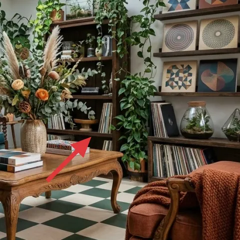
The woven basket on the floor supports the room’s boho texture story while solving a practical problem: where to put extra throws, plant supplies, or books when guests arrive. It’s placed close to the greenery and between seating zones, so it doesn’t feel random—it reads like part of the planting-and-textile system. I’d pick this kind of basket over a matching cabinet because rentals benefit from flexible storage you can move. The trade-off is that woven baskets can look best when they’re not stuffed full; keep the contents low-profile and the silhouette crisp.
Keep basket contents “quiet”
If you stash items inside, choose neutral colors so the basket stays part of the palette.
The cost, layer by layer
| Layer | Item | Cost |
|---|---|---|
| 1 | Woven throw blanket for armchair | $35 |
| 2 | Throw pillow cover with geometric pattern | $18 |
| 3 | Wood coffee table | $160 |
| 4 | Tabletop potted indoor plant | $25 |
| 5 | Framed geometric wall art print (DIY equivalent) | $50 |
| 6 | Decorative ceramic vase | $30 |
| 7 | Woven basket (storage) | $60 |
| Total | $378 | |
If you need a cheaper version, start by swapping the coffee table and vase down to thrifted wood and a simpler ceramic shape. Keep the throw blanket and the framed print—those two do the most visible work on a patterned, plant-filled wall.
What worked, what didn't (across the whole room)
This room’s success comes from repeating just a few ideas: teal as the anchor, burnt orange as the warm accent, and circles as the pattern language. Plants and ceramics add softness so the geometry doesn’t feel harsh. The only thing to watch is keeping surfaces edited so everything doesn’t feel overloaded.
What worked
- The teal sofa color anchors the palette so geometric art looks intentional, not accidental.
- The woven throw blanket adds texture where the eye lands first when scanning the seating.
- Circle motifs in the framed art and sofa pillow create pattern continuity across the wall.
- The wood coffee table’s warm tone balances the cooler tile floor and white walls.
- Plants add depth at multiple heights, from tabletop to hanging vines.
- A centered ceramic vase lets the coffee table feel styled without filling every surface.
What didn't
- When tabletop objects spread out, the coffee table stops feeling like a focal cluster.
- If the pillow pattern is too busy next to the framed prints, the sofa reads cluttered.
- Overstuffing the woven basket makes it look more like storage than decor.
- Adding another bold framed print can crowd the wall—one statement print is enough.
- If the plant pot is turned away, foliage looks lopsided and the room feels less “styled.”
What we'd skip if we did it again
Skip adding a second statement framed print right next to the first one. With circles and blocks already dominating the wall, the second frame tends to compete and makes the pattern feel louder than the sofa can handle.
Skip trying to match everything to the exact burnt orange shade. Instead, keep the warm accent in one or two textile/object spots (like the throw and a ceramic) so the room reads curated rather than color-cast.
Skip “surface stacking” on the coffee table. A vase plus a small book cluster is enough—extra items make the table visually busy and pull attention away from the geometry and plants.
Frequently asked
How long does this living room refresh take?
Plan on 2–4 hours total. Hanging one removable framed print usually takes the bulk of the time, and arranging plants takes a little trial and error. Styling the coffee table and seating with a throw, pillow, and vase is fast once you decide where your “center cluster” lives.
Is this renter-friendly if I’m worried about move-out?
Yes—every layer here is removable. Textiles (throws and pillow covers), potted plants, framed art, and freestanding storage can be boxed back up at the end of your lease. The only “swap” is DIY art for one framed print, which keeps the look consistent without changing landlord-installed elements.
What if my room is smaller than this one?
Use the same system but reduce the number of framed prints and limit plants to fewer height levels. One hero pillow plus one framed print keeps the pattern language strong without crowding. On a smaller room, the coffee table styling should stay minimal—just a vase and a couple books.
What if my room is bigger and feels empty?
Add height by leaning into hanging vines and increase the plant presence with one extra tabletop pot. Keep the geometric wall theme consistent, but consider adding one more framed print after the first becomes “readable” from your main seating position. The goal is rhythm, not more of everything.
Where can I shop for these pieces without drilling?
For renter-safe hanging, look for frames that come ready to hang with secure backing, and use removable hooks or Command strips. Throws and pillow covers are easy to source through major home retailers and thrift shops. For plants and vases, garden centers and local boutiques often have better variety for the exact leaf shapes and ceramic finishes.
What’s the biggest mistake people make with this kind of boho-geometric look?
Overloading surfaces and frames at the same time. Geometric walls plus multiple statement textiles can quickly turn cohesive into chaotic. Pick one wall pattern hero (like the framed circle print), one textile hero (the throw), and then let plants and a ceramic vase add softness.
More in Living Room

Under $400: teal-and-rust renter living room refresh with 7 layers
A bright, boho-leaning living room gets a coordinated look without drilling or permission. This renter-friendly refresh uses 7 swaps (inclu…
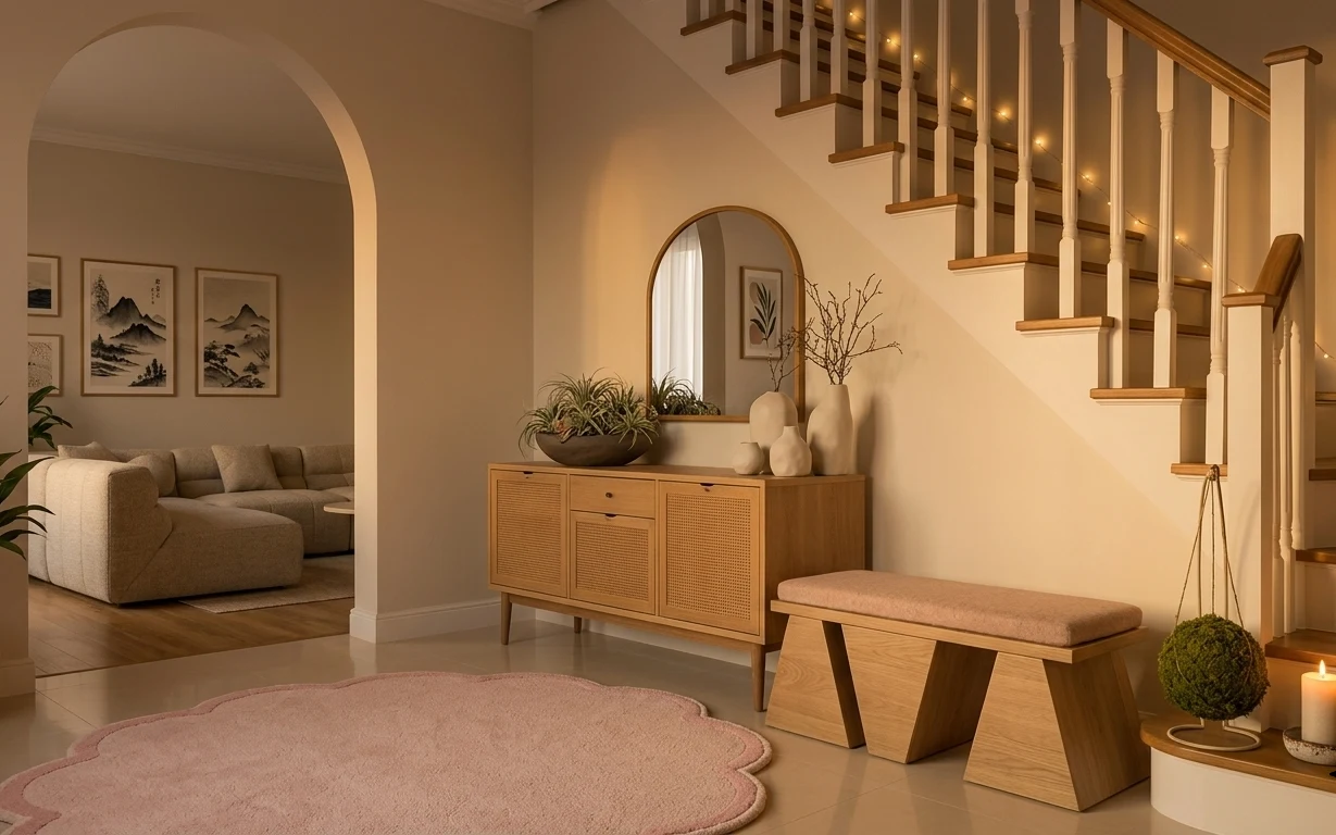
Under $600: 7 move-ready living room swaps with string lights
A move-friendly living room refresh under $600 using the pink round rug, a wood sideboard, and warm string lights. This plan focuses on ren…
Under $500: warm earthy living room refresh for renters
A warm, earthy living room look is achievable on a $500 renter-friendly budget using seven movable swaps—starting with a patterned rug, a r…