
- Best for
- Cost-effective bathroom styling
- Cost
- $420 total (layers)
- Time
- 2–4 hours
- Renter-safe
- Yes (no-drill swaps + DIY labels)
Why warm-beige details are the bathroom spa corner of 2026
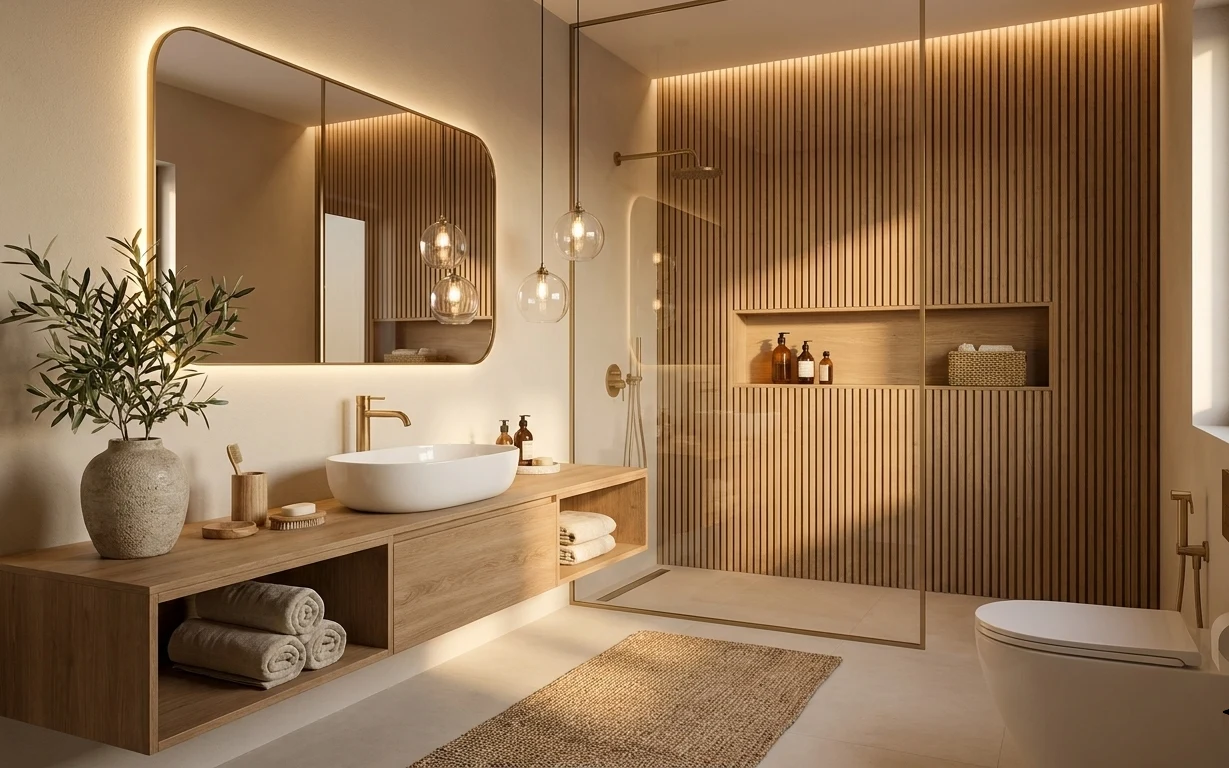
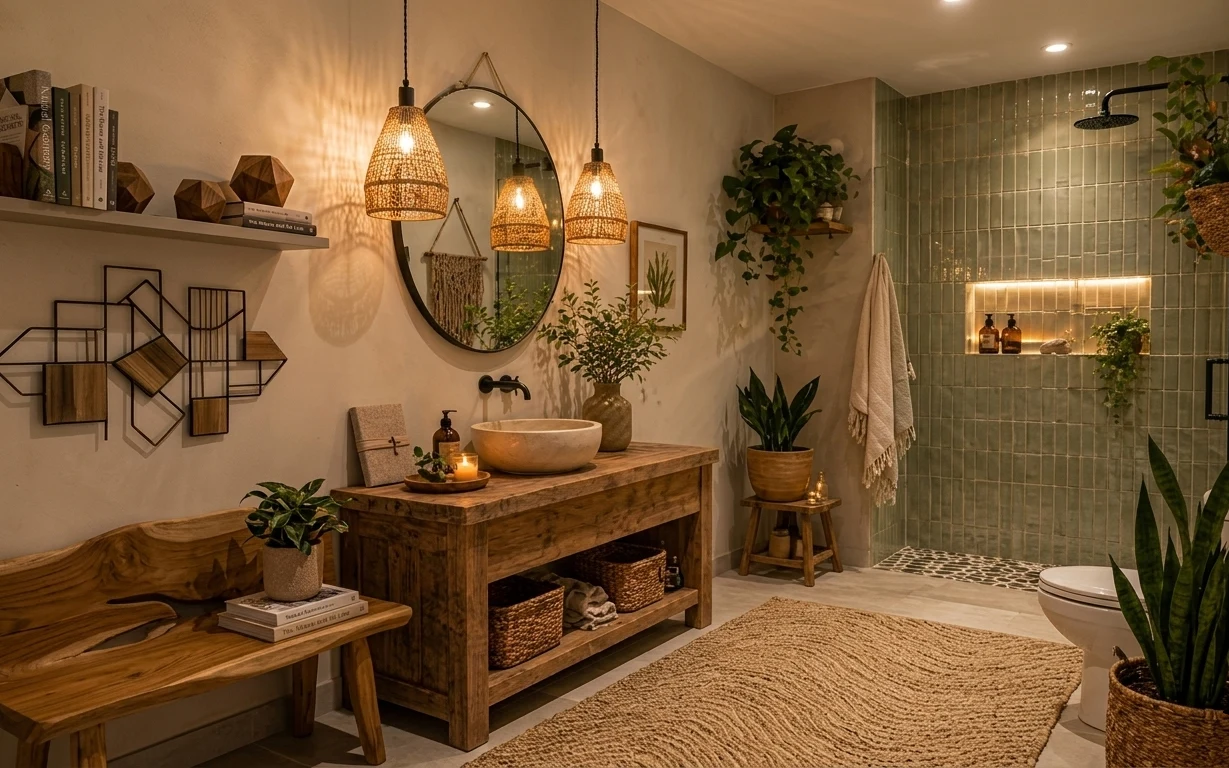
Start with what the eye already loves in this photo: warm light beige walls, light wood, and that rounded brass mirror. Then borrow the spa logic—layer soft textures at floor level and mid-height so the room feels finished without adding construction. The woven bath rug anchors the space, while brown folded towels repeat the earthy palette on a near-by surface. Finally, vanity shelf styling matters more than most people think: a plant + a couple tactile objects read “intentional” instantly in a small bathroom.
I once overdid bathroom styling by adding too many matching items, and it looked fussy instead of calm. What changed my mind was noticing how this setup uses repetition, not clutter: same warm neutrals, a mix of textures (woven + ceramic + smooth glass), and breathing room around the mirror. That’s the rental-friendly formula here—soft, warm, and easy to reset.
Layer 1 — woven bath rug (tan) ($120) Texture underfoot that hides everyday mess
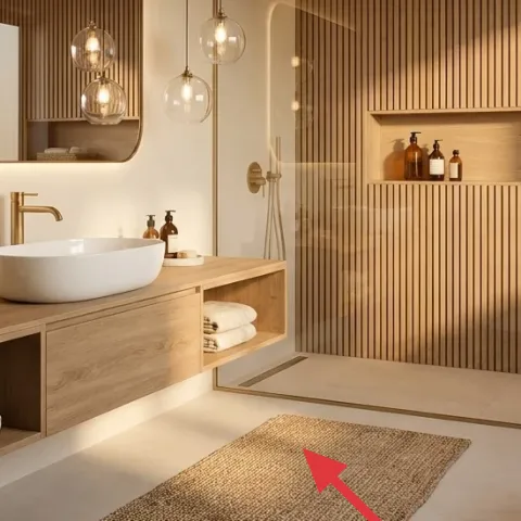
This tan woven bath rug sits on the light tile floor in the foreground, so it becomes the first texture your feet meet and the first visual anchor when you walk in. It reads warm against the cream tile and light wood, and the open weave keeps the space from feeling heavy. I’m choosing a rug over a runner because a single full bath mat area keeps the look centered and less visually broken on awkward renter layouts. The trade-off is simple: woven texture means you’ll spot-clean faster after spills, not ignore them.
Keep the rug the palette, not the pattern
Go for tan or oatmeal tones (like this) so the mirror and wood can stay the stars.
Layer 2 — folded bath towels (brown) ($60) A mid-level color echo without extra wall items
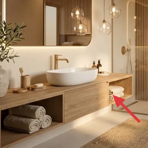
These folded brown towels live inside the vanity’s open shelving, where they add both color and shape. Folding them keeps the palette tight and prevents “towel pile” chaos from taking over the corner. I like towels here more than hanging towels because the folded stack gives a clean horizontal rhythm that matches the vanity lines. The trade-off is that you need enough towels to swap the display set when they get damp—so it’s better to plan for at least two sets even in a small bathroom.
Fold size changes the whole look
Thicker folds look more spa-like; thin rolls read more casual.
Layer 3 — large ceramic vase with leafy plant ($60) Green that softens warm neutrals
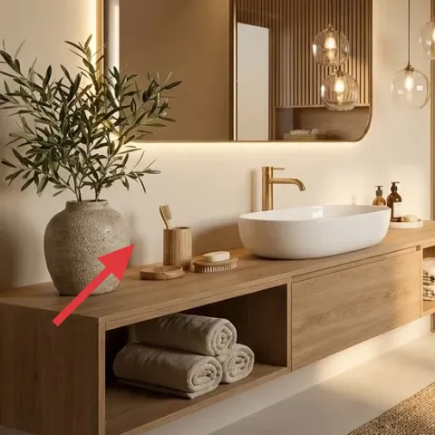
The large ceramic vase and leafy plant on the left side gives the room life without adding visual weight. Because the wall and floor are light, the plant’s darker leaves stand out just enough to feel intentional, not random. I’m keeping the object scale large (a chunky vase, not a tiny bud vase) because bathrooms can feel visually flat once you remove “real” furniture. The trade-off: plants need light and wipe-downs in humid spaces, so choose a plant you’ll actually maintain.
Match the plant’s container to your wood tones
Warm beige ceramics and earthy neutrals tie back to the vanity finish.
Layer 4 — woven basket on vanity shelf ($30) Storage that reads like décor
This woven basket sits on the vanity shelf and does double duty: it holds smaller essentials while adding an extra texture that echoes the bath rug. Woven materials are doing real work here—when you use multiple “natural” textures, the room feels curated even if you’re only swapping small objects. I’m choosing a basket instead of a box because the texture catches warm light and makes the shelf look styled, not staged. The trade-off is that baskets collect dust at the rim, so a quick wipe when you reset towels helps keep it looking fresh.
Use one basket, not a whole set
One woven piece gives warmth without cluttering the vanity shelf.
Layer 5 — wooden brush on vanity ($25) A small utilitarian prop that looks purposeful
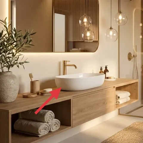
The small wooden brush on the vanity shelf keeps the countertop from looking like “only decorative bottles.” It introduces a new material texture—smooth wood grain—so the shelf styling feels lived-in rather than purely cosmetic. I’m placing this layer as a supporting player on purpose: it’s small enough not to compete with the mirror, but it adds an everyday object that reads intentional. The trade-off is that it can drift out of the frame over time; when it does, move it back to the same side so the composition stays consistent.
Repeat one material across two heights
Wood on the shelf + wood in the vanity makes the whole corner feel cohesive.
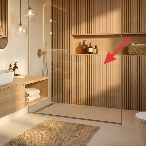
Layer 6 — arched mirror with rounded brass frame ($80) The shape that makes the room feel softer
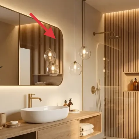
This large arched mirror with its rounded brass-toned frame is what turns the bathroom from “clean and simple” into “designed.” The arch counters the straight lines of tile and built-in shelving, so the reflection feels gentler even though the room is visually structured. I’m treating the mirror as a key layer because shape matters more than trying to change wall color in a rental. The trade-off: a brass-framed look can feel too warm if everything else is also yellow-toned—so keep your textiles in oatmeal/brown and let the wood balance the palette.
Don’t fight the existing frame color
If your bathroom already has warm hardware, mirror tones should echo it instead of contrasting hard.
Layer 7 — DIY apothecary-style jar labels (print + apply) ($45) Make the bottles look “matched” without replacing anything
Make it instead of buying it
This DIY updates the brown apothecary-style bottles on the vanity shelf with printed labels so they look cohesive without swapping the fixtures.
Materials
- Printable label paper sheets (8.5×11) — 1 pack — $10
- Clear waterproof label tape — 1 roll — $6
- Mini scissors + ruler — 1 set — $4
- Small brush or sponge (for smoothing) — 1 — $8
Steps
- Measure one bottle’s label area with a ruler and note width/height in inches.
- Choose a simple typography layout (name + “hand” + small icon) sized to your measurements.
- Print the label on matte label paper and let it sit for 2 minutes so ink looks crisp.
- Cut each label with sharp scissors, using the ruler as a straight guide.
- Lightly dampen a cloth and wipe the bottle surface to remove residue and dust.
- Apply the label, then seal the edges with clear waterproof label tape for bathroom humidity.
Total DIY cost: $28 — saves about $17 over buying.
Matching labels are the quickest way to make a bottle cluster read “designed,” especially when the bottles are already in place. In this photo, the apothecary-style shapes and warm amber tones feel cohesive, and the labels complete the story—same vibe, same spacing, same visual weight. I’m choosing labels over replacing the bottles because renters can’t reliably swap fixtures, and this keeps the styling move-ready for the lease end. The trade-off is patience: labels need straight alignment, and the seal matters in a steamy bathroom.
Keep the label set small
Two or three labels look intentional; a dozen looks like you’re trying too hard.
The cost, layer by layer
| Layer | Item | Cost |
|---|---|---|
| 1 | Woven bath rug (tan) | $120 |
| 2 | Folded bath towels (brown) | $60 |
| 3 | Large ceramic vase with leafy plant | $60 |
| 4 | Woven basket on vanity shelf | $30 |
| 5 | Wooden brush on vanity | $25 |
| 6 | Arched mirror with rounded brass frame | $80 |
| 7 | DIY apothecary-style jar labels (print + apply) | $45 |
| Total | $420 | |
If you need a cheaper variant, focus on the rug + towel set first, then swap the plant for a smaller tabletop version. Skip the mirror upgrade and keep the existing reflection shape, and use one woven basket instead of both basket and brush for styling.
What worked, what didn't (across the whole room)
This look succeeds because it repeats warm materials at different heights: floor (rug), shelf (basket/brush/bottles), and mid-wall (mirror shape). It also avoids clutter by using a tight neutral palette and tactile textures. The only thing that can derail it is over-styling the vanity surface.
What worked
- The woven bath rug anchors the space and visually warms up the light tile floor.
- Brown folded towels add color without adding new objects to the bathroom perimeter.
- A ceramic vase with leafy plant balances the mirror’s warm metal tones.
- A woven basket brings texture repetition, making the vanity shelf feel intentionally styled.
- Apothecary-style bottles look more “set” when labels match in typography and spacing.
- The arched mirror softens straight architectural lines for a gentler spa effect.
What didn't
- Too many small bottles at once can turn a calm shelf into a visual pile.
- Using cool-toned textiles against warm wood can make the palette feel mismatched.
- If the plant is too small, the left side reads empty instead of balanced.
- Skipping a label “seal” makes printed text look tired sooner in bathroom humidity.
What we'd skip if we did it again
Skip changing the big bathroom hardware or fixtures. A rental-safe refresh gets 80% of the visual impact from textiles and countertop styling, not from major swaps you can’t undo at move-out.
Skip adding multiple storage containers that look similar. One woven basket does the job; too many matching boxes make the vanity shelf look crowded and harder to keep clean.
Skip tiny décor in a small bathroom. If an object is meant to “read” visually—like a vase or rug—size it up so it actually changes how the corner feels.
Frequently asked
How long does this bathroom refresh take for a renter?
Plan on about 2–4 hours total. The rug and towel styling are quick, and the vanity shelf pieces can be set up in one sitting. The only slower part is label alignment for the apothecary bottles—printing, cutting, and sealing. If you’re doing multiple label sizes, add extra time for measuring and test-printing.
Is this renter-friendly if I can’t change the bathroom’s fixtures?
Yes—this look doesn’t depend on replacing the vanity, faucet, toilet, or any hardwired lighting. The layers are removable and move-ready: textiles like a woven bath rug and folded towels, plus countertop decor and a DIY label refresh. Even the mirror upgrade can be handled as a replaceable decor piece if your lease allows it.
What if my bathroom is smaller than this one?
Keep the same palette and texture repetition, but reduce scale. Go with a smaller rug shape that still covers the “step zone” and choose a plant that matches the shelf size. The key is spacing—leave breathing room around the mirror and between bottles so the corner stays calm.
What if my bathroom is larger and feels too blank?
Add one more texture at the same heights, not another color. For example, keep towels in the same brown family and add a second woven piece (like a second basket) on a different shelf bay. Avoid adding lots of competing patterns; the mirror shape and warm wood tones need a quiet backdrop.
Where should I shop for these items on a budget?
For the woven rug and towels, big-box home goods and online retailers often have good neutral options. Look for a rounded brass-framed mirror at home decor marketplaces, or thrift for similar shapes. For the DIY labels, printable label paper and waterproof tape are usually the most economical route and let you match your existing bottles exactly.
What’s the biggest mistake people make with spa-style bathrooms?
They over-style the vanity. When every surface is covered with matching props, the shelf starts to feel cluttered instead of serene. Use one anchor textile (the rug), one main green element (the plant), and one storage texture (the woven basket), then limit everything else to two small supporting objects.
More in Bathroom
Under $500: a bathroom spa corner refresh with 7 renter swaps
A renter-friendly bathroom spa corner refresh with 7 swaps that keep the same warm, natural feeling. Everything in this look is move-ready …
Under $600: spa bathroom corner refresh with renter swaps
A renter-friendly bathroom refresh built around a spa bathroom corner—warm wood, green tile, and plants—using move-safe swaps. This plan ke…
Under $300: bathroom vanity swaps for move-friendly calm
A small bathroom vanity refresh for shared housing: swap in 7 move-ready upgrades for under $300. The look focuses on a rug, tidy textiles,…