
- Best for
- Kitchen counter styling
- Cost
- Under $500
- Time
- 1 weekend
- Difficulty
- Easy to moderate
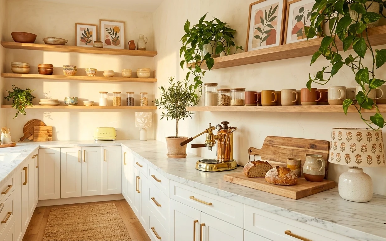
Why this warm-beige kitchen counter nook is the move-friendly nook of 2026
The heart of this look is the warm, beige-toned backdrop plus that “collected” feeling on the shelves and counter. You can see the mix of matte textures (jute rug), glossy glass (canisters and jars), and natural wood (open shelves and a wood tray). Instead of chasing expensive permanent changes, this comes from placement—plants at eye level, frames grouped above, and a tray to corral small things. For renters, it’s achievable because you’re styling what you can touch: textiles, wall decor, and removable wall products.
I almost overdid it once by adding too many small items at once—jars, cups, and little ceramics everywhere—until the counter started looking busy instead of curated. What fixed it was one “landing pad” (a single wood tray for the daily-use items) and repeating the same materials in different zones: wood, glass, and green. Once that pattern holds, the rest can be simple.
Layer 1 — jute area rug (5×7) ($120) Grounds the counter zone underfoot
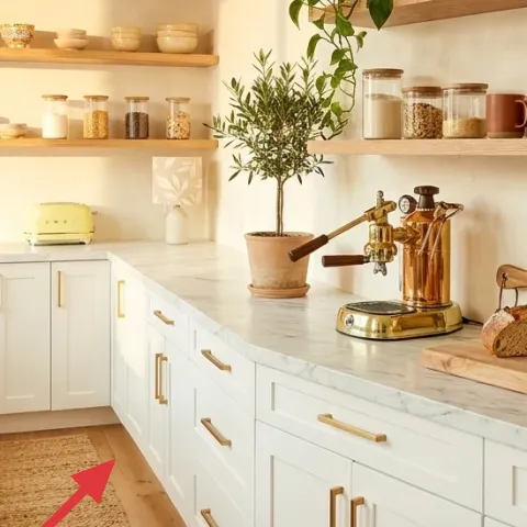
A jute area rug in the 5×7 range sits right where you walk past the white marble-look counter, adding that dry, woven texture that reads natural beside the smooth surfaces. The trade-off is practical: jute can be a little rough and will show foot traffic faster than a plush rug. Still, this kitchen’s palette is warm and earthy-neutrals, so the fiber tone does the heavy lifting visually. Compared with a flat synthetic mat, a true jute rug looks warmer in daylight and holds up better to casual daily use.
Pick the rug for scale, not perfection
If it reaches at least under the front edge of the open walkway, it will look intentional even when the space is compact.
Layer 2 — peel-and-stick wallpaper for the backsplash wall ($90) Gives the white wall pattern without commitment
The wall behind the countertop is mostly a blank, which is why the shelves and plants read so clearly in the photo. Adding peel-and-stick wallpaper to that backsplash wall keeps the look botanical-but-polished, and it’s renter-safe because it comes down without paint or drilling. The trade-off: removables can lift at corners if the wall isn’t clean or if the adhesive is stressed, so plan for careful smoothing. Compared with painting, wallpaper gives you pattern contrast (and a place for frames to “float” over) without fighting the lease constraints.
Choose a pattern that won’t fight the shelves
A small botanical repeat or gentle lattice reads layered over jars and mugs.
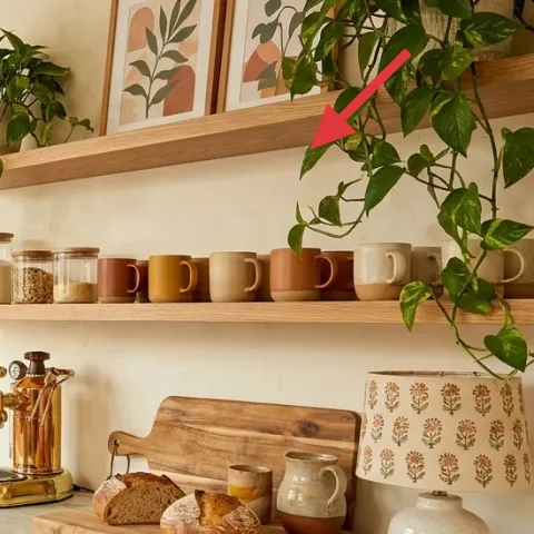
Layer 3 — framed botanical print set (3 frames) ($100) Pulls the greenery theme up to eye level
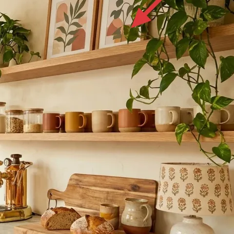
Those framed botanical prints above the shelves create the “top line” of the room, balancing all the counter styling below. Recreating this with a three-print set gives you a cohesive look without hunting for matching singles, and the frames bring warmth to an otherwise white wall. The trade-off is spacing: if the frames are too tight, they feel cluttered; too far apart, they look random. Compared with hanging one large print, a small group gives more flexibility for aligning with shelf height and plant leaves.
Hang so the frames center between shelf lines
Use Command hooks and aim for the optical center of the print set, not the top of the shelf.
Layer 4 — tall leafy potted plant ($40) Adds vertical life where the wall is busy
The tall leafy plant in the photo does two jobs: it adds forest-green color and it gives height, so the shelves and counter don’t feel flat. A rental-friendly approach is using a potted plant you can move—place it near the shelves, then rotate it occasionally for even light. The trade-off is maintenance: plants need consistent light, and leaves can drop when they’re moved or repotted. Compared with adding only small countertop herbs, a taller plant balances the visual weight of the wood shelves and the framed prints.
Don’t block the shelf styling
Keep the plant’s widest leaves slightly in front of the open shelves so jars and mugs still read clearly.
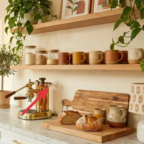
Layer 5 — wood tray for the counter ($20) Keeps ceramics and mugs from scattering
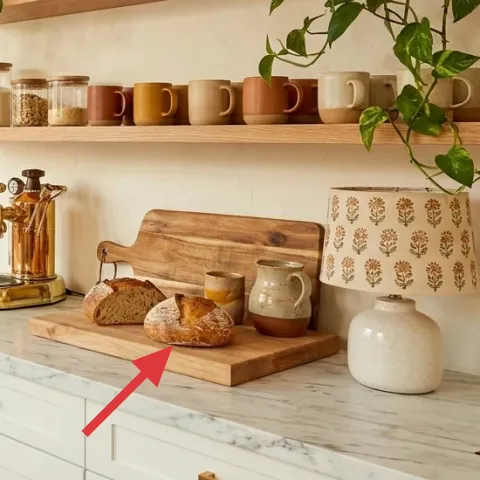
A wood tray on the marble-look counter acts like a visual boundary for the everyday items—mugs, small ceramics, and snack objects—so the surface stays styled rather than accidental. This matters in a kitchen because steam, crumbs, and quick-use clutter can take over fast. The trade-off is that trays are one more surface to clean, but it’s easier than clearing the entire counter. Compared with styling directly on the counter, a tray gives you a reset option: when guests come over, everything “goes back” onto the tray.
Match the tray to the shelf tone
If the open shelves read warm honey wood, pick a similarly warm finish so it blends instead of contrast-blaring.
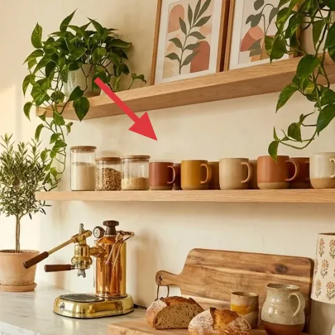
Layer 6 — ceramic canisters and jars ($25) Makes storage look intentional
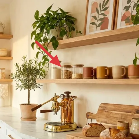
The look depends on glass and ceramics grouped across the shelves and counter—jars/canisters add rhythm and give that lived-in, collected feel. A small set of ceramic canisters can replicate the “collected pantry” vibe without needing matching storage everywhere. The trade-off: you’ll want to keep the contents similar in color or texture (think light grains, coffee grounds, or dry goods) so they don’t look mismatched. Compared with using one big container, several smaller canisters create variety at different heights, which feels more editorial next to the wood shelves.
Group by height, not by label color
Place taller jars in back rows and shorter ones on the front edge of the shelf or tray.
Layer 7 — DIY apothecary jar labels ($20) Personalizes the jars without new hardware
Make it instead of buying it
This DIY adds apothecary-style labels to the existing jar/canister set so the shelf reads cohesive and curated.
Materials
- Printable label sheets (inkjet/laser) — 1 pack — craft store — $10
- Weatherproof label protector sheets or clear packing tape — 1 roll — office/craft store — $6
- Scissors — 1 pair — household — $2
- Fine-tip permanent marker — 1 — office/craft store — $2
- Small folder or baking paper for a clean workspace — 1 sheet — household — $0
Steps
- Choose 3–5 jar names that fit your real pantry items (like “coffee,” “oats,” “flour”).
- Set the label template to an apothecary style (simple serif, centered text, generous margins).
- Print the labels at high quality and let the ink fully dry.
- Trim each label with clean edges so it doesn’t curl.
- Apply a clear protector over the label surface (or wrap with packing tape) to resist kitchen moisture.
- Write any small notes (like “whole” or “ground”) with a fine-tip marker if you want extra detail.
- Wipe each jar area with a dry cloth so the label sits flat.
- Place labels straight, press firmly, and keep jars on the counter so you can check alignment.
Move the eye around the shelf, and labels make the jars feel “collected on purpose” instead of just stored. Because this uses printable sheets, it’s a renter-safe switch-up: no tools, no drilling, and no changes to the landlord-installed fixtures. The trade-off is that paper labels need a protector in a kitchen—wipe-down moisture can smear unprotected ink. Compared with buying pre-printed labels, DIY lets the typography match the framed botanical vibe above.
Keep the text count low
Short names read better on small jar fronts than long ingredient lists.
The cost, layer by layer
| Layer | Item | Cost |
|---|---|---|
| 1 | Jute area rug (5×7) | $120 |
| 2 | Peel-and-stick wallpaper for backsplash wall | $90 |
| 3 | Framed botanical print set (3 frames) | $100 |
| 4 | Tall leafy potted plant | $40 |
| 5 | Wood tray for the counter | $20 |
| 6 | Ceramic canisters and jars | $25 |
| 7 | Apothecary jar labels (DIY) | $20 |
| Total | $415 | |
A cheaper variant is using a smaller rug (5×7 thrift finds) and printing one or two frames instead of a three-print set, while keeping wallpaper to just a single backsplash rectangle.
What worked, what didn't (across the whole room)
This kitchen nook succeeds because the styling is arranged in repeatable zones: rug on the floor, frames above, and plants plus ceramics in the vertical space. The wood tray on the counter prevents quick clutter from turning into visual chaos, and the layered textures keep it from feeling sterile. The main weakness is that a removable wallpaper surface can look slightly imperfect at seams if the wall isn’t prepped.
What worked
- The jute rug adds fiber texture that softens the white marble-look countertop.
- Wallpaper behind the counter would give pattern contrast while keeping the shelf styling the focus.
- The framed botanical prints pull the green theme upward and make open shelving feel intentional.
- The tall plant adds vertical balance so the shelves and jars don’t look too horizontal.
- A wood tray keeps mugs and small ceramics corralled for fast daily reset.
- Grouped jars/canisters create height variety across shelves and counter without extra furniture.
What didn't
- Too many countertop objects outside the tray makes the space feel busy in daylight.
- Wallpaper edges can lift slightly if the wall has dust or if you smooth unevenly.
- Plants that aren’t rotated can develop uneven leaf growth and look lopsided.
- Using only clear glass containers without ceramics can feel cold next to warm wood.
- Wide labels with lots of text can look messy on small jar fronts.
What we'd skip if we did it again
Skip replacing anything fixed to the rental—stick to renter-safe layers like rugs, removable wallpaper, frames, and countertop decor. In a kitchen like this, the landlord-installed base can’t be changed, but the visual impact still comes from what sits on top of it.
Skip a “matchy-matchy” set of every jar and mug. A curated mix looks more like real life and less like staging, especially when you vary shapes across shelves and keep colors within warm neutrals.
Skip adding extra wall items once the frames and plants are in place. If the wall already has framed botanical prints and tall leaves nearby, adding another small art layer can crowd the sightline.
Frequently asked
How long does this kind of kitchen refresh take?
Most of the time goes into placement: hanging the framed botanical prints, smoothing peel-and-stick wallpaper, and setting up the shelves so the heights feel intentional. The styling part—tray first, then mugs/jars, then plants—usually takes an evening. If you’re doing the DIY jar labels, add another hour for printing, trimming, and sealing.
Will this work in a rental where I can’t drill or paint?
Yes—the plan stays renter-safe by relying on removable wall decor and textiles. Use Command hooks for framed art, peel-and-stick wallpaper only where you can remove it cleanly, and keep everything else as freestanding items (rug, tray, jars, and potted plants). Nothing depends on changing the landlord’s cabinets, countertop, or plumbing fixtures.
What if my kitchen is smaller than the photo?
Shrink in two places: choose a slightly smaller rug and keep only one tall plant so the shelves don’t feel crowded. For frames, aim for the same height as in the photo, but reduce the number of prints to two if needed. The core strategy—one tray zone plus repeated wood/green accents—still holds.
What if my kitchen has more wall space than this?
Add spacing, not clutter. Keep the same materials and colors, but widen the gap between framed prints or add one more countertop vignette inside the tray format. A second small potted plant can work if it doesn’t block the shelf line or compete with the tall plant’s silhouette.
Where should I shop differently to keep the budget down?
For the rug and ceramic jars, thrift and resale shops are your best bet because you’re not chasing a specific brand—texture and shape matter more. For framed botanical prints, consider print sets from big-box stores or online marketplaces, then match frames with removable hardware. Peel-and-stick wallpaper often costs less when you buy during sales and pick a single pattern panel.
What’s the biggest mistake people make in kitchen counter styling like this?
Overfilling the counter outside a single “landing pad.” When everything is scattered, the eye has nowhere to rest and it starts to feel cluttered fast. Start with the tray, add your mugs and small ceramics, then pause before adding more. If it still feels empty, bring in plant height or a second jar group on the shelf—not more loose items.
More in Kitchen & Dining

Under $500: renter-friendly kitchen counter nook refresh
A kitchen counter nook refresh that looks botanical and warm, using renter-safe updates like a jute rug, peel-and-stick backsplash wallpape…
Under $400 Japandi kitchen counter corner refresh (7 swaps)
Get the japandi kitchen counter corner look without touching fixed things. This under-$400 plan swaps textiles and countertop decor—plus a …