
- Best for
- outdoor renters who want an evening-ready seating zone
- Cost
- about $600 for the full look
- Difficulty
- easy (mostly buying, plus one small DIY)
- Time
- about a weekend for styling and shopping
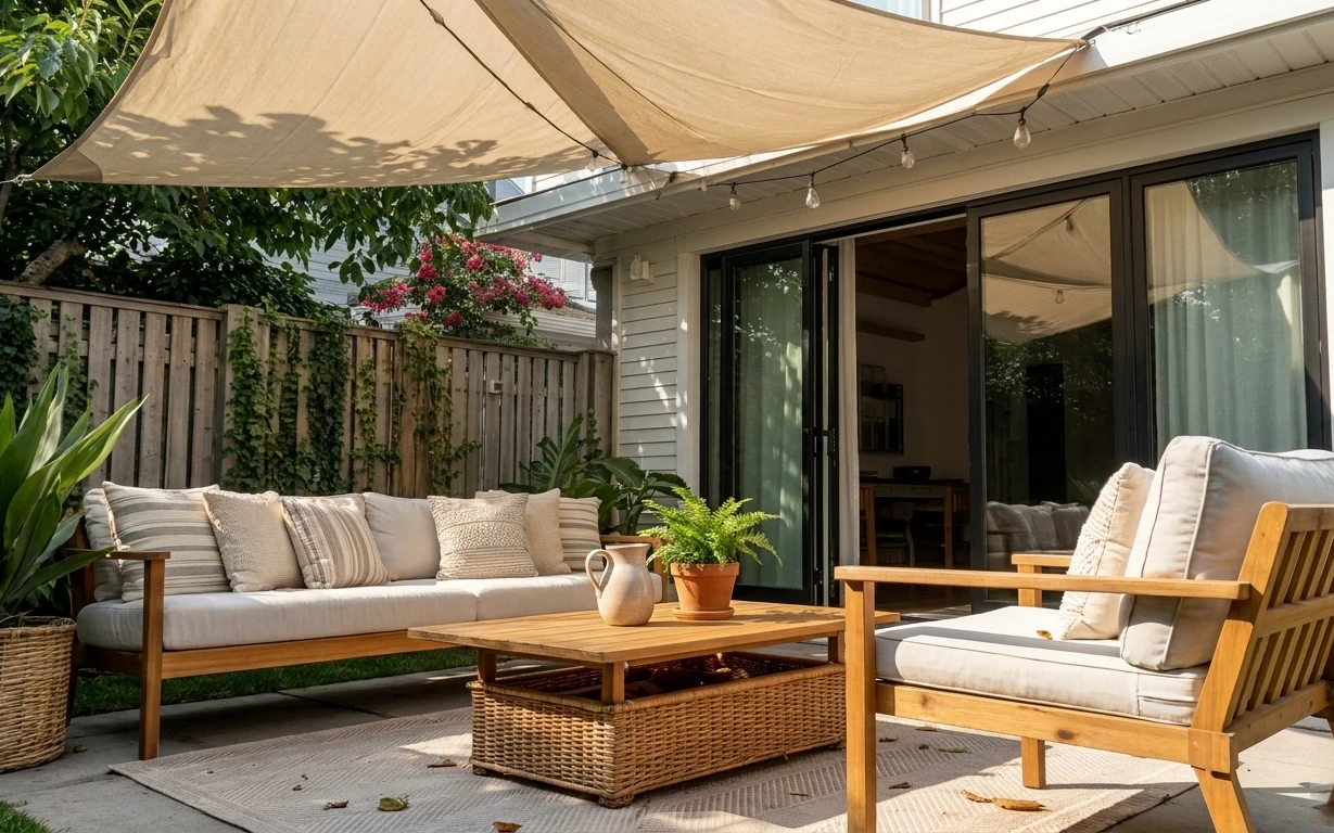
Why warm wood-and-rattan patio seating area is the patio seating area of 2026
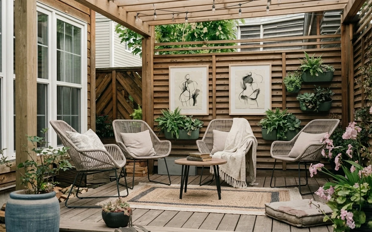
Start with the floor: a large rug grounds the seating and makes the deck feel intentional instead of like a walkway. In the photo, the cream throw drapes over the chairs, and the framed art prints bring that “outdoor living room” feeling right onto the wood slat privacy wall. The plug-in string lights add a gentle glow overhead, while the layered planters keep the palette earthy—warm wood, sage green, and a little pink. For renters, this combination is realistic because all the heavy visual work comes from things you can take with you.
I once overdid outdoor decor by buying a bunch of matching items from one set—rugs, planters, and frames all too coordinated. It looked clean, but it felt like a showroom. What changed my mind: I started copying the way this patio uses contrast—textiles in cream, art in black linework, greenery in muted green, and flowers that stay a bit wild. The result is that “styled but lived in” look without needing permanent changes.
Layer 1 — rug ($200) with a deck-friendly flat weave
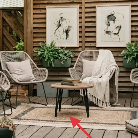
The rug is the first thing your eye reads: a flat, woven-looking design that softens the wooden deck floor and creates a clear seating zone. Because it sits under all four chairs, it also helps unify the metal-and-rattan look without making the patio feel overly heavy. I’d usually skip patterns outdoors when it’s windy, but this one feels subtle enough to handle daily use and still reads cozy. The trade-off is upkeep—shake it often and use it with a rug pad if you’re prone to shifting on wood planks.
Define the zone, even outdoors
Rug edges should land under chair legs so the seating feels “together,” not floating on the deck.
Layer 2 — lightweight throw blanket ($35) draped in warm cream
The throw blanket on the chairs is doing visual work twice: it adds softness against the airy woven chair texture and it makes the seating look more relaxed than strictly decorative. A lightweight weave in warm cream also plays nicely with the wood slat privacy wall, since it mirrors the light tone already in the scene. The obvious alternative is a patterned outdoor cushion, but that can fight the clean lines of the art prints. This choice is quieter and easier to maintain—washable textiles usually beat elaborate styling out back.
Let the texture carry the color
If your plants are already colorful, choose solids in cream or oat so the blanket supports, not competes.
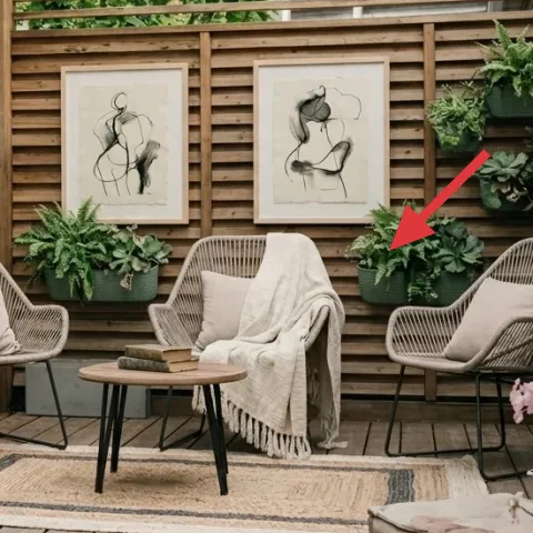
Layer 3 — framed art prints (pair) ($120) linework centered on the slats
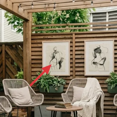
Those two framed art prints on the wood slat privacy wall are what make the patio feel designed instead of temporary. The black linework against a light background gives you structure while still feeling organic—perfect for pairing with greenery. The move-friendly win here is placement: hanging art over slats still looks intentional, even if you’re not able to paint or mount permanent shelves. If you’ve ever tried to do a “gallery wall” outdoors with random sizes, this pairing is a simpler version that reads balanced at a glance.
Pick frames that won’t warp
For outdoor spaces, look for sealed frames and keep them covered during storms to avoid bends or fading.
Layer 4 — plug-in string lights ($25) along the ceiling beams
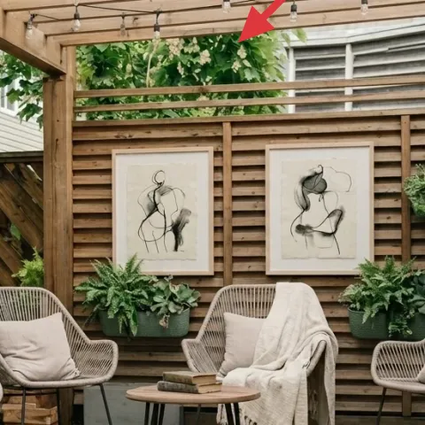
Overhead lighting is the difference between “daytime patio” and “evening hangout,” and these plug-in string lights do it without any hardwiring. They also echo the patio’s straight beam lines—bulbs running across the top section so the light stays even and flattering. The trade-off with string lights is that you need a clear path for cords, so plan where the plug lands before you hang anything. I love this look because warm, low-level lighting makes every texture—rug weave, chair fibers, and greenery—feel softer after dark.
Route cords before you attach the first hook
Keeping slack out of the walkway prevents tangles and keeps the lights straight.
Layer 5 — large ceramic planter on the floor ($35) with a muted blue-gray finish
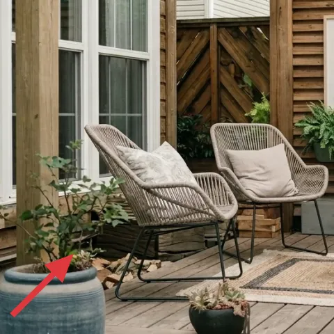
The large ceramic planter anchors the left side visually and brings in an earthy, slightly coastal note without turning the patio into a theme. Its muted blue-gray tone sits between the warm deck wood and the sage green plants, so it helps the whole palette look edited rather than random. The obvious alternative is adding another pot on the wall, but adding height can overwhelm small layouts. This floor planter gives you instant depth with a single item—just make sure it’s stable and not overly light if your patio gets breezy.
Choose heavier planters for windy decks
Weight at the base keeps arrangements from shifting when doors open and close.
Layer 6 — round wooden side table ($110) for a natural central landing
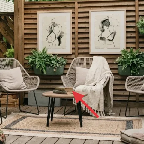
The round wooden side table is the practical styling piece: it gives the seating a natural “center” and makes the chairs feel like a coordinated conversation set. The warm wood finish also ties directly into the slat wall, so nothing looks mismatched—even with black metal chair frames. I would normally choose a square table for more surface area, but this round top is easier to style with small objects because it doesn’t create sharp corners in the middle of a group. The trade-off is less usable space, so keep items minimal: a stack of books, a shallow tray, or a single vase.
Keep the top styling low
On patios, low objects read better in photos and stay comfortable between chairs.
Layer 7 — pink flowering plants ($30) as a move-friendly seasonal hit
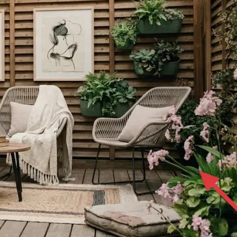
This spot of pink is the patio’s “seasonal” cue—bright enough to pull your eye toward the seating, but still soft because it mixes with green leaves instead of overpowering the palette. If you’re trying to keep the look renter-safe, focus on movable plant moments rather than trying to redesign the wall or add built-in elements. For a DIY-friendly version, you can swap fresh blooms for a dried arrangement so it lasts longer between re-styles. The trade-off is scent and longevity: dried flowers won’t smell as strong, but they hold their shape for weeks.
Make it instead of buying it
This DIY foraged dried floral arrangement recreates the pink-and-green focal cluster using dried stems you can tuck into the same type of planter.
Materials
- foraged dried stems — 1 bundle — start $10
- dried filler stems (baby’s breath or similar) — 1 small bunch — $6
- twine — 1 spool — $4
- brown paper wrap — 1 sheet/roll — $3
Steps
- Gather dried stems with a few different heights so the arrangement isn’t flat.
- Trim stems so taller pieces sit in the back and shorter pieces front-fill.
- Tie a loose bundle with twine, leaving room to fan individual stems out.
- Wrap any fragile bits in brown paper so they don’t shed while you arrange.
- Loosen the bundle and place stems into the planter so pink sits closest to the viewer.
- Lightly adjust angles until greens frame the pink instead of stacking on top.
Total DIY cost: $23 — saves about $7 over buying.
The cost, layer by layer
| Layer | Item | Cost |
|---|---|---|
| 1 | rug | $200 |
| 2 | lightweight throw blanket | $35 |
| 3 | framed art prints (pair) | $120 |
| 4 | plug-in string lights | $25 |
| 5 | large ceramic planter on the floor | $35 |
| 6 | round wooden side table | $110 |
| 7 | pink flowering plants | $30 |
| Total | $555 | |
A cheaper variant uses a smaller rug (or a solid flat runner) and one framed print instead of a paired set. Swap the ceramic planter for a textured plastic pot in the same muted blue-gray tone, and keep the pink focal point to a single planter cluster.
What worked, what didn't (across the whole room)
The strongest decisions are the ones that add structure: the rug defines the seating zone, the framed prints give the slat wall a focal point, and the string lights make evening use feel intentional. The plants also stay cohesive because the green tones are muted and the pink stays concentrated.
What worked
- The rug under every chair leg makes the deck look like a real outdoor living area.
- Cream throws soften woven chair texture without introducing new bold colors.
- Two framed art prints create balance on the slat wall instead of random singles.
- Plug-in string lights add warm depth after dark with no hardwired work.
- Muted blue-gray and sage green in planters keep the palette controlled.
- The round side table visually centers the set and keeps styling low and practical.
What didn't
- Too many small planters would clutter the wall and compete with the framed prints.
- If the rug shifts on wooden planks, the whole “zone” effect disappears.
- Over-bright pink blooms spread across multiple containers can start to look noisy.
- Using a very patterned blanket might fight the art’s minimal linework.
- Placing the table styling too tall can block sightlines between chairs.
What we'd skip if we did it again
Skip wall changes that require permanent mounting. With a wood slat privacy wall, it’s tempting to “level up” with shelves or bigger built-ins, but this look mostly relies on movable art and planters you can take down at move-out.
Skip a second rug layer or stacked rugs. One well-sized rug does the grounding here; extra textile layers tend to make an outdoor deck feel smaller, and they also increase slipping and cleaning work.
Skip buying matching everything. The patio in the photo works because only a few elements repeat—cream textiles, muted greens, and warm wood—while the plants and pink focus vary. That mix keeps it garden-like instead of themed.
Frequently asked
How long does this patio refresh take?
Plan for about one weekend if you’re doing it in phases: shop first (rug, lights, frames, textiles), then assemble the furniture and rug, and finally place plants and style the table. Expect extra time if you need to adjust the cord route for the plug-in string lights so they sit neatly overhead.
Will this work if my patio is smaller than the photo?
Yes—scale down one anchor element rather than removing everything. Use the same idea: a single rug that sits under the chairs’ front legs, one framed set centered on the slat wall, and one planter cluster for the pink focus. If the wall feels too busy, keep only one framed print and let the greenery do the texture work.
What if my deck floor is slippery or uneven?
Choose a rug with a flat weave that lies flat, and add a non-slip rug pad if the rug starts to creep. Rounded corners also help visually, but the key is keeping chair feet stable so the seating doesn’t “migrate.” Once the rug holds its position, the whole look stays cleaner.
Can I do the string lights without permanent installation?
This setup is designed for plug-in use, so the lights themselves don’t require hardwiring. Use renter-safe methods like removable hooks or ties where they connect to beams, and keep the cord path out of the walkway. The goal is simple: safe placement and straight lines overhead.
Where should I shop if I want the same earthy-neutrals vibe?
Look for the rug and throw in home retailers that carry natural weaves and neutral textures. For the framed prints, search for small black line-art prints in matching frames. For planters, focus on muted ceramic tones and greenery that’s consistent in leaf color—sage greens and one pink focal pot.
What’s the biggest mistake people make with outdoor styling?
It’s over-adding. Outdoor spaces look styled when you repeat a small palette and give each object a job: rug grounds, blanket softens, frames structure, lights warm up, and plants add life. If every item is competing for attention, the patio reads cluttered instead of curated.
More in Outdoor & Patio
Under $600: a patio seating area refresh with no-drill style
A warm-wood patio seating area refresh built around a large rug, layered throws, framed wall art, and plug-in string lights—no landlord cha…
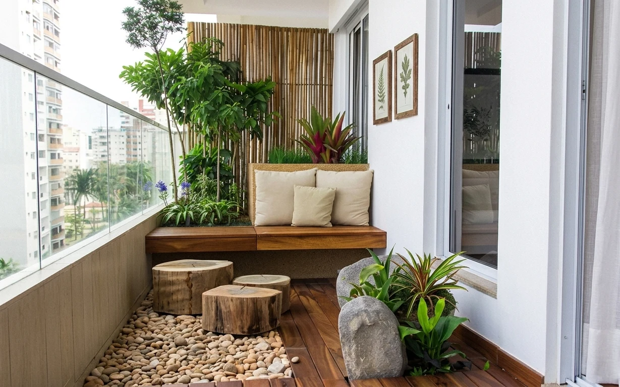
7 balcony nook upgrades for a $700 weekend
A balcony nook refresh that looks like a high-touch resort, built from seven changes you can do on a weekend. With $700 total spend, you’ll…
Coastal patio seating area refresh, $800
A patio seating area with cream cushions, light wood furniture, and string lights looks pulled together fast with 7 specific swaps. This $8…