- Best for
- color + glow updates
- Time
- one weekend
- Total cost
- about $700
- Renter-safe
- not renter-safe (vanity paint DIY)
Why a powder-blue vanity paint is the bathroom of 2026
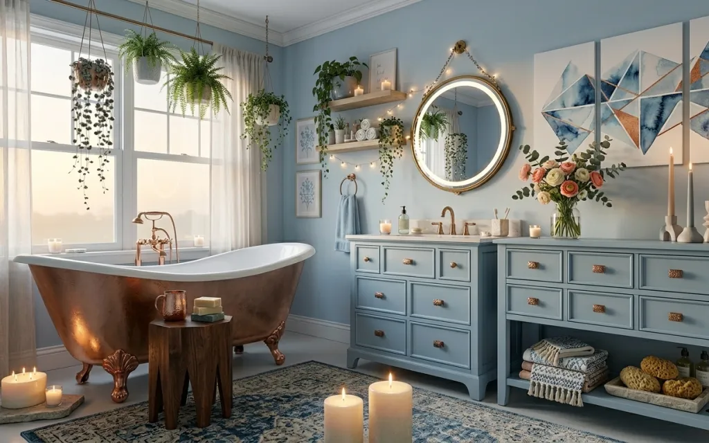
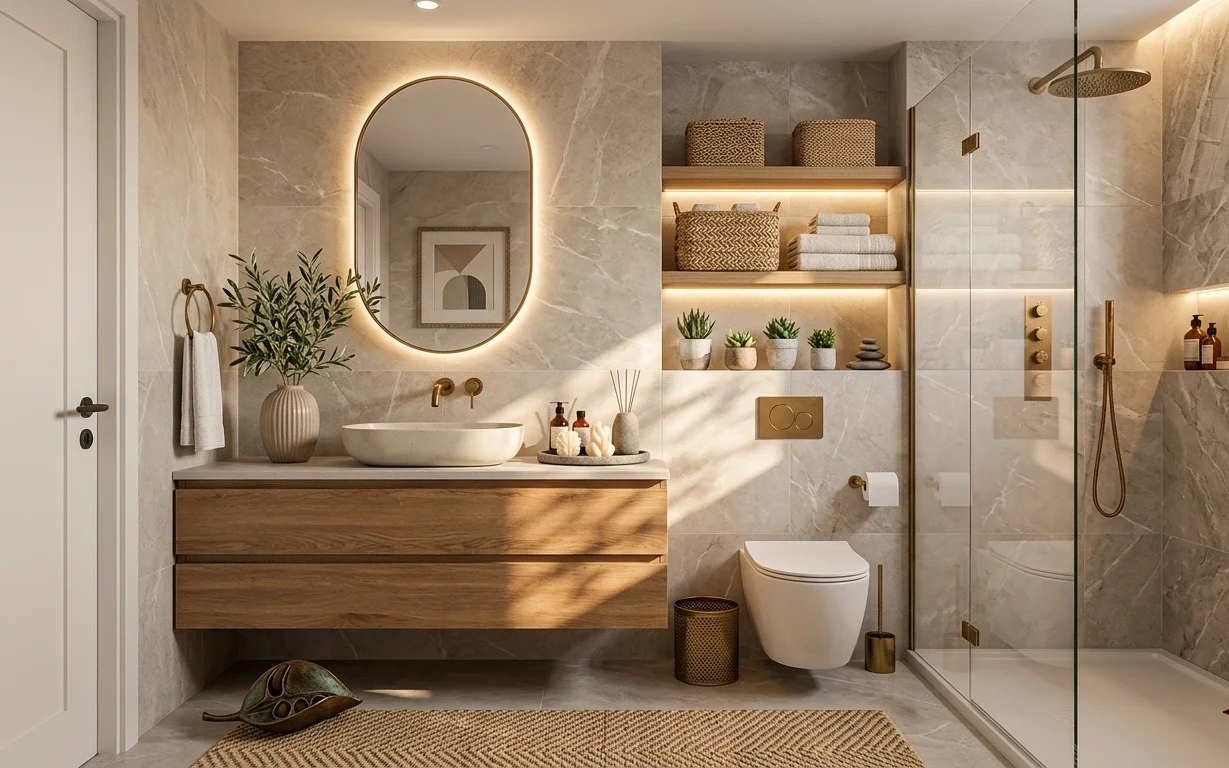
This photo works because the blue walls and powder-blue vanity create a single, calm color field, while the brass-framed round mirror and warm candles add glow. You can see the mix of textures: a soft patterned area rug underfoot, sheer white curtain panels pulling in daylight, and smooth painted drawer fronts. Even the greenery—hanging pots plus shelf plants—keeps the space from feeling formal. For US homeowners, this kind of refresh is doable in a weekend because you can prioritize the “big surfaces” (paint and rug) first, then layer in details.
I used to chase décor so hard that I’d forget the main job: choosing the right wall and vanity color to control the whole palette. In my last place, I added art and lamps, then painted later—and the room suddenly made sense once the base color stopped fighting everything. Here, the powder-blue vanity does that job. The mirror and candles finish the effect with warm points of light, so the room reads cozy even when the walls stay bright.
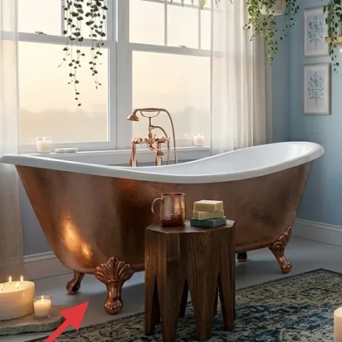
Layer 1 — Blue patterned area rug ($150) grounds a freestanding-tub floor
The blue patterned area rug sits under the bathtub and reaches far enough across the room that the floor stops looking “empty” in the center. Pick a 5×7 or 8×10 scale so the rug edge lands outside the tub footprint, not just beneath it. The pattern matters here: it picks up the bathroom’s blue tones while adding contrast against the light trim and sheer curtains. A plain solid rug would look fine, but the lived-in motif is what makes the whole composition feel styled. Trade-off: patterned rugs are harder to spot-clean than solids, so plan on quick blotting for spills.
Anchor the tub with rug scale
If the rug bunches or the front edge sits too close to the tub, the room reads unfinished. Size up until you can walk on the rug comfortably before your foot reaches the tub.
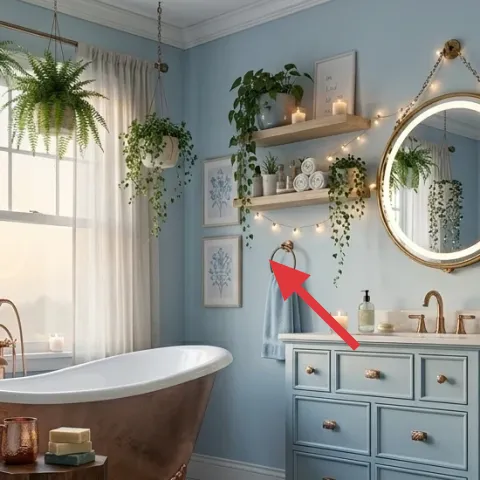
Layer 2 — Powder-blue double-sink vanity ($250) brings the main color down to eye level
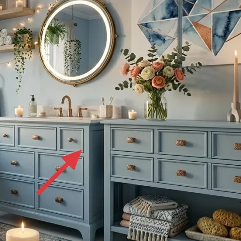
In this bathroom, the double-sink vanity is the visual anchor: its powder-blue paint picks up the wall tone and gives the space that crisp, coastal-clean feeling. The hardware and drawer spacing make it look intentional even before you add décor—so painting is the highest-impact move. Going DIY on the vanity is also practical: you get a major look change without changing the layout. The trade-off is prep—paint won’t stick or look smooth if the surface is dusty or not lightly scuffed. If you want the mirror to look “brighter,” matching the vanity color to the wall is the easiest way.
Make it instead of buying it
DIY the vanity refresh by painting the powder-blue coat so the bathroom has one unified blue field like the photo.
Materials
- Paint for furniture/trim (1 quart) — about enough for one solid coat + touchups — hardware store — $55
- Mini foam rollers (2) — craft store — $10
- Painters tape — 1 roll — hardware store — $8
- Sandpaper (220–320 grit) — 1 pack — hardware store — $7
- Tack cloth or dusting cloth — 1 pack — hardware store — $6
Steps
- Clear the counter and remove anything sitting on the vanity front, then tape off edges you want perfectly straight.
- Clean the painted surface thoroughly and let it fully dry.
- Lightly scuff the vanity faces with 220–320 grit to help the new paint grip.
- Wipe with a tack cloth to remove dust.
- Roll a thin first coat in the direction of the grain/flat panels, avoiding drips at corners.
- Let the first coat dry completely, then sand very lightly if you see raised grain or tiny bumps.
- Remove dust and apply a second thin coat.
- Reinstall items on top once fully cured, and touch up small spots with a small brush.
Total DIY cost: $86 — saves about $164 over buying.
Keep the glow in mind
Brass tones read warmer against powder blue, so a slightly creamy paint (not icy blue) usually looks more flattering with the round mirror and candles.
Layer 3 — Round wall mirror with brass frame ($120) doubles light in a small visual radius
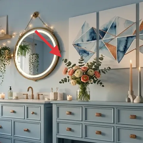
This round wall mirror is doing two jobs at once: it reflects the window glow from the left side and softens the geometry with a shape that isn’t straight-edged. The brass frame also acts like a warm “connector” between the candlelight on the floor and the brass accents you’d notice around a faucet. A rectangular mirror can work, but it often makes the room feel more technical next to a freestanding bathtub with curved lines. The trade-off with round mirrors is placement—hang it too high and you’ll lose the reflection at counter height. Keep it centered over the vanity so it reads intentional from the room entrance.
Don’t hang it off-center
If the mirror isn’t centered to the vanity width, the symmetry breaks and the room can feel slightly “off” even when everything else is perfect.
Layer 4 — Blue-and-white framed wall art print ($80) adds pattern without overcrowding
The blue-and-white framed wall art print gives the walls a clear focal point that matches the vanity and rug palette. It’s also sized to be readable without stealing attention from the mirror, which is the main reflection feature. The key is the color family: cool blues plus white keep the room airy, while the framing makes the art look finished next to painted cabinetry. If you choose a different art color, you may need to change accessories to match, which is why sticking to blue-and-white is the lower-stress path. Trade-off: art on painted walls can glare in bright daylight, so consider mat finish and position.
Match art to drawer color
Pull the dominant blue from the vanity paint into the art choice so your wall reads like one palette instead of separate décor.
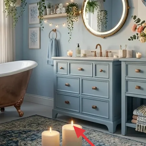
Layer 5 — Candles in a low tray on the floor ($35) brings nighttime softness
Those candles in a low tray sit at floor level near the bathtub, which is why they look so intentional instead of decorative “on the side.” Warm candlelight flatters painted surfaces and makes the mirror reflection feel richer, especially after dark. A single candle can look sparse, but the trio effect here creates depth and height variation without adding extra objects. Trade-off: floor-level candles require care—keep them away from curtains and make sure the tray is stable. If your bathroom runs steamy, choose candles that stay clean and avoid drifting wicks that can smoke.
Use candle clusters, not single sticks
Clusters give you a fuller reflection in the mirror, so the glow reads like décor rather than a utility item.
Layer 6 — Vase with pink and white roses ($30) makes the countertop feel “finished”
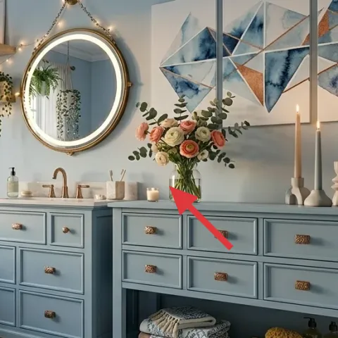
The vase with pink and white roses on the vanity shelf adds softness and a tiny pop of warm color against the powder-blue backdrop. It also gives the room movement—those petals and stems break up the straight lines of drawers and the countertop edge. A lower-cost floral swap can still work as long as the blooms hit the right color range (pink, blush, and white) and the vase stays fairly simple. The trade-off is freshness: real roses won’t last as long as dried stems, so plan for a quick replacement cycle. Still, this is one of the fastest ways to make a painted bathroom look lived-in rather than staged.
Choose a compact arrangement
If the flowers are too tall, they block the mirror line and make the vanity look busy.
Layer 7 — Hanging plant pot with trailing greenery ($30) adds vertical life near the window
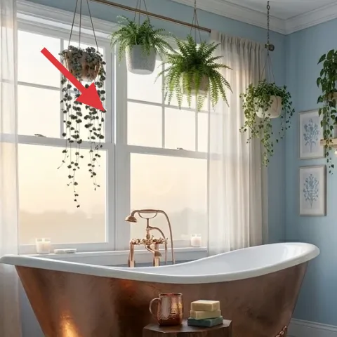
The hanging plant pot with trailing greenery pulls the eye upward and gives the bathroom an easy “green layer” without adding clutter on the counters. It’s especially effective near sheer white curtain panels because the leaves soften the window area and create a natural frame around the light. You could put plants on shelves, but trailing plants add a different silhouette—one that makes the room feel taller and more relaxed. Trade-off: hanging plants need consistent care and a stable setup so the pot doesn’t swing. For a weekend refresh, prioritize leaf health—full, thriving greenery is what sells the look.
Let the plant trail, don’t hide it
When the greenery falls past the pot rim, it reads intentional instead of accidental.
The cost, layer by layer
| Layer | Item | Cost |
|---|---|---|
| 1 | Blue patterned area rug (5×7 or similar) | $150 |
| 2 | Powder-blue double-sink vanity paint refresh (retail equivalent) | $250 |
| 3 | Round wall mirror with brass frame (24–36") | $120 |
| 4 | Blue-and-white framed wall art print (16×20) | $80 |
| 5 | Candles in a low tray on the floor (set) | $35 |
| 6 | Vase with pink and white roses (small arrangement) | $30 |
| 7 | Hanging plant pot with trailing greenery | $30 |
| Total | $695 | |
If you want a cheaper variant, prioritize vanity paint plus the rug, then use one larger framed wall art print instead of multiple smaller frames. Swap the fresh rose vase for a simpler decorative ceramic vase with a small green plant on the vanity shelf, and choose a single-tray candle set over a larger cluster.
What worked, what didn't (across the whole room)
The biggest win is that the palette is controlled: powder blue repeats across the walls and vanity, then the round brass mirror and candles add warm contrast. Layered greenery keeps the room from feeling overly polished, and the patterned rug makes the tub zone look grounded. The only thing to watch is clutter—too many small objects would compete with the mirror reflection.
What worked
- The blue patterned area rug anchors the bathtub zone so the floor doesn’t feel visually floating.
- Powder-blue vanity paint pulls the wall color down to eye level and makes the room feel designed.
- The round brass-framed mirror softens the layout and multiplies window light across the vanity.
- Blue-and-white framed wall art adds cohesion without fighting the mirror’s reflection.
- Candles in a low tray add warm glow that reads cozy in the evening.
- Trailing greenery near the window adds height and movement without occupying counter space.
What didn't
- Rug edges that sit too close to the tub make the space feel smaller than it is.
- Oversized mirror placement can clip the reflection so it stops enhancing the vanity.
- Too many small frames together would compete with the single mirror focal point.
- Floral arrangements that are too tall can block sightlines and make the vanity look crowded.
- Hanging plants placed too far from the curtain line can feel disconnected from the light.
What we'd skip if we did it again
Skip the urge to add multiple competing “statement” items on the same wall. In this layout, the mirror is the star, so adding too many framed pieces behind or beside it would muddy the hierarchy. Pick one framed wall art print and let the mirror do the heavy lifting for reflections.
Skip a plain solid rug if the goal is to make the bathtub feel styled rather than just placed. The rug pattern is what connects the powder-blue palette to the warmer accents around candles and brass. If going simpler, at least choose a rug with subtle variation so it doesn’t look flat.
Skip high-maintenance flowers in the first pass. Fresh roses look lovely, but a weekly replacement can become a chore. For a restart, use a compact vase arrangement and keep the blooms within the pink-and-white range, then switch in fresh stems when the rest of the room is already painted and aligned.
Frequently asked
How long does this bathroom refresh take?
Plan on one weekend if the vanity is the only DIY paint project. Expect a day for prep and coats (plus dry time), then a couple of hours for rug placement, mirror hanging, framed art layout, and styling the candles and flowers. If you’re new to painting, add an extra half-day for troubleshooting drips or touch-ups. The rest is mostly arranging and making sure the mirror and art align with the vanity.
What if I rent and can’t paint the vanity?
Skip the vanity paint layer and keep the color harmony through accessories. Use a rug and framed art in matching powder-blue tones, then choose a round mirror frame that brings a warm brass note like the photo. For greenery, rely on hanging plant pots and shelf plants rather than paint. If you can change curtains, swap to sheer white for the same light, airy effect. The overall look still holds because it’s built on color repetition and warm reflections.
My bathroom is smaller—what should I scale down?
Start with rug size: for smaller floors, choose the largest rug that still leaves a clear border around the tub zone, rather than a runner that looks like an afterthought. Keep the mirror centered and avoid very oversized frames that dominate the wall. For wall art, use one framed print instead of multiple pieces. Candles should stay in a stable low tray so you don’t eat counter space.
What if my bathroom is larger—how do I prevent it from feeling empty?
Size up the rug and move the mirror slightly farther away from the vanity if you need more visual breathing room. If the wall feels bare, add one extra framed wall art print near the existing piece, keeping the same blue palette. For greenery, add a second plant pot on the floating shelf (not more than that, or it turns into clutter). Keep candles clustered so the floor-level glow doesn’t get lost.
Where should I shop for these specific items?
For the vanity paint refresh, a local hardware store is best for getting the right trim paint and sanding supplies. Rugs and framed art prints are easiest to find at big-box home stores or curated online retailers—focus on matching blue tones rather than chasing a brand. For candles, choose a simple low tray set with a warm burn profile. The hanging plant pot and greenery can come from any garden center, as long as the trailing leaves look full.
What’s the biggest mistake homeowners make with this look?
The most common miss is buying items that don’t repeat the same blue family. When the vanity blue, rug blue, and framed art blue don’t relate, the bathroom reads mismatched even if each individual piece is pretty. Another mistake is going too tall with flowers or wall décor, which blocks sightlines and makes the vanity feel crowded. Keep one main focal point (the mirror), then support it with one art print, one rug, and warm candle glow.
More in Bathroom

Under $700: a powder-blue bathroom refresh with 7 upgrades
A powder-blue bathroom looks different the moment you swap the rug, refresh the vanity color, and add a warm brass-framed mirror plus candl…
Under $400: 7 move-ready swaps for a spa bathroom refresh
A spa bathroom that looks built-in but can still be packed: seven renter-friendly swaps for a warm, marble-and-wood look under $400. Focus …
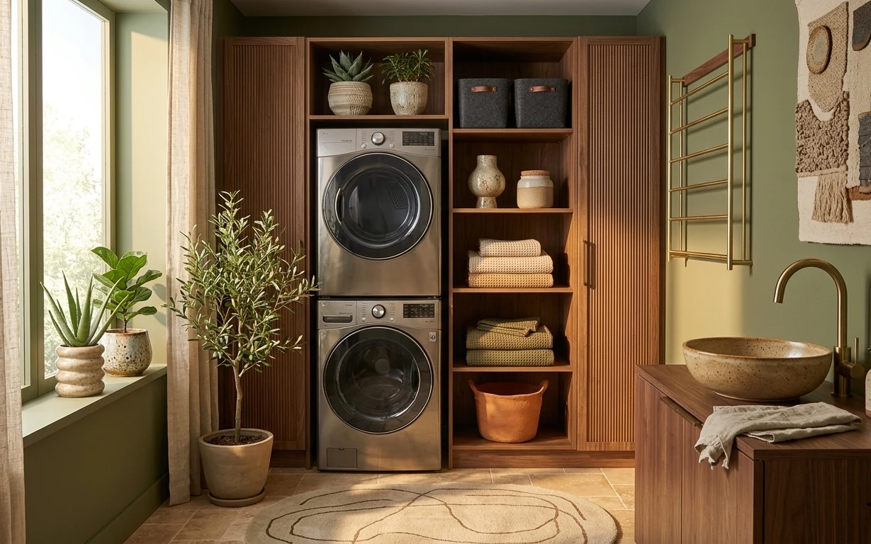
Under $600: laundry bathroom nook refresh with 7 layers
A laundry bathroom nook can look intentional without a full renovation. Here are 7 weekend-friendly updates—rug, curtains, towel storage, p…