
- Best for
- Cost + color cohesion
- Cost
- Under $700 for the main swaps
- Difficulty
- Easy (mostly freestanding + wall-friendly hanging)
- Time
- About a weekend
Why an olive-and-terracotta palette is the living room of 2026
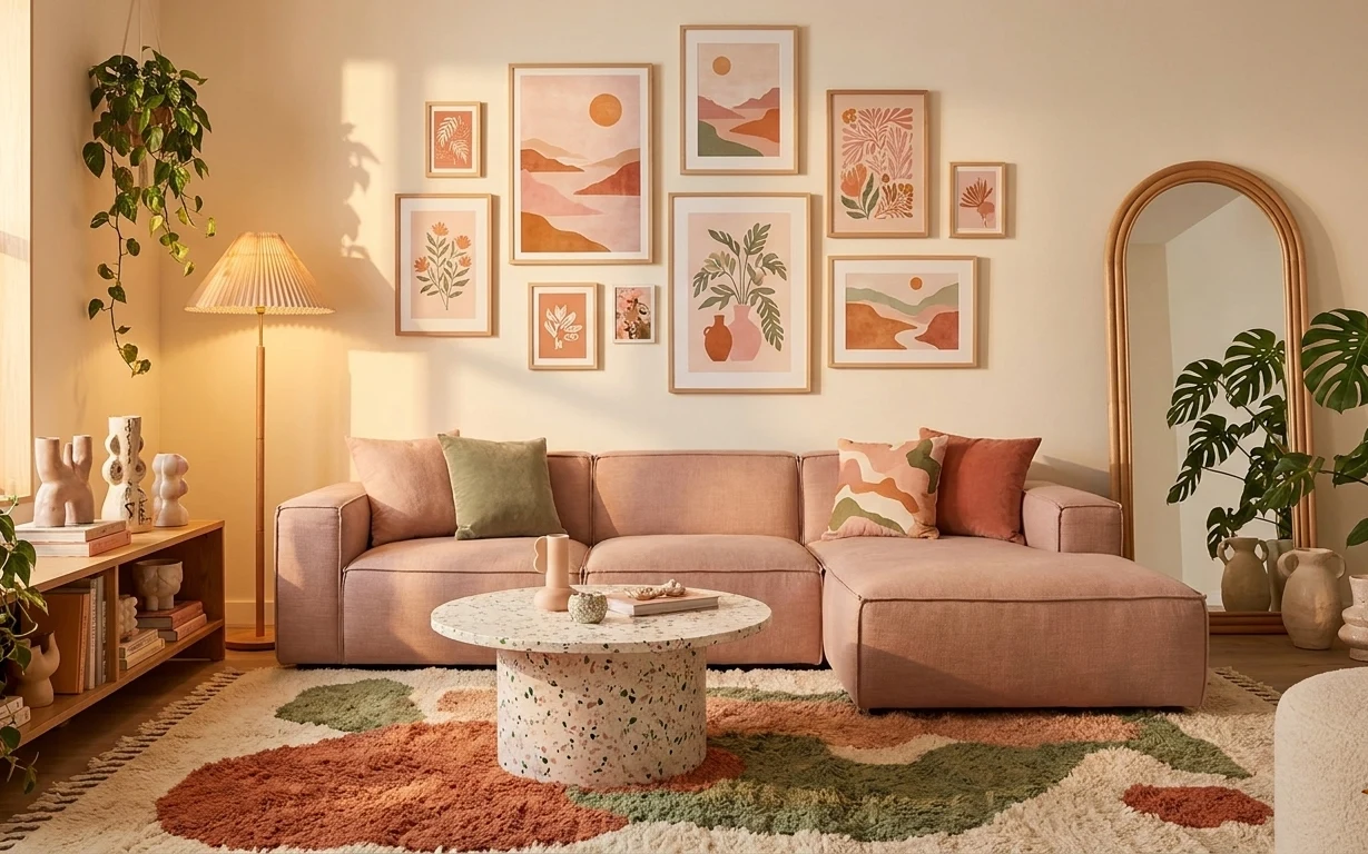
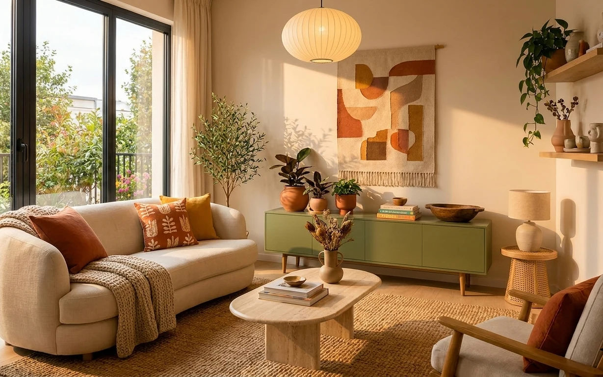
Start with the foundations that change how the space feels: in this photo, the beige sofa reads calm, but the multi-color rug gives the room its movement. The round terrazzo-style coffee table adds speckled texture without looking heavy, and the pleated floor lamp softens everything when daylight fades. On the wall, framed prints in warm earth tones bring a curated “collected over time” rhythm. For renters, this works because every big visual note can be swapped with freestanding pieces and wall-friendly hanging methods.
I’ve made the mistake of overmatching—trying to pick one “perfect” shade and ending up with something flat. Here, the palette stays cohesive because it repeats: olive green on the rug and pillows, terracotta rust across the art, and that creamy beige throughout. The textures do the rest: woven rug fibers, matte ceramics on the side shelf, and that gently patterned coffee table surface. Once the repeats are in place, the room feels designed without needing anything permanent.
Layer 1 — multi-color area rug ($200) Ground the beige sofa with pattern + color
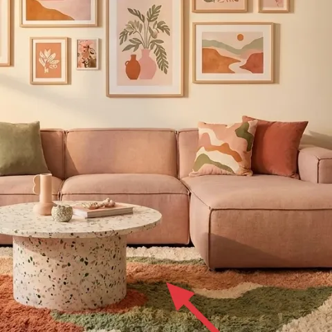
This multi-color area rug sits under the coffee table and front sofa edge, acting like the room’s visual anchor. The earthy greens and terracotta rust keep the palette from feeling one-note next to the beige upholstery, and the shape/scale is important—too small and it looks like a random accent. A flatweave-style alternative can work, but it won’t hide wear as well as a thicker, higher-coverage rug. Trade-off: you’re committing to color underfoot, so choose a rug with tones already echoed in the framed art.
Pick tones that already exist
Pull one green and one rust from the art or pillows, then let the rug repeat those hues.
Layer 2 — round terrazzo-style coffee table ($180) Add speckled texture without visual weight
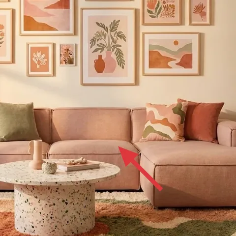
The round coffee table is doing a lot: it’s the only hard-edged shape, so it breaks up the sofa’s long line and gives the room a softer rhythm. The terrazzo-style surface adds a speckle pattern that ties into the rug’s scattered color fields, while the creamy base keeps it compatible with the beige sofa. The “obvious alternative” is a rectangular table—clean, but it can make the whole seating area feel boxy. Trade-off: round tables take a bit of clearance, so measure the path between the sofa chaise area and the side shelf.
Round helps traffic flow
If your room feels narrow, the curve creates more forgiving turning space than corners.
Layer 3 — plug-in floor lamp with pleated fabric shade ($80) Soften evenings with warm, diffuse light
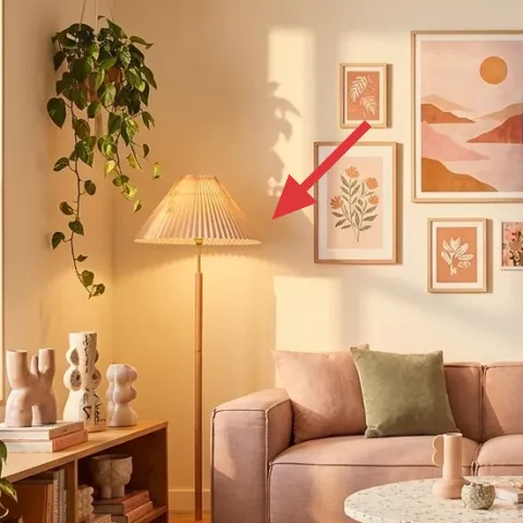
This floor lamp with a pleated fabric shade adds a warm glow that reads “evening-ready” even in daylight. Positioned to the left of the seating area, it gives vertical height and light at the exact zone where a table lamp would start feeling too low. A brighter white bulb can look fine in a showroom, but in real life it fights beige walls and can make the rug look dull. Trade-off: fabric shades show texture—choose one with a smooth, evenly pleated look so the light stays flattering.
Don’t pair cool bulbs with warm decor
If your lamp uses a cooler LED, the beige and terracotta tones can look slightly green or washed.
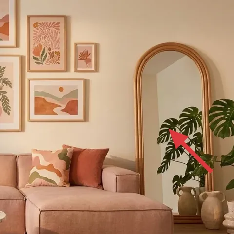
Layer 4 — arched wall mirror with gold-toned frame ($80) Pull light across the sofa
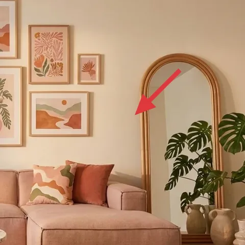
The arched mirror with a gold-toned frame sits on the right side and visually expands the room by bouncing light across the sofa. That arch shape is key—it echoes the curve of the plant and breaks up the straight lines of framed prints. If you swap to a square mirror, the room can feel more formal and less relaxed. Trade-off: mirrors are high-contrast objects, so keep the frame finish warm-toned and let your decor (like ceramics and terracotta) provide the softness.
Match the finish, not the exact gold
Look for “warm brass” or “antique gold” so it stays in the same temperature as the room.
Layer 5 — large leafy indoor plant in corner ($35) Add height and a lived-in feel
The large leafy indoor plant in the corner adds height that the sofa can’t provide, and it brings that olive-green tone into the room as living texture. It also frames the arched mirror—plants and mirrors are a great pairing because both create natural “open space” around the center. A shorter plant can work, but it won’t balance the wall art cluster the same way. Trade-off: bigger plants need a little light and occasional rotation, so place it where it can actually get through your everyday window access.
Rotation keeps the silhouette even
Every couple of weeks, turn the pot so leaf growth spreads evenly.
Layer 6 — framed art print set for the gallery cluster ($80) Repeat the terracotta + olive palette
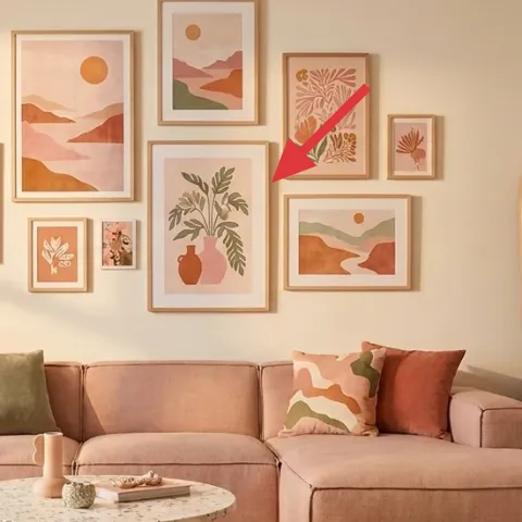
The framed art print set creates the collected-grid feel above the sofa, and it’s where the palette gets “read” as intentional. The prints in warm earth tones and botanical shapes make the rug and pillow colors feel like part of a story, not random accents. If the obvious alternative is one big statement piece, the room can end up either too minimal or too heavy—this gallery mix gives rhythm without overpowering the seating. Trade-off: you’ll spend a little time spacing frames so the grid doesn’t look accidental; use removable hanging methods and keep gaps consistent.
Keep spacing consistent
Even 1–2 inches of difference between frames can throw off the grid pattern.
Layer 7 — throw pillow cover in olive green ($30) Tie soft texture to the rug colors
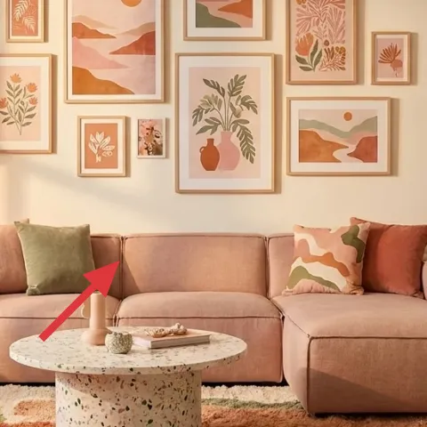
The olive green throw pillow cover is placed on the sofa where it’s easy to spot, so it acts as the color “bridge” between wall art and the patterned rug. The matte fabric feel also adds comfort—unlike decorative objects, pillows soften the room instantly. A terracotta pillow can work too, but olive tends to read more grounded next to beige, especially when there’s a leafy plant in the mix. Trade-off: pillow covers can look flat if the fabric is too shiny, so choose a medium-weight textile with a natural texture rather than glossy sheen.
Repeat the accent once more
If the pillow is olive, look for olive notes in at least one other item—rug, art, or plant.
The cost, layer by layer
| Layer | Item | Cost |
|---|---|---|
| 1 | 8×10 multi-color area rug | $200 |
| 2 | round terrazzo-style coffee table | $180 |
| 3 | plug-in floor lamp with pleated fabric shade | $80 |
| 4 | arched wall mirror with gold-toned frame | $80 |
| 5 | large leafy indoor plant (4–6 ft) | $35 |
| 6 | framed art print set (gallery cluster) | $80 |
| 7 | throw pillow cover in olive green | $30 |
| Total | $685 | |
If you need a cheaper route, drop the rug to a smaller size or choose a thinner construction, and pick a simpler mirror shape. A basic framed-print set from the same warm palette still reads cohesive, especially when the pillow and plant repeat the olive and terracotta tones.
What worked, what didn't (across the whole room)
The overall verdict: the room feels intentional because it repeats the same earth palette across five different textures—rug fibers, tabletop speckle, plant leaves, pillow fabric, and framed art inks. Warm lamp light makes the beige sofa feel less flat. The only time it can slip is when one piece is either too glossy (light reflection) or too cool-toned (color temperature mismatch).
What worked
- The multi-color rug pulls beige, olive, and terracotta into one “grounded” palette.
- The round coffee table softens the seating lines and keeps traffic flow forgiving.
- The pleated lamp shade gives diffuse warmth that flatters framed prints and ceramics.
- The arched mirror adds depth and makes the wall feel taller without clutter.
- The large plant brings vertical energy that balances the gallery cluster.
- The olive pillow cover ties back to the rug, so color feels repeated—not random.
What didn't
- A rectangular coffee table would have made the seating zone feel boxier next to the chaise.
- Too-small framed art spacing can read “tacked on,” even if the colors are right.
- Cool white bulbs can fight beige walls and mute terracotta rust.
- If the rug is too neutral, the olive-and-rust palette disappears into the sofa.
What we'd skip if we did it again
Skip a second “matching” patterned item once the rug already has multiple earth tones. When rug + art both bring pattern, extra prints can feel busy—save pattern for one main surface and keep the rest textured and solid.
Skip a mirror with a cool finish if the decor is warm-toned. A silver or icy frame can make the beige sofa and terracotta accents look slightly off, even when everything else is coordinated.
Skip cool lighting temperatures. If the floor lamp bulb runs 4000K+, the room can look flatter and the colors less rich, especially in the evening. Stick to warm, diffuse light so the palette stays earthy.
Frequently asked
How long does this kind of living room refresh usually take?
Plan on about a weekend. The rug and coffee table are the fastest wins (often an hour or two each), and the lamp is typically plug-and-go. The slow part is art spacing—lay frames out on the floor first, then hang with removable methods and check straightness from the sofa.
Can renters copy this without drilling or permanent changes?
Yes. The big pieces are mostly freestanding: rug, coffee table, floor lamp, and plant. For the framed art cluster and mirror, use renter-safe removable hanging methods that match the weight of the frames. Keep everything move-ready so it packs up cleanly at lease end.
What if my living room is smaller than in the photo?
In a smaller room, scale down the rug size and keep the coffee table proportion. Choose a slightly narrower mirror or place it higher so it doesn’t swallow wall space. The framed art cluster can stay—just reduce the number of frames to keep the wall from feeling crowded.
What if my living room is larger and feels empty?
Add breathing room with larger rug dimensions and keep the coffee table’s round shape. Go for a fuller plant silhouette and a slightly taller floor lamp so you get more vertical balance. For the art wall, increase the print variety while staying inside the olive-and-terracotta palette.
Where should I shop for these specific items without blowing my budget?
Start with the rug and mirror because those are hardest to get “close enough.” Look for budget-friendly options at home goods stores and online marketplaces, then shop for the lamp and coffee table at the next level of quality you can afford. For the framed art, pick a set with matching color families and similar frame tones.
What’s the biggest mistake people make with this look?
Usually it’s color temperature mismatch—using cool bulbs, icy metal finishes, or a rug that’s too gray. The second common miss is overmatching patterns: if the rug already carries multiple earth tones, don’t add additional high-contrast prints that compete with the gallery cluster.
More in Living Room
Under $700: earthy living room refresh with move-ready swaps
An earthy living room refresh that leans on warm lighting, a patterned rug, and mix-and-match art. This renter-friendly setup stays move-re…
Under $350: airy boho living room refresh with 7 move-friendly swaps
A sunlit boho living room refresh built for shared housing: swap in a new rug, curtains, and textiles, then add framed art, a tray styling …