
- Best for
- mid-height shelf styling + textile layering
- Cost
- Under $800 total
- Difficulty
- Easy to Moderate
- Time
- 2–4 weekend hours (plus one DIY dry time)
Why this warm wood-and-olive refresh is the boho bedroom of 2026
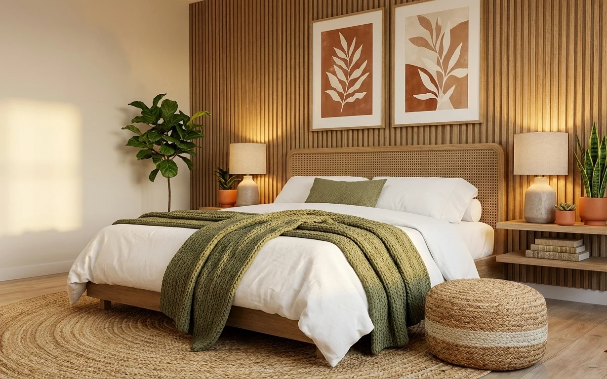
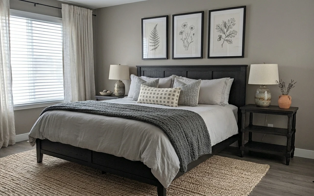
The first thing this room does is make the wood panel wall feel intentional: the warm slats set the backdrop, then the cream duvet and white pillows soften the contrast. A jute area rug anchors everything with texture underfoot, while the green throw blanket adds that grounded olive note right where your eye lands on the bed. The framed botanical prints bring a natural theme without needing a lot of color. For a weekend refresh, this approach is achievable because it focuses on movable, ownable pieces—rug, art, lamps, and styling—rather than changing the bones of the space.
One mistake I caught myself making in my own place: I kept adding “matching” decor until the room felt flatter than when it started. Here, the better move is to repeat materials instead of exact colors—wood + linen + terracotta + green. Once I switched from color-matching to texture-matching, everything suddenly looked finished even when the updates were small. That’s what this setup nails: a few deliberate buys, then styling that reads as lived-in, not staged.
Layer 1 — jute area rug ($200) tight-weave texture underfoot
This jute area rug sits under the bed and helps the whole room feel grounded, not floating. In the photo, it’s a tight weave with a natural straw tone that harmonizes with the warm wood wall and keeps the cream bedding from looking too crisp. The tempting alternative is a flat “fake jute” rug, but it won’t hold up visually—especially once daylight hits it and the rug starts to look gray or uneven. A real jute look also adds that hands-on texture you can feel with your eye. Trade-off: it can shed a little early, so a rug pad helps keep it stable.
Choose the rug pad, not just the rug
A thin pad boosts comfort and reduces shifting, which matters most when a rug sits mostly under furniture like this bed.
Layer 2 — framed botanical print pair ($180) warm earth-toned leaf shapes
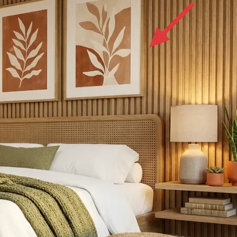
The two framed botanical prints on the wood panel wall are the visual punctuation that keeps the room from reading as one big wood block. Their terracotta-and-cream palette echoes the planter color and the duvet, so your brain gets a consistent “natural” story. The easy alternative would be a single large print, but two smaller pieces balance the wall spacing with the bed’s width and the shelf height. Keeping the prints framed (instead of canvas art) also adds a clean border that matches the neatness of the woven headboard. Trade-off: measure wall spacing and hang them evenly—botanical art looks intentional only when the alignment is.
Keep frames similar in thickness
Even when prints differ, the shared frame look makes the pair read as a set against the vertical wood slats.
Layer 3 — terracotta planters on the shelf ($35) paintable warmth at the right height
Those terracotta planters on the shelf do more than hold plants—they bring the room’s warm color signal down from the artwork into the everyday zone where you notice it. Because the shelf holds multiple objects, the planters also create small, repeated anchors that keep the styling from looking random. Buying new planters is straightforward, but it’s easy to overspend when you only need a color pop in the existing plant spots. The best trade-off here is to keep the plant silhouettes and change the planter finish (through paint/accents) so the shelf styling looks intentional without replacing the whole setup.
Make it instead of buying it
Turn plain terracotta planters into coordinated painted accents so they match the room’s cream-and-terracotta palette without buying a whole new set.
Materials
- Terracotta planters set (2–3 small pots) — craft store — $12
- Acrylic paint (warm terracotta tone) — small bottle — $6
- Sponge brush — small pack — $4
- Painter’s tape — 1 roll — $3
- Clear matte sealer — use what you already have — $0
Steps
- Rinse and dry the planters so paint sticks evenly.
- Mask simple shapes with painter’s tape for clean edges.
- Dab on the terracotta paint with a sponge brush for a soft, textured finish.
- Remove tape while paint is still slightly tacky for sharper lines.
- Let the planters dry fully, then add a second dab coat if the terracotta looks patchy.
- Apply clear matte sealer if the planters will be handled often (optional if the finish feels dry to the touch).
Total DIY cost: $25 — saves about $10 over buying.
Keep the accent pattern small
A narrow stripe, band, or partial paint keeps the plants looking natural instead of looking like store-bought novelty pots.
Layer 4 — wood wall shelf unit ($180) open storage that makes styling easier
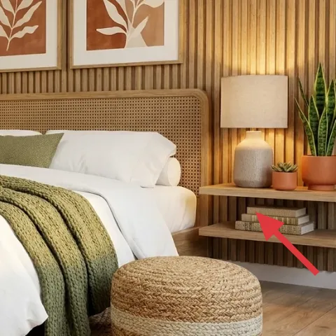
The wood wall shelf unit is doing double duty here: it’s storage for decor and it’s a stage that makes plants and lamps look “placed,” not dropped in. The warm shelves also echo the wood panel wall, so the whole wall reads like one cohesive system instead of separate items. If you skip shelves and only add a lamp and art, the room can feel top-heavy—your eye has nowhere to land at mid-height. This shelf gives that mid-height anchor where the planters, books/objects, and lamps can repeat the earthy palette. Trade-off: don’t over-style; with open shelving, fewer objects at more breathing room looks more elevated than a crowded lineup.
Group by height first
Start with tall items (like the narrow plant), then fill in with shorter pots and small objects so the shelf stays balanced.
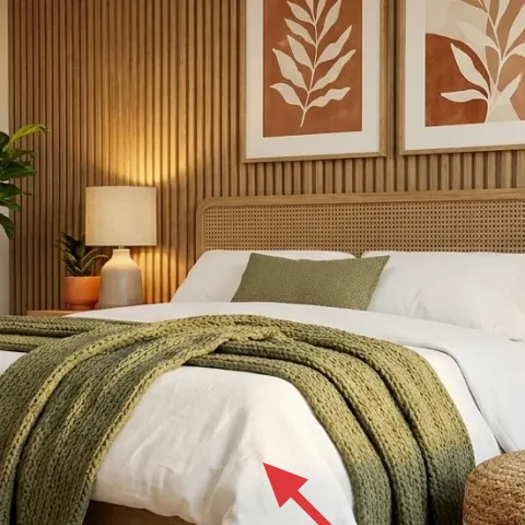
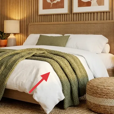
Layer 5 — green throw blanket ($60) olive drape that softens the bed
The green throw blanket folded over the bed adds an easy, high-impact color layer without changing the whole bedding palette. Its olive tone connects to the plants and keeps the room from feeling too beige and flat. The “obvious” alternative is to go with a neutral throw, but neutrals disappear once the wood wall and rug do most of the heavy visual lifting. This blanket gives a clear focal point in the center of the bed while still feeling natural because the weave reads cozy, not shiny. Trade-off: choose a thickness that holds its fold—if the knit is too thin, it slumps and looks accidental instead of styled.
Avoid matching green exactly
If the throw green matches the plants perfectly, the room can look flat; aim for a similar family of olive rather than a strict match.
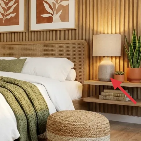
Layer 6 — table lamp with fabric shade ($60) warm pool of light beside the bed
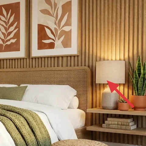
These fabric-shade table lamps add warm, soft light that makes the whole wood-and-cream scheme feel calmer after dark. The shade material is key—paper or fabric diffusion prevents harsh hotspots, so the light looks like it belongs in a relaxed bedroom rather than an office. The alternative is an LED bulb-only “brighter” setup, but that usually makes wooden walls look darker and makes the room feel less sleep-friendly. With lamps, the positioning also matters: place them so the light hits the wall and the bed from the sides, not from overhead only. Trade-off: fabric shades need a quick dusting now and then to keep them looking crisp.
Match lamp tones, not bulb brightness
Look for warm light (around 2700K) so the wood wall and cream bedding read golden instead of blue.
Layer 7 — white duvet cover ($80) crisp base for the olive layer
The white duvet cover works like a reset button: it keeps the earthy palette from taking over completely and gives the green throw somewhere to pop. In the photo, the duvet also makes the woven headboard texture look cleaner, because the bed doesn’t compete with the wall’s vertical lines. Swapping it for off-white or patterned bedding could be tempting, but if the pattern is too busy, it fights the botanical prints and the shelf styling. The crisp base also makes the room feel brighter in daylight, even though the walls are warm wood. Trade-off: white shows lint and wrinkles, so plan for quick smoothing and frequent laundering.
Use pillow texture, not just color
If the white looks flat, add interest with a slightly different pillow weave (still in the same cream family).
The cost, layer by layer
| Layer | Item | Cost |
|---|---|---|
| 1a | Jute area rug 5×7 | $160 |
| 1b | Rug pad | $40 |
| 2a | Framed botanical print (left) | $100 |
| 2b | Framed botanical print (right) | $80 |
| 3 | Terracotta planter accents (DIY at retail equivalent) | $35 |
| 4 | Wood wall shelf unit | $180 |
| 5 | Green throw blanket | $60 |
| 6 | Table lamp with fabric shade | $60 |
| 7 | White duvet cover | $80 |
| Total | $795 | |
If you want a cheaper version, prioritize the jute rug + one botanical print first, then add only one table lamp and a single green throw. You’ll still get the warm wood + olive effect, but you’ll spread the shelf styling and the second lamp over a second weekend.
What worked, what didn't (across the whole room)
This layout works because it repeats a few materials—wood, linen-like whites, olive textiles, and terracotta—at multiple heights (floor, bed, shelf, wall). The result looks styled without needing big structural changes. The main trade-offs are maintenance and staying restrained with open shelving.
What worked
- The jute rug anchors the bed and adds texture that makes the wood wall feel warmer.
- Framed botanical prints bring a natural motif that matches the plant shapes without adding clutter.
- Terracotta planters repeat a warm color at shelf level, so the room feels cohesive.
- Fabric-shade table lamps soften the wood panel wall and keep nighttime light flattering.
- The green throw blanket gives the bed a clear focal fold instead of blending into neutrals.
- Open shelving keeps styling organized at eye level, which makes the room feel “finished.”
What didn't
- When the shelf looked crowded, the plants stopped feeling intentional and started feeling accidental.
- If the throw green is too bright, it clashes with terracotta and makes the wood look too dark.
- Skipping a rug pad makes the rug shift underfoot, which looks messy even when everything else is tidy.
- If the duvet looks wrinkled, the whole room reads less calm against the clean lines of the wood slats.
What we'd skip if we did it again
Skip matching “set” decor from the same retailer. In this room, the best look comes from repeated materials—wood tones, cream textiles, terracotta accents—rather than identical objects.
Skip going too neutral for the bed. A neutral throw can disappear against the wood headboard texture and make the room feel flat; keep the olive throw for a grounded focal point.
Skip over-styling the shelf unit. Start with plants and one or two small objects, then stop—open shelves look best when there’s breathing room between pieces.
Frequently asked
How long does this kind of boho bedroom refresh take?
Most homeowners can finish the buy-and-place pieces (rug, lamps, framed prints, and throw) in one weekend. If you’re DIY-ing the terracotta planter accents, add prep/drying time—plan for about a day where the paint can cure between coats. Total active time is usually 4–6 hours, but the room still feels noticeably different as soon as the art and rug are in.
What if I rent and can’t mount anything to the wall?
For renters, lean on freestanding changes: the jute area rug, the duvet cover, the throw blanket, and the table lamps. For the framed botanical prints, look for a no-drill option like picture hanging hardware that doesn’t require drilling (or use adhesive picture strips rated for your frame weight). The shelf unit is the one part that may require permission, so prioritize styling around what’s already there.
My bedroom is smaller—will this feel too busy?
If the room is smaller, keep the same material story but reduce quantity. Use one statement botanical print instead of two, or keep two prints but make them narrower so they don’t widen the wall visually. Choose a slightly smaller rug size if needed, and keep the shelf lineup to plants plus one small decorative tray. Let negative space do the work.
What if my bedroom is bigger and needs more visual weight?
Scale up the rug so it reaches farther under the bed. In a larger room, two table lamps can be a real advantage because they balance the sightline around the bed. For the wall, add more botanical frames only if they’re in the same warm palette; otherwise, keep the two prints and let the wood slats and headboard texture provide the drama.
Where should I shop to get this look without overspending?
For the biggest “feel” items—jute rug, framed prints, and lamps—mix budget-friendly options with one real upgrade. Look for jute rugs and rug pads in home goods stores or marketplaces, then spend a bit more on lamp shades because fabric quality shows. For the botanicals, prioritize printed leaf art with terracotta tones so it matches the plants.
What’s the biggest mistake people make in rooms like this?
Overmatching. When everything is the same exact shade of green or the same beige tone, the room can look flat instead of layered. Another common miss is crowding the shelf—open shelves read better with a few intentional pieces and spacing between them. If the room starts to feel busy, remove objects before adding more.
More in Bedroom
Under $800: boho bedroom refresh with warm wood details
A boho bedroom refresh that leans on warm wood, olive textiles, and framed botanical art—built with seven tangible upgrades. Total DIY + bu…
Under $700: warm neutral bedroom refresh with 7 renter-friendly swaps
A warm beige-and-camel bedroom refresh you can recreate in a rented space with 7 renter-friendly swaps. Focus on the area rug, textured thr…
Under $600: move-friendly earthy bedroom refresh
An earthy-neutrals bedroom refresh you can do as a renter for under $600. This look leans on a woven rug, soft gray textiles, plug-in lamps…