
- Best for
- warm, boho-style bedrooms
- Time
- 1 weekend
- Total cost
- about $800
- Renter-safe
- yes (swap items instead of permanent fixes)
Why warm terracotta-and-wood boho is the bedroom retreat of 2026
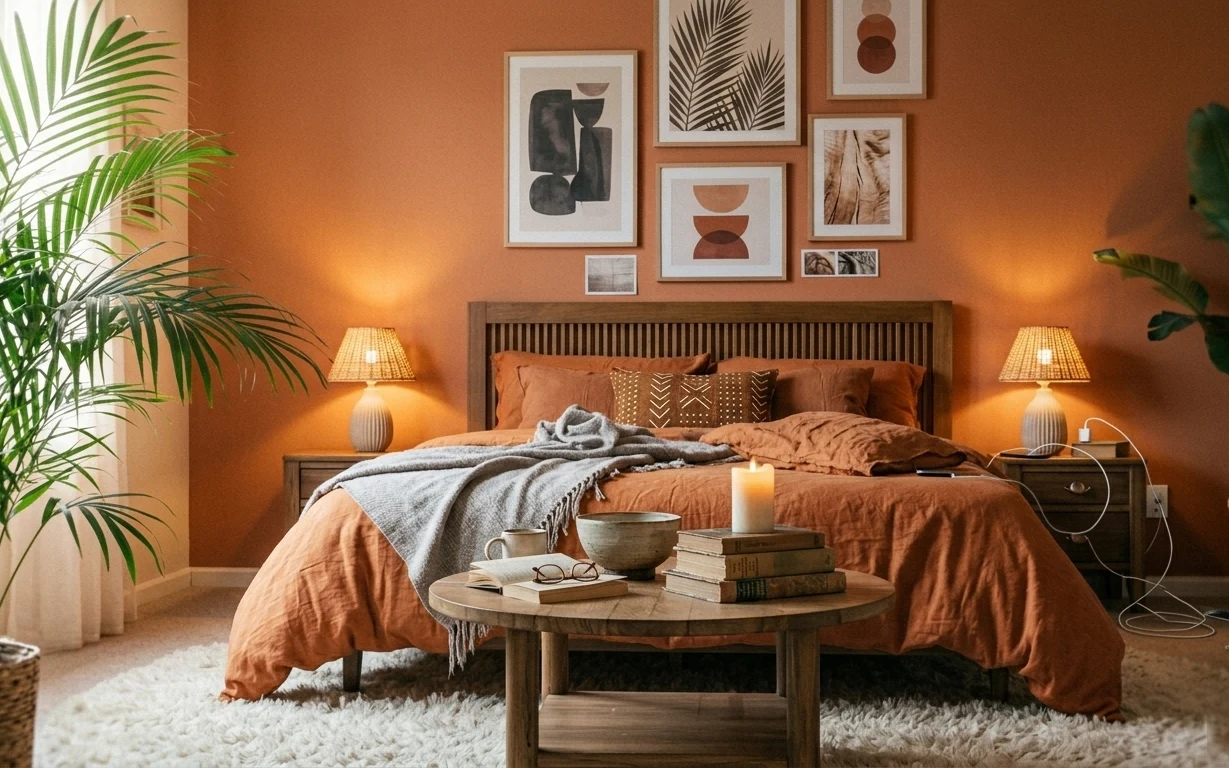
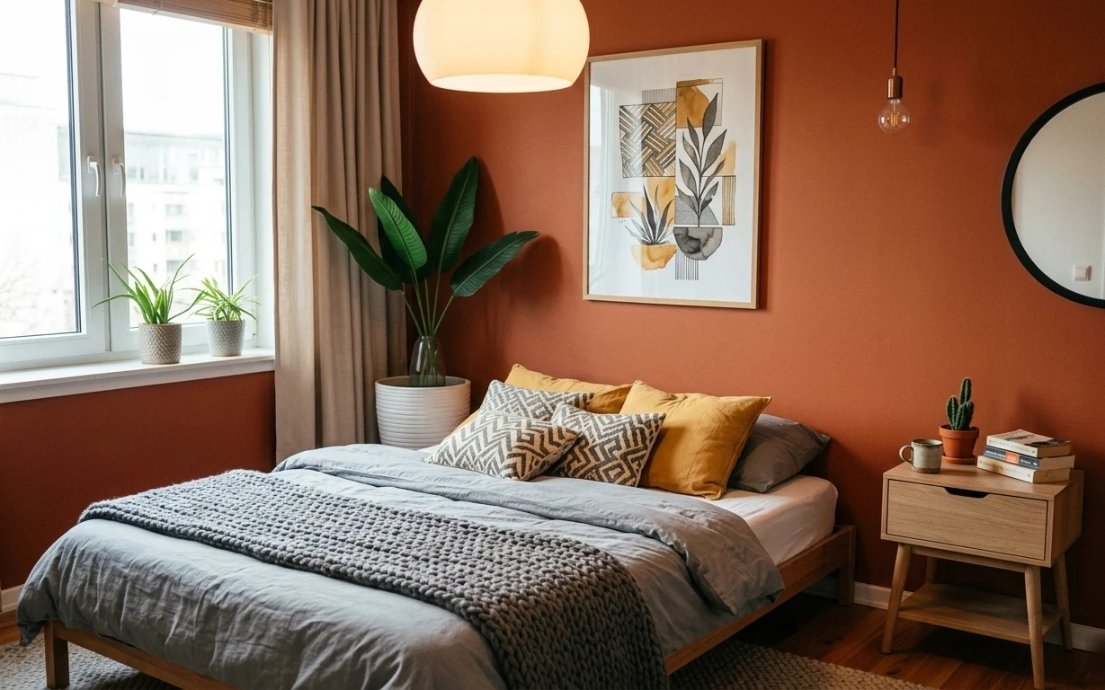
Start by noticing the contrast: the shag white rug softens everything, while the terracotta wall keeps the palette grounded. The bed’s orange-brown comforter brings warmth in a big, obvious shape, and the gray throw adds texture without fighting the color. On my own first “cozy” redo, I tried to fix everything with tiny decor pieces—this image is a better lesson: pick one grounding fabric (rug) and one hero bedding color, then build around them. For homeowners, that order is fast and satisfying.
The moment that made me pause in this photo is the lighting height. I used to reach for floor lamps right away, then realized the bedside lamps (with similar beige shades) keep the glow cozy without stealing attention. Also, the coffee table styling is a reminder that “styled” can still be practical—books and a bowl feel lived-in, not staged. That’s the same mindset that made my last bedroom feel calmer: fewer items, better materials, warm light.
Layer 1 — shag area rug ($200) Soft underfoot, low-fuss for a busy bedroom
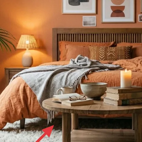
The shag area rug sits under the bed and anchors the whole scene, making the room feel warmer the instant you walk in. In a bedroom retreat like this, the rug is doing the heavy lifting that paint alone can’t—creating a plush “buffer” between the hard terracotta wall and the wood furniture. A 5×7 style size is especially forgiving because it covers the landing spots where your feet go day to day. The trade-off is maintenance: choose a rug with a manageable pile and vacuum regularly so it stays fluffy instead of flattened.
Pick a rug with a real cream tone
Look for off-white rather than bright white so the fibers blend with warm lamps and terracotta paint.
Layer 2 — orange-brown comforter ($100) Brings the hero color in one large shape
The orange-brown comforter is the color anchor that makes the terracotta wall feel intentional instead of random. It covers a lot of surface area, so you don’t need multiple dyed throws or bold prints to get impact. This is also the easiest way to pull a room together when the existing wood furniture is already warm. The alternative—adding only pillows—tends to look scattered because the bed becomes a patchwork of small accents. The trade-off: richer comforters show lint and wear sooner, so plan for quick spot cleaning.
Choose comforters that read warm, not orange-candy
Terracotta rooms look best with muted clay tones that lean brown, especially under beige-shaded lamps.
Layer 3 — gray throw blanket ($25) Adds texture without competing with terracotta
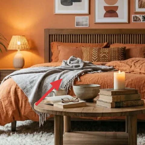
The gray throw blanket gives you that “layered” look over the orange-brown bedding, but it stays neutral enough to let the wall color and art do their jobs. Drape it so it looks casually tossed—like a late-afternoon landing spot—rather than folded into perfect edges. This choice is the visual bridge between the creamy rug and the warmer bedding tones. If you skip the throw, the bed can feel one-note: all color, no texture. The trade-off is scale: a too-small throw looks lost; aim for a blanket that hangs off the edge enough to create movement.
Let one corner hang
Even a small overhang makes the blanket look styled while still feeling relaxed.
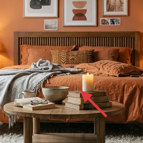
Layer 4 — small wooden coffee table ($150) The DIY paint job that makes everything look curated
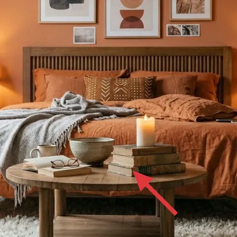
This small wooden coffee table is the styling surface that connects the bed zone to the room’s decor—books, a bowl, and the candle all live here. In photos like this, the table’s finish matters because it sits in the middle of the palette: it either looks like a random extra piece or like part of the plan. Painting is the fastest way to unify the wood tones with the rest of the room’s warm browns and creams. The trade-off is time spent prepping, but the upside is you can make a worn finish look fresh in a weekend.
Make it instead of buying it
Sand and paint the coffee table so its wood finish matches the room’s warm terracotta-and-cream palette without buying a new table.
Materials
- Sandpaper (assorted grits) — — store hardware aisle — $18
- Bonding primer (for wood) — 1 quart — home improvement store — $35
- Interior paint (warm cream or warm brown) — 1 quart — paint store — $12
- Painter’s tape + drop cloth — kit — home improvement store — $10
- Water-based topcoat (matte) — 1 quart — paint store — $35
Steps
- Clean the tabletop with a degreasing cleaner, then dry fully.
- Sand the surface to scuff-smooth it and knock down any rough spots.
- Wipe off dust with a tack cloth or damp microfiber, then let it dry.
- Apply a bonding primer in thin coats, brushing with the grain.
- Let primer cure per the label.
- Lightly sand the primer for adhesion and wipe dust again.
- Paint the tabletop and edges with 2 thin coats, allowing drying between coats.
- Let the paint cure per the label.
- Apply a matte topcoat for durability.
- Let the topcoat cure before styling with books and a candle.
Total DIY cost: $110 — saves about $40 over buying.
Don’t skip topcoat on a tabletop
Candles and drink rings happen fast—without a protective topcoat, paint scuffs and dents show up sooner than expected.
Layer 5 — set of framed art prints on wall ($180) Gives the terracotta wall focus
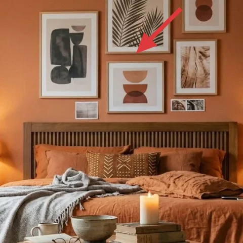
The set of framed art prints is what turns a plain terracotta wall into a focal point. The mix of rectangular and stacked frames keeps it modern, while the neutral abstracts coordinate with the warm bedding tones instead of competing. This works because it creates a clear vertical rhythm above the bed, so the whole room reads intentional. If you only add a single large print, the composition loses the collected feel that makes this style look lived-in. The trade-off is alignment: measure the center point above the headboard so the cluster feels balanced, not accidentally scattered.
Center the cluster over the bed
Hang the middle frame so it lines up with the bed’s centerline for instant harmony.
Layer 6 — table lamp with beige shade on right ($50) Keeps the glow soft at night
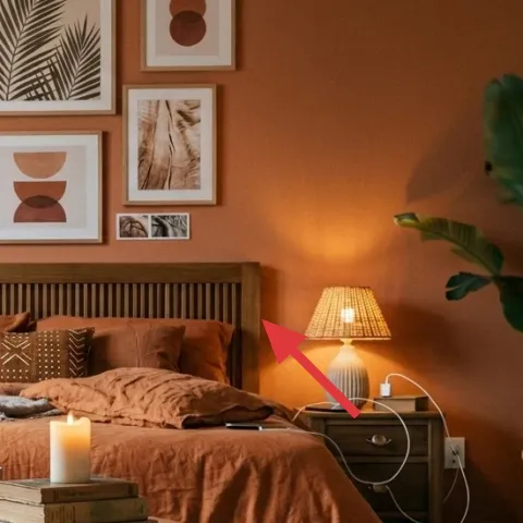
The table lamp with a beige shade adds warm, low glare light that flatters the terracotta wall and makes the bedding look richer. Warm shades do double duty: they soften shadows from the framed art and they make the coffee table candle feel intentional rather than “extra.” An overhead fixture would flatten the room, but lamps create depth by putting light at different heights—shade for atmosphere, table for practicality. The alternative—matching every lamp exactly—can be fussy; this look is more forgiving if both lamps share shade color and scale. Trade-off: beige shades can show dust, so keep a microfiber cloth handy.
Match shades, not necessarily bases
Two different lamp bases still look coordinated if the shade color and height match.
Layer 7 — large potted plant on right ($35) Adds a natural counterpoint to the art
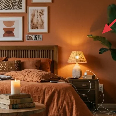
The large potted plant on the right brings in green to break up all that terracotta, cream, and warm wood. In a bedroom retreat, plants matter because they soften the geometry of the bed frame and framed art—your eye gets a calm, organic shape to rest on. It also makes the lighting feel more dimensional; the warm lamp glow hits the leaves in a way that feels alive. The alternative—going all-in on more prints—can make the wall feel busy. The trade-off is placement: make sure it has enough light so the leaves don’t lose their shape.
Give it room to spread
Plants look better when you can see leaf volume, not when they’re squeezed behind furniture.
The cost, layer by layer
| Layer | Item | Cost |
|---|---|---|
| 1 | Shag area rug 5×7 (cream) | $200 |
| 2 | Orange-brown comforter | $100 |
| 3 | Gray throw blanket | $25 |
| 4 | Small wooden coffee table (DIY paint-equivalent) | $150 |
| 5 | Set of framed art prints (5–7 prints) | $180 |
| 6 | Table lamp with beige shade | $50 |
| 7 | Indoor plant (4–6 ft) in a pot | $35 |
| Total | $740 | |
If the coffee table paint DIY is a lot, use a readymade wood stain + seal approach or buy a pre-finished coffee table in a warm neutral. Keep the rug and comforter colors the same so the palette still feels cohesive.
What worked, what didn't (across the whole room)
This room’s wins come from big, high-coverage choices: the shag rug and the orange-brown comforter set the tone, while lamps and wall art keep the lighting and focal points balanced. The smaller styling pieces (books, bowl, candle) land because the surfaces and textures already look intentional. The only place this kind of scheme can go sideways is when the textures don’t “talk” to each other—too much contrast makes it feel busy instead of warm.
What worked
- The shag rug creates a soft buffer that makes the terracotta wall feel warmer, not heavier.
- The orange-brown comforter is the color anchor that reduces the need for lots of small accents.
- Gray throw texture adds depth and keeps the bed from looking flat or one-note.
- Framed art above the bed gives the wall a clear vertical focal point at the right height.
- Table lamps with beige shades keep the glow flattering with minimal glare.
- The right-side plant balances the geometry of wood and frames with an organic shape.
What didn't
- If the comforter reads too bright-orange, it fights the wall color and looks less collected.
- A rug with too-sparse pile can make the room feel less cozy under warm lamps.
- Wall art clusters that aren’t centered above the bed can look accidental, even with great frames.
- Without a topcoat on a painted tabletop, everyday rings and scuffs show up quickly.
- Beige lampshades that aren’t dusted enough can make warm light look dull over time.
What we'd skip if we did it again
Skip swapping the paint first. In a terracotta wall scenario like this, the quickest “new room” feeling comes from textiles and lighting, not a color change that doesn’t address texture.
Skip buying matching everything from one big-box set. The collected look here comes from mixing textures (shag, woven-like tones, matte frames) while keeping color harmony.
Skip adding more wall pieces than needed. If the framed art cluster isn’t centered and spaced, extra frames will make the wall feel chaotic instead of warm and curated.
Frequently asked
How long does this kind of bedroom refresh take on a weekend?
For most homeowners, this is a 1–2 weekend project. The rug and comforter swap are quick, and the framed art setup depends on how carefully you measure and level. Styling on the coffee table and bedside surfaces is usually 45–90 minutes once the big pieces are in place. The DIY paint step is what adds calendar time because you need sanding, curing, and a protective topcoat.
What if I rent and can’t commit to long-term changes?
This setup is friendly because the high-impact items are mostly removable: textiles (rug, comforter, throw), lighting (swap lamps), and framed art. If the wall is already a color you like, keep it and focus on textiles + lamps for the biggest payoff. For the coffee table, a paint makeover is reversible in a way—use careful prep and keep a plain option in mind if you need to restore later.
My room is smaller—how do I scale this without it feeling crowded?
In a smaller bedroom, keep the bed as the anchor and downsize where you can: choose the closest rug size that still reaches under the front legs of the bed, and limit the number of coffee table styling objects so the surface feels breathable. For wall art, use fewer frames but keep the same spacing and centered placement above the bed. The plant can stay, but pick a slightly narrower silhouette so it doesn’t overpower the corners.
Where should I shop differently if I want the look on a budget?
Look for textiles (comforter and throw) at discount home stores or during seasonal sales, because color tone matters and sales make it affordable fast. For the rug, consider buying from a retailer with easy returns so you can check pile thickness in person. Framed art sets are often cheaper online, but measure the available wall space first and prioritize consistency in frame width and matte color.
What’s the biggest mistake people make with a terracotta-and-boho bedroom?
Going too bright with orange. Terracotta rooms look best with muted clay tones that lean brown, especially under warm beige-shaded lamps. The second big mistake is skipping texture—if you rely only on color, the bed and wall art can look flat. Add at least one “soft” texture (shag rug or textured throw) and one matte surface (matte frames or lampshades) to keep the vibe cohesive.
More in Bedroom
Warm terracotta boho bedroom refresh, $800
This warm terracotta bedroom retreat gets its cozy, styled feel from a plush shag rug, an orange-brown comforter, and warm table lamps. Wit…
7 no-drill ways to style a terracotta bedroom for $400
A terracotta-and-beige bedroom refresh with move-friendly swaps: rug, curtains, framed art, throw textiles, a bedside table, and a round mi…
Under $500: boho bed nook refresh with renter-friendly wall decor
A boho bed nook refresh that looks like a full design moment—without drilling. With a $500 renter-friendly plan, you’ll layer a bold geomet…