- Best for
- Weekend visual upgrades
- Time
- 1–2 weekends
- Difficulty
- Confident DIY
- Cost
- Under $800
Why colorful tile backsplash is the kitchen island of 2026
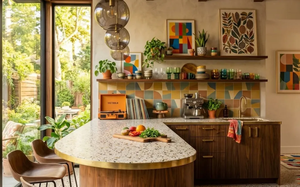
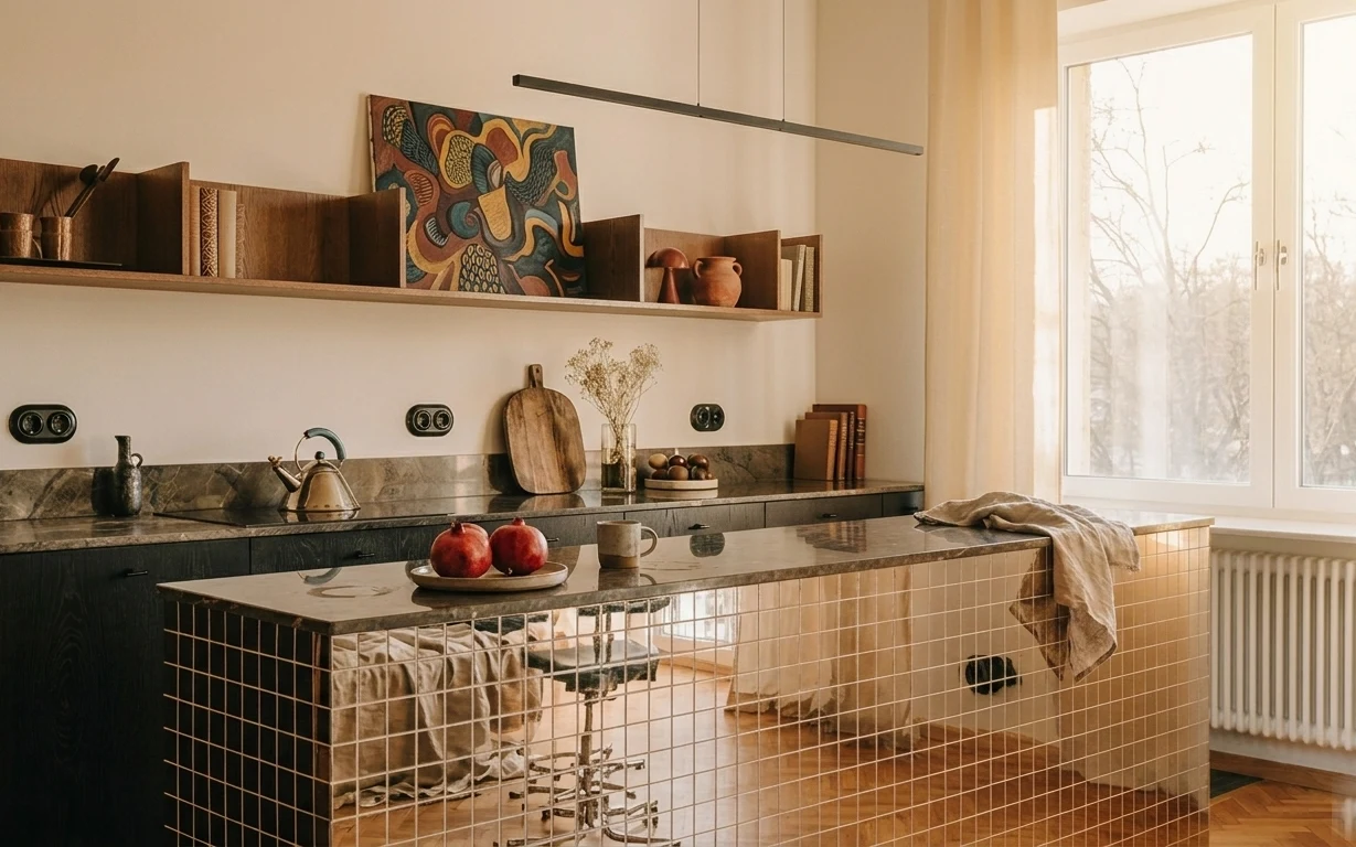
The first thing I notice here is that cheerful backsplash, then the way the speckled island countertop and warm wood cabinets give the whole kitchen a calm base. The two-globe pendant light adds a sculptural, mid-century feel without fighting the color. A folded dish towel on the counter and a patterned rug on the floor keep the space from reading like a showroom. For US homeowners working on a weekend, this is one of those “do the high-impact piece” rooms: you can update the visual anchor (the backsplash) and let everything else support it.
I used to overthink backsplash color and end up buying something too subtle. This time, I leaned into contrast the way you’d see in a magazine kitchen—bold pattern, then repeat it in small accessories like a towel and a rug. The trick is choosing pieces that look intentional next to wood and cream, not pieces that only work under perfect lighting.
Layer 1 — patterned kitchen rug ($200) Softens the island footprint
This patterned kitchen rug sits under the dining chair area, grounding the island zone and giving your feet a break from hard tile and wood. Because it’s already in the same warm, mid-century palette, it doesn’t fight the cabinetry—it actually makes the wood look richer. The alternative is a plain flatweave, but plain can read temporary in a kitchen where spills happen; a busy pattern hides everyday marks better. Expect the trade-off to be careful vacuuming around edges and occasional spot cleaning, but the payoff is a room that feels “placed,” not just functional.
Choose a rug with movement, not stripes
Geometric patterns and multicolor dots hide the stuff kitchen floors collect—crumbs, water spots, and dust from open windows.
Layer 2 — two-globe pendant light fixture ($120) Adds sculptural warmth
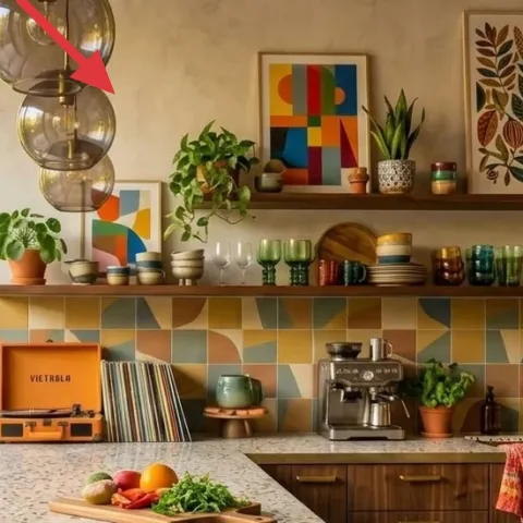
The two-globe pendant fixture above the island brings that glossy, modern look while still feeling friendly thanks to the warm glass tones. It’s positioned where your eye naturally lands, so even small kitchens benefit from upgrading lighting that’s centered over the work area. If you swapped it for a single flat shade, you’d lose the “stacked” depth that makes this setup feel designed. The trade-off: pendant glass is meant to be cleaned—fingerprints show, but the light stays crisp when it’s wiped down regularly.
Keep the pendant centered on the island
When the light lines up with the island’s middle, chairs and countertop styling look more balanced without extra rearranging.
Layer 3 — framed botanical wall print ($80) Brings organic color to the right wall
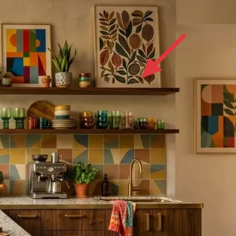
The framed botanical wall print on the right wall adds a second kind of pattern—leafy shapes—that works beautifully next to the geometric backsplash. Because it’s framed, it’s easy to keep the scale consistent and give the eye a stopping point above the shelf line. If you left that wall bare, the kitchen would rely on backsplash color alone, which is a lot of pressure on one surface. This print also has enough earthy tones to connect to the warm wood cabinetry. The trade-off is spacing: hang it at eye level so it feels intentional, not like it’s drifting.
Match frame widths, not just colors
When both prints share a similar frame thickness, the walls feel curated even when the artwork differs.
Layer 4 — framed colorful abstract wall print ($80) Adds a graphic pop above the shelves
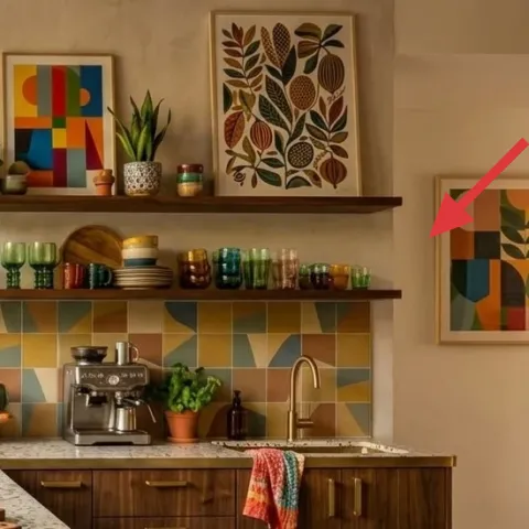
The framed colorful abstract wall print adds a blocky, modern hit that echoes the backsplash without requiring you to match every single color. It sits near the shelf zone, so it visually “pairs” with what’s happening on top—cups, jars, and the small potted plant—making the whole wall feel styled instead of accidental. The obvious alternative is adding a single larger piece, but a smaller print lets the space stay airy and lets the backsplash stay the star. Trade-off: abstract prints can feel busy, so keep the rest of the countertop accessories in simpler shapes and repeated finishes.
Avoid mismatched frame heights
If one print hangs noticeably higher than the other, the wall styling starts to look off even when the colors match.
Layer 5 — multi-color backsplash tile ($150) Make the backsplash the anchor
The multi-color backsplash tile is the visual engine of this kitchen—color that reads warm and playful without turning the room chaotic. Covering a backsplash with peel-and-stick lets you aim for that same “tiles with movement” look without demolition. The alternative is repainting cabinets or walls, but that spreads effort across surfaces that aren’t the primary focal point. With tile-style wallpaper, you get the biggest change in the fewest hours, especially for weekend homeowners. The trade-off is prep: the wall has to be clean and smooth so seams don’t telegraph.
Make it instead of buying it
DIY the multi-color backsplash tile look with peel-and-stick tile wallpaper so you get the same bold geometry without hiring a contractor.
Materials
- Peel-and-stick tile wallpaper roll — ~30 sq ft — home improvement store — $90
- Degreaser cleaner spray — 16 oz — hardware store — $10
- Microfiber cloths (pack) — 8 count — home improvement store — $8
- Plastic smoothing tool — 1 — hardware store — $12
- Utility knife blades (pack) — 10 count — hardware store — $5
Steps
- Clean the backsplash thoroughly with degreaser until the surface squeaks.
- Measure the backsplash panel area and mark level lines with painter’s tape.
- Dry-fit a strip and trim edges with a sharp utility knife.
- Peel a small section of the backing and start the top edge along your level line.
- Smooth from the center outward using the plastic tool to push out bubbles.
- Repeat for each row, lining up grout-style seams before you fully press.
- Trim around outlets and corners with careful, shallow cuts.
- Press the final seams with steady pressure and wipe away any residue.
Total DIY cost: $125 — saves about $25 over buying.
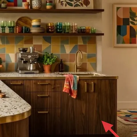
Layer 6 — folded dish towel on the counter ($35) Adds color you can rotate
A folded dish towel on the counter does more than cover a drawer pull—it’s a small color repeat that makes the backsplash feel connected to daily life. Here, the towel brings warm, saturated tones without competing with the tiles or the framed art. Buying a single towel in a multicolor palette is easier than trying to find matching accessories in every store. The alternative is leaving the counter visually bare, which can make the island look like it’s waiting for a styling moment. The trade-off is laundering: switch it out every week or two so it stays bright and doesn’t look faded.
Use the towel like a color swatch
If you’re keeping the backsplash bold, let the towel pull 1–2 colors from it so everything feels intentional.
Layer 7 — wood cutting board on the countertop ($40) Makes the island look lived-in
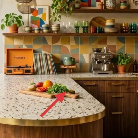
The wood cutting board on the countertop is the calm, natural texture that keeps all that color from tipping into “decor only.” It gives you a practical surface that reads warm next to cream and speckled stone, and it’s scaled to sit comfortably on the island without looking like a random add-on. If you replaced it with a metal tray, the room would feel cooler and more showroom-like. This choice also supports easy styling: swap it from board to serving tray depending on what’s out. Trade-off: wood needs a light wipe and occasional oiling, but that’s still faster than redoing surfaces.
Pick one wood tone and repeat it once
When the board matches your cabinet undertones, the kitchen looks cohesive with zero extra work.
The cost, layer by layer
| Layer | Item | Cost |
|---|---|---|
| 1 | Patterned kitchen rug (5×7) | $200 |
| 2 | Two-globe pendant light fixture | $120 |
| 3 | Framed botanical wall print | $80 |
| 4 | Framed colorful abstract wall print | $80 |
| 5 | Peel-and-stick backsplash tile wallpaper (multi-color squares) | $150 |
| 6 | Folded dish towel on the counter | $35 |
| 7 | Wood cutting board | $40 |
| Total | $705 | |
If you want a cheaper version of the backsplash look, choose a simpler tile pattern in the same warm color family and use smaller countertop accessories in one repeat hue. Keep the rug patterned and use framed prints with consistent frame widths for the “finished” feeling.
What worked, what didn't (across the whole room)
The big win is making the backsplash and pendant do the heavy visual lifting, then supporting them with wall art and texture. The rug and towel add the everyday softness that keeps the island from feeling too precious. The only place to watch is print spacing: when frames sit at inconsistent heights, the whole wall reads less intentional.
What worked
- The two-globe pendant creates depth over the island, so the center of the kitchen looks designed.
- The multi-color backsplash tile pulls warmth into a light-and-wood palette without needing repainting.
- The patterned kitchen rug hides crumbs and water better than a solid neutral would.
- Framed botanical and abstract prints add layered pattern types without crowding the countertop.
- The folded dish towel repeats backsplash tones for a coordinated, lived-in surface.
- The wood cutting board adds tactile warmth that balances glass, stone, and glossy tiles.
What didn't
- Leaving the wall art area empty makes the backsplash look louder than it needs to.
- Using frames of different widths can make the prints feel like separate projects.
- Skipping rug placement can make the dining chairs look like they float over hard flooring.
- Installing peel-and-stick without cleaning can cause edges to lift at corners.
- Overstyling the island with too many small items competes with the backsplash geometry.
What we'd skip if we did it again
Skip a full repaint if the cabinets are already solid. In this kind of bright kitchen, changing the backsplash and adding the right lighting does more for the overall mood than wall color ever will.
Skip plain accessories when the backsplash is bold. A solid towel and a solid runner will often look like “leftover staging,” while a patterned rug and a color-matched towel make the island feel planned.
Skip frame mismatches. Choosing prints is fun, but if the frames don’t share widths and consistent heights, the wall can start to look accidental even when the artwork itself is great.
Frequently asked
How long does this kitchen island refresh take?
The backsplash peel-and-stick work is usually the longest part—plan about half a day for prep and fitting, plus another block for finishing trims and outlet edges. Hanging the framed prints and setting up the rug are quick: think 2–4 hours total. Swapping the pendant light can be as fast as a few hours if wiring is already set; otherwise, budget a bit more time for electrician coordination.
What if I’m renting and can’t make big changes?
This plan is homeowner-friendly, but the most rental-safe moves are the rug, towel, cutting board styling, and framed prints. For the pendant, ask your landlord about fixture swaps; peel-and-stick backsplash tile can sometimes be removable, but always test a small section first and remove carefully at the end of your lease.
Can this work in a smaller kitchen?
Yes—just scale down the rug size and avoid oversized wall prints. In a smaller kitchen, one strong anchor like the backsplash pattern is enough; the pendant stays centered, and the frames can be closer together. Keep the island accessory styling minimal so the counter doesn’t visually shrink the space.
What if my kitchen has different cabinet colors?
The color strategy here is warm wood plus cream plus a multicolor accent. If your cabinets are darker or cooler, look for backsplash wallpaper with similar undertones (warm neutrals and earthy greens) and choose prints with a couple of repeat colors. The rug should pull 1–2 colors from the backsplash to keep the palette cohesive.
Where should I shop for these items without overspending?
For the rug, look for a patterned 5×7 from a home store or reputable online retailer with clear return policies. For framed prints, choose sets from places that offer consistent frame widths. Pendant lights and peel-and-stick tile wallpaper are easiest to compare on big-box websites first, then check local stores for the final in-person match.
What’s the biggest mistake with this kind of kitchen refresh?
Hanging the frames too high or too low relative to each other is the most common issue. Another frequent miss is skipping backsplash prep—if the wall has grease or dust, peel-and-stick seams can lift. Measure, test fit, and keep frame widths consistent so the room reads intentional from day one.
More in Kitchen & Dining

What $800 buys: a bright kitchen island refresh
A bright kitchen island refresh for under $800: swap in a patterned rug, update the two-globe pendant, and pull focus with framed art and p…
Under $350: terracotta-and-ink kitchen island styling refresh
A budget-friendly kitchen island refresh that leans warm and lived-in, using moveable swaps like a draped throw, styling-ready counter obje…
7 kitchen swaps for renters’ budgets ($400)
A bright, plant-filled kitchen refresh for shared housing with move-ready swaps. This $400 plan focuses on a patterned rug, bar stools, and…