
- Best for
- textiles + art + one cabinet paint refresh
- Cost
- $580 total (about $600 max)
- Time
- one weekend
- Difficulty
- Confident DIY
Why warm-toned kitchen nook is the kitchen nook of 2026
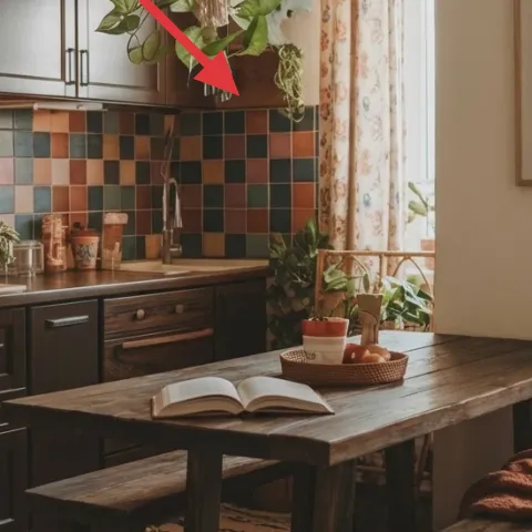
The warm wood island, dark cabinet fronts, and the multicolor square-tile backsplash already give the room its signature backbone. What makes it feel styled instead of just “functional” are the soft textures: the floral curtain panels pull daylight across the window, and the brown throw adds a folded, lived-in note. This refresh leans into those same textures (rug underfoot, art at eye level, plants in the corners) so the room reads intentional without changing the whole kitchen layout. It’s achievable for homeowners working in a weekend rhythm.
I used to overthink kitchens and start with paint, then wonder why the room still feels flat. The moment I stopped and treated the space like a sitting room—textiles first, then art, then greenery—the colors from the tile started behaving. Here, the warm wood and cream background make earthy tones easy to repeat: think rug fibers, curtain fabric, and leaf shapes all echoing the same calm palette.
Layer 1 — patterned area rug under the kitchen table ($200) anchors the whole nook
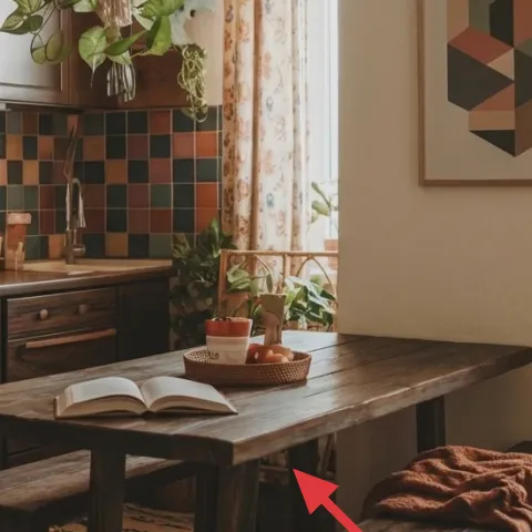
A patterned area rug under the small wooden table gives you that “this is a zone” feeling, even in a kitchen. In the photo, the rug sits right where you land your feet—soft underfoot against the wood floor and visually tethering the island-and-table angle. Choosing a mid-contrast rug with warm neutrals and a few small pops keeps the multicolor tile from turning chaotic. The trade-off: a rug means a bit more cleaning, but it’s the fastest way to make the nook feel finished compared with swapping cabinets first.
Rug scale matters more than pattern
If the rug’s too small, the table looks like it’s floating. Aim for a size that reaches past the table legs enough to ground the seating area.
Layer 2 — floral curtain panels at the window ($80) soften the tile’s hard lines
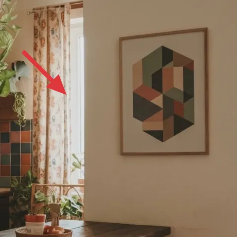
Those floral curtain panels are doing something specific: they break up the backsplash’s grid with organic shapes and add movement when daylight hits. Hanging curtains higher (near the ceiling line) makes the window feel taller, which is especially helpful in a kitchen nook where you’re already visually busy. The fabric texture also cools the room’s temperature contrast—soft textile against dark wood and glossy tile. The alternative is blinds or plain panels, but florals add personality without needing artwork on every wall.
Let the pattern talk to the tile
Pick a floral with colors that echo the backsplash (olive/teal/orange) so the window doesn’t feel separate from the main palette.
Layer 3 — framed geometric wall art print ($80) gives the room an eye-catching focal point
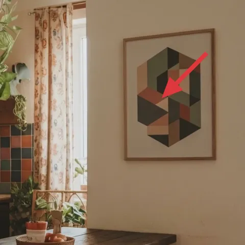
The framed geometric wall art print balances the kitchen’s straighter architecture with bold, structured color blocks. Because it’s single, framed, and centered on the wall, it reads clearly from across the room—even with a busy tile backsplash nearby. A geometric print also matches the “architectural” rhythm of the tile without copying it, which prevents visual overload. The trade-off is spacing: you want it at a comfortable eye-level height so it doesn’t compete with countertop styling.
Use it to repeat one tile color
If the print includes a similar teal or orange, it makes the entire backsplash look more curated rather than random.
Layer 4 — woven basket on the wooden table ($35) adds texture you can style daily
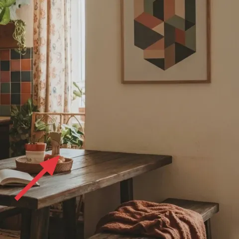
The woven basket on the wooden table adds a different texture than wood, tile, or glass. It’s also practical: it gives you a home for small everyday items without needing extra surfaces. In the photo, the basket’s warm weave ties right back to the cabinet wood tones, so the table feels less bare even with an open book and plants around it. The trade-off is choosing the right size—too big and it crowds the table; too small and it doesn’t read as a styling anchor.
Don’t hide the basket under clutter
If it’s always packed, it stops looking intentional. Keep it to one “moment” (fruit, napkins, or a single plant) so the weave stays visible.
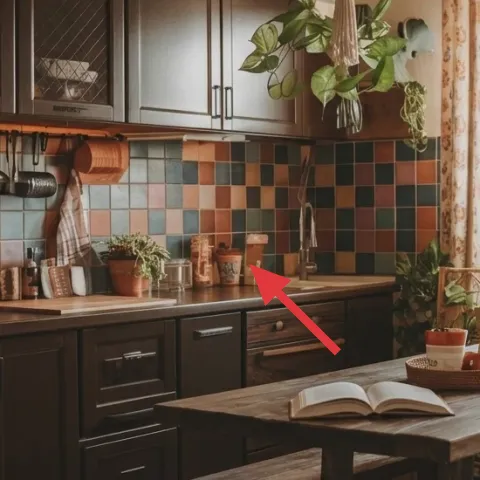
Layer 5 — potted plant on the countertop ($80) brings life close to the backsplash
A potted plant on the countertop creates that kitchen version of a windowsill moment: greenery right where your eyes pause when you move around the island. In the photo, the plant’s big leaves echo the organic softness of the floral curtains, which makes the multicolor tile feel less loud. The advantage over “just adding another object” is scale—plants add height and shape, not only color. The trade-off is maintenance: pick a plant that tolerates your light level so it stays looking full instead of droopy.
Choose leaves with similar scale
Big leaves work well next to backsplash tile because they visually compete with the pattern without getting lost.
Layer 6 — decorative canisters on the countertop ($35) keeps the kitchen feeling curated
The decorative canisters on the countertop turn “ingredients” into a styling layer. They sit in front of the tile, so the visual rhythm of lids, shapes, and colors adds order instead of letting the counter look randomly stocked. Compared with a single jar, a set gives you spacing options: taller items near the backsplash, shorter ones toward the table edge. The trade-off is that you have to actually keep them aligned—when everything’s mismatched, it stops looking curated and starts looking cluttered.
Limit the palette to 2–3 tones
If your canisters, napkins, and fruit all introduce new colors, the counter stops supporting the tile. Reuse the same warm neutrals and one accent.
Layer 7 — paint to refresh the dark wood cabinet fronts ($70) makes the warm palette feel new
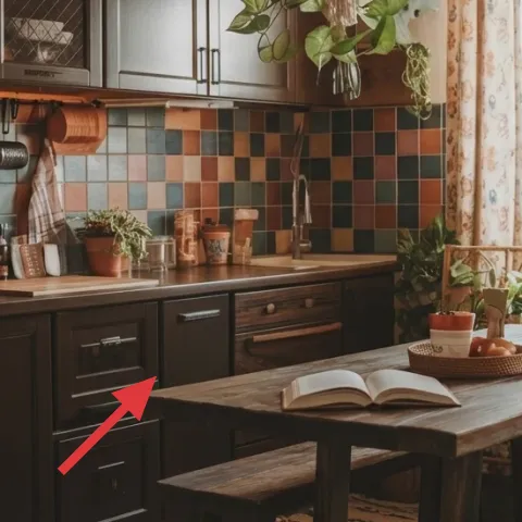
Refreshing the dark wood cabinet fronts with paint is the highest-impact change you can do without demolition. The photo reads warm and grounded, but the cabinets are a lot of visual weight—painting lets that weight feel smoother and more cohesive with the cream walls and the tile colors. A warm brown-tinted finish keeps the farmhouse warmth while sharpening the room’s overall tone. The trade-off: paint is a weekend project with prep time, and cabinets show drips quickly, so careful masking and patience pay off.
Make it instead of buying it
This cabinet-front refresh uses warm-brown paint so the dark wood reads cohesive with the tile and cream wall.
Materials
- Primer for wood cabinets — 1 quart — home improvement store — $30
- Cabinet paint (warm brown tint) — 1 quart — home improvement store — $12
- Foam mini roller + angled brush set — assorted — hardware store — $8
- Painter’s tape + drop cloth — one kit — hardware store — $10
Steps
- Clean and degrease cabinet fronts so paint bonds evenly.
- Lightly sand to remove shine and help primer grip.
- Mask edges and cover nearby counters with a drop cloth.
- Roll on primer in thin coats and brush corners for a smooth finish.
- Let primer dry fully per the label.
- Apply cabinet paint with a foam roller; back-brush for even coverage.
- Let the first coat dry, then repeat for a second coat if needed.
- Let paint cure fully before heavy use of doors and drawers.
Total DIY cost: $60 — saves about $10 over buying.
The cost, layer by layer
| Layer | Item | Cost |
|---|---|---|
| 1 | Patterned area rug under the kitchen table | $200 |
| 2 | Floral curtain panels at the window | $80 |
| 3 | Framed geometric wall art print | $80 |
| 4 | Woven basket on the wooden table | $35 |
| 5 | Potted plant on the countertop | $80 |
| 6 | Decorative canisters on the countertop | $35 |
| 7 | Paint to refresh the dark wood cabinet fronts | $70 |
| Total | $580 | |
If you want it cheaper, start with the rug and curtains first, then swap the cabinet paint for a lighter refresh like repainting only the cabinet hardware area and keeping canisters minimal. You still get the zone + softness without funding every layer at once.
What worked, what didn't (across the whole room)
The best part of this kitchen nook is how warm the palette stays, largely because of repeat textures: wood, textile, and greenery near the tile. The smaller objects (basket + canisters) keep it from feeling staged, but still pulled together.
What worked
- The patterned rug grounds the small table so the nook reads intentional, not accidental.
- Floral curtain panels soften the backsplash’s grid and make daylight feel warmer on the counters.
- The framed geometric wall art adds a clean focal point without competing with the tile texture.
- Greenery close to the island makes the space feel lived-in and not purely decorative.
- Woven basket texture repeats the warmth of the wood and keeps the tabletop from looking empty.
- Decorative canisters create order on a counter that would otherwise look randomly stocked.
What didn't
- When countertop objects multiply, the tile’s colors feel louder instead of curated.
- If curtains are hung too low, the window shortens visually and the room feels more cramped.
- Choosing a rug with mismatched colors can make the backsplash look like the only “real” design element.
- Overcrowding the basket makes it look like storage rather than a styling piece.
What we'd skip if we did it again
Skip swapping multiple big-ticket kitchen elements at once. In a nook like this, the tile backsplash and dark cabinet mass already do the heavy lifting—textiles, art placement, and one cabinet refresh are the more realistic path on a weekend.
Skip buying “matchy” accessories in the same tone. Repeating warm browns is great, but aim for texture variety—woven, ceramic, leaf shape—so the room doesn’t look flat and monochrome.
Skip choosing a rug that’s too small. It’s the fastest way to undo the grounded feeling, and it makes the table look like it belongs to a different room than the backsplash.
Frequently asked
How long does this kitchen nook refresh take on a weekend?
Plan on 1 full weekend day for the prep-and-paint (cleaning, masking, priming, painting, and a careful second coat), plus a half day for styling: rug placement, curtain hanging, and arranging the basket and canisters. If you’re not painting cabinets, you can usually finish the rest in 3–5 hours. The key is treating each layer like a placement job, not a deep clean.
If I rent, can I still do most of this?
Yes. Skip the cabinet paint and go for renter-friendly swaps: curtains you can hang with the right rod, a washable area rug, and a framed geometric print you can hang with appropriate hardware. The countertop styling pieces (canisters, basket, and plants) are naturally renter-safe. For anything that requires drilling, choose an alternative hanging method that matches your lease rules.
What if my kitchen is smaller than the photo?
Go smaller in rug size only if you keep the “grounding” effect—make sure the table legs sit fully on the rug, and the rug doesn’t end halfway under the bench. Choose curtains with a simpler floral or a lighter background so the window doesn’t visually crowd the wall. For art, keep it one larger frame rather than multiple tiny prints to maintain a clean focal point.
What if my space is larger—how do I scale this look?
Add dimension by sizing up the rug and widening the curtain coverage so it spans beyond the window trim. If the wall space is bigger, use a slightly larger framed geometric print or move it to a more central wall location for better balance. Keep the countertop styling grouped—one basket moment plus a small canister cluster—so the scale feels intentional rather than scattered.
Where should I shop for the key pieces if I want it to look cohesive?
For the rug and curtains, start with department home sections or online retailers that let you filter by warm neutrals. For the framed geometric print, look for poster/print galleries that offer framed options in standard sizes. Plants and baskets are easiest to nail at local nurseries and home stores, where you can check leaf scale and weave texture in person.
Biggest mistake to avoid in a kitchen nook like this?
Trying to match everything color-for-color. The tile backsplash already sets a strong multi-color pattern, so your job is to repeat warmth through materials (wood + woven + ceramic) and keep one focal print at eye level. When objects introduce too many competing colors, the tile looks louder and the room feels less curated.
More in Kitchen & Dining

5 weekend swaps for a $600 kitchen nook refresh
A kitchen nook refresh with curtain panels, a framed geometric print, and a patterned rug—plus small plant and countertop styling upgrades.…
Walnut-and-emerald kitchen island refresh, $600
A deep-green wall and warm walnut kitchen island make the whole space feel sharper. This weekend refresh leans on 7 specific upgrades—plus …
7 renter-friendly swaps for a $400 kitchen refresh
A rented kitchen can look like this $400 island bar zone with small, no-drill swaps: a patterned area rug, a few counter styling pieces, an…