- Best for
- high-impact kitchen island styling
- Cost
- about $600
- Difficulty
- Moderate
- Time
- One weekend + touch-ups
Why deep-green details are the kitchen island of 2026
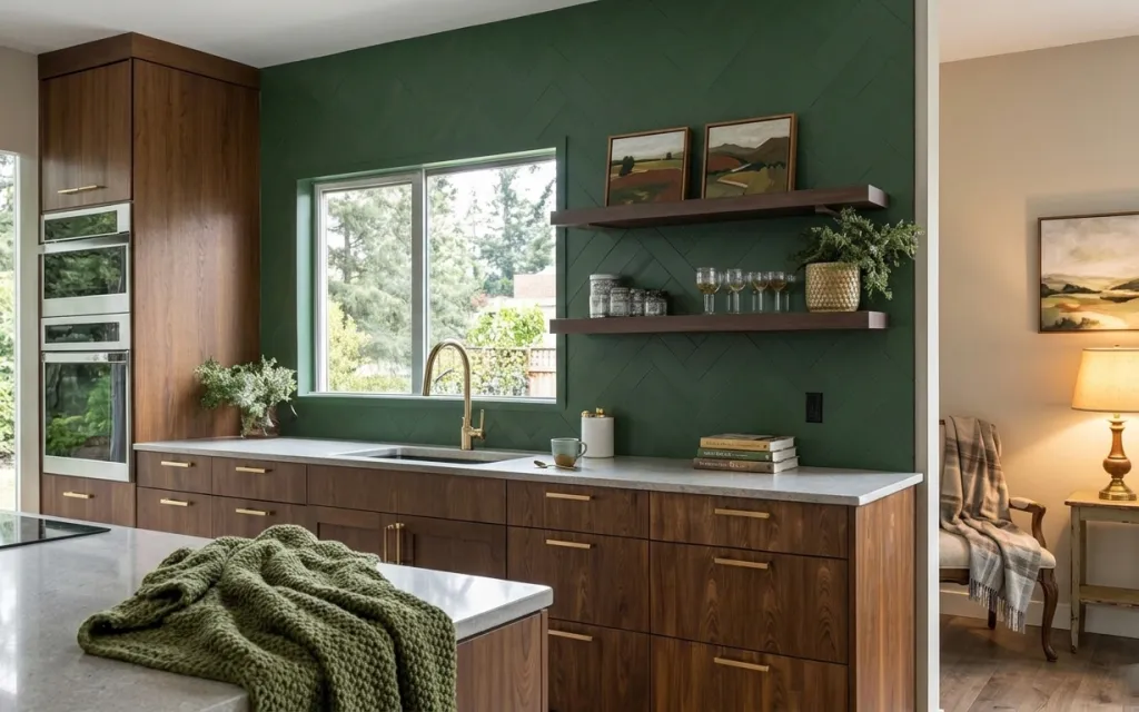
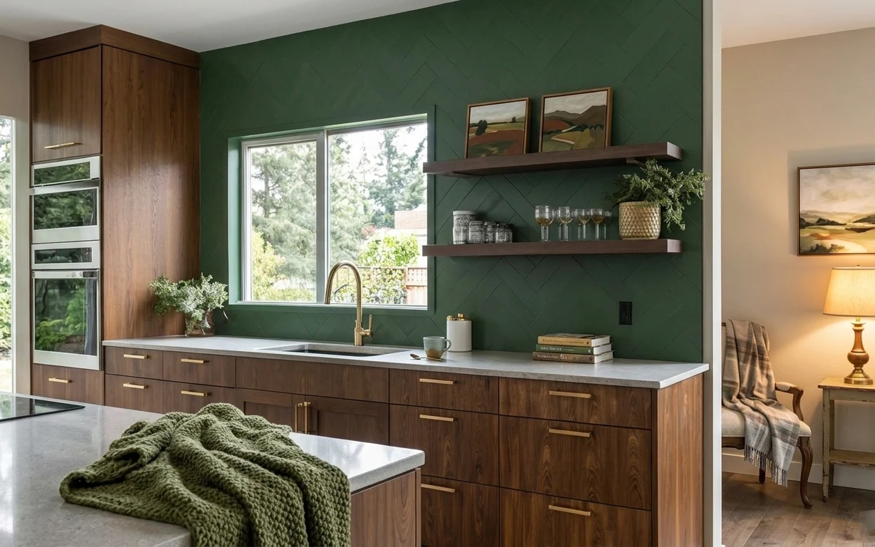
The first time I saw a green backsplash-style wall paired with walnut cabinetry, it reminded me of the kitchens in Domino’s “real homes” spreads—bold, but still lived-in. Here, the light gray countertop and the warm wood grain keep the palette grounded, while the deep green textured wall adds depth without extra hardware. I also love how a green knitted throw drapes over the edge of the island, turning a practical surface into something you actually want to pause at. The trick is balancing hard lines (drawers and shelves) with soft texture (knit + lamp light).
I almost convinced myself that the “right” version of this would require a full layout update—new cabinets, new lighting, the whole thing. Then I noticed how much is doing the work just above the sink: the floating shelves create a focal point, and the framed prints add calm symmetry on the side wall. Once those anchors are set, the rest is just styling and small swaps. The only lesson I’d repeat: pick one hero color (that deep green) and make every other piece quietly support it.
Layer 1 — green knitted throw blanket ($30) Adds a soft edge to the island
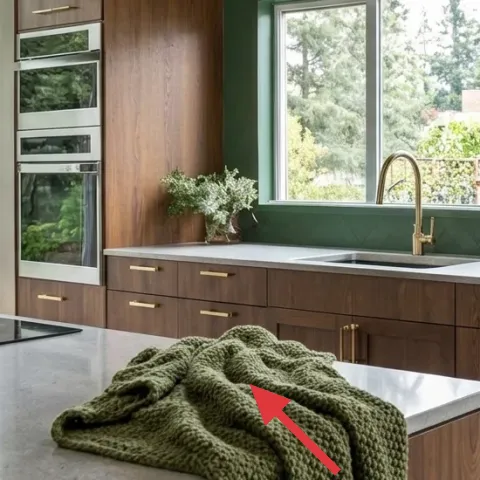
That green knitted throw sits right on the island edge, where it’s visible every time you walk in. It works because the texture reads “textile” against the countertop’s smooth, light gray surface—so the room feels warmer even in daylight. A throw is also the easiest place to add the exact shade family without committing to hardware or a big wall job first. The trade-off is that it needs a quick fluff and occasional shake to keep it looking intentional, not rumpled.
Keep the fold simple
Lay it in one thick fold so the knit pattern shows; you’ll get more visual interest than with thin, flat layering.
Layer 2 — table lamp with cream shade ($80) Warms the right side without replacing fixtures
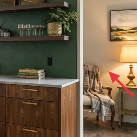
The cream-shaded table lamp gives the space a soft fallback light on the right side of the room, especially in the evening. It’s positioned to spill glow across the wall and side table, which makes the green feel richer instead of flat. If you’re tempted to chase “brightness” with overhead lighting, this is the counter-move: keep the overhead simple and let a lamp handle mood. The trade-off is obvious—lamps don’t replace task lighting by themselves—so keep the lamp for ambience while your main lighting still does the work.
Match the shade color, not the bulb
Cream shades hide color cast better than white ones, which helps the green wall stay true.
Layer 3 — framed landscape print (right) ($80) Pulls the palette to the walls
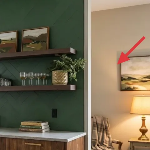
That framed landscape print on the right wall echoes the room’s warm wood tones and natural greens, tying the countertop and shelf styling to the rest of the space. Framed art matters here because the wall is already doing a lot—deep green and texture—so you want art that feels grounded rather than graphic. Choosing a landscape format also balances the horizontal feel of the shelves and the island. The trade-off: you’ll want to place it at eye level so it reads as “intentional art,” not an afterthought leaning against the wall.
Use painter’s tape for height
Test the top edge with tape before drilling anything—small shifts change the whole relationship to the lamp.
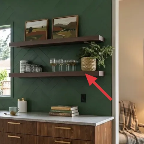
Layer 4 — floating shelves with glassware ($120) Creates vertical structure above the countertop
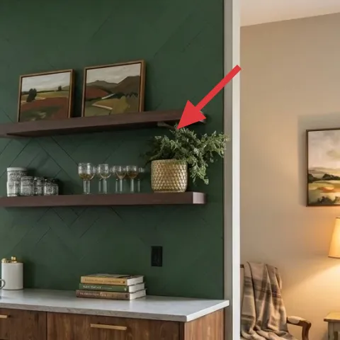
Those floating shelves are the visible “architecture” of the look, and they’re positioned right where you’d naturally glance—over the counter near the window. Wood shelves repeat the walnut cabinetry’s warmth, while the glassware and stacked objects prevent the green wall from feeling empty. The reason this beats the obvious alternative (a single counter-height shelf) is scale: shelves add height without blocking the sink area. The trade-off is cleaning—dusting glassware and shelf backs takes a minute—but it’s a small cost for a focal point that looks styled every day.
Don’t overload both shelves
If everything is “busy,” the wall reads cluttered; keep a few negative spaces so the green can breathe.
Layer 5 — kitchen faucet at sink ($120) Makes the center feel finished
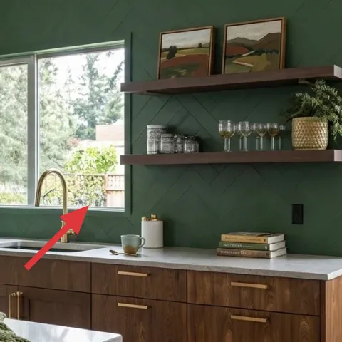
The faucet is a small object, but it sits exactly at the visual center of the kitchen island zone, so it can make the whole refresh feel “finished” or “almost.” A clean, traditional silhouette matches the landscape art and the wood grain, keeping the modern farmhouse vibe cohesive. Swapping the faucet is also one of those high-visibility upgrades that doesn’t require redoing cabinetry—just a weekend-level change. The trade-off is that plumbing work can be fussy, so if you’re not comfortable with the install, treat it as a call-an-electrician moment for confidence and timing.
Keep the finish consistent
If you change the faucet, aim for the same metal family as any shelf accessories or drawer pulls.
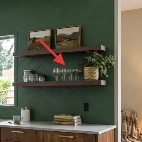
Layer 6 — glassware stack on shelf ($35) Adds sparkle without visual clutter
The stack of glassware on the shelf adds a little “catch the light” detail that the green wall would otherwise flatten. It works because glass gives you tiny highlights that bounce around, while the overall shape still stays neat and vertical. This is a smarter option than adding a big decorative vase alone because glassware gives variety in reflection and scale. The trade-off is you’ll want to wipe fingerprints—glass shows them fast—but the shelf looks styled longer when it’s clean.
Balance glass with one solid texture
Pair clear glass with a matte element (like a book stack) so the shelf doesn’t feel too shiny.
Layer 7 — painted green textured wall ($70) Sets the hero color in one weekend
A painted green textured wall is the fastest way to make a kitchen feel custom, because it changes how light and contrast read across every surface. The textured finish keeps it from looking like a flat, overly perfect backdrop, and it also harmonizes with the walnut cabinetry’s grain. This is the move over “just adding decor,” because decor can be rearranged, but the wall sets the rules for everything that follows. The trade-off is prep time—tape, protect countertops, and prep edges carefully—yet it’s still a weekend-friendly job for homeowners.
Test your green before you commit
Greens can shift toward blue or yellow depending on daylight; paint a small section and observe it at different times of day.
The cost, layer by layer
| Layer | Item | Cost |
|---|---|---|
| 1 | Green knitted throw blanket | $30 |
| 2 | Table lamp with cream shade | $80 |
| 3 | Framed landscape print (right) | $80 |
| 4 | Floating shelves set (wood) | $120 |
| 5 | Kitchen faucet at sink | $120 |
| 6 | Glassware stack on shelf | $35 |
| 7 | Paint for green textured wall | $70 |
| Total | $535 | |
If budget is tighter, keep the lamp and framed print, then swap only the most visible shelf accessories and the throw. That gives you the same “styled focal point” feeling while postponing faucet or shelf hardware changes.
What worked, what didn't (across the whole room)
This setup nails contrast: deep green plus warm walnut keeps the kitchen from feeling sterile, and the shelves + lamp create a natural viewing path. The trade-offs are manageable—mostly around upkeep of small styling items and keeping clutter off the shelves.
What worked
- The deep green textured wall makes the countertop look cleaner and more intentional.
- Floating shelves concentrate styling where the eye lands while standing at the sink.
- The cream lamp brings warmth that softens the green during evening use.
- A green knitted throw adds comfort texture without changing any major fixtures.
- Framed landscape art gives visual continuity to the natural elements on shelves.
- Glassware on the shelves adds sparkle without needing more wall decor.
What didn't
- If the shelf stacks get too tall, the island area starts to feel visually top-heavy.
- Glassware shows fingerprints; it needs a quick wipe after heavier use.
- Without careful art height, the side wall can feel unbalanced next to the lamp.
- A throw that’s too thin reads “random” instead of part of the island styling.
What we'd skip if we did it again
Skip replacing multiple kitchen fixtures in the same weekend. Pick one visible hardware upgrade (like the faucet) and save the rest for later, so the refresh reads cohesive instead of scattered.
Skip shelf clutter that matches the countertop’s complexity. Use one “hero” stack (glassware or books) plus one supporting item, and leave space so the green wall stays calm.
Skip under-choosing your green tone. Test the paint beside the countertop and wood cabinets, because the wrong shade can pull the room toward muddy instead of grounded.
Frequently asked
How long does this kind of kitchen refresh take?
Most of the layers are “weekend speed” if the items are already on hand: styling swaps, installing a lamp, hanging art, and mounting shelves usually land in the same 1–2 day block. Painting (if you do it) is the only real time stretch, mainly because of prep and drying. Plan for an extra evening for small alignment tweaks—art height and shelf spacing tend to need a second look.
If I rent, can I still get this look?
Yes—swap anything permanent for renter-friendly equivalents. Keep the deep color idea but use peel-and-stick wallpaper on a single wall, then use screw-in shelves only if your lease allows anchors. The lamp and framed prints are easy to keep move-ready, and a knitted throw can carry the color story without commitment. For shelves, look for bracket systems that use less-damaging mounting methods if needed.
What if my kitchen island is smaller or the wall is narrower?
Go narrower on the visual “stacks.” Choose one shelf-height styling moment instead of two busy shelves, and scale the framed art smaller so it doesn’t overpower the lamp side. The goal is to keep one focal zone above the counter: shelves, art, and small objects should relate to each other in height, not compete.
Where should I shop for the shelves, glassware, and art?
For shelves, look for unfinished or stained wood floating options that match walnut tones; hardware stores and mid-range home sites are usually the fastest. For glassware and vases, thrift and home goods sections are great—aim for clear glass, a matte base item, and one gold-toned accent like the vase. For framed prints, search for “landscape print in wood frame” and match the frame thickness to your shelf’s look.
What’s the biggest mistake people make with a deep-green kitchen wall?
They pick a green without checking how it behaves next to warm wood. Greens can look rich in a swatch, then turn dull once they sit beside walnut grain and daylight. The fix is simple: test in a small section and observe it morning, afternoon, and evening—especially with the lamp on—before doing the whole wall.
Can I redo only one layer and still see a difference?
Absolutely. The shelves and framed landscape prints are strong standalone upgrades because they establish the room’s focal rhythm. The lamp also changes the room immediately after sunset, even if the wall and faucet stay the same. If choosing one “big feel” change, prioritize the green wall—color sets the tone for every other object.
More in Kitchen & Dining
Walnut-and-emerald kitchen island refresh, $600
A deep-green wall and warm walnut kitchen island make the whole space feel sharper. This weekend refresh leans on 7 specific upgrades—plus …
7 renter-friendly swaps for a $400 kitchen refresh
A rented kitchen can look like this $400 island bar zone with small, no-drill swaps: a patterned area rug, a few counter styling pieces, an…
Under $300: green-and-wood kitchen counter-and-shelf refresh
A green-tile kitchen counter-and-shelf setup that looks styled but stays renter-safe: layered countertop objects, linen towel texture, and …