- Best for
- Kitchen counter-and-shelf styling
- Cost
- About $300 total
- Difficulty
- Easy, mostly decor swaps
- Time
- About 2 hours
Why green-tile and wood warmth is the kitchen counter-and-shelf of 2026
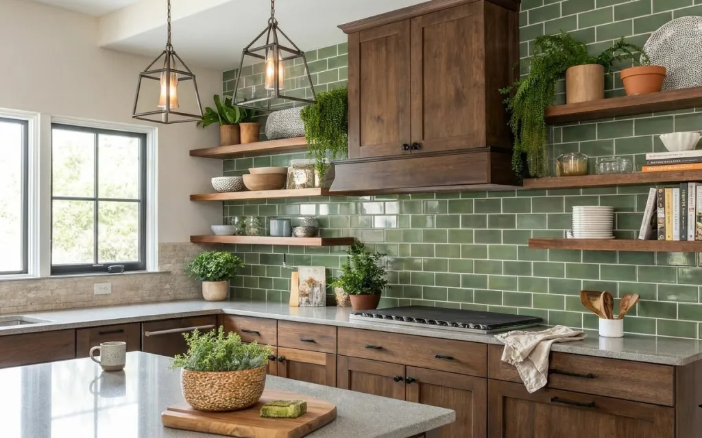
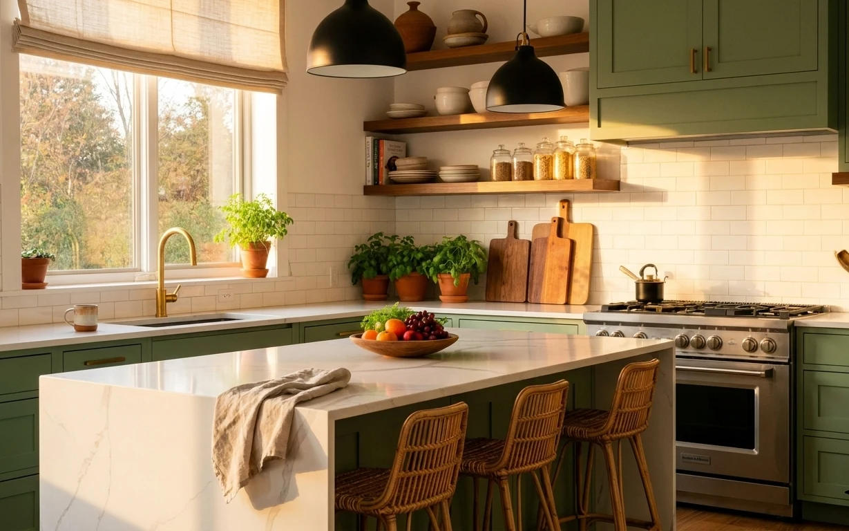
That green tile backsplash and warm wood tones are already doing the heavy lifting, so the smartest move is styling what renters can actually change: countertop groupings, shelf objects, and textiles. Here you’ve got a stone counter that reads cool, then softened with a folded linen towel and matte ceramic planters. The layered heights—from a wooden cutting board up to shelf jars and books—keep the whole run feeling intentional. This is achievable on a budget because it’s mostly “buy a few right pieces” instead of swapping fixtures.
I used to overthink shelf styling and end up with a perfectly lined-up grid that felt like a staged showroom. What changed for me was watching how natural light hits matte ceramics and how quickly you lose the look when everything is the same height. In this kitchen, the textures do the work: woven ceramic, clear glass, and the dry texture of linen. Once you repeat those materials and keep one “hero” object centered, it stops looking like clutter.
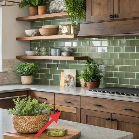
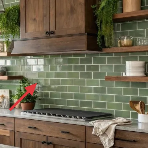
Layer 1 — wooden cutting board on countertop ($35) Centered “base” for small greenery
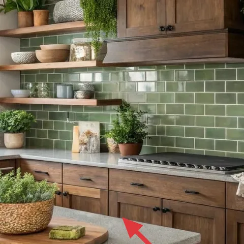
The wooden cutting board is the quiet foundation under the countertop plant moment, and that matters more than it sounds. In the photo it sits front-and-center on the stone surface, giving the grouping a warm, matte anchor that contrasts the cool tile and glossy counter. Buying a board (instead of starting with another pot or candle) prevents the look from turning into random heights with no staging. The trade-off: a board won’t stay as crisp-looking as ceramic trays if you use the space heavily, so choose a board you don’t mind seeing a little lived-in.
Layering rule: one base, one “tall,” one “clear”
Start with a wooden base, add one plant, then include one clear or reflective item (like glass jars) so the eye can rest.
Layer 2 — large woven ceramic bowl centerpiece ($60) Adds texture without more clutter
This woven ceramic bowl centerpiece gives the countertop styling that “collected” feel without adding extra objects. The mottled, sandy color reads warm against the green tile, and the open form lets the plant inside feel light instead of heavy. It’s an easier choice than filling the counter with multiple small planters because one bowl creates a full focal point. The trade-off is scale: a too-small bowl looks lost, and a too-large one can overwhelm the island. In the photo, the bowl sits wide enough to balance the shelf line above.
Why woven works here
Woven texture visually softens the straight lines of tile grout and cabinet hardware.
Layer 3 — small potted plant on countertop (light clay pot) ($30) Brings the live color down to counter height
The small plant in a light clay pot is what makes this counter feel “alive” instead of styled. Positioned near the right side of the island, it also repeats the terracotta warmth you already see on the shelves, so the whole kitchen reads cohesive. If you went with a faux plant, it would lose the same crisp silhouette against the stone; real leaves catch light in a way that looks natural from window brightness to evening lamplight. The trade-off: you’ll need to rotate it occasionally so it stays full-looking from the main viewing angle.
Make it work with daylight
Place your plant where it gets window light, then rotate weekly so the growth direction stays balanced.
Layer 4 — stack of books on shelf ($25) Adds height with zero extra hardware
The book stack on the right shelf adds vertical rhythm without visual noise, which is exactly what shelves need. In this kitchen, the green tile background is strong, so the books need to stay mostly neutral and not compete with the plant shapes. This choice is better than adding another decorative object because books create layered edges and a natural “stack” form that looks composed. The trade-off: book styling is a little delicate—if your spines are too bright, the shelf can start to feel random fast.
Pick one “quiet” color family
Muted spines keep the green tile the star while books still provide structure.
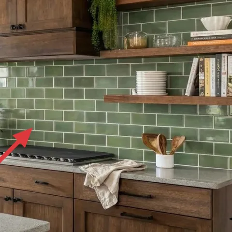
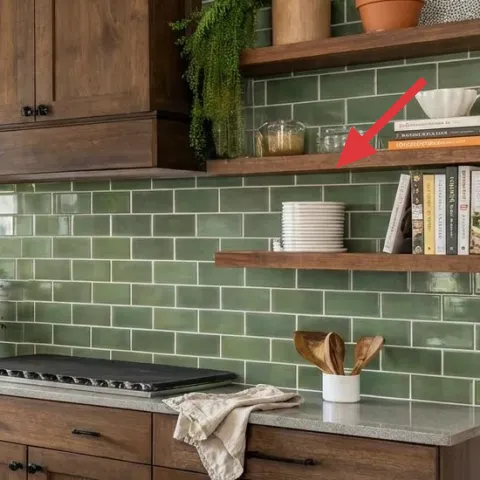
Layer 5 — apothecary-style glass jars on shelf ($45) Clear storage that reads like decor
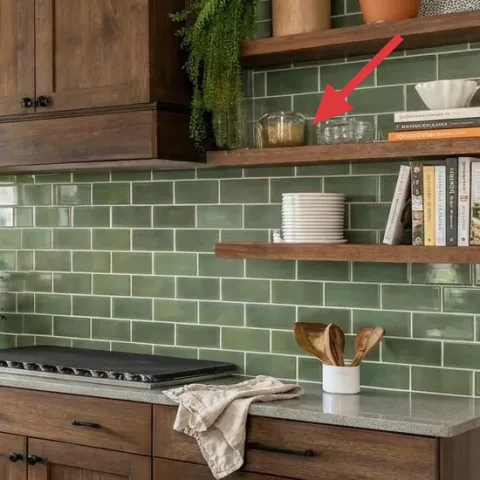
Glass jars give you that crisp, apothecary look that pairs with both the greenery and the warm wood. In the photo, they sit near the book stack and reflect daylight, which makes the shelf feel brighter and more dimensional than you’d get from only matte ceramics. Buying jars is simple, but the renter-friendly angle is that you can keep the styling removable: the labels, contents, and arrangement can change with seasons. The trade-off is that glass shows dust faster than ceramic—so it’s the kind of decor that rewards a quick wipe-down.
Don’t overfill
If the jars look crowded or opaque inside, the shelf stops feeling airy and starts looking like storage.
Layer 6 — folded linen dish towel on countertop ($25) Softens the hard stone and tile
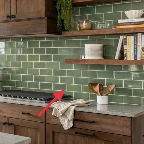
A folded linen dish towel adds the missing textile warmth you want next to stone. The towel is placed on the right side of the countertop, so it naturally reads as part of the daily-use zone while also providing a matte surface that echoes the woven ceramic. If you swap to a terry cloth towel, it can look bulky and visually busy against the sleek countertop. Linen’s trade-off is that it wrinkles, but that’s also why it looks relaxed in a photo like this. Bonus: it’s also easy to change out for seasons without committing to any permanent updates.
Keep the fold intentional
Tri-fold or half-fold once, then tuck the edge so the towel looks styled, not dropped.
Layer 7 — leaning framed artwork on shelf ($80) Pulls the backsplash color story upward
The leaning framed artwork on the shelf acts like a visual “cap” on the whole counter-and-backsplash run. Because it’s placed higher than the countertop items, it extends the eye upward and balances the plants and jars below. This choice works better than another small object because framed pieces read as cohesive—edges, spacing, and a clear rectangle give the shelf a focal structure. The trade-off is making sure the art doesn’t fight the tile color; keeping it neutral-toned lets it harmonize with green. A simple botanical or textured print fits the modern-organic vibe without adding a loud theme.
Match the shelf’s material language
If your decor includes wood, glass, and ceramics, choose a frame finish that doesn’t look metallic-cold.
The cost, layer by layer
| Layer | Item | Cost |
|---|---|---|
| 1 | Wooden cutting board on countertop | $35 |
| 2 | Large woven ceramic bowl centerpiece | $60 |
| 3 | Small potted plant in light clay pot | $30 |
| 4 | Stack of books on shelf | $25 |
| 5 | Apothecary-style glass jars (DIY labels not included in table) | $45 |
| 6 | Folded linen dish towel | $25 |
| 7 | Leaning framed artwork on shelf | $80 |
| Total | $300 | |
If you want a cheaper variant, use one jar instead of multiple and choose thrifted books with mostly neutral spines. Swap the framed piece for a smaller 16×20 print, still leaning on the shelf.
What worked, what didn't (across the whole room)
Overall, this kitchen feels styled because every object has a job: one base for the counter, one texture centerpiece, then repeating materials upward on shelves. The green tile and warm wood combination stays balanced because the decor leans matte (linen, wood, ceramic) with just enough shine (glass). The only moment that can tip into “too much” is jar volume, since glass can look busy when filled heavily.
What worked
- The wooden cutting board creates a warm matte base so the greenery reads intentional.
- The woven ceramic bowl adds texture while keeping the countertop grouping compact.
- Real plants provide silhouette and depth that faux greenery can’t match in daylight.
- Books add vertical height without the visual noise of extra ornaments.
- Glass jars reflect light and make the shelf feel brighter against green tile.
- Linen dish texture softens the hard stone and keeps the kitchen looking lived-in.
What didn't
- Overfilling jars makes the shelf look like storage instead of curated decor.
- If the framed artwork is too colorful, it fights the green tile instead of supporting it.
- Too many small plants on the counter can crowd the working zone and feel cluttered.
- Matching everything too closely (same color, same height) flattens the visual rhythm.
What we'd skip if we did it again
Skip buying a full matching “kitchen decor set.” In a room with a strong backsplash and built-in wood, matching everything can look like a theme instead of styling.
Skip adding more countertop items than you can move daily. This setup keeps one base, one centerpiece, and one plant—so the counter stays usable and the styling doesn’t fall apart.
Skip heavy jar fills or dark contents. If the jars look opaque, the light-reflection effect disappears and the shelf stops feeling airy against the green tile.
Frequently asked
How long does this kitchen refresh take?
Plan for about 1–2 hours if your shelves already hold the same general items. The biggest time sink is spacing: you’ll want to move the cutting board, woven centerpiece, and plants a few times until the heights feel balanced. Once jars, books, and the framed piece are placed, you can usually finish with a quick wipe and a towel fold in under 15 minutes.
Can I do this as a renter without permission?
Yes—everything here is removable and doesn’t require wall changes. Use countertop objects, shelf styling, and textiles (like the linen dish towel) instead of swapping hardware or fixtures. The framed artwork and jars are also easy to pack away at move-out. If you have shelves that are built-in, stick to freestanding decor items rather than installing new brackets or anchors.
What if my kitchen is smaller than the photo?
Scale the grouping down by choosing one “hero” object instead of two. For example, keep the woven bowl centerpiece but reduce the number of shelf plants. Use a single book stack and one framed piece, then leave more open spacing on the shelf so the green tile doesn’t feel crowded. In small kitchens, negative space is what keeps the look curated.
Where should I shop for these renter-friendly pieces?
For jars, towels, and the kind of neutral ceramics in the photo, look at home stores and kitchen-focused retailers for unlabeled glass containers you can style. For woven bowls, ceramic planters, and linen towels, try marketplace-style sites or local thrift shops—just filter for your color family (green, cream, warm wood). Books are easiest to thrift, then restack by spine color.
What’s the biggest styling mistake with kitchens like this?
The most common miss is making every item the same visual weight—same height, same finish, same size. This photo works because it repeats materials (wood, ceramic, glass, linen) while changing height and texture. If your jars and books sit too evenly spaced, the shelf can look flat. Aim for one base object, one focal centerpiece, then one or two taller elements.
More in Kitchen & Dining

Under $300: green-and-wood kitchen counter-and-shelf refresh
A green-tile kitchen counter-and-shelf setup that looks styled but stays renter-safe: layered countertop objects, linen towel texture, and …
7 renter-friendly swaps for a $400 kitchen island refresh
A renter-friendly kitchen island refresh using olive cabinetry cues, warm pendant lighting, and move-friendly styling—everything packs up w…
7 kitchen counter corner swaps for a $250 weekend refresh
A kitchen counter corner refresh for shared housing: swap textiles and countertop accessories to get the warm, minimal look for about $250.…