- Best for
- renter kitchen island staging
- Cost
- $310 total, under $400 budget
- Difficulty
- easy (mostly styling + labeling)
- Time
- about 2–3 hours
Why olive-and-brass details are the kitchen island of 2026
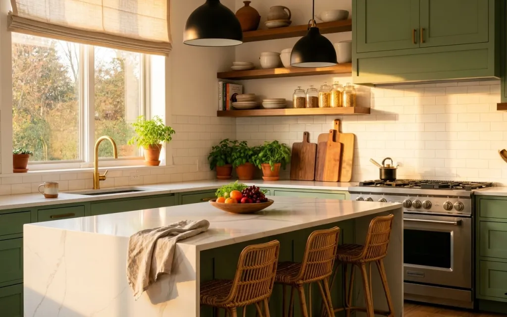
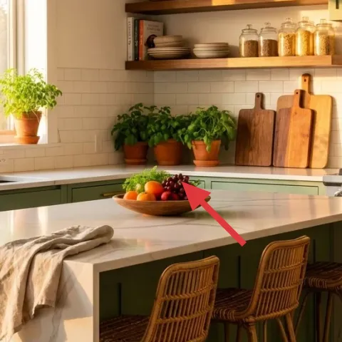
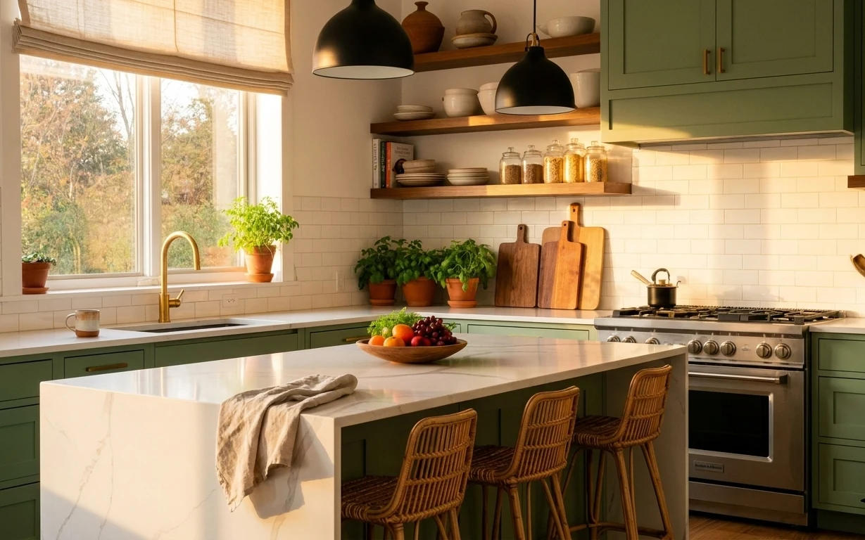
The starting point is already there: olive-green cabinetry, white subway tile, and those warm brass accents make the island feel intentional even before styling. The linen dish towel adds a soft, slightly rumpled texture right where hands and food land. A ceramic fruit bowl keeps color concentrated in one spot instead of spreading across the whole counter. And the clustered potted plants bring that “lived-in but curated” look, especially near the windows where daylight hits. For renters, this is achievable because the hard parts stay untouched—only decor and textiles move in.
I used to overdo plant styling, like I could fix any kitchen by adding “one more” pot. This time, I watched how the light falls and grouped greenery in threes instead. The change that mattered: I stopped aiming for perfectly even spacing and aimed for one main visual landing spot—the island center—then let plants balance it on the perimeter.
Layer 1 — Folded linen dish towel ($40) absorbs daily mess without changing the fixtures
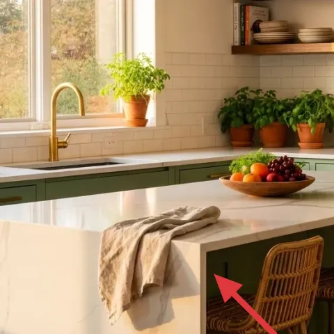
Use a folded linen dish towel on the island edge, like the one draped in the foreground. Linen reads textured from across the room, and it also earns its keep by catching water marks during cooking, then hiding clutter when you’re not actively wiping. I’d choose linen over a slick cotton because the fabric looks intentional even when it’s not perfectly straight. The trade-off is that linen wrinkles—so embrace a “folded, not ironed” look to keep it relaxed. Tuck one corner so it doesn’t slide, especially if you have kids or frequent foot traffic.
Keep the fold asymmetrical
A slightly off-center fold looks styled, but it also stays put better than a perfectly centered rectangle.
Layer 2 — Ceramic fruit bowl on island ($35) makes the counter look planned, not random
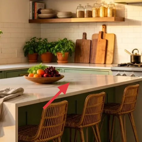
A ceramic fruit bowl (the same one centered in the island) turns everyday groceries into decor. It works because the bowl’s curved shape echoes the kitchen’s softer lines, while the fruit color gives you a quick “palette” that doesn’t require wall changes. Choose glazed ceramic in a cream or warm neutral so it doesn’t fight the olive cabinetry. The trade-off is that fruit bowls need a refresh—when the fruit looks tired, swap in citrus or leave only a few pieces so it still reads curated. This is also renter-friendly: clear it out and pack it when the lease ends.
Limit the fruit to 3–5 items
Too much variety becomes busy. A small handful keeps the bowl graphic and easy on the eye.
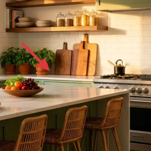
Layer 3 — Potted plant on windowsill ($80) anchors the light and softens the hard tile
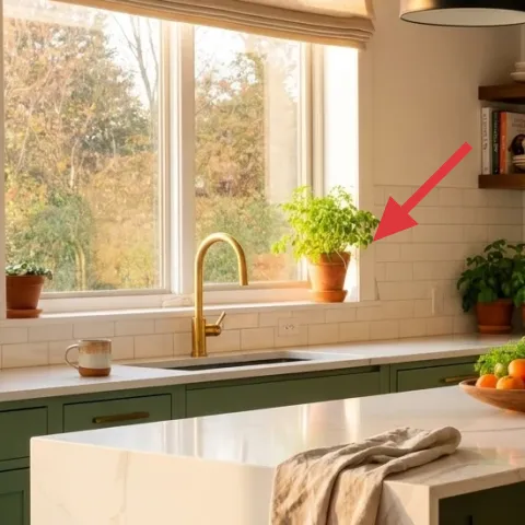
Place a potted plant on the windowsill, like the one near the left window. Plants feel especially good here because daylight is already doing the work, and a single pot creates instant “life” without adding clutter to the island. I’d pick a plant with medium-to-full leaves so it holds visual weight against the bright window and white backsplash. The trade-off is upkeep: windowsills dry out faster, so rotate the pot and check moisture weekly. If the leaves start looking tired, move the pot back to the window but trim stray browning pieces so it keeps its shape.
Match plant height to sill depth
If the pot sits too low, it disappears; too tall, it blocks sightlines. Aim for leaves that skim the window light.
Layer 4 — Small potted greenery along counter ($25) adds texture between the sink and shelves
Use a smaller pot of greenery near the counter line to fill the “visual gap” between the island and the open shelf. This layer matters because it prevents the space from reading like three separate zones: window, island, shelving. A compact plant is also easier for renters—no permanent layout changes, just a swap of where the plant sits. The trade-off is that small plants dry quickly, so pick something tolerant (and keep a simple watering routine). When you move, pack the pot and keep the styling consistent in the new place.
Repeat a pot color, not a pot shape
Keeping one earthy pot tone ties the counter to the island without making everything look identical.
Layer 5 — Multiple potted plants along counter ($80) balances the island so it feels intentional
Cluster multiple potted plants along the counter shelf area to create a “green line” that visually supports the island bowl and towel. It works because grouping beats scattering—your eye reads one composition instead of separate decisions. I’d rather do three to five pots with similar leaf textures than add many random single plants, which can start to look cluttered fast. The trade-off is that grouping takes a little more watering time, but the payoff is a cohesive look that feels styled. Keep the pots within the same width band so the greenery doesn’t creep into the island workspace.
Don’t block appliance paths
If you place plants too close to the stove or sink edges, they’ll get bumped and start looking messy.
Layer 6 — Glass jars on open shelf ($30) keeps pantry storage visible but pretty
Make it instead of buying it
DIY apothecary jar labels for the glass jars so the shelf looks cohesive without replacing the built-in shelf or fixtures.
Materials
- Printable label sheets — 1 pack — online print shop — $10
- Clear label-friendly tape or laminate sheets — 1 roll — office supply — $3
- Scissors — 1 pair — already owned — $2
- Jars and jar contents — use what you have — $0
- Spray bottle (for clean glass) — already owned — $0
Steps
- Pick one label style (simple serif or all-caps) and keep the same font across every jar.
- Print labels on matte paper so they look like apothecary signage, not computer paper.
- Cut labels with a straight edge and leave a small margin so they sit cleanly on the jar.
- Clean the jar glass with a quick wipe so the label sticks without bubbles.
- Apply clear tape or a laminate sheet to protect labels from steam and splashes.
- Set jar labels at the same height on each jar for a tidy shelf line.
Total DIY cost: $15 — saves about $15 over buying.
Label only what you use weekly
When you label fewer jars, the shelf looks curated instead of like a full pantry inventory.
Layer 7 — Stack of books on open shelf ($20) adds height without adding extra objects
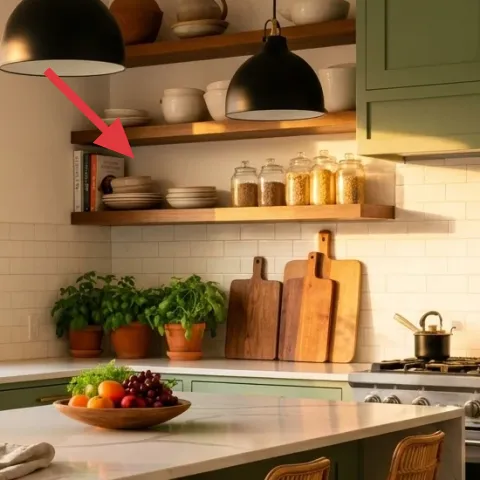
A stack of books on the open shelf creates instant height variation and keeps the shelf from feeling flat. In this photo, the books sit next to the jars, so they also help “ground” the display—your eye can land on the spine colors before it moves down to the jars and greenery. I’d choose books with muted covers (creams, tans, or warm grays) so they don’t compete with the olive cabinetry. The trade-off is that stacks need occasional reshuffling; spines curl or fall, especially near windows. Keep a simple rule: one stack, one supporting item, then stop.
Use one vertical stack, not two small ones
Two stacks can look fussy. One tower reads intentional and easier to maintain.
The cost, layer by layer
| Layer | Item | Cost |
|---|---|---|
| 1 | Linen dish towel, folded | $40 |
| 2 | Ceramic fruit bowl | $35 |
| 3 | Indoor plant in pot for windowsill | $80 |
| 4 | Small potted greenery along counter | $25 |
| 5 | Multiple potted plants cluster | $80 |
| 6 | DIY apothecary-style jar labels (retail equivalent) | $30 |
| 7 | Stack of decorative books | $20 |
| Total | $310 | |
If you want to spend less, use one plant instead of three and switch the fruit bowl to a simple ceramic platter. Keep the linen towel and jar labels—those two do the most visual work for the money.
What worked, what didn't (across the whole room)
The strongest wins were the island textiles and the shelf styling: the linen towel adds texture up close, while the jar labels and book stack keep the open shelf from looking like random storage. Grouping plants into a counter line made the island feel more balanced from the room’s widest view. The only miss was overthinking symmetrical placement—once the greenery and labels matched heights, the composition looked calmer.
What worked
- The linen dish towel adds texture that reads “styled,” even when the island is in daily use.
- The ceramic fruit bowl concentrates color so the counter looks intentional, not cluttered.
- Plants near the window use daylight to soften the hard, bright backsplash.
- Grouping greenery in a line balances the island without blocking work zones.
- Apothecary-style labels make jars look cohesive instead of like unlabeled leftovers.
- The book stack creates vertical rhythm on the open shelf next to glass and ceramics.
What didn't
- Randomly placing small pots made the counter feel busy instead of curated.
- Labels that don’t match height across jars look accidental, even if the font is pretty.
- Overloading the fruit bowl with too many types and colors turned the island into “visual noise.”
- Perfect symmetry between plants looked stiff compared to the relaxed towel fold.
- Too-tall plants near the stove area risk getting bumped and looking messy.
What we'd skip if we did it again
Skip adding more objects to the island edge just to “fill space.” In this layout, the towel and fruit bowl already give you texture and color; extra items pull attention away from the center when you’re cooking.
Skip buying three matching plant pots from the same set. Instead, repeat the pot color or finish, then mix plant textures—this looks collected, not catalogued.
Skip complicated label systems that require special adhesives or long print prep. Simple, label-friendly materials are enough to make glass jars look apothecary-styled without turning the shelf into a maintenance project.
Frequently asked
How long does this kitchen island refresh take?
Most of the work is styling, not construction. Plan for about 45 minutes to arrange the island bowl and towel, another 30–60 minutes to reposition plants, and 30–45 minutes for jar labels (printing, cutting, and applying). If you already own the plants and jars, the timeline stays closer to two hours. The look also gets easier each time because the setup is repeatable in a move-out checklist.
Is this renter-safe if my lease doesn’t allow changes to cabinets or shelves?
Yes—everything in this refresh is either removable decor (plants, towel, fruit bowl, books) or removable labeling on existing glass jars. It doesn’t require painting walls, drilling, or replacing any landlord-installed fixtures. The open-shelf styling is just objects you can pack in boxes. At the end of the lease, clear the shelf display and reinstall your usual counter basics.
What if my kitchen island is smaller or my countertop is busier?
Scale down the number of plant pots and keep the island center as the “landing zone.” Use one small cluster (two pots max) instead of a wider line, and rely on the linen towel plus a single ceramic bowl to provide texture and color. If your counter is narrower, choose a flatter fruit bowl or platter so it doesn’t crowd prep space.
What if I don’t have open shelving above the backsplash?
The shelf concepts still work elsewhere. Put the jar labels and book stack on a countertop riser, a freestanding cabinet surface, or even a kitchen cart top (as long as it’s visible and easy to maintain). The key is height variation: jars/ceramics for small pattern and books for vertical rhythm.
Where can I shop for these pieces without overspending?
For styling staples like linen towels, ceramic bowls, and plants, big-box home stores and discount marketplaces are usually cheaper than specialty boutiques. Look for ceramic bowls in warm neutrals and choose plants that tolerate window light. For jar labeling, print your own from simple label templates and apply label-friendly protection so it stays crisp around steam.
What’s the biggest mistake people make with kitchen island styling like this?
They overfill. If everything is decorative—the towel, the fruit, multiple pots, and extra small objects—the island stops reading as one composition. Instead, anchor the center with one bowl, add one textured textile element, and keep plants grouped with a repeatable pot palette. That’s how the island stays “styled” even on ordinary days.
More in Kitchen & Dining
7 renter-friendly swaps for a $400 kitchen island refresh
A renter-friendly kitchen island refresh using olive cabinetry cues, warm pendant lighting, and move-friendly styling—everything packs up w…
7 kitchen counter corner swaps for a $250 weekend refresh
A kitchen counter corner refresh for shared housing: swap textiles and countertop accessories to get the warm, minimal look for about $250.…
What $800 buys: a bright kitchen island dining nook refresh
A bright kitchen island dining nook refresh with floral wallpaper, pink chairs, and a brass pendant. This weekend project plan fits a $800 …