
- Best for
- Weekend refresh with visible changes
- Time
- One weekend
- Difficulty
- Moderate
- Cost
- About $800
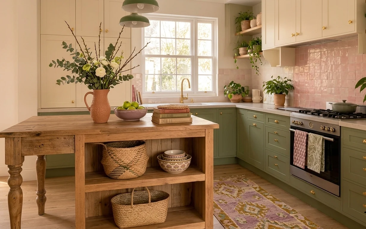
Why floral-wall color pop is the kitchen island dining nook of 2026
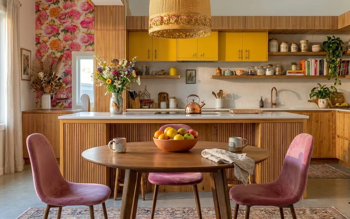
That left-wall floral pattern does more than add color—it sets the whole room’s rhythm before your eye even reaches the island. In the photo, the warm wood tones, the pink upholstered chairs, and the muted patterned area rug all soften the bold yellow cabinets. The brass/bronze pendant and a simple linen runner add polish without getting fussy. For US homeowners, this is exactly the kind of high-visibility change that feels like decorating, not renovating—especially when you can pick the strongest-impact wall and lighting first.
I used to think floral wallpaper was “too much” for a kitchen because it can feel loud in real life. But seeing it paired with strong neutrals—the wood floors, the beige curtains, and that grounded rug pattern changed my mind. If the textures stay natural (linen, woven rug, wood grain), the print reads like art instead of clutter. The other thing I learned the hard way: start with what’s behind the furniture, not the accessories.
Layer 1 — area rug 5×7, muted pattern ($150) Grounding under the chairs
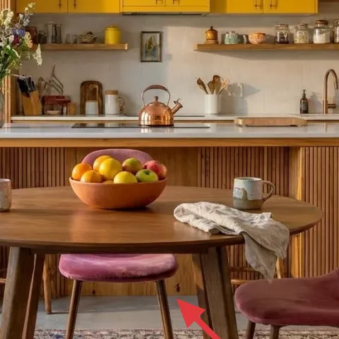
The muted, patterned area rug sits under the dining table and catches the eye right away because it’s the “floor layer” between chairs and cabinetry. The pattern keeps the pink chairs from looking too literal, while the tone plays nicely with the warm wood in the island base and the light wood floors. If you go too solid, you’ll end up with color floating everywhere; if you go too busy, the floral wall competes. I’d choose a 5×7 with soft contrast so you can use it with changing seasons—pumpkin-orange in fall, then spring greens—without redoing the whole room.
Anchor the rug
Let the front chair legs sit fully on the rug so the dining set reads as one piece.
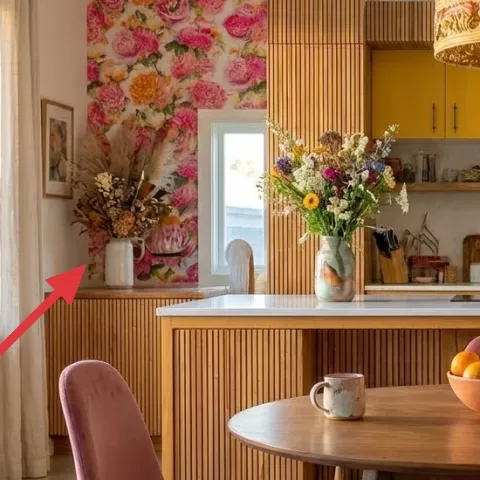
Layer 2 — floral wallpaper accent (peel-and-stick) ($120) Adds art-like depth on the left wall
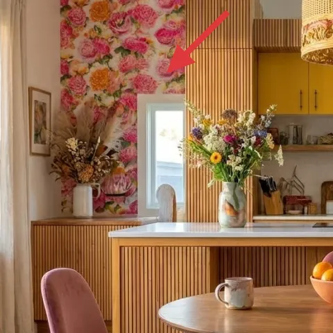
The floral wallpaper accent is the loudest visual element in the photo, and that’s why it works: it’s framed by calmer zones—beige curtains, warm wood trim, and clean cabinet lines. A peel-and-stick version is the homeowner-friendly weekend option because you can test placement and keep the rest of the kitchen intact. The key trade-off is that you’ll want to match pattern scale to your wall size; oversized blooms can overwhelm a narrower section. Place it behind the dining sightline so the bouquet, pendant, and chairs feel like part of the same story.
Choose placement like you’re framing a picture
Center the print around the dining moment, not the window trim, so the room reads intentional.
Layer 3 — beige curtain panels for the left window ($80) Softens the daylight and balances the print
The beige curtain panels add breathing room between the floral wall and the bright kitchen cabinetry. In a space like this, curtains aren’t just functional—they help turn hard sunlight into something softer and more livable. Since the photo shows warm light and a strong color palette, the beige works like a visual buffer. The trade-off is that full-length panels can require measuring twice and ironing once you get them home. Still, that effort is far less than rebuilding anything structural—and it makes the floral wall feel curated rather than accidental.
Hang for puddle, not just height
If clearance allows, let the hem skim near the floor for a tailored line.
Layer 4 — set of 4 pink upholstered dining chairs ($180) Brings a playful color note you can echo elsewhere
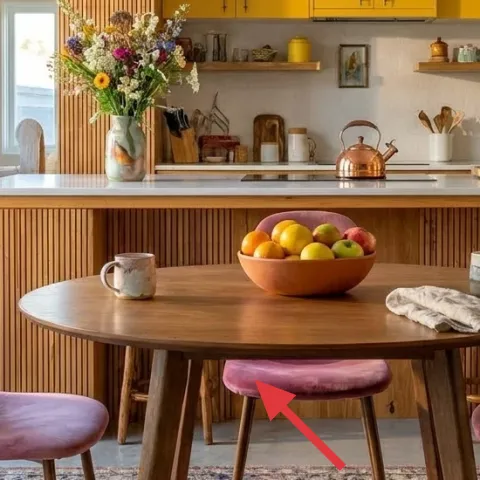
Those pink upholstered chairs are doing the heavy lifting: they pull the eye toward the dining table and add a softer texture than wood alone. The upholstery also helps the floral wallpaper feel intentional—because both introduce “fabric energy,” not just visual color. If you swap to plain wood chairs, the whole corner can feel harsher next to the pendant and yellow cabinets. The trade-off with upholstered seating is upkeep: you’ll want a simple fabric cleaner and a plan for crumbs and coffee rings. To keep it cohesive, repeat the pink in something small—like a dish or art frame—rather than adding more big colors.
Don’t pick a pink that clashes with the cabinet yellow
Bring a swatch to the room and make sure the chair tone reads as warm, not magenta.
Layer 5 — round wooden dining table ($140) Makes the nook feel social
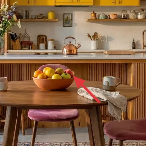
The round wooden table is the geometry that keeps everything from feeling too sharp. In the photo, it turns the dining area into a conversation-friendly center—especially with four chairs and a fruit bowl as a focal object. Round tables also soften the look of the vertical wood paneling and help the floral wall feel less overwhelming. If you choose a square table instead, you’ll feel the corners more, and the room can start to look like a gallery layout. The trade-off is limited surface for extra serving, but the clear benefit is better visual flow between island and dining.
Use the center like a styling “stage”
Small objects (fruit bowl, a couple of mugs) look better on round surfaces than cluttered stacks.
Layer 6 — brass/bronze pendant light ($90) Adds a warm metal note above the table
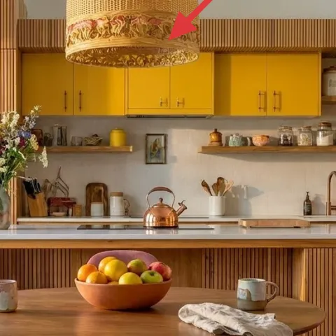
The brass/bronze pendant gives the room an “after-work glow” even in daylight, and it visually ties into the warm wood cabinetry and countertop. Over a dining table, the pendant acts like a ceiling anchor: it pulls the eye up to balance the wallpaper’s energy and keeps the chairs from feeling like they sit too low. If you go with a flat white fixture, the whole nook can look unfinished next to the decorative wall. The trade-off is that statement shades can be more noticeable, so you’ll want to keep the surrounding styling simple—like the linen runner and a tidy fruit bowl.
Match the pendant to your kitchen finish
If the hardware reads warm (brass/copper), choose a pendant in that same family.
Layer 7 — linen runner on the dining table ($40) A small textile layer that makes everyday meals look styled
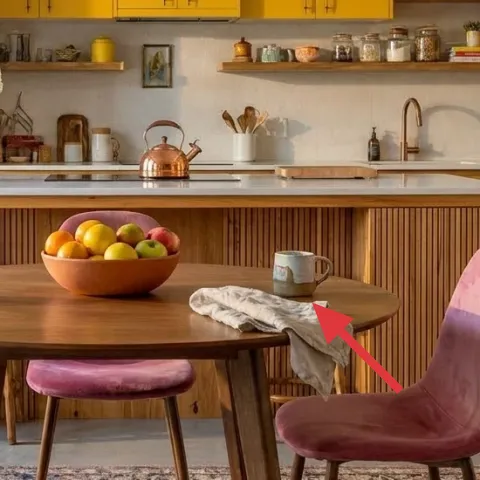
Make it instead of buying it
A simple linen runner keeps the dining table looking fresh, and it’s cheaper than buying a ready-made one with the same length.
Materials
- Linen fabric, 1 yd (58" wide) — fabric store — $15
- Iron-on hem tape, 1 roll — craft store — $7
- All-purpose thread, 1 spool — craft store — $6
- Measuring tape — hardware store — $5
Steps
- Measure the table width you want covered and decide on runner width (leaving a few inches of breathing room at each side).
- Cut linen fabric to length and width, using a straight edge.
- Press a double-fold hem on both long edges to set the guide lines.
- Apply iron-on hem tape inside the hem folds following the package instructions.
- Press again firmly so the tape bonds across the full length.
- Optional: stitch along the edges for extra security and to make it wash-ready.
- Trim any loose threads and give the runner a final press.
- Wash once (cold, gentle) and re-press so it lays flat like linen always does after laundering.
- Set the runner on the table with the longest edge centered under the pendant sightline.
Total DIY cost: $33 — saves about $7 over buying.
The cost, layer by layer
| Layer | Item | Cost |
|---|---|---|
| 1 | Area rug 5×7, muted pattern | $150 |
| 2 | Peel-and-stick floral wallpaper accent (one wall) | $120 |
| 3 | Beige curtain panels (pair) | $80 |
| 4 | Set of 4 pink upholstered dining chairs | $180 |
| 5 | Round wooden dining table | $140 |
| 6 | Brass/bronze pendant light | $90 |
| 7 | Linen runner (made DIY) | $40 |
| Total | $800 | |
If the full floral wallpaper cost feels like a stretch, choose a smaller peel-and-stick pattern area behind the dining table only—or swap to a single roll of wallpaper for the left wall and keep the rest of the color coming from curtains and chair upholstery.
What worked, what didn't (across the whole room)
The biggest win is how the rug and chairs make the dining set feel like a defined zone, even with bold wallpaper and yellow cabinets. The pendant light also helps the nook feel intentional, not like a “kitchen with furniture.” The styling objects (fruit bowl and bouquet) read as purposeful rather than clutter because there’s still room to breathe.
What worked
- The muted rug pattern keeps the pink chairs from feeling too sweet next to the floral wall.
- The floral wallpaper placement behind the dining sightline makes the nook feel designed, not random.
- Beige curtain panels soften bright daylight and balance the strong yellow cabinetry.
- The round table shape improves flow between island cooking and dining without harsh corners.
- The brass/bronze pendant visually ties metal and wood finishes into one palette.
- The linen runner adds a textile layer that makes everyday table moments look styled.
What didn't
- If the chairs are too bright or too cool-toned, they fight the cabinet yellow instead of harmonizing.
- Wallpaper that’s mis-centered can pull attention away from the dining table and make the wall feel “off.”
- A pendant that’s too small for the table can make the center feel crowded by eye level.
- A rug with high-contrast black or white can turn the corner busy when the wallpaper already has detail.
What we'd skip if we did it again
Skip repeating the same color everywhere—especially pink. It’s best to keep pink concentrated in the chairs (and maybe one small accent) so the wallpaper and yellow cabinets stay the real stars.
Skip a matching “set” approach for the dining area. Coordinated chair upholstery and rug plus curtain tones look better when they come from different sources and textures, not one retailer’s bundle.
Skip ceiling-light-only solutions when the dining table is the focal zone. A properly scaled pendant adds warmth and structure; without it, the nook can feel flat even after you add wallpaper.
Frequently asked
How long does this kitchen island dining nook refresh take on a weekend?
Plan for about 1–2 days of work. Peel-and-stick wallpaper and hanging/adjusting curtains are usually the time blockers, plus rug and chair placement. If swapping or installing a pendant is included, add extra time for fixture prep and careful height checks. The DIY linen runner is quick—more time spent measuring than sewing.
If I rent, what part of this should I prioritize (and what should I avoid)?
In a rental, prioritize the rug, curtains, and styling layers on the table—those are completely removable. If you can do peel-and-stick wallpaper with landlord approval, choose one wall only and keep the seams clean. Avoid permanent pendant changes unless the rental is set up for it; in that case, use a plug-in option that still hangs at the right height.
My dining area is smaller—how do I scale this down?
Keep the rug size practical: aim for at least the front chair legs to sit fully on the rug. For wallpaper, reduce the covered area and make sure it’s centered behind the table instead of wrapping into awkward corners. If the pendant reads too large, pick a smaller diameter shade while maintaining a similar hang height over the tabletop.
Where should I shop if I want the pink chair look without overspending?
Check resale marketplaces for upholstered chairs, then verify fabric condition and chair wobble before buying. For new chairs, look for off-brands with solid-return policies and sample fabrics in the same pink family. The trick is matching tone: you want warm pink that works with yellow cabinetry, not a cool rosy shade.
What’s the biggest mistake people make in a kitchen with bold wallpaper?
Centering the wallpaper around the wrong focal point is the most common issue. If the print isn’t aligned behind the dining table sightline, the room can feel busy even when everything else is nice. The fix is simple: measure, then mark the center placement before you apply the first strip.
How can I keep the dining table styling from turning into clutter?
Use one “center object” at a time: fruit bowl or vase, not both crowded together. Let the linen runner create the tidy baseline, then keep the edges clear for plates and mugs. If the countertop is already visually busy, store small items off the island so the dining vignette stays the calmer zone.
More in Kitchen & Dining
What $800 buys: a bright kitchen island dining nook refresh
A bright kitchen island dining nook refresh with floral wallpaper, pink chairs, and a brass pendant. This weekend project plan fits a $800 …
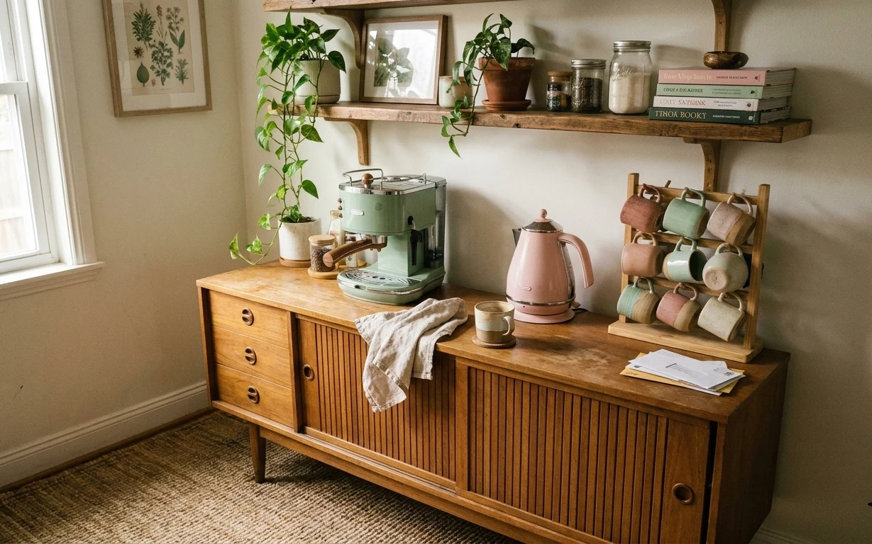
How to style a kitchen counter corner for $500
A kitchen counter corner refresh on a $500 renter-friendly budget: swap in a neutral 5×7 rug, add a framed botanical print, bring in a tall…
Under $300: move-friendly kitchen island refresh with 7 layers
A bright kitchen-island refresh for shared housing—under $300 with 7 move-ready swaps. Focus on rug pattern, a painted terracotta-style cen…