- Best for
- A calm, organized kitchen counter corner
- Cost
- $415 total (7 move-friendly swaps)
- Difficulty
- Easy DIY + styling
- Time
- About 3–4 hours
Why warm wood-and-sage kitchen counter corner is the renter-friendly corner of 2026
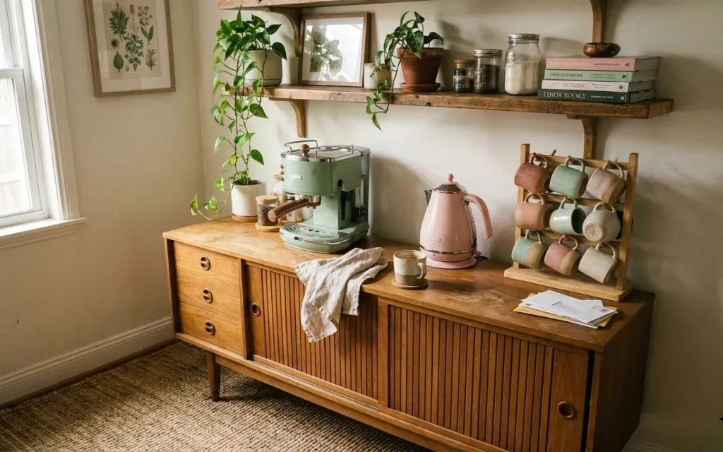
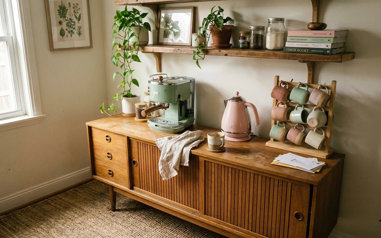
The first thing I notice in this setup is how the warm wood reads like furniture, even against a plain wall. The textures do a lot of work: the neutral rug under the sideboard, the folded linen dish towel on the wood surface, and the mix of matte pottery and glass jars overhead. There’s also a clear “one shelf, one theme” pattern—plants, books, and jars all share earthy tones—so it doesn’t feel cluttered even with countertop items. This look is achievable on a renter budget because it’s mostly soft goods and styling objects you can swap back in minutes.
I almost overcomplicated a similar counter once by adding too many small containers. It looked cute at first, then my brain kept seeing “things” instead of a calm vignette. What changed my mind was simplifying the surface into zones: rug for grounding, tray for collecting, and labels for visual order. When those pieces repeat in the same palette (warm wood, sage green, terracotta-pink notes), the whole corner starts to feel intentional.
Layer 1 — Area rug 5×7, textured neutral ($200) Soft underfoot, hides everyday kitchen mess
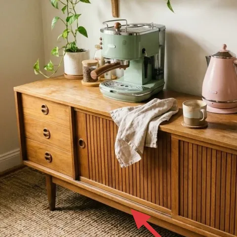
A textured 5×7 area rug anchors the kitchen counter corner and makes the carpet feel like part of the design instead of a default. In this photo, the rug’s neutral tone lets the warm wood sideboard, the sage-green appliance, and the terracotta notes stand out without fighting the floor. The big win is practicality: a lightly mottled surface helps disguise small crumbs and the kind of scuffs that always happen near a counter. The trade-off is that you’ll want to choose a rug with a low-ish pile so the rest of the space still feels easy and open.
Rug placement beats extra decor
Let the rug reach under the front legs zone of the sideboard area so the corner reads “set up,” not “stuff sitting on carpet.”
Layer 2 — Framed botanical print (wall art) ($25) Adds calm greenery without changing anything functional
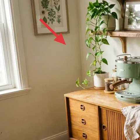
A framed botanical print pulls the plant palette onto the wall, which matters when renters can’t paint or alter the surrounding surfaces. This corner already has leafy shapes in white pot and terracotta planters, so echoing that silhouette in wall art keeps the design consistent. A botanical print also works better than generic abstract art here because the image has natural linework that fits warm wood and matte ceramics. The trade-off: framed art needs a little spacing discipline—too low or too tight to the shelf makes the wall look crowded instead of curated.
Match the “line style,” not the exact plants
Look for botanical prints with similar thin, leafy linework so the wall feels related to the plants rather than competing with them.
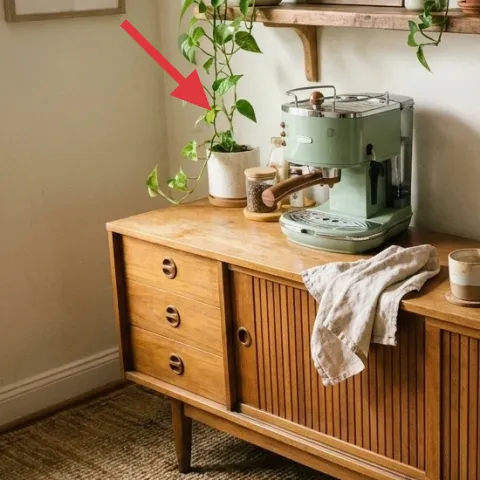
Layer 3 — Tall leafy plant in white pot (floor) ($30) Brings the vertical element the counter can’t provide
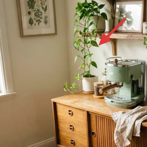
A tall leafy plant adds the vertical rhythm that makes a sideboard vignette feel finished. In the hero image, the white pot and bright green leaves create a soft backdrop against the wall and balance the horizontal lines of the countertop and shelf. This is the renter-friendly move because it’s just a floor item—you can move it with you, and you don’t need any permanent fixings. The trade-off is light: if the plant doesn’t get enough daylight, it’ll look leggy, so a bright window location is key for keeping that full, airy silhouette.
Don’t oversize the pot
If the pot is much bigger than the plant root ball, the leaves can stall and the plant looks less “lush” even in the right corner.
Layer 4 — Decorative tray on sideboard ($35) Controls countertop clutter with one collecting surface
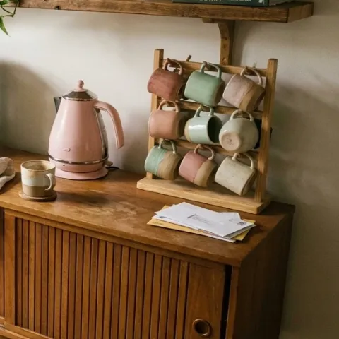
A decorative tray turns a busy countertop into a deliberate display by giving small items a shared boundary. In the photo, the tray sits near the center of the sideboard top, which makes mugs and countertop pieces look styled instead of accidental. This works especially well in a kitchen corner because trays help you “collect now, clear later”—you can lift everything off in one grab before guests arrive or before a quick wipe-down. The trade-off is that you may need to edit what belongs on the tray; if it’s overloaded, it stops acting like a visual organizer.
Use the tray as the styling rule
If you can’t place it on the tray, it’s probably better off stored elsewhere until the next refresh.
Layer 5 — Medium planter pot (terra-cotta look) ($15) Warmth in small doses keeps the shelf from looking sterile
A medium planter pot with a terra-cotta look is an easy way to add warmth to the counter without introducing another furniture piece. In the hero, the terracotta-toned pot reads like a color bridge between the warm wood and the pink kettle accents, so the whole corner feels cohesive instead of random. Pots also work in renter terms: they’re movable, they don’t rely on drilling, and they can be swapped out when your tastes shift. The trade-off is that shiny glazed finishes can look too “new” next to older wood, so choose a slightly matte texture if possible.
Color-match by temperature
Aim for warm terracotta-pink undertones rather than a bright orange-red to keep the palette soft.
Layer 6 — Decorative book stack on shelf ($15) Gives the shelf a “top weight” so jars feel intentional
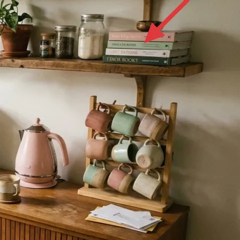
A decorative book stack adds visual weight behind smaller items and creates a height step that makes the shelf styling look layered on purpose. In the hero image, the books sit along the wall shelf and help frame the jars and smaller decor, so nothing looks like it’s floating. This choice is renter-friendly because books can be replaced cheaply, swapped with what you already own, and packed away easily during a move. The trade-off: don’t stack too tall—if the stack rises above the jar line, the shelf starts looking top-heavy instead of balanced.
Keep the spine color muted
Choose covers that lean cream, sage, or warm neutrals so the jars stay the focal “labels.”
Layer 7 — DIY apothecary jar labels (on existing glass jars) ($45) One small text detail that makes everything read organized
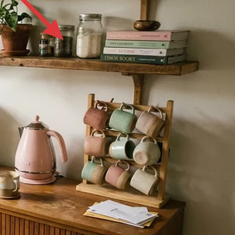
Make it instead of buying it
DIY apothecary-style labels for the existing glass jars on the shelf—printing the text and adhering it so the jars look coordinated instead of random.
Materials
- Printable label sheet (laser/inkjet) — 1 pack — Amazon/Office store — $6
- Printer paper (backup for test prints) — 1 ream — office store — $8
- Scissors or craft knife — 1 set — craft store — $10
- Double-sided label tape (paper-safe) — 1 roll — craft store — $4
- Small ruler/marker — 1 pack — office store — $7
Steps
- Pick 6–10 jar “names” that match what’s already inside (coffee, tea, spices, rice, etc.).
- Design labels in a simple apothecary style (small caps, serif font, consistent spacing) and print 1 test sheet.
- Measure a jar’s label area and lightly mark placement so the text sits centered on the glass.
- Cut the labels cleanly, then dry-fit each one on its jar before adhering.
- Apply double-sided tape to the back edges (avoid bubbles that show through glass).
- Press each label onto a clean, dry jar and hold for 20–30 seconds to set the grip.
Total DIY cost: $35 — saves about $10 over buying.
When you add consistent labels to glass jars, the shelf stops looking like “items I own” and starts reading like a curated storage system. In the hero image, the jars are already there—your job is to make the text styling match so the warm wood, green accents, and terracotta tones feel planned. This DIY is especially renter-friendly because labels are removable and don’t require permanent changes to the shelving or the jars. The trade-off is precision: labels that are crooked or different sizes can make the whole shelf feel busier, so center alignment matters more than fancy graphics.
Keep the jar text scale consistent
Small, same-size labels read more apothecary than mixing big “statement” labels with tiny ones.
The cost, layer by layer
| Layer | Item | Cost |
|---|---|---|
| 1 | Area rug 5×7, textured neutral | $200 |
| 2 | Framed botanical print 16×20 | $25 |
| 3 | Indoor plant (4–6 ft) in white pot | $30 |
| 4 | Decorative tray | $35 |
| 5 | Planter / pot (medium) | $15 |
| 6 | Decorative book stack | $15 |
| 7 | DIY apothecary jar labels (retail-equivalent) | $45 |
| Total | $415 | |
If $30 for a tall plant feels steep, use a smaller tabletop plant for the first pass and save the tall plant for later—your rug and labels still carry most of the “organized” look.
What worked, what didn't (across the whole room)
This corner looks put-together because the styling follows a repeatable system: grounded rug, vertical plant for balance, and a shelf that’s organized by height. The tray concept helps the countertop stay tidy even with everyday items out. The only part that can tip from “curated” to “busy” is jar shelf spacing—labels and consistent scale matter.
What worked
- The neutral 5×7 rug makes the sideboard feel like intentional furniture instead of a standalone piece.
- The framed botanical print echoes the plants so the wall and shelf styling read as one palette.
- A tall leafy plant adds vertical softness and balances the countertop’s straight lines.
- A decorative tray groups mugs and countertop pieces into one easy-to-clean zone.
- Warm-toned pottery keeps the shelf from feeling sterile next to sage-green and glass.
- DIY-style jar labels add structure so the shelf looks curated, not cluttered.
What didn't
- Too many small objects on the sideboard top competes with the plant and makes the corner feel noisy.
- Labels with mixed sizes make the shelf look like random containers instead of storage.
- Overstacking the book height can pull attention away from the jars and dish items.
- A shiny planter finish can look too new next to warm wood, changing the tone of the palette.
- If the plant isn’t in bright daylight, it loses fullness and the styling loses its “light” feel.
What we'd skip if we did it again
Skip adding more countertop containers. In a kitchen counter corner, extra vessels usually create visual clutter faster than they add storage—use a tray and keep the rest out of sight.
Skip mismatched jar text sizes. Even if the jars are pretty, inconsistent label scale reads chaotic; pick one apothecary template and apply it across all jars.
Skip a tall plant that isn’t getting enough light. If the leaves start thinning, the whole corner looks unfinished; a smaller plant in brighter light beats a leggy larger one.
Frequently asked
Is this renter-friendly if my lease doesn’t allow changes to walls?
Yes—this look is built from movable items and surfaces you don’t have to alter. The main work is styling (tray placement), adding a rug, and using wall art that can be hung without drilling. The DIY jar labels are applied to the jars themselves, so you can remove them at move-out without leaving marks.
How long does the jar-label DIY take?
Plan for about 45–60 minutes total: test-print one sheet, measure label placement, cut, then apply the labels. If the printer settings need adjusting, add another 10 minutes. The result is worth it because consistent label styling is what makes the shelf read “system” instead of “random collection.”
What if my kitchen counter corner is smaller than this photo?
Keep the plant but downsize everything else. Use the rug area to anchor the scene, keep the tray to one cluster of items, and limit the book stack height. If shelf space feels tight, reduce the number of jars on display and keep the labels consistent on the jars you do show.
What if my corner gets more foot traffic and I need something tougher?
Choose a rug with a textured surface and consider a slightly thicker pile for comfort, since kitchen corners are high-use areas. For the styling, keep the tray close to the sideboard center so you can lift items off quickly. The labels won’t be affected by traffic—just wipe the jars clean before re-pressing if needed.
Where should I shop if I want this palette (warm wood, sage green, terracotta pink)?
For the fastest match, start with a neutral rug and a botanical print in warm tones, then pull colors from the existing pieces you already have. Plants and planters are easiest to source locally, while trays and book stacks are widely available at home goods retailers and thrift stores. The DIY label template is the budget-friendly anchor.
Biggest mistake to avoid for a kitchen counter corner like this?
The biggest mistake is adding too many small containers without a collecting surface. If everything sits “loose” on the sideboard, the corner starts to feel busy even with beautiful items. Use one tray as the rule, keep jar labels consistent, and let the plant provide vertical calm.
More in Kitchen & Dining
How to style a kitchen counter corner for $500
A kitchen counter corner refresh on a $500 renter-friendly budget: swap in a neutral 5×7 rug, add a framed botanical print, bring in a tall…
Under $300: move-friendly kitchen island refresh with 7 layers
A bright kitchen-island refresh for shared housing—under $300 with 7 move-ready swaps. Focus on rug pattern, a painted terracotta-style cen…
Under $500: warm renter-friendly kitchen breakfast nook refresh
A warm, earthy breakfast nook look for renters using move-friendly swaps: a statement rug, styled counter pieces, and labeled storage jars.…