- Best for
- Renter-friendly kitchen styling
- Time
- 2–4 hours
- Difficulty
- Easy
- Cost
- Under $500
Why warm earthy-neutrals is the breakfast nook of 2026
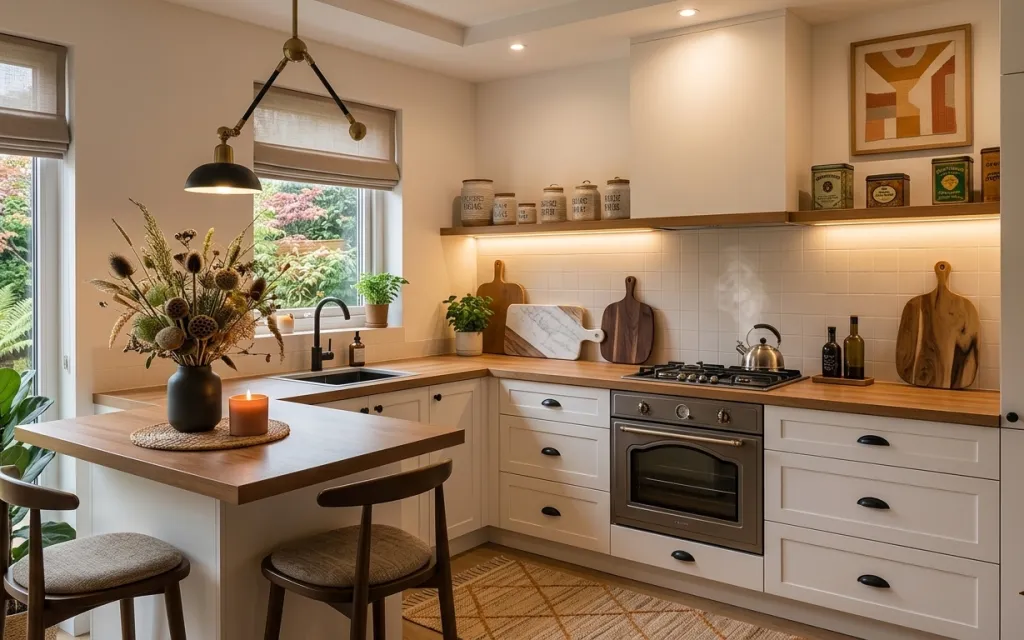
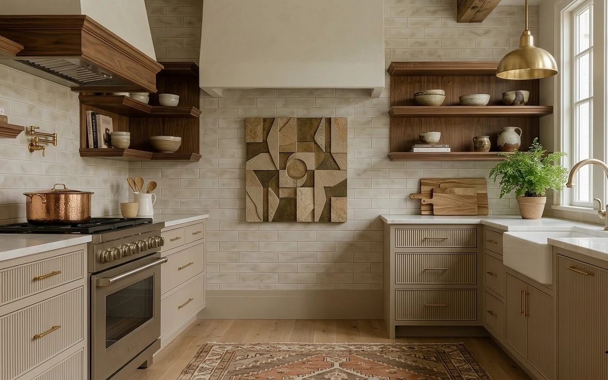
The photo reads like a calm morning: warm brass pendant light, a creamy countertop, and lots of texture layered in small doses. Underfoot, the area rug adds a soft anchor, while the black ceramic vase with dried flowers brings a sculptural focal point. The candle jar and a couple of compact plants keep things from feeling too “staged,” and the wood cutting boards add that hands-on, lived-in kitchen energy. The best part for renters: none of these pieces depend on changing built-ins or installing new fixtures.
I used to over-style kitchens with too many “cute” items at once, and it always looked busy instead of intentional. This time, I focused on the repeating materials I could actually repeat: wood tones on the boards, black in the vase and candle, and greenery in small pots. That single rule turned the counter into a scene you can maintain without constantly resetting everything.
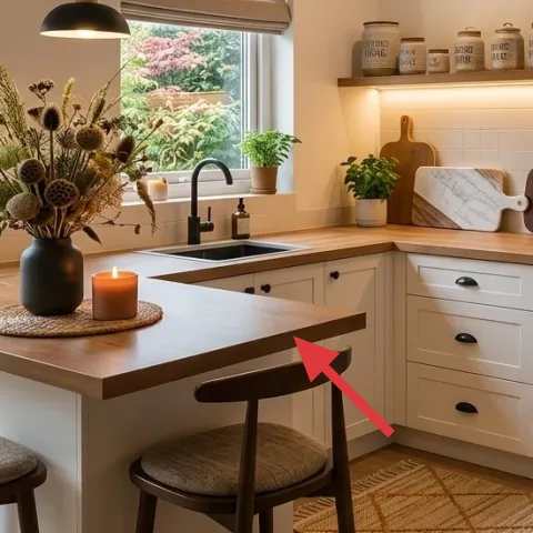
Layer 1 — area rug ($150) warm pattern under the stool legs
An area rug in a warm, woven-inspired pattern helps the breakfast nook feel finished because it visually holds the dining table and stools in one grounded zone. In this photo, the rug sits under the front legs and extends far enough to catch movement when you pull a chair out. I like this choice over a runner here because it works with the whole seating area, not just the center line. The trade-off: a rug needs occasional vacuuming (especially with plant debris), but it’s renter-safe and easy to roll up at move-out.
Keep 8–12 inches of rug visible past the table legs
That extra border stops the seating from looking “floating” on bare flooring.
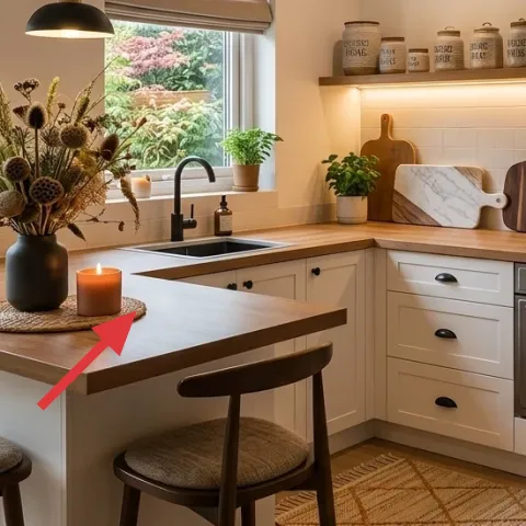
Layer 2 — glass candle jar ($25) amber light by the table edge
This glass candle jar is doing double duty: it adds a warm glow for evenings and adds a small vertical shape on the countertop. Because it’s placed near the front of the table surface (where your eyes land first), it reads as intentional styling instead of clutter. Choosing a glass jar over a hurricane holder is an easy renter win—no extra base, and it looks good even when the candle isn’t lit. The trade-off is scent options: pick a neutral or wood-and-cotton style so it doesn’t fight the other warm elements like dried florals.
Match the metal tone to the light fixtures
Brass details look cohesive next to amber candle glass.
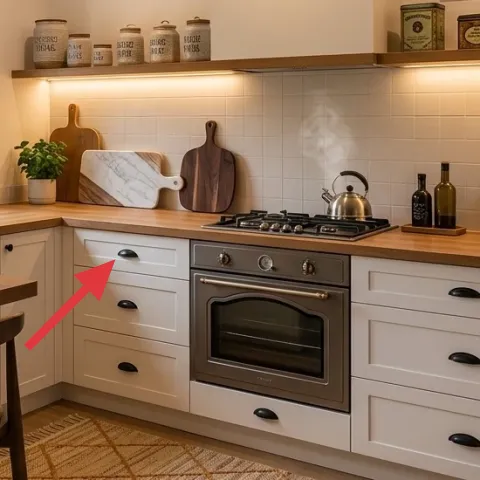
Layer 3 — black ceramic vase with dried flowers ($30) matte contrast against cream counters
A black ceramic vase gives you contrast that feels modern without looking harsh, especially next to a light countertop. In the photo, the vase sits on the left side of the dining table and holds dried florals that add texture you can’t fake with store-bought greenery. This is the layer I’d prioritize if only one person in the lease is willing to style: it changes the whole mood because it’s a focal-object, not just decor. The trade-off is that dried arrangements look best when you keep them dusted and top up with a similar bouquet once or twice a year.
Pick dried stems with varied head sizes
Different “seed pod” shapes create depth without adding more objects.
Layer 4 — small potted plant on countertop ($25) soft green breaks up warm wood
Plants in small pots prevent the nook from becoming a one-note palette of cream, wood, and black. Here, the plants are tucked into the countertop area where they visually “lift” the styling—like a mini garden that doesn’t need shelves or wall installs. A compact pot is easier for renters than a tall plant because it fits tight corners and you can lift it off when you move. The trade-off is light requirements: set both plants near the window and rotate weekly so the leaves don’t lean toward the glass.
Don’t place plants where you’ll bump them daily
If the plant sits right in the chair pull path, it’ll get knocked around.
Layer 5 — wood cutting board set on display wall ($45) warm grain repeats in multiple shapes
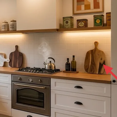
The wood cutting boards are the “functional decor” layer—flat, warm, and easy to style because their grain reads as texture. In the photo, the boards sit along the wall in different sizes, which keeps the display from looking like a single slab. This approach beats a single oversized board because the variety makes the wall feel curated instead of accidental. The trade-off is spacing: leave enough gap between boards so the labels and edge profiles don’t visually merge at a distance.
Use display boards you already own first
If you don’t have several, one or two boards still work—add the rest gradually.
Layer 6 — kitchen spices jars with labels ($40) labeled storage that looks styled, not messy
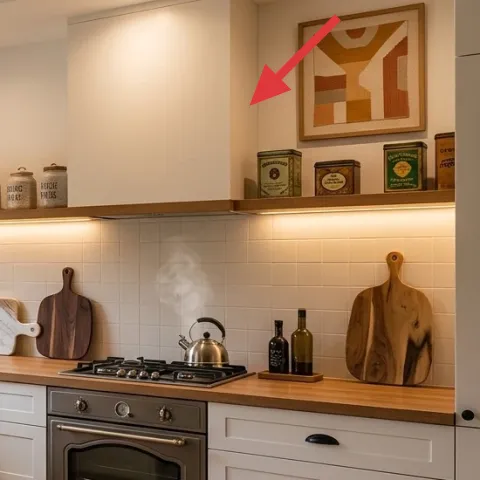
This shelf of labeled kitchen spices jars is what makes the whole nook feel composed—everything looks purposeful because the containers match and the text aligns. Instead of trying to hide every container in a cabinet, go for a small, consistent set you can see from the breakfast table. When the labels are legible and the jar shapes are similar, you get that magazine-order effect without changing the built-ins. The trade-off is that labels need replacing if you switch brands, but that’s a lot easier than swapping out hardware or fixtures.
Make it instead of buying it
DIY apothecary-style jar labels that match the fonts and spacing of the existing jars, so the shelf looks coordinated without sourcing a whole new matching set.
Materials
- Printable label sheets — 8.5×11 — letter size — $8
- Ink/toner refill (budget allowance) — 1 — printer store — $6
- Scissors — 1 pair — craft store — $4
- Clear packing tape — 1 roll — office store — $5
- Fine-tip marker (for small touch-ups) — 1 — craft store — $3
Steps
- Measure each jar’s front panel height and width with a measuring tape.
- Create a simple label layout in your preferred design app with consistent margins.
- Print the labels at the size you measured, then let the ink fully settle for a few minutes.
- Cut each label cleanly with scissors along the edge of the printed border.
- Apply the labels to the jars using clear packing tape so the text stays readable.
- Let the tape adhere for 10–15 minutes, then wipe off any fingerprints with a dry cloth.
Total DIY cost: $26 — saves about $14 over buying.
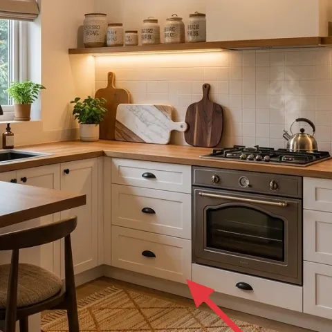
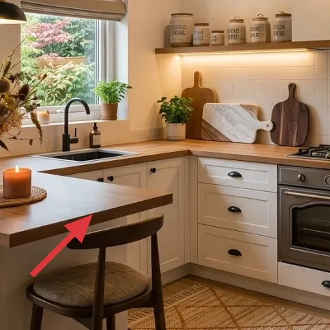
Layer 7 — rectangular dining table ($120) the warm base for everything you touch
A rectangular dining table gives this breakfast nook its “work surface” feel, and it’s the piece your plants, candle, and vase are built around. Because the table is the biggest horizontal plane in the scene, even small items look more intentional when they sit on a defined tabletop rather than directly on bare flooring. I’m calling out the table as a layer because renters can often find the right footprint at thrift stores and marketplaces, then style it with the exact same black-and-wood rhythm you see here. The trade-off is stability: choose a table with a sturdy frame so the chair movement doesn’t loosen it over time.
Prioritize a tabletop you can wipe in one pass
That keeps the styled look from turning into streaks after breakfast.
The cost, layer by layer
| Layer | Item | Cost |
|---|---|---|
| 1 | Area rug (5×7), warm woven pattern | $150 |
| 2 | Glass candle jar, amber | $25 |
| 3 | Black ceramic vase with dried-flower stems | $30 |
| 4 | Small potted plant for countertop display | $25 |
| 5 | Wood cutting board set for display | $45 |
| 6 | Apothecary-style jar labels (retail equivalent) | $40 |
| 7 | Rectangular dining table | $120 |
| Total | $435 | |
If you want a cheaper variant, focus on the rug first (or swap in a smaller size), then keep the candle and one plant. Skip the cutting-board set expansion and use what you already have until the labels and rug bring everything together.
What worked, what didn't (across the whole room)
The biggest win was repeating the same material notes—black ceramic, warm wood, and small greenery—so the nook reads intentional from every angle. The area rug also helped the dining moment feel anchored even with bright daylight. One miss: when there were too many small objects on the table, the candle and vase competed instead of cooperating.
What worked
- The rug pattern adds warmth and makes the stool area feel like a single zone.
- Black ceramic and amber glass provide contrast without adding clutter.
- Wood cutting boards bring functional texture that matches the kitchen’s warm tones.
- Two plants at different heights keep the countertop from reading flat.
- Labeled jars make storage look styled, even when you’re mid-cook.
What didn't
- Overbuying extra decor created visual noise on the table’s main surface.
- Using mismatched container sizes made the jar shelf feel accidental.
- Placing plants too close to the chair path led to frequent knocks.
- Trying to rely on candle glow alone made mornings feel too dim.
What we'd skip if we did it again
Skip a “decor by committee” approach where every surface gets something new. In this nook, the best look comes from fewer, stronger objects: rug first, then one focal vase/candle, then greenery. When everything is competing, the room stops feeling curated.
Skip expensive custom-style pieces that don’t pack away well. This is a renters-first refresh, so prioritize tabletop-friendly items and removable shelf styling like jars and labels over anything that would be hard to transport or re-create.
Skip adding multiple label styles. Keeping the jar typography consistent is what makes the shelf read neat from the breakfast table, so commit to one label format and reuse it across all containers.
Frequently asked
How long does this breakfast nook refresh take for a renter?
Most of the time goes to styling and spacing, not shopping. If the rug is already picked up, plan for about 2–4 hours: lay out the rug, position the table items, place both plants, and then finalize the jar labels. If you’re making the labels from scratch, add another 20–40 minutes for printing and cutting.
Is this doable in a rental without drilling or wall changes?
Yes. The look here is built from move-friendly layers: a rug under the seating area, countertop items (vase, candle, plants), and labeled jars. If you’re also copying the wood board display, make sure your renter-safe method matches your current setup (for example, items that are already mounted versus new wall hardware).
What if my kitchen nook is smaller or narrower?
Go smaller on the rug size first, but keep the rule about visible border under the stool area. On a narrower table, keep just one plant and one focal object (like the vase), and let the cutting boards do the remaining wall texture. The “less but stronger” approach prevents the breakfast nook from feeling crowded.
Where should I shop for these pieces if I want them to look cohesive?
Start with the rug, then shop for a black ceramic vase and a glass candle jar in the same general tone palette. For jars and labels, craft stores and kitchen supply sections usually have great containers, but the real cohesion comes from consistent label styling. Marketplace and thrift finds are especially good for the dining table.
What’s the biggest styling mistake in kitchens like this?
The biggest mistake is spreading too many small objects across the same horizontal surface. In this look, the table gets one main sculptural piece (vase) plus one smaller anchor (candle), while the plants and jars work as secondary texture. If the counter feels cluttered, reduce items before switching to “more decor.”
Will the dry flowers and candle choices stay looking good long-term?
Dried stems last a long time, but they do collect dust—quick wipe-downs keep them crisp. For candles, choose a jar you can keep as a container even after the wax runs out, so the styling doesn’t disappear mid-season. The labels can be refreshed whenever you refill jars, which is part of why this system is renter-friendly.
More in Kitchen & Dining

Under $500: warm renter-friendly kitchen breakfast nook refresh
A warm, earthy breakfast nook look for renters using move-friendly swaps: a statement rug, styled counter pieces, and labeled storage jars.…
Under $400: renter-friendly kitchen nook swaps with bold botanicals
A renter-friendly kitchen nook refresh under $400: add an ochre patterned rug, mustard curtains, a framed botanical print, and small plant …
Under $600: brass-and-tile galley kitchen weekend refresh
A galley kitchen can feel custom with a few targeted swaps: rug, brass lighting, cabinet hardware, and a brighter tile backsplash. This $60…