
- Best for
- Weekend refresh that reads immediately in daylight
- Time
- 4–7 hours active, plus paint cure time
- Difficulty
- Moderate DIY (tile paint prep is the key)
- Cost
- About $600 for the full 7-layer look
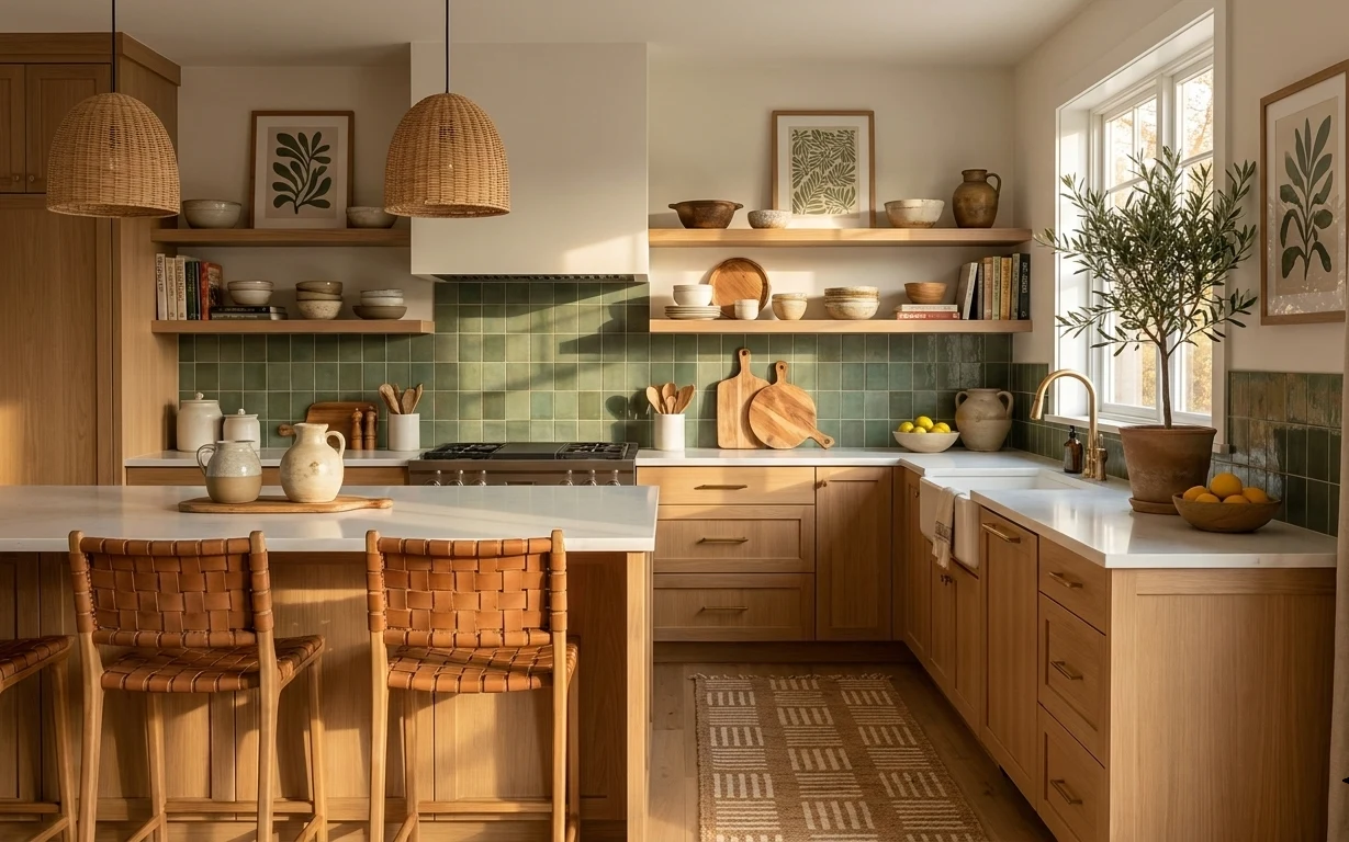
Why warm beige-and-brass fixtures is the galley kitchen of 2026
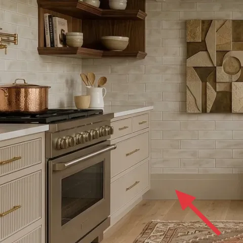
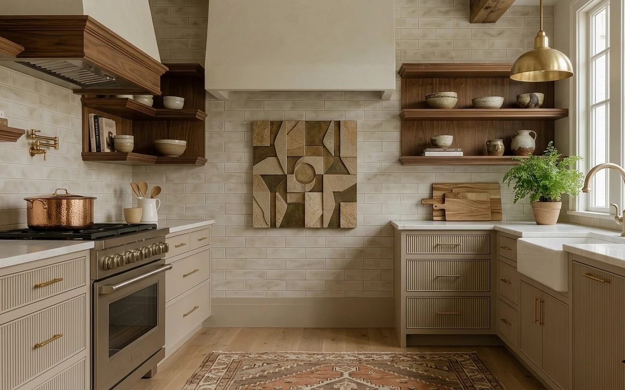
In this galley kitchen, the look starts with texture: the patterned rug underfoot, the matte tile backsplash behind the counters, and the warm wood shelving that holds everyday ceramics. The brass hanging light above adds a reflective note right when your eye moves down the length of the room, so the whole space feels intentional instead of “staged.” Because you own the place, you can prioritize the changes that read immediately in daylight: hardware, lighting, and one backsplash paint pass. It’s a very achievable vibe for homeowners who want maximum impact for a single weekend.
I almost chased a full backsplash replacement the first time I tried to “fix” a kitchen like this. Then I caught myself doing the thing I always do—buying a bigger project when the room actually needed a surface refresh. Painting the tile is the moment that made everything look calmer and more pulled-together against the wood and brass. It also lets you match the existing warm neutrals instead of starting over with a new pattern.
Layer 1 — Patterned area rug ($120) grounds the run of the room
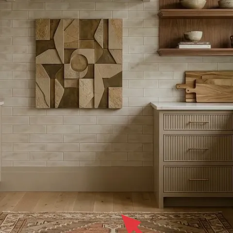
Pick a patterned area rug in warm beige with mid-tone brown and soft gray lines, because that’s what visually “holds” this narrow kitchen together. In a galley layout, a runner that’s too neutral reads like an afterthought; too bold and it fights the tile. This rug works because it repeats small shapes that echo the backsplash’s geometry, while the warm base keeps the cabinetry feeling richer. The trade-off: a rug like this is more noticeable than a plain one, so it’s worth choosing the size carefully so it sits flat under the main traffic paths.
Measure the aisle, not the cabinets
For a galley kitchen, measure the walking lane between bases and aim for the rug to land there with a little breathing room on both sides.
Layer 2 — Brass hanging light fixture ($100) adds a reflective highlight
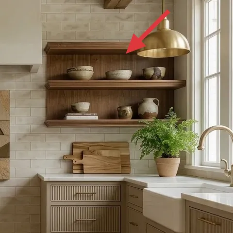
A brass hanging light fixture gives you that warm “glint” without needing wallpaper, a full cabinet refresh, or new tile. The reason it matters in this photo: brass sits near the bright windows, so reflections help the room feel longer and lighter. If you swap to brass (or a brass-toned option), keep the shade shape simple so it doesn’t compete with the backsplash’s pattern and the cabinetry’s vertical detailing. The trade-off is practical—brighter bulbs can emphasize texture—so choose a warmer color temperature for evening comfort and keep the fixture clean since brass shows dust faster than matte finishes.
Warm color temp keeps tile from looking gray
When you’re working with neutral tile, warmer bulbs help the backsplash read creamy instead of cool.
Layer 3 — Brass faucet ($100) ties the shine to the light
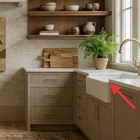
The faucet is one of the few truly “metal-forward” objects in the room, so matching it to the brass lighting instantly tightens the palette. Swap to a brass finish (or a brass-toned look) and the counters and shelves start to feel related instead of scattered. The trade-off: a new faucet is a bigger weekend project than a rug, but it’s still a non-structural change—plan on shutoff time and give the connections a careful check afterward. If you’re nervous about installation, having the faucet professionally fitted can be worth it; the design payoff is immediate.
Don’t match finish by photo color alone
Brass tones vary a lot—test swatches or buy from a retailer with clear finish naming to avoid “yellow next to gold.”
Layer 4 — Wall shelves ($100) add warm vertical storage
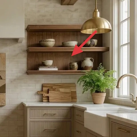
Wood wall shelves are doing more than decoration here—they create a homey “third surface” between the counters and the backsplash. The key decision is scale: shelves that are too narrow look skimpy in a galley, while oversized shelves can make the wall feel crowded. Choose shelves with a warm natural wood tone and a clean bracket profile so they sit comfortably next to tile and brass. Fill them with small ceramics and books the way the photo does: mix matte bowls with one glazed accent, and keep clutter to a handful of items per shelf line. The trade-off is dusting—open shelves mean you’ll wipe them more often than closed cabinetry.
Use the “one height rule”
Keep most objects within the same height band so the shelves look curated, not stacked.
Layer 5 — Gold cabinet pulls on drawers ($60) makes storage feel intentional
Cabinet hardware is the fastest way to change the room’s perceived finish. In this kitchen, the gold-toned pulls echo the brass lighting and keep the cabinetry from looking flat against the neutral tile. Choose pulls that are slightly slimmer than chunky bar styles; that subtle proportion makes the cabinetry feel lighter in a narrow footprint. The trade-off is measurement: if your pulls don’t match the existing hole spacing, installation turns into a deeper project with more drilling. To keep it weekend-friendly, select hardware that matches the current centers or plan for a straightforward replacement path.
Match the pull length to the drawer width
Small drawers need shorter pulls; if they’re too long, the hardware visually “shrinks” the cabinetry.
Layer 6 — Potted plant on windowsill ($30) brings the “alive” counterpoint
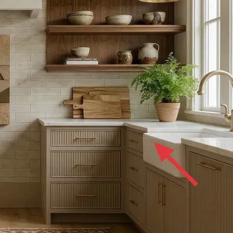
A potted plant on the windowsill adds soft movement and a touch of green that the warm neutrals need. In this photo, the plant is placed right where the day floods in, so it reads fresh without needing extra décor pieces. Choose a plant with medium-fine leaves (not big, stiff fronds) to keep it in scale with a galley kitchen wall and shelf styling. The trade-off is location: windowsills get dry fast, so plan on regular water checks and rotating the pot so the leaves grow evenly toward the light.
Rotate the pot weekly for a fuller silhouette
A quick turn keeps the plant balanced and prevents one-sided lean.
Layer 7 — Tile backsplash in neutral tones ($80) gets a cleaner, brighter read
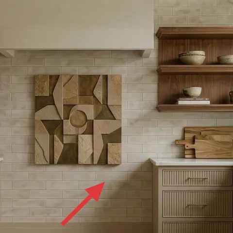
Paint the tile backsplash in a neutral tone that pulls warm rather than gray, because the backsplash is the room’s biggest uninterrupted visual field. The goal is subtle: soften grout lines, unify color variation, and make the tile look more “designed” against the brass and wood shelves. This approach works fast for homeowners because it’s surface-level—no demolition, no new plumbing lines—and it upgrades the kitchen without changing your layout. The trade-off is prep: skipping cleaning and priming can lead to peeling, so follow a careful surface routine and take your time on the first coat. Once it cures, the rest of the styling (rug, shelves, ceramics) looks instantly more intentional.
Make it instead of buying it
Paint over the existing neutral tile backsplash to make the whole galley read brighter and more cohesive with your brass and wood.
Materials
- Tile & laminate bonding primer — 1 quart — home improvement store — $30
- Water-based cabinet/bath paint (warm neutral) — 1 quart — home improvement store — $10
- Painters tape — 1 roll — home improvement store — $8
- Degreasing cleaner — 1 bottle — grocery/home store — $6
- Foam roller cover + angled brush (kit) — 1 set — home improvement store — $6
Steps
- Clean the tile thoroughly with degreaser so paint grips the surface, then rinse and fully dry.
- Tape off countertop edges and any fixtures so you don’t get messy paint lines.
- Lightly scuff the tile with fine abrasive to improve adhesion.
- Wipe off dust and apply the bonding primer with a foam roller for smooth coverage.
- Let the primer cure fully according to the label before painting.
- Cut in edges with the angled brush, then roll the face with even coats.
- Apply a second paint coat and blend any brush marks while the paint is still wet.
- Let the final coat cure for the full recommended time before touching the backsplash area normally.
Total DIY cost: $60 — saves about $20 over buying.
The cost, layer by layer
| Layer | Item | Cost |
|---|---|---|
| 1 | Patterned area rug (5×7) | $120 |
| 2 | Brass hanging light fixture | $100 |
| 3 | Brass kitchen faucet | $100 |
| 4 | Wood wall shelves | $100 |
| 5 | Gold cabinet pulls on drawers | $60 |
| 6 | Potted plant on windowsill | $30 |
| 7 | Painted neutral tile backsplash (retail equivalent) | $80 |
| Total | $590 | |
If the backsplash paint feels like too much, start cheaper by focusing on the rug and cabinet hardware first—those two changes usually give the biggest “done” feeling for the least fuss.
What worked, what didn't (across the whole room)
This refresh works because it repeats warm metals and warm neutrals across multiple heights—floor (rug), ceiling (light), and eye level (shelves, faucet). The result feels cohesive without erasing the character of the existing tile and cabinetry. The hardest part is deciding how much to change versus how much to restyle around what’s already there.
What worked
- The patterned area rug visually anchors the narrow aisle and makes foot traffic feel intentional.
- Brass lighting reflections brighten the backsplash so the neutrals read warm, not flat.
- Matching faucet finish to the light creates an “at a glance” coordinated look.
- Wood wall shelves add storage and vertical warmth without blocking daylight.
- Gold cabinet pulls shift the cabinetry from builder-basic to designed with one small swap.
- A windowsill plant keeps the room feeling lived-in rather than purely styled.
What didn't
- Trying to paint tile without full degreasing makes adhesion inconsistent across the backsplash.
- Hardware choices that don’t match existing drawer hole spacing create extra weekend work.
- Overfilling shelves turns the wall into visual noise in a galley layout.
- Cool-toned paint on tile can pull the backsplash toward gray and fight the brass.
What we'd skip if we did it again
Skip a full backsplash replacement if you’re not ready for demolition. Painting tile—done carefully—keeps the original layout and saves days, while still giving you that cleaner, brighter backdrop for shelves and ceramics.
Skip buying random matching décor to “complete” the look. Start with one structural change (rug size or hardware finish), then style with fewer objects so the shelves read curated instead of cluttered.
Skip a lighting finish that’s too cool or too silver next to brass. In this kitchen, warm metals are the thread that ties surfaces together, so the small finish mismatch shows immediately.
Frequently asked
How long does this kind of galley kitchen refresh take?
If you’re only swapping hardware, a light fixture, and adding the rug, you can do most of the work in one weekend. The tile backsplash paint part takes additional time because prep and full curing matter. Plan on a first paint day for primer and paint, a second day for touch-ups, and then follow the label cure schedule before heavy kitchen use.
What if I rent or can’t change plumbing fixtures?
Skip the faucet and focus on the rug, wall shelves (if allowed), and hardware—those give the biggest visible payoff without touching plumbing. For plants and décor, use the existing sink area for a windowsill plant and a couple of ceramics on shelves. If fixtures can’t change, use warmer bulbs in the existing light to keep the tile from reading cool.
My galley is shorter—should I still use the same rug size?
Go smaller only if the aisle still looks anchored. In a short galley, a 5×7 can work if the rug sits under the main traffic lane and doesn’t bunch at the ends. If the room is longer, consider an 8×10 so the pattern doesn’t “stop” halfway down. The goal is visual continuity, not perfect coverage.
Can I paint tile backsplash even if the grout lines are dark?
Yes, but expect the first coat to look uneven. Use primer designed for tile and plan on at least two paint coats, with careful cutting at the grout lines. A slightly warm neutral paint helps dark grout read more blended, but you may need a second pass in heavy-saturated areas.
Where should I shop for the brass look on a budget?
For brass tones, compare lighting and hardware finishes side-by-side in-store when possible. Home improvement stores and big-box retailers often have brass-toned fixtures and standard drawer pulls that match hole spacing. For the rug and plant, focus on material and color match first—pattern warmth and leaf texture matter more than brand.
Biggest mistake to avoid in a kitchen like this?
The biggest mistake is treating it like a blank canvas. Keep finishes coordinated (warm metals and warm neutrals), and don’t over-style open shelves. If paint is involved, don’t rush prep—degreasing and full primer cure are what prevent peeling and uneven sheen.
More in Kitchen & Dining
Under $600: brass-and-tile galley kitchen weekend refresh
A galley kitchen can feel custom with a few targeted swaps: rug, brass lighting, cabinet hardware, and a brighter tile backsplash. This $60…
Under $600: botanical kitchen corner refresh with 7 weekend wins
Turn a bright kitchen corner into a calm, botanical moment with 7 budget-friendly upgrades. This weekend refresh keeps the look cohesive—ju…
Under $1000: a homeowner's warm-modern kitchen refresh with seven sun-soaked layers
A complete seven-layer homeowner refresh for a warm-modern kitchen — sage tile backsplash, oak cabinets, three hand-woven saddle-leather ba…