
- Best for
- Textiles + counter styling
- Cost
- Total $260
- Difficulty
- Easy (mostly shopping + stacking)
- Time
- One afternoon
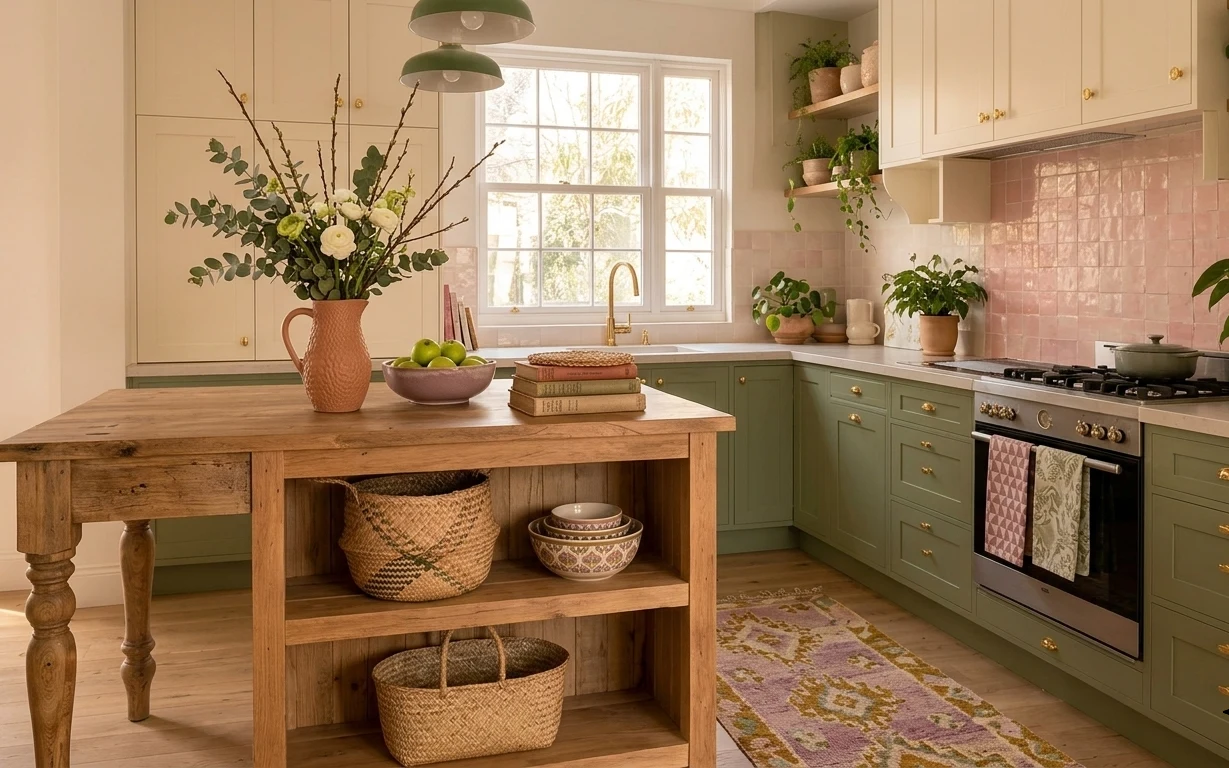
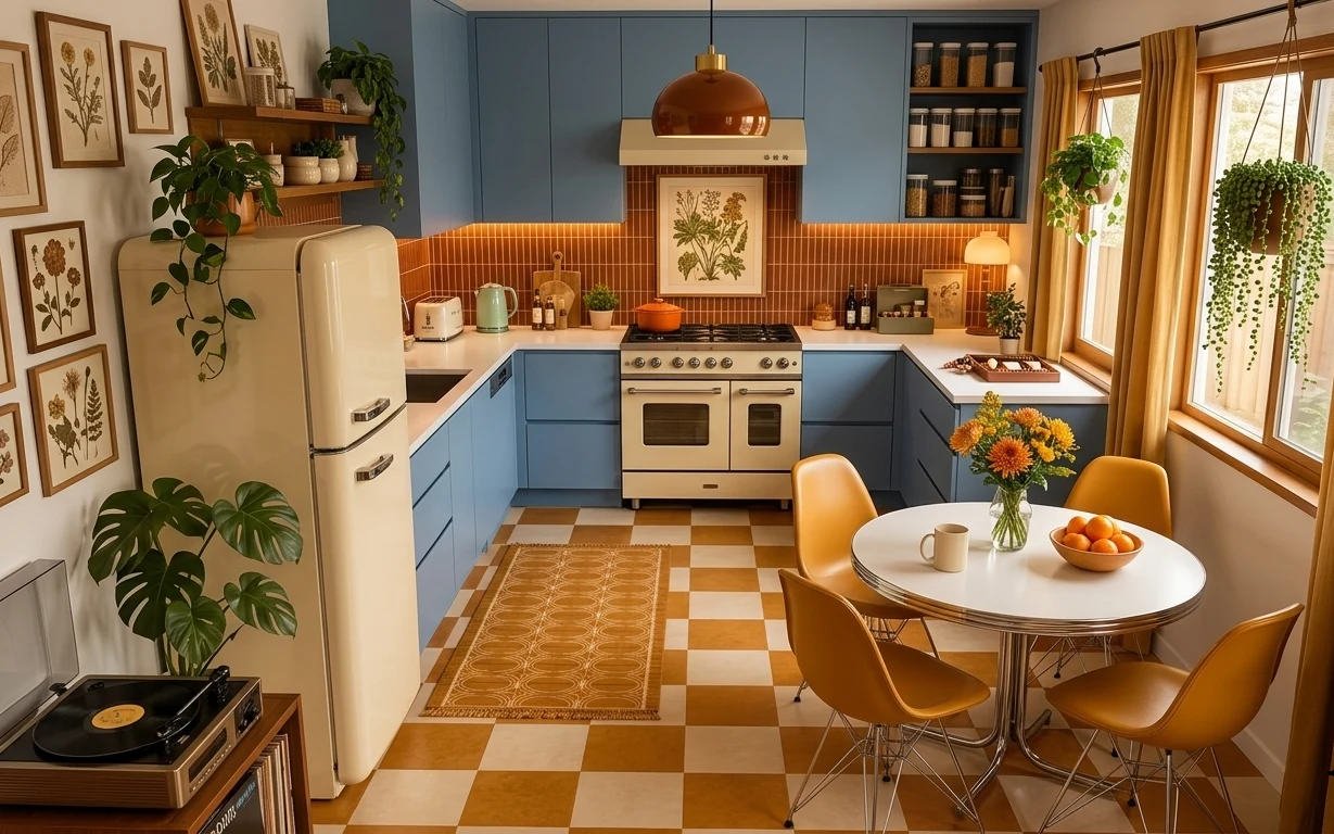
Why olive-green cabinets and terracotta details are the kitchen island of 2026
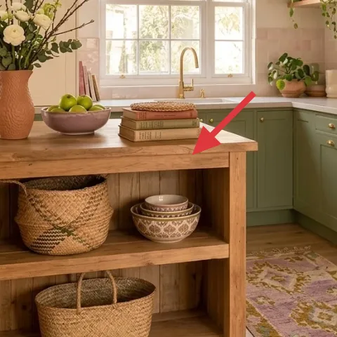
The hero moment here is how warm materials sit against clean lines: the wood table holds a terracotta pitcher, leafy stems, and a few “readable” objects, not a big messy dump of stuff. The patterned area rug grounds everything on the light wood floor, while the green drum pendant shades add that vintage-leaning color pop above the center. Because shared housing needs everything to pack up later, this style relies on swaps you can carry: textiles, freestanding decor, and small groupings on the counter and shelves.
I almost chased a more permanent-feeling look the first time I tried this—meaning I kept trying to “fix” a layout with hard changes. Then I noticed how much of the cozy effect came just from grouping: one hero (the terracotta vase), two supporting textures (woven baskets and books), and repeating green through the pendant and plants. That’s the version that travels with you.
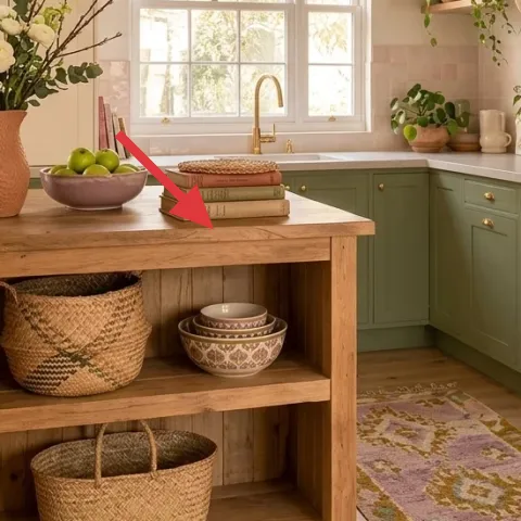
Layer 1 — Decorative book stack ($15) Anchor pieces with readable spines
On the table, the stack of books works because it creates height without taking up more floor space. The key is scale: the pile sits low enough to keep sightlines open, but tall enough that the terracotta centerpiece and fruit bowl don’t feel floating. A cheaper alternative is a single thicker book, but the look in the photo depends on visible edges and staggered thickness, which reads intentional. The trade-off is that books need occasional dusting, so choose covers you don’t mind handling and repurpose them after each move.
Stack by color range, not just size
Pick two to three book covers that share a tone (cream, green, or warm neutral) so the stack blends into the palette instead of becoming random clutter.
Layer 2 — Ceramic bowl with green apples ($20) Keep one food-safe focal moment
The ceramic bowl with green apples gives the table a “lived-in” center without adding visual noise. It’s also an easy move-friendly swap: the bowl travels in a tote, and the fruit can be replaced in minutes depending on what’s in season. The photo’s vibe comes from contrast—the smooth ceramic shape against the rough wood tabletop and the woven baskets below. The obvious alternative is a glass bowl, but glass can look too sleek and reflections fight daylight through the window. Ceramic holds the warmth better, and the bowl is still useful after the decor moment.
Choose a bowl that can survive real life
If it’ll get bumped while packing and unpacking, pick something you can wipe clean quickly and still use at the next place.
Layer 3 — Woven storage basket on lower shelf ($25) Add texture where you can’t see wall art
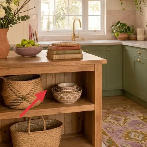
The woven basket on the lower shelf adds the earthy texture the rest of the room hints at, especially against the clean cabinetry lines. This is the kind of “background layer” that makes the table area look styled even when you’re not actively arranging. The basket also hides everyday items—extra napkins, kitchen towels, or small bundles—so the top surface stays intentional. A cheaper alternative is a plastic organizer, but the photo’s warmth comes from the basket’s irregular weave and muted tone. The trade-off is that woven pieces collect a little dust, so a quick shake-out keeps it looking fresh.
Match weave tones across two baskets
Using baskets in the same warm family (natural straw vs. darker wicker) makes the whole island feel cohesive.
Layer 4 — Terra-cotta pitcher vase with bouquet ($45) A painted look without the commitment
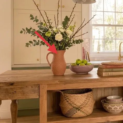
This terracotta pitcher is doing the heavy lifting: warm clay color makes the bright kitchen feel grounded. The bouquet inside adds movement and height, and the pitcher shape is bold enough to read as a centerpiece even when the rest of the table is simple. For shared housing, the win is packing—ceramic and terra-cotta can be wrapped and carried without tools or wall changes. The alternative—buying a fake floral bundle alone—can look flat and too “one-note” against the real wood grain. Terracotta + stems creates the texture contrast that makes everything feel curated.
Don’t use sprays that need ventilation indoors
If adding any finish to clay, wait for airflow and follow the label; stick to quick-dry options that won’t linger.
Layer 5 — Potted plant on the counter ($35) Repeat green beyond the pendant shade
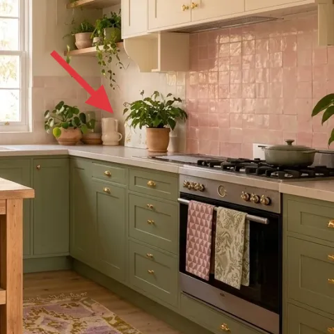
That potted plant on the counter keeps the palette from feeling like “just styling on the table.” It echoes the green in the pendant shades and ties the window daylight to the rest of the scene. The plant also fills a vertical gap—without adding more furniture—so the kitchen feels fuller without feeling crowded. A cheaper alternative is a small cutting in a jar, but it won’t match the scale in the photo where leaves reach into the visual space. The trade-off with live plants is water timing, but it’s still one of the easiest things to wrap, transport, and restart.
Choose plants that tolerate moving
Look for hardy varieties that handle a quick change in light when you move between leases.
Layer 6 — Green drum pendant shade ($40) Color at ceiling height without drilling
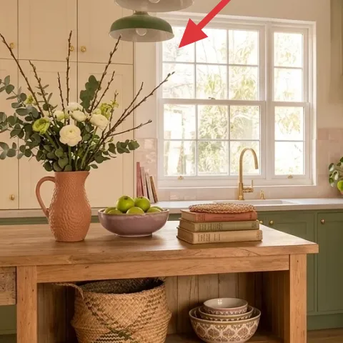
The green drum pendant shades are what make the island feel styled from every angle, not just from countertop height. Even with limited changes allowed in shared housing, a shade-and-cord swap can still be move-ready if it’s plug-in compatible. The drum silhouette keeps the light soft, and the color works because it sits between the cream walls and the sage cabinets. The obvious alternative is a bright white shade, but that pushes the room too neutral and makes the terracotta feel louder than it needs to. The trade-off is brightness control—you may need to pick a bulb with warmer color temperature to match the daylight mood.
Keep one green family, then repeat it once
Let the pendant set the hue, and choose plant tones that look related rather than perfectly identical.
Layer 7 — Patterned area rug ($80) Make the island zone feel intentional
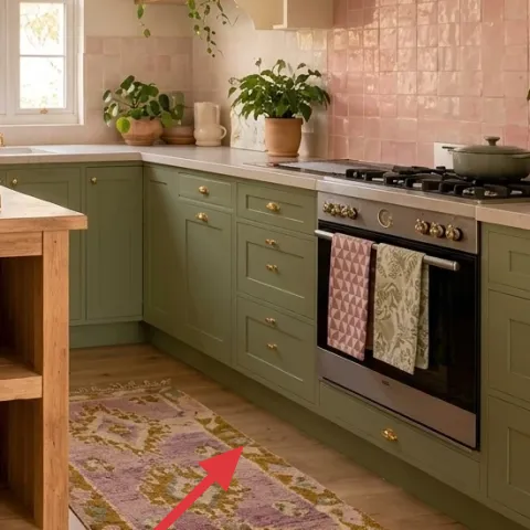
The patterned area rug is what turns this into a “room-within-a-room” moment, defining the island zone on the light wood floor. The muted purple and gold pattern adds character without clashing with the warm terra-cotta, woven textures, or the sage cabinetry tones. It also hides small scuffs that happen in shared housing—like dropped mugs and moving-day dirt. A cheaper alternative is a solid rug, but the photo’s energy comes from pattern that reads as lived-in and vintage-inspired. The trade-off is that pattern draws the eye, so keep the tabletop styling simple and cohesive.
Skip high-pile rugs if you’ll move often
They’re harder to fold cleanly and can snag on door thresholds during a fast move.
The cost, layer by layer
| Layer | Item | Cost |
|---|---|---|
| 1 | Decorative book stack | $15 |
| 2 | Ceramic bowl with green apples | $20 |
| 3 | Woven storage basket | $25 |
| 4 | Terra-cotta pitcher vase with bouquet | $45 |
| 5 | Potted plant on counter | $35 |
| 6 | Green drum pendant shade | $40 |
| 7 | Patterned area rug 5×7 | $80 |
| Total | $260 | |
If the rug pattern feels too bold, choose a similar-size rug in oatmeal or cream with a low-contrast motif. Keep the terracotta centerpiece and one woven basket as the texture “core,” and the island still reads warm and intentional.
What worked, what didn't (across the whole room)
This setup nails the “centerpiece + texture + repetition” formula: terracotta warmth, woven baskets, and green cues from the pendant and plant. The patterned rug adds structure, but it also means the table needs restraint.
What worked
- The patterned area rug anchors the island zone and makes the room feel intentional in daylight.
- Terracotta pitcher warmth balances the pale backsplash and cream walls.
- Woven baskets add texture variety without taking up extra surface space.
- A small ceramic bowl with fruit creates a functional centerpiece that’s easy to reset.
- Book height gives structure so the bouquet doesn’t feel like it’s floating alone.
- Green pendant shades tie the countertop styling to the lighting cue at eye level.
What didn't
- If the tabletop gets too many objects, the terracotta centerpiece loses its role as the anchor.
- Mixing basket tones (natural with very dark) makes the island look less cohesive.
- A very reflective bowl material can fight window light and look less warm than ceramic.
- Skipping the rug pattern and going solid can make the island feel unfinished.
What we'd skip if we did it again
Skip swapping fixed kitchen elements (like cabinets or built-in hardware). This look gets most of its impact from textiles, plants, and a single centerpiece—things that pack into a few boxes when a lease ends.
Skip overfilling the island. The photo works because the table has one hero (the terracotta pitcher), one supporting texture (woven baskets), and only a couple of readable objects; extra decor turns into visual clutter fast.
Skip rug shortcuts that won’t travel. If the rug can’t be folded cleanly or is too high-pile, it’s a hassle during moves, and the “freshly styled” effect disappears the first time the rug bunches at the door.
Frequently asked
How long does this kind of kitchen-island refresh usually take?
Most shared-housing versions take about 2 to 4 hours. Shopping for the rug and the centerpiece accounts for most of the time, while arranging the island is straightforward: books first, then a centerpiece, then one supporting texture like a woven basket. If plants are part of the swap, include an extra 15 minutes for pot placement and wiping down the counter.
If I’m a renter, can I change lighting like the pendant shades?
Look for move-friendly options that don’t require drilling or rewiring—ideally a plug-in compatible shade or a corded fixture you can remove in minutes. If your current setup can’t handle a swap safely, skip the lighting layer and lean harder on the rug pattern and terracotta centerpiece, which still anchor the look.
What if my kitchen island or table is smaller than in the photo?
Scale down the table styling, not the idea. Use a shorter book stack and a smaller ceramic bowl so the terracotta pitcher remains the hero. Keep one woven basket for texture and choose a rug size that reaches at least under the front legs of the table, so the island still feels “zoned.”
What if my space is larger or the ceiling height is different?
For larger kitchens, bump the rug to the next standard size and let the plant reach slightly higher visually (still easy to move). If pendant shades feel too small, stick to a shade color you already have, then add height with the bouquet stems rather than trying to change anything fixed.
Where should I shop differently to keep this budget under control?
For the rug and woven textures, start at discount home stores or resale marketplaces—patterned rugs are often much cheaper than “new look” listings. For the ceramic bowl, thrift works well because shape matters more than brand. Plants and terra-cotta-style pieces are the one area where a reliable local nursery usually saves money long-term.
More in Kitchen & Dining
Under $300: move-friendly kitchen island refresh with 7 layers
A bright kitchen-island refresh for shared housing—under $300 with 7 move-ready swaps. Focus on rug pattern, a painted terracotta-style cen…
Under $500: warm renter-friendly kitchen breakfast nook refresh
A warm, earthy breakfast nook look for renters using move-friendly swaps: a statement rug, styled counter pieces, and labeled storage jars.…
Under $400: renter-friendly kitchen nook swaps with bold botanicals
A renter-friendly kitchen nook refresh under $400: add an ochre patterned rug, mustard curtains, a framed botanical print, and small plant …