
- Best for
- Textiles + countertop styling
- Cost
- $240 total
- Time
- 1 afternoon
- Renter-safe
- No drilling needed
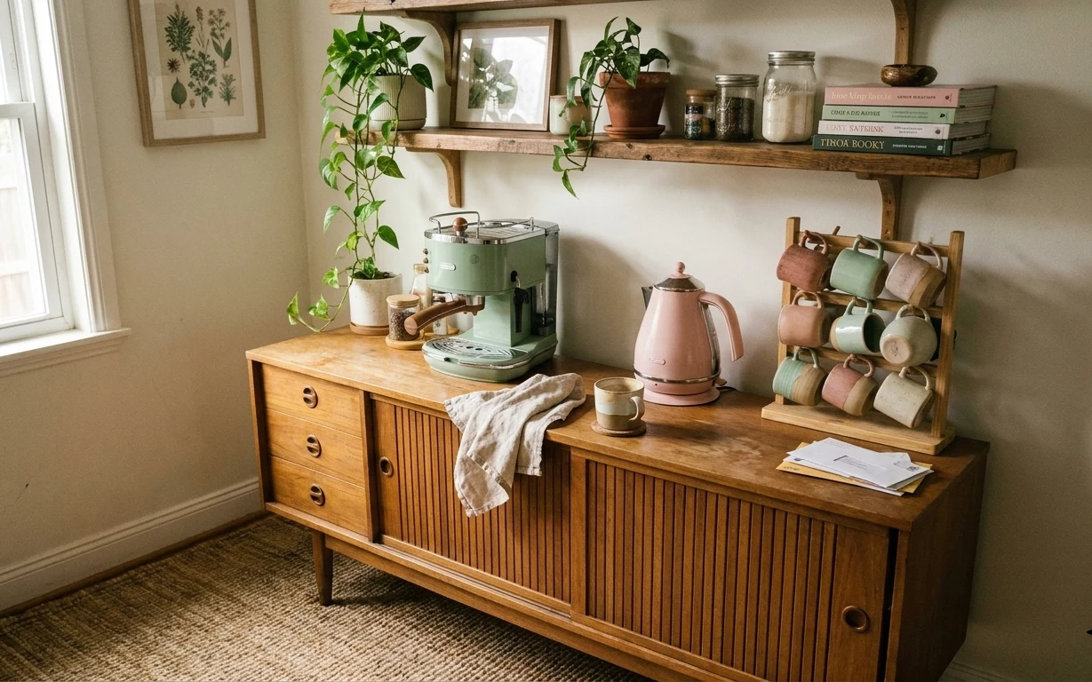
Why warm wood-and-cream shelves are the kitchen counter corner of 2026
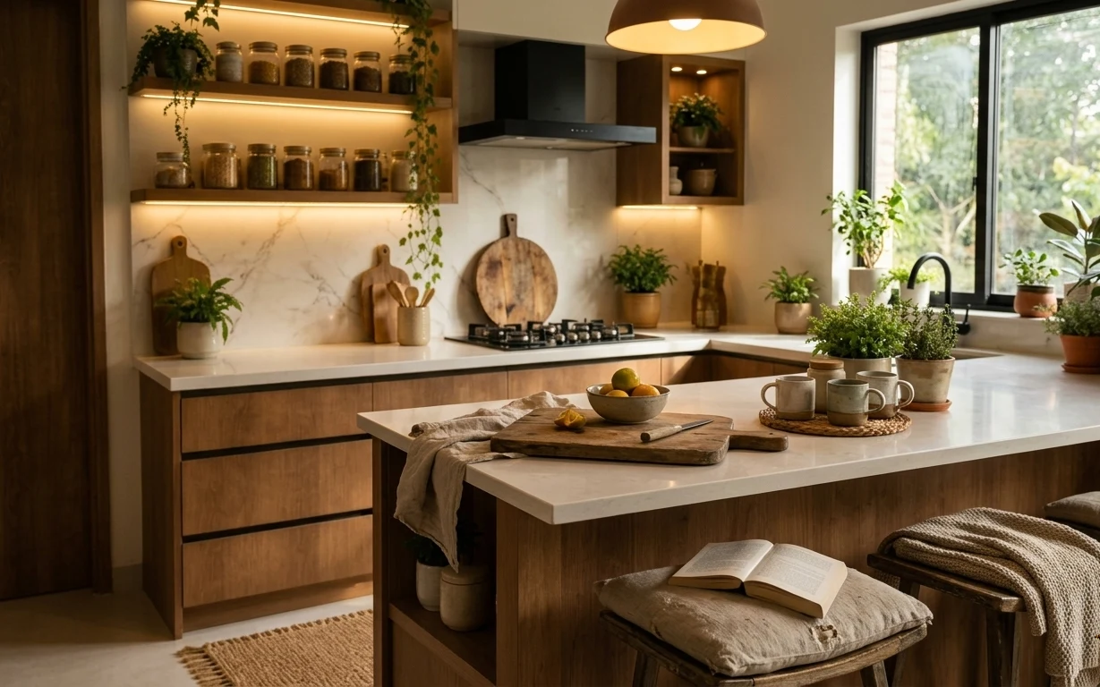
This look reads “put together” because the main textures repeat: warm wood tones, cream stone, and lots of greenery. On the floor, a jute rug anchors the zone; on the counter, a towel and a tray create a calm visual center. The bench area keeps fabric in the mix with a lightweight throw folded over the cushions. The plants add height and softness, while a ceramic vase and utensil crock keep day-to-day items from looking random. For shared housing, every swap here is freestanding or textile-based, so it packs up with you.
I used to over-focus on big purchases first—the kind of mistake that leaves your counter looking worse. What changed my mind was noticing how this setup treats “small things” like they’re a system: a tray for grouping, a single vase for shape, and plants to keep the palette from going flat. When you repeat that rhythm, the room stops feeling like a temporary rental and starts feeling like something you chose.
Layer 1 — jute area rug ($80) grounds the counter zone
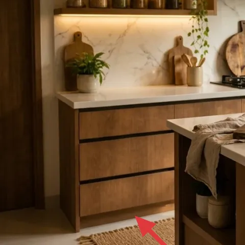
That jute rug matters because it softens the hard tile-and-stone combo you see in the background. In the photo, the rug sits under the action area near the peninsula, so it visually tells your eye, “this is the part you live in.” The trade-off is shedding: jute can be a little rough underfoot at first, and it benefits from a rug pad in real life. Choosing a neutral woven instead of a printed rug keeps the color story consistent with the warm wood and cream surfaces already present.
Pick a rug that matches the room’s warmth
Jute’s honey-beige tone pairs with warm wood cabinets far better than cool gray fibers.
Layer 2 — lightweight throw blanket ($25) adds softness without committing
The folded throw on the bench-like seating brings that “lived-in but edited” feeling that kitchens often miss. It’s big enough to register from across the room, but small enough to fold into a box when the lease ends. I like this over buying a decorative cushion set because a throw covers a larger surface area with one object, which means fewer decisions. Keep it in a neutral fabric that echoes the cream countertop—then you can switch it seasonally without changing the whole palette.
Fold it so it reads as intentional
A loose, slightly draped fold looks natural; a perfectly stacked rectangle reads staged.
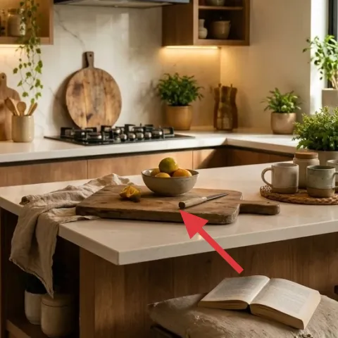
Layer 3 — decorative tray ($25) groups countertop clutter
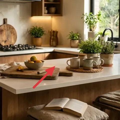
That tray on the counter is the organizing trick: it gives the eye one “landing spot” so bottles, bowls, and small serving items don’t look accidental. It also lets you move items around quickly during cooking—no deep-cleaning required, just lift and reset. The trade-off is you have to commit to using the tray as the home base; otherwise it becomes another random object. Choose a tray with natural texture (wood, stone-look, or ceramic) so it blends with the warm cabinet tones instead of competing.
Use a tray for daily reset
After cooking, re-stack the items on the tray instead of spreading them back out.
Layer 4 — painted terracotta planter set ($45) brings greenery in a portable way
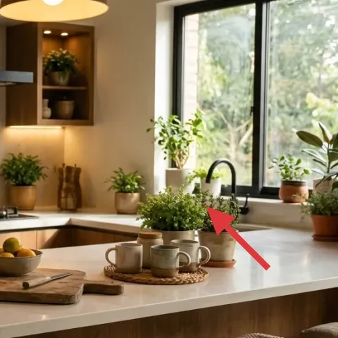
Plants make this corner feel soft and alive, but you need planters that are easy to take with you. A small painted terracotta planter set lets you match the warm palette while varying the heights—exactly what you see across the counter and window ledge area. The trade-off is terracotta can dry out faster than plastic, so it’s best paired with a quick habit: check soil moisture when you water. Painted finishes also handle moving better than fussy ceramics because you can re-touch them in your next place without tools.
Don’t seal-planter it if you might move
If you paint, keep it simple so you can scrape and refresh later; avoid permanent sealing steps.
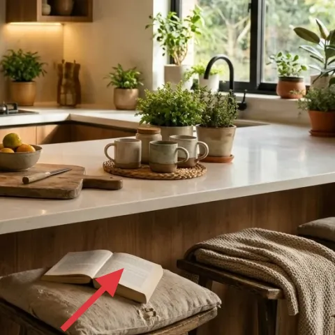
Layer 5 — decorative book stack ($15) adds height and color contrast
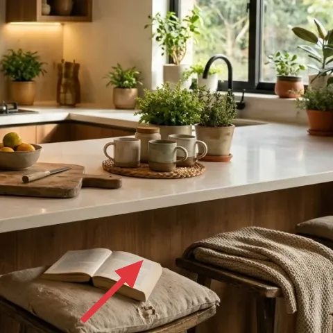
The book stack by the seating adds a vertical accent that balances the horizontal countertop lines. It’s a styling move that also does real work: cookbooks and notebooks stay in reach without looking like storage bins. I’d choose it over a single framed print here because kitchen sightlines change constantly, and books read as functional from every angle. Keep the covers in the same family as the rest of your palette—warm neutrals or muted earth tones—so the stack looks like part of the room instead of a separate trend.
Let the color do the decorating
Choose covers with cream, tan, or olive tones to echo the countertop and plants.
Layer 6 — vase ($20) provides one sculptural shape
A single vase is how this counter stays styled even on non-garnish days. In the photo, the ceramic vase and nearby plants create a rhythm of rounded shapes that counters the crisp geometry of cabinetry and backsplash. The trade-off is that a vase looks “empty” if you never refresh it, so it’s best paired with a simple habit—weekly stem swap or even one fresh herb sprig. Picking a ceramic vase in a neutral tone keeps it compatible with any next place’s wall color.
Use one vase, not five decor pieces
One sculptural container reads intentional and takes up less counter space.
Layer 7 — ceramic utensil crock ($30) keeps tools looking styled
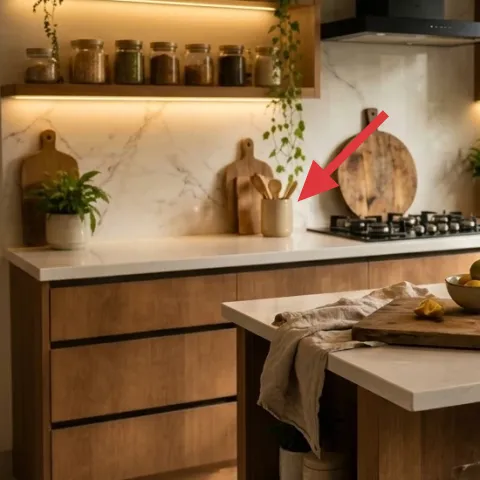
The utensil crock is the practical object that prevents “kitchen mess” from taking over the corner. Keeping utensils in a dedicated container makes the counter look curated even when you’re mid-cook, and it’s much easier to pack than trying to hide items in drawers you can’t fully reorganize. I like ceramic here because it echoes the stone-and-cream palette while still feeling warm. The trade-off is you may need to adjust utensil amounts—choose the crock size that matches your usual daily tools, not every gadget you own.
Size it to your everyday rotation
If you only use a few tools daily, don’t stuff the crock to the top.
The cost, layer by layer
| Layer | Item | Cost |
|---|---|---|
| 1 | Jute area rug | $80 |
| 2 | Lightweight throw blanket | $25 |
| 3 | Decorative tray | $25 |
| 4 | Painted terracotta planter set | $45 |
| 5 | Decorative book stack | $15 |
| 6 | Vase | $20 |
| 7 | Ceramic utensil crock | $30 |
| Total | $240 | |
A cheaper variant keeps the same layout: swap the rug for a smaller woven at $80, choose an off-brand tray at $15, and pick one planter instead of a set while keeping the counter grouping rule.
What worked, what didn't (across the whole room)
The strongest wins were the grouping pieces—tray first, then one sculptural vase—because they make everything else look deliberate. Textiles (rug + folded throw) did a lot of heavy lifting in the comfort department without changing any fixed parts. The only friction point was keeping the plants looking “full” across weeks, since greenery demands a little consistency.
What worked
- The jute rug defined the kitchen corner even with all the hard stone surfaces around it.
- The tray created an instant focal point and prevented small items from scattering visually.
- One vase gave sculptural shape so the counter didn’t feel flat or purely functional.
- The throw added softness at seating height, not just at the floor.
- Keeping utensils in a crock made “mid-cooking mess” look styled instead of chaotic.
- Plants added height variety between shelf, counter, and window ledge.
What didn't
- Without a repeatable reset routine, the counter tends to drift back into random clusters.
- Terracotta-style planters can dry faster, so greenery needs more frequent checking.
- If the throw is too bulky, it interrupts the line of the seating and feels less intentional.
- A tray that’s too small for your everyday items turns into a constant re-stacking chore.
What we'd skip if we did it again
Skip buying a new “counter theme set” from one brand. Kitchen counters look best when you repeat materials (warm wood, cream, ceramics) and let a few objects do the work.
Skip oversized wall decor or anything that requires hardware. In shared housing, wall changes add stress and often fail the move-proof test.
Skip multiple small planters in mismatched finishes. One consistent planter style plus varied plant heights reads more intentional and is easier to pack.
Frequently asked
How long does a refresh like this take?
Plan for about 60–120 minutes. The rug and textile choices do the visual work first, then you can style the tray, vase, and book stack in 20–30 minutes. If you’re also watering and repositioning plants, give yourself an extra 10 minutes for getting heights right.
Is this doable in a rented kitchen with no permission for changes?
Yes—this approach avoids fixed replacements and focuses on freestanding objects and soft goods. The rug, throw, tray, vase, and planter set all pack into boxes and are easy to remove at move-out, so you’re not stuck with “house-only” decor.
What if my kitchen is smaller or my counter has less space?
Use the same system, just reduce the footprint: one tray, one vase, and one plant cluster. A smaller rug or a runner under the seating area still anchors the corner. If you lose countertop space, swap the book stack for a single cookbook turned upright.
What if my counter is already cluttered and I can’t style it quickly?
Start with the tray rule: put the “daily” items onto the tray and keep everything else out of sight until the first reset. The goal is not to make the counter perfect—it’s to make it readable from standing height. Once the layout works, the weekly reset becomes automatic.
Where should I shop for these move-friendly pieces?
Look for rug and throw first at big-box home stores or discount home sections, then grab smaller decor at home goods shops or thrift. Ceramic planters and vases are often best found in person because weight and glaze color matter. If you thrift, stick to neutral tones so it matches future palettes.
Biggest mistake people make in this type of kitchen corner?
Adding too many small objects without a grouping strategy. Without a tray or a single focal item (vase or plant cluster), the counter reads busy even if every piece is nice. Keep to one grouping center, repeat materials, and let plants supply the height variation.
More in Kitchen & Dining
7 kitchen counter corner swaps for a $250 weekend refresh
A kitchen counter corner refresh for shared housing: swap textiles and countertop accessories to get the warm, minimal look for about $250.…
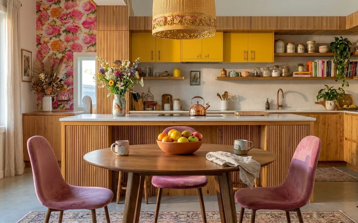
What $800 buys: a bright kitchen island dining nook refresh
A bright kitchen island dining nook refresh with floral wallpaper, pink chairs, and a brass pendant. This weekend project plan fits a $800 …
How to style a kitchen counter corner for $500
A kitchen counter corner refresh on a $500 renter-friendly budget: swap in a neutral 5×7 rug, add a framed botanical print, bring in a tall…