
- Best for
- Adding warmth to green-tile bedrooms with renter-safe swaps
- Cost
- $361 total, under $400
- Difficulty
- Easy—mostly textiles, plug-in lighting, and styling
- Time
- 1–2 hours (plus a quick plant-light check)
Why warm wood-and-moss color palette is the botanical bedroom of 2026
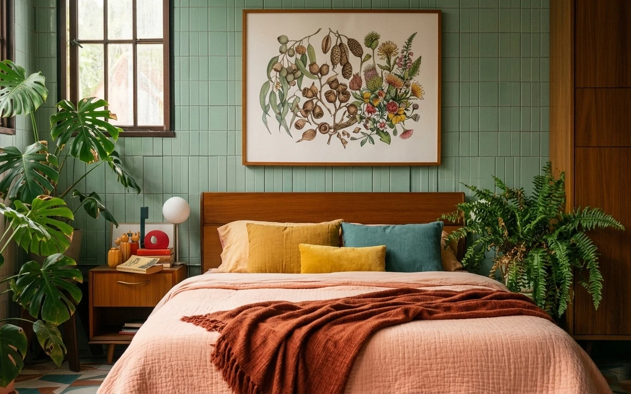
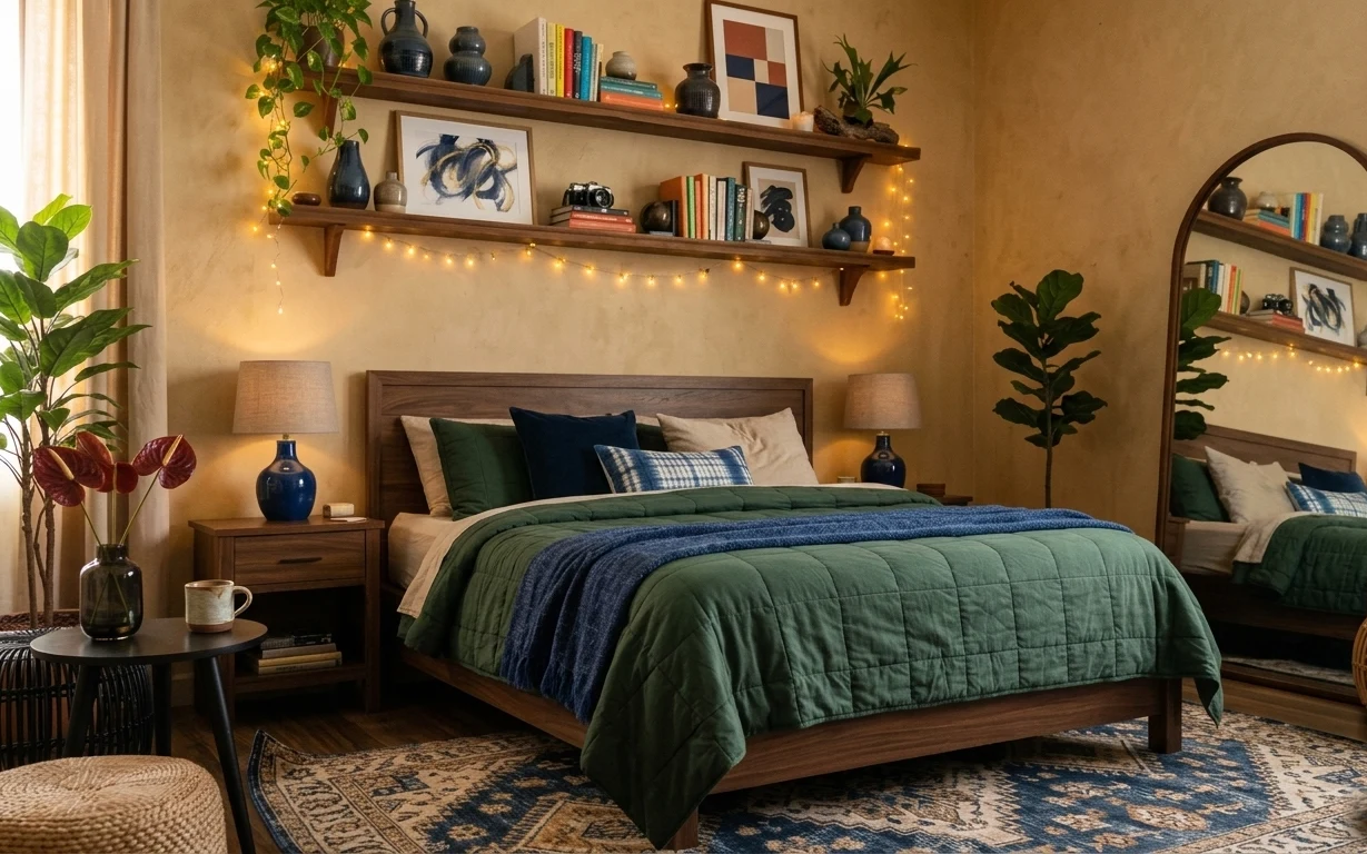
The easiest way to make green tile feel warm is to repeat “earth” tones on purpose. In this photo, the terracotta throw blanket lands right at the center of the bed, then the mustard and teal pillows echo it. Those soft textiles sit against the tan quilted duvet cover and keep the look from reading cold. I also love the contrast of smooth materials: the lamp’s round white shade, the crisp framed botanical print, and the leaf textures from the monstera. For renters, all of these are movable pieces—no permission needed.
I’ve made the mistake of adding too many small decor objects in a bedroom like this—then everything competes with the art and the plant. The change here is focus: one framed botanical print as the anchor, two pillows max for color, and a single statement plant. That creates calm even with bold green tile behind it. The rest is just texture: quilted cotton, a heavier throw, and that clean globe lamp shape.
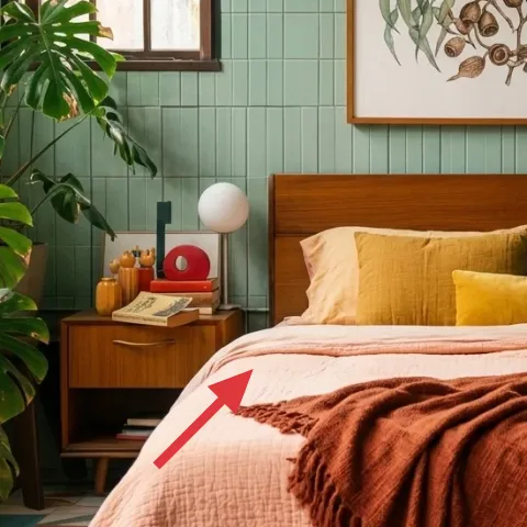
Layer 1 — terracotta throw blanket ($35) adds the bed’s warm focal stripe
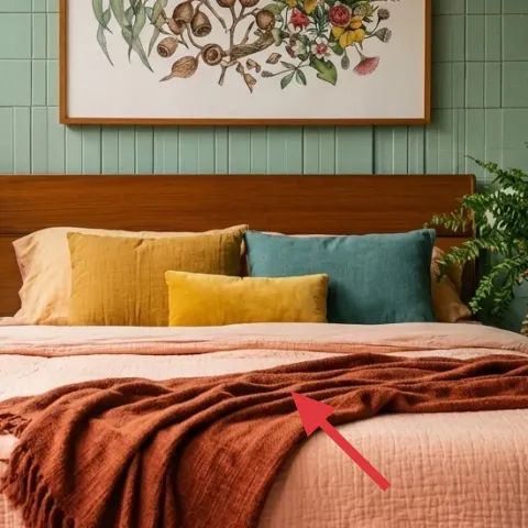
The terracotta throw blanket is the visual bridge between the green tiled wall and the warm wood furniture. It’s draped across the front of the tan quilted duvet cover, so it reads like a deliberate “band” rather than a random accessory. Choosing a throw with a slightly chunky weave also matters here—it catches light softly and looks substantial, which is important against glossy-looking tiles. The trade-off I’d accept: you’re committing to a strong accent color, but you can swap it seasonally at move-out without touching the landlord’s surfaces.
Layer texture, not just color
Pick a throw that looks heavier than a flat blanket; texture makes the whole bed feel styled even when you keep the pillow count low.
Layer 2 — mustard throw pillow ($18) repeats the lamp’s warm undertone
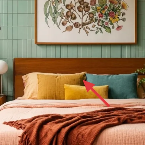
The mustard throw pillow gives the bed a sunny note that doesn’t fight the green tile. It sits close to the center of the mattress, where your eye naturally lands after the framed botanical print. A pillow like this also keeps the palette from becoming too cool—especially next to the crisp, white globe lamp. The trade-off is that mustard can go either golden or too yellow; aim for a slightly muted shade so it feels grounded rather than neon. Style it with the seam lines facing forward to keep the look tailored.
Why two pillows works here
With a busy botanical print above and a big plant beside the room, two pillow colors feel intentional instead of cluttered.
Layer 3 — teal throw pillow ($18) balances the terracotta with a cool counterweight
The teal throw pillow is the cool counterbalance that stops terracotta from dominating. It’s positioned slightly to the right of the center pillow cluster, so it visually “anchors” the right side of the bed and echoes the green family already on the walls—without making the room monochrome. This is also where you can control the overall mood: a deeper teal reads moody, while a lighter one stays airy. The trade-off: you’re choosing a second accent color, so you’ll want to keep everything else simple—like leaving the duvet cover mostly intact.
Match by undertone, not exact color
Teal doesn’t need to be an exact copy of the tile—just share the same cool undertone so it feels cohesive.
Layer 4 — white globe table lamp ($55) softens the room with an all-angles shape
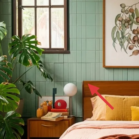
The white globe table lamp brings a gentle glow while also giving the room a clean, modern silhouette. In the photo it sits on the bedside table, just left of the bed’s headboard area, which makes it feel functional and styled at the same time. The rounded form is a nice counterpoint to the square tile lines—your eye relaxes because the lamp doesn’t repeat sharp geometry. I’d choose a plug-in lamp for this look because renters can relocate it instantly at move-out. The trade-off is bulb warmth: if the bulb is too cool, it can feel clinical against the warm textiles.
Don’t skip bulb temperature
Use a warm bulb (around 2700K) so the globe reads cozy against the terracotta and wood tones.
Layer 5 — wooden bedside table ($75) keeps the look grounded beside the bed
The wooden bedside table is what makes the palette feel finished: it repeats the warm wood tones from the bed and complements the botanical print’s earthy colors. Its drawers/doors give the room a grounded, mid-century feel, especially when paired with the sleek globe lamp. I’d pick a bedside table that’s the right height for your bed so the lamp shade sits visually level—too tall looks top-heavy, too short looks like the lamp is floating. The trade-off is size: a larger table gives you storage for styling objects, but it can crowd a smaller bedroom, so measure the walking space first.
Use the top for just 1–2 items
One lamp plus a small stack or object keeps the tile-lined wall from feeling over-styled.
Layer 6 — framed botanical wall art ($80) ties the whole palette to one print
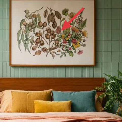
The framed botanical wall art is the room’s visual anchor, sitting above the headboard so it frames the bed without adding more furniture. In this setup, the print’s mix of greens, browns, and small pops of color makes it easy to justify the pillow colors and the terracotta throw. The key renter-friendly move is that it’s a framed piece, not a painted wall change—so you can take it with you. If you’re styling for move-out flexibility, keep the frame size similar to what’s already working here: big enough to read from across the room, but not so large it crowds the headboard area.
Keep the frame wood tone in mind
Warm-toned frames look best with wood furniture like this; cool metal frames can make the palette feel mismatched.
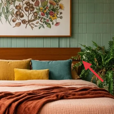
Layer 7 — large monstera plant ($80) makes the green tile feel intentional
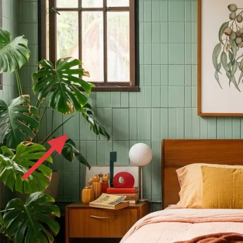
The large monstera plant on the left side does double duty: it adds softness, and it brings leaf texture that matches the botanical theme of the framed print. Because it’s tall and wide, it also balances the stronger vertical lines created by the bed and the framed artwork. I’d rather place one big plant here than several small ones—the scale makes the corner feel designed, not dotted with accessories. The trade-off is maintenance: monstera wants consistent light, so choose a window position that you’ll actually use every day. With the right spot, it becomes “decor” and “life” at once.
Let the plant overlap the visual space
When the plant sits close to the bed zone, it helps the room feel like one composed vignette instead of separate furniture islands.
The cost, layer by layer
| Layer | Item | Cost |
|---|---|---|
| 1 | terracotta throw blanket | $35 |
| 2 | mustard throw pillow | $18 |
| 3 | teal throw pillow | $18 |
| 4 | white globe table lamp | $55 |
| 5 | wooden bedside table | $75 |
| 6 | framed botanical wall art | $80 |
| 7 | large monstera plant | $80 |
| Total | $361 | |
If you want a cheaper version, swap the framed botanical print for a smaller framed art print and choose a cotton throw instead of a heavier woven one. A lower-cost plug-in table lamp shade or a basic ceramic plant pot can also shave budget without changing the overall palette.
What worked, what didn't (across the whole room)
This refresh works because it follows the photo’s logic: one botanical anchor above the bed, warm textiles to counter the tile, and a tall plant to soften all the straight lines. The look also stays coherent because the accents repeat the same “earth + cool” undertone story.
What worked
- The terracotta throw creates a warm focal stripe across the front of the bed.
- Mustard and teal pillows give color without turning the bed into a pile.
- The white globe lamp rounds out the square tile geometry and reads cozy at night.
- Warm wood bedside furniture keeps the palette grounded with the headboard tone.
- The framed botanical print ties the pillow colors to one central artwork.
- The large monstera’s scale balances the bed and keeps the corner from feeling stark.
What didn't
- More than two pillow colors would fight the framed print and make the bed look busy.
- A cool-toned bulb in the globe lamp turns the warm textiles dull and gray.
- Using a very small framed print above the bed would feel lost against the headboard scale.
- Skipping the plant (or using only tiny plants) leaves the left corner visually empty.
- Choosing a very bright mustard can feel too loud against the green tile backdrop.
What we'd skip if we did it again
Skip adding a third accent pillow. In this kind of bedroom, a fourth fabric color usually shows up as clutter instead of composition—especially when the wall art and plant already carry pattern and botanical energy.
Skip choosing a lamp just because it matches the room’s colors. The lamp’s shape matters as much as the color; a harsher, angular lamp tends to look “stuck on” next to tile, while the globe form reads more integrated.
Skip replacing the framed botanical artwork with multiple small prints. One clear anchor above the headboard keeps your eye from bouncing, and it makes the terracotta throw feel more intentional.
Frequently asked
Is this renter-friendly if I can’t drill for wall art?
Yes—the look relies on framed artwork and movable decor rather than wall changes. Choose a lightweight frame and hang it with removable methods your lease allows (for example, Command Strips designed for the frame’s weight). Everything else—pillows, throw, lamp, and plants—packs up easily at move-out.
How long does it take to pull together this bedroom styling?
Plan for 1 to 2 hours. The biggest time blocks are picking the pillow/throw colors and adjusting the drape so it lands where your eye expects on the bed front. After that, it’s just placing the lamp and plant, then stepping back to check scale with the headboard and framed print.
What if my bedroom is smaller than this one?
Go smaller in furniture only if the bed area still reads balanced. For a tighter room, keep the same “one anchor” rule: one framed botanical piece above the bed, two pillows max, and one main plant. If the room feels crowded, swap the bedside table for a narrower version rather than removing the lamp.
What if my bedroom is brighter or darker than the photo?
Color still works, but you’ll adjust texture and lighting first. In brighter rooms, a slightly heavier throw and a warmer bulb help prevent the palette from going too crisp. In darker rooms, lean into more light reflection from the lamp shade and keep the framed art clean and readable from across the bed.
Where can I shop for these items without buying a whole set?
For the core palette, shop in separate categories: a terracotta throw in bedding departments, two solid pillow covers, a plug-in globe or spherical table lamp, and one botanical print in the wall-art section. Plants are usually easiest from local nurseries or big-box garden centers—then match the vibe through leaf scale rather than the exact species.
What’s the biggest styling mistake in a room with bold wall tile?
The biggest mistake is adding too many competing patterns at once. Tile already provides grid structure; the botanical print and leaf textures add pattern too. Keep textiles simple and limited (two pillows, one throw), and let the plant and framed art do the “design work.”
More in Bedroom
6 no-drill ways to style a green-and-terracotta botanical bedroom, $400
A botanical bedroom refresh using renter-safe swaps—textiles, plug-in lighting, removable wall art, and plants. This look stays cohesive wi…
7 no-drill swaps for a $600 bedroom shelf look
A warm, renter-friendly bedroom refresh with a layered rug, plug-in lighting, and shelf decor vibes—built for a $600 budget. These 7 no-dri…
5 renter-friendly no-drill swaps for a $500 bed nook refresh
A warm, terracotta-bed-nook look is achievable for about $500 with no drilling—mostly textiles, one framed print, and move-friendly bedside…