
- Best for
- Textured, renter-friendly bedroom lighting and shelf styling
- Time
- 2–3 hours total (plus paint dry time for DIY art)
- Total cost
- $523 for the layered refresh (budget cap: $600)
- Renter-safe
- Yes—no drilling, no permanent fixture swaps
Why warm wood-and-olive styling is the bedroom of 2026
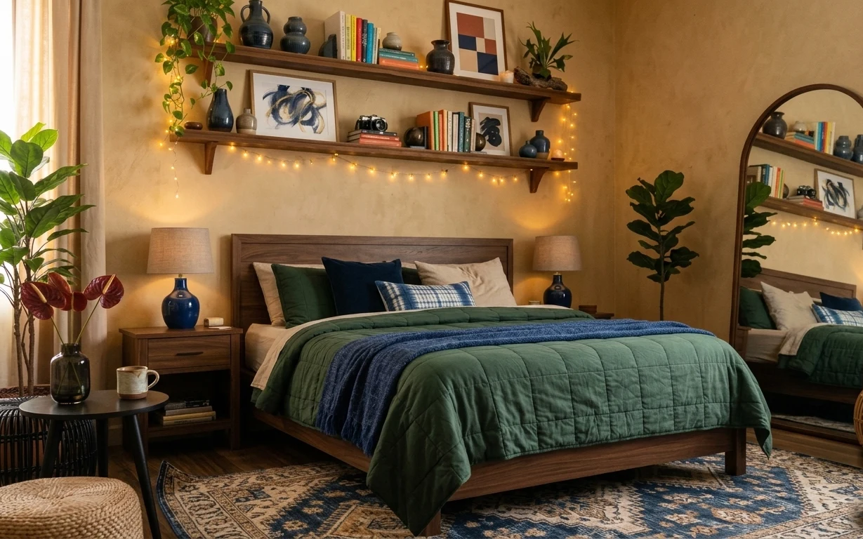
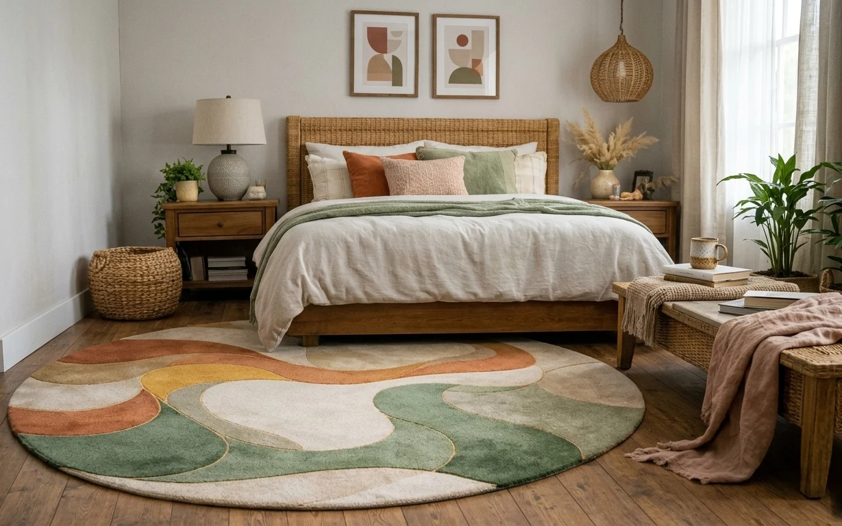
The fastest way to get this look is to start with texture: a blue-toned throw blanket, green bedding tones, and an 8×10 patterned area rug that grounds everything in one color story. Then add warm light at tabletop height with plug-in lamps, plus a soft scatter of warm string lights along the shelves. In the photo, you can also see matte ceramic, glass, and wood all playing together—no one finish has to be “perfect,” as long as the colors stay in the same orbit.
I almost overthought the shelves the first time I tried a layered look like this. I kept reaching for matching sets, and the room ended up looking like a catalog instead of a lived-in corner. What changed my mind: keeping most items in a tight palette (warm neutrals, deep green, a hit of blue) and letting the shapes vary—vases, books, and frames—so it reads curated, not coordinated.
Layer 1 — Area rug 8×10 ($200) Patterned base that hides the everyday
This 8×10 patterned rug is doing the heavy lifting under the bed and bedside zone. The scale is big enough to anchor the room, but the mix of warm beige, deep blue, and muted shapes keeps it forgiving when you’re walking around barefoot. A solid rug would show every shadow and drip; a busy pattern like this makes the whole setup look intentional even when day-to-day life gets a little messy. Trade-off: it takes up more visual space than a small rug, so it’s best when you already have a bed-and-shelf layout to fill.
Choose a pattern with two neutrals
Look for one warm background tone plus a cooler accent (blue here), so your pillows and textiles can “match” without actually matching.
Layer 2 — Wood bedside table ($80) Extra surface for lamps, mugs, and daily clutter
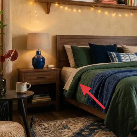
A simple wood bedside table gives you the same function as the photo—lamp-height lighting, a place for a mug, and a tray-ready surface—without needing any permanent wall work. The mid-tone wood also plays well with the rug’s warm base, so the room feels cohesive even when you mix lamp shades and ceramics. If you go smaller, you’ll still get the look, but the styling space gets tight fast. Trade-off: wood finishes show wear sooner than painted ones, so it’s worth using a felt coaster or tray when you set down hot drinks.
Keep the top clear most of the week
When the surface is mostly empty, that warm lamp glow reads “designed,” not crowded.
Layer 3 — Plug-in table lamp with fabric shade ($60) Soft light at eye level
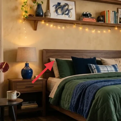
Plug-in table lamps with fabric shades create the warm, dimmable feel in the photo without touching the hardwired ceiling. In this setup, the lamp sits beside the bed, so the light hits walls and bedding first—helping the room look taller and calmer. The shade texture matters: a smooth, glossy shade can look harsh next to patterned textiles. Trade-off: fabric shades can collect dust, but a quick wipe or lint roller keeps them looking fresh. This is also an easy swap later, since lamps are among the most renter-friendly “upgrade” items.
Don’t rely on one overhead light
If the only light source is ceiling-level, the shelves and bedding can look flat. Add at least one tabletop lamp for depth.
Layer 4 — Framed art print 16×20 (abstract) ($25) Color cue that makes the shelf feel styled
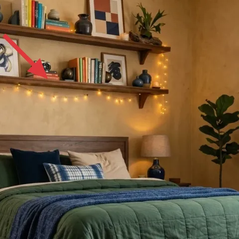
That abstract framed print works like a color connector between the rug’s blue and the room’s deep-green bedding tones. A renter-safe approach is to treat the frame like a surface accessory: place it on the floating shelves (as shown) so you’re not committing to wall anchors or drilling. If the frame is too small for the shelf, the whole shelf can look under-figured; if it’s too large, it fights the books and vases. Trade-off: you’re prioritizing color and shape over “meaning,” which is perfect for a fast refresh.
Make it instead of buying it
DIY a hand-painted abstract on cardstock, then pop it into a simple 16×20 frame so the shelf gets a custom color anchor.
Materials
- Cardstock (sturdy, 1 sheet) — 1 — craft store — $2
- Acrylic craft paint set — small assortment — craft store — $8
- 16×20 frame (or poster frame insert) — 1 — thrift/discount — $10
Steps
- Cut cardstock to fit the frame opening with a small margin for the mat.
- Lightly sketch 3–5 abstract shapes using pencil (no need to be perfect).
- Paint the background in a warm neutral, keeping brushstrokes visible.
- Layer 2–3 accents in deep blue and muted green, letting edges overlap.
- Let the paint dry fully, then add one last thin detail line for rhythm.
- Place the finished cardstock into the frame and tighten the back.
Total DIY cost: $20 — saves about $5 over buying.
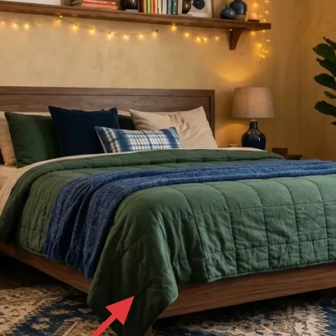
Layer 5 — Throw blanket (blue wool-look) ($60) The easiest color pop for a bed
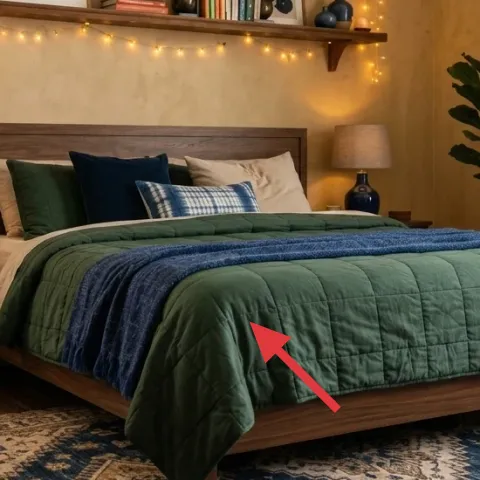
The blue throw blanket is what makes the green-and-warm palette feel intentional instead of flat. It’s draped across the front of the bed, so it adds a horizontal color band that works with the rug pattern below. Wool-look throws also read richer than cotton because the weave catches warm light and softens sharp lines from the wood frame. Trade-off: thicker throws can feel bulky if you don’t have bedding width to spare, so drape it loosely rather than tucking it tightly. The styling decision here—where it lands on the bed front—matters as much as the color.
Drape, don’t fold
A loose drape creates movement and gives your bed “layers” even with minimal pieces.
Layer 6 — Warm white string lights (set) ($18) Shelf glow without hardwiring
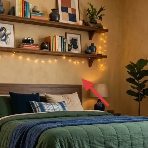
Warm white string lights stretched along the shelf edge replicate the golden, lived-in glow in the photo. Since you’re not replacing any landlord fixtures, this is a renter-friendly effect you can add with Command hooks or removable clips around the shelves. The trade-off is managing the cord: tuck it behind shelf items and keep the plug accessible so you’re not constantly rerouting. Color temperature matters too—choose warm white rather than cool LEDs, or the green and wood tones can feel muddy. This layer is small in cost but big in mood.
Hide cords in the gaps
Let books and vases block the cord line so the lights look intentional, not like holiday decor.
Layer 7 — Tall potted plant (4–6 ft) ($80) Vertical softness to balance the bed
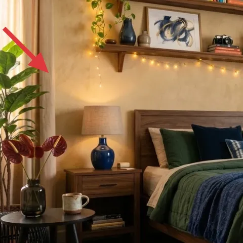
A tall potted plant adds the vertical break the bed can’t provide, especially in a room with open shelving. In the photo, the leaves sit near the curtain and shelf zone, so they visually connect the warm window textiles to the framed decor without needing more wall art. Go for a full plant silhouette—thin or droopy options won’t read as “lush” from across the room. Trade-off: taller plants need consistent light, so it’s worth placing it near the window and rotating it weekly for even growth.
Rotate on wash day
Small routine: rotate the pot every week so growth stays symmetrical.
The cost, layer by layer
| Layer | Item | Cost |
|---|---|---|
| 1 | Area rug 8×10 | $200 |
| 2 | Wood bedside table | $80 |
| 3 | Plug-in table lamp with fabric shade | $60 |
| 4 | Framed art print 16×20 (abstract) | $25 |
| 5 | Throw blanket (blue wool-look) | $60 |
| 6 | Warm white string lights (set) | $18 |
| 7 | Tall potted plant (4–6 ft) | $80 |
| Total | $523 | |
If you want a cheaper version, swap the 8×10 rug for a smaller 5×7 and choose a less expensive plug-in lamp with the same warm bulb color. Keep the string lights and the blue throw—those are the “mood” pieces that carry the look.
What worked, what didn't (across the whole room)
The best parts of this bedroom refresh are the layers of warmth: the patterned rug, the blue throw, and the tabletop lamps all reinforce the same palette. String lights add glow without permanent changes, and the plant keeps the shelf area from feeling too flat.
What worked
- The 8×10 rug anchored the bed and made the space feel intentional instead of transitional.
- Wood bedside surfaces gave enough room for the lamp, mug, and a tray without extra furniture.
- Warm plug-in lamps made the bedding colors read richer than daylight alone.
- The blue throw created a clear horizontal line that visually connects rug to bed.
- The framed abstract tied shelf styling to the rug’s blue without matching everything exactly.
- String lights along the shelf edge made the shelves feel styled even on plain nights.
What didn't
- Too many small objects on the bedside table made the light feel cluttered, not curated.
- Cool-white string lights pushed the greens toward gray, fighting the warm wood tones.
- A smaller-than-needed rug left gaps around the bed, and the whole layout looked “in progress.”
- Skipping vertical greenery made the shelf-and-bed zone feel top-heavy.
- Choosing a plain, thin throw looked flat against the bed frame’s solid silhouette.
What we'd skip if we did it again
Skip buying matching “bedroom sets.” This look works because shapes and textures vary (wood, ceramics, fabric, glass), not because everything is from one collection.
Skip cool-white bulbs in plug-in lamps. Warm light keeps the beige and deep-green palette cozy, while cool light can make greens look dull and muddy.
Skip a tiny rug under the bed. Even if the room is small, going bigger (like an 8×10) is what makes the bed feel grounded and helps the shelf glow feel purposeful.
Frequently asked
How long does this refresh take for a renter?
Plan about 2–3 hours total for placement and styling. The main time sink is bedding and rug positioning, then sorting shelf items so the string lights don’t look messy. If you DIY the abstract art, add paint dry time; otherwise you can go fully ready in one afternoon.
Is this really pack-away friendly at the end of a lease?
Yes. The rug, bedside table, plug-in lamps, string lights, plant, and the framed print are all standard take-with-you items. Even the DIY art fits in the frame and can be swapped later. The only “wall” element in the photo is used as a shelf surface—so there’s no need for anchors or drilling.
What if my bedroom is smaller than this one?
Use the same palette, but scale down the rug footprint first and then reduce the number of shelf objects. Keep one strong color cue (the blue throw or the framed abstract), and let the plant be shorter or moved to a corner near the window. The goal is the same: warm lighting plus one big texture anchor.
What if my room is bigger and needs more visual weight?
Go bigger with the rug if you can, or layer a rug with a rug pad under the same pattern family. Add a second warm light source—another plug-in table lamp or a taller plant—to balance the bed and shelves. Keep the string lights consistent so the glow reads intentional rather than scattered.
Where can I shop without overpaying for these exact pieces?
Look for the rug and plant in local marketplaces or big-box seasonal sections, then focus your budget on the rug pattern and lamp warmth. For string lights, discount packs are fine as long as they’re warm white. The framed art can be thrifted for the frame and DIY’d for the print.
What’s the biggest mistake in bedroom shelf styling like this?
Over-coordinating. If every object looks “matched,” the shelf stops looking lived-in and starts looking staged. Keep materials varied (ceramic, glass, wood, fabric) and repeat only 1–2 color notes—blue and deep green—so everything feels connected without being identical.
More in Bedroom
7 no-drill swaps for a $600 bedroom shelf look
A warm, renter-friendly bedroom refresh with a layered rug, plug-in lighting, and shelf decor vibes—built for a $600 budget. These 7 no-dri…
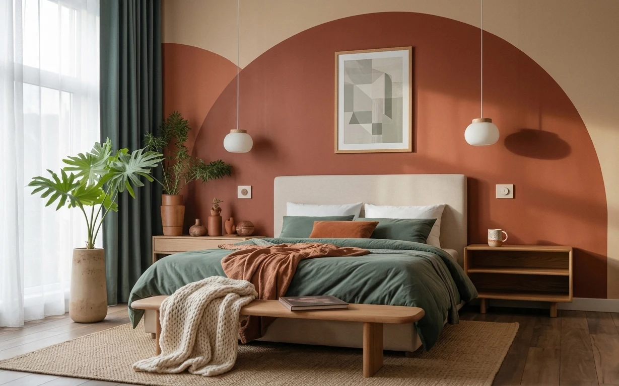
5 renter-friendly no-drill swaps for a $500 bed nook refresh
A warm, terracotta-bed-nook look is achievable for about $500 with no drilling—mostly textiles, one framed print, and move-friendly bedside…
6 renter-safe bedroom swaps for a $300 refresh
A $300 bedroom refresh built for shared housing: one patterned rug, a warm throw, framed art, and renter-safe lighting and curtains—plus DI…