- Best for
- move-ready bedroom refresh
- Time
- 2–4 hours total
- Total cost
- $300
- Renter-safe
- yes — textiles and plug-in lighting
Why olive-and-rust textures are the bedroom of 2026
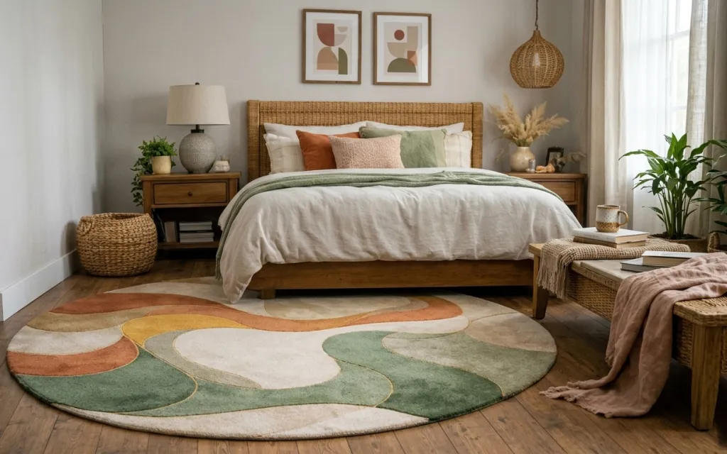
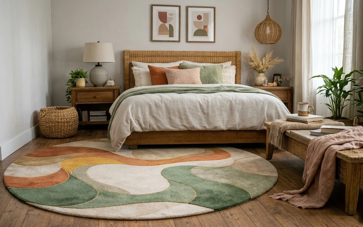
The easiest way to make a rented bedroom feel intentional is to start with texture at floor level and build upward. In this photo, the large area rug’s abstract earth tones play nicely with the light wood floor, while the dusty rose throw adds a second warm note without needing matching sets. The curtain panels keep the window soft, and the framed abstract prints give the wall breathing room above the woven bed frame back. This is a look you can copy with swap-friendly textiles and plug-in lighting, not permanent changes.
I used to overdo “statement” decor in shared spaces—one big wall piece plus a bunch of smaller stuff—and it always ended up looking crowded once I moved. The shift for me was treating the room like a stack: one grounded anchor (the rug), one or two calming textiles (curtains and a throw), then warm accents that can travel. The minute I tried a layered neutrals + rust palette, the bedroom started working even on weeks when I didn’t have energy for more styling.
Layer 1 — large area rug with abstract shapes ($120) Patterned base, not wall-to-wall beige
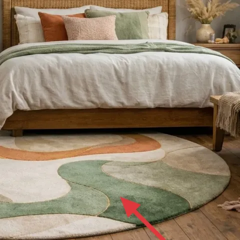
A large area rug with abstract shapes is the fastest way to stop a bedroom from feeling like “just flooring and a bed.” The colors—warm cream, olive green, and rust terracotta—echo the rest of the room so you don’t have to hunt for exact matching shades. I like this over a solid rug because the pattern hides tiny scuffs and dust traffic, especially in a shared apartment where the floor takes a lot. The trade-off is that you’re choosing a bigger purchase up front, so keep the rest of the styling calmer and let the rug do the talking.
Go for pattern scale
Pick a rug big enough that the pattern feels like part of the room, not like a postage stamp under the bed.
Layer 2 — dusty rose throw blanket ($25) Adds warmth you can fold in a box
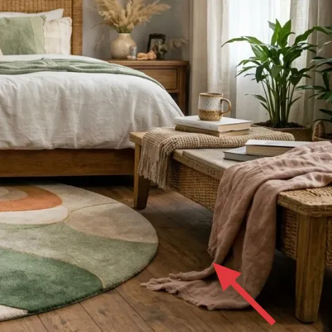
This dusty rose throw blanket gives the room a second temperature layer—warm against the cream bedding tones—without introducing a new color family. It sits folded at the bench at the foot of the bed, which keeps it visible but still easy to pack when the move calendar starts. The best part for shared housing is that it functions like decor and also gets used for naps, movie marathons, or that one night the thermostat mysteriously changes. I’d rather buy one good throw than chase multiple “cute” small items that don’t read from the doorway.
Match texture, not shade
If your rose isn’t identical, look for the same softness—slub, knit, or a light weave—so it harmonizes.
Layer 3 — pair of framed abstract prints ($50) Two frames keep the wall calm
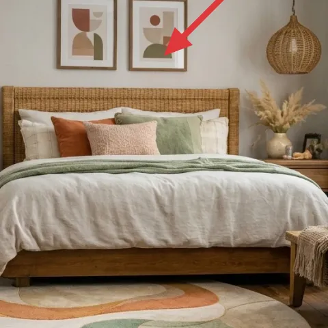
A pair of framed abstract prints gives the wall structure without the commitment of a full gallery wall. The prints are the kind of graphic-but-earthy that work with both the rug’s shapes and the plants’ organic forms, so the room feels collected instead of random. This is the move I always forget: with a strong rug, you can go minimal on the wall and still get personality. The trade-off is spacing—too close and it looks tight; too far and the frames feel lost—so aim for a simple, centered alignment above the bed area.
Keep frames lightweight
Look for paper-backed or easy-to-hang frames so they dismantle fast at move time.
Layer 4 — plug-in table lamp with white shade ($25) Warm lamp glow for evenings
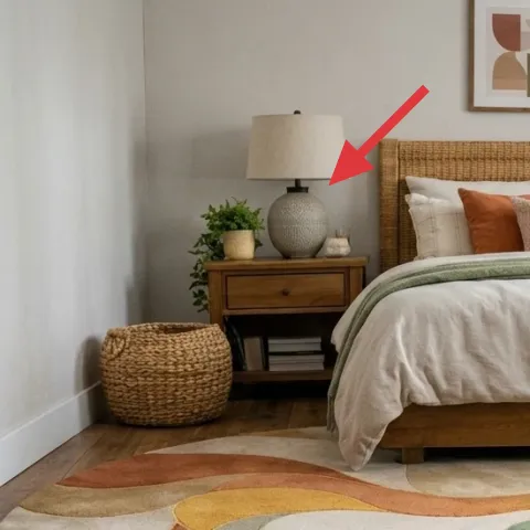
A plug-in table lamp with a white shade softens the room and makes the whole bedroom feel calmer after dark. In the photo, the lamp’s textured base and clean shade balance the earthy rug and the warmer rust pillows, so you get warmth without orange overload. I prefer a white shade over a colored one here because it won’t fight the olive and cream tones. The trade-off is bulb choice: a cool LED can make everything look washed-out, so stick with a warm bulb for that lived-in glow.
Don’t use a too-cool bulb
Cool lighting turns olive green gray fast, which undermines the whole palette.
Layer 5 — hanging woven pendant light ($20) Natural texture overhead
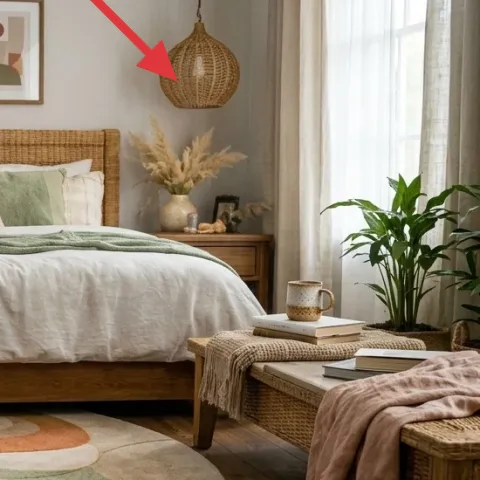
A hanging woven pendant light adds natural texture overhead, which is key when you’re working with mostly soft goods on the floor and bed. The woven silhouette mirrors the room’s other organic materials—like the rattan basket and the plant leaves—so everything feels like it belongs together. I like this over adding another lamp because it changes the vertical rhythm: the room has light coming from a higher point, not just from bedside height. The trade-off is that you want to keep the rest of the surfaces simple so the woven texture reads clearly.
Let it be the pattern above
If overhead texture is strong, keep your bedding and wall art less busy.
Layer 6 — light beige curtain panels ($30) Soft window frame
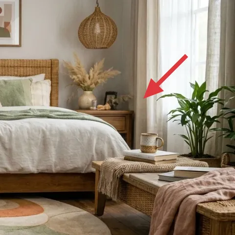
Light beige curtain panels make the window area feel finished and also make the room look taller, especially against off-white walls. This works well with the rug’s rounded shapes and the room’s earth palette, because the curtains act like a neutral “buffer” between the brighter textiles and the wall. I’d rather do curtains than add extra wall decor here—moving textiles is easier, and they pack flatter. The trade-off is measurement: curtains that are too short look fussy, so check height and hang width before buying.
Choose a forgiving fabric weight
Light-to-medium panels drape better and hide small imperfections in rented window setups.
Layer 7 — green pillow covers (dyed look) ($30) DIY color that matches the rug
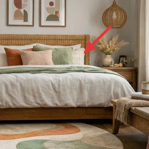
Make it instead of buying it
Dyed pillow covers let you land on the same olive-green note as the rug—without buying a whole new set.
Materials
- Fabric dye (olive green) — 1 kit — Target or craft store — $12
- Salt — for dye bath — 1 small bag — $5
- Drop cloth or plastic liner — 1 — hardware store — $4
- Disposable gloves — 1 pair — pharmacy/box store — $2
Steps
- Pre-wash the pillow covers if they’re new, then fully dry.
- Protect your work surface with a drop cloth or plastic liner.
- Prepare the dye bath following the dye kit directions.
- Submerge the covers and stir or agitate so the color takes evenly.
- Rinse in cool water until the water runs less cloudy.
- Dry fully, then fluff before inserting into the cover.
Total DIY cost: $23 — saves about $7 over buying.
Pillow covers are the easiest way to “tune” a color palette when you’re moving soon, and the green note in this room helps the rug and bedding read as one story. A dyed look is especially good here because the exact olive tone is hard to match by shopping alone—dye gets you closer to the rug’s muted green. This also keeps the bedroom flexible: swap out covers later while leaving the pillow form behind. The trade-off is you need a little patience for dyeing and rinsing, but the result is custom color you can’t buy off-the-rack for the same price.
Do small test swatches
If your dye kit supports it, test on a scrap or seam allowance first to avoid going too dark.
The cost, layer by layer
| Layer | Item | Cost |
|---|---|---|
| 1 | large area rug with abstract shapes | $120 |
| 2 | dusty rose throw blanket | $25 |
| 3 | pair of framed abstract prints | $50 |
| 4 | plug-in table lamp with white shade | $25 |
| 5 | hanging woven pendant light | $20 |
| 6 | light beige curtain panels | $30 |
| 7 | green pillow covers (dyed look) (DIY option) | $30 |
| Total | $300 | |
A cheaper variant swaps the rug for a smaller or lower-cost patterned option, and replaces the framed prints with a single larger framed abstract print that’s easier to find for less.
What worked, what didn't (across the whole room)
This palette works because it repeats texture and temperature—woven, knit, and plant life—while using only a few earth tones. The rug does most of the heavy lifting, and the lighting plus curtains keep things soft instead of flat.
What worked
- The large abstract rug anchors the room and hides everyday scuffs better than a solid color.
- Dusty rose as a throw shade adds warmth without fighting the olive-green accents.
- The paired framed prints keep the wall styled while staying move-friendly and lightweight.
- Warm lamp light makes the bedroom feel usable after dark, not just “nice by day.”
- The hanging woven pendant adds vertical texture and connects the plants to the palette.
- Light beige curtains soften the window and visually stretch the space.
What didn't
- Too much matching “set” decor would make the room feel rigid, so variation matters.
- Cool-white bulbs would flatten the olive tones and make everything look slightly gray.
- If the curtain panels are too short, the window area looks cut off instead of framed.
- Buying pillow covers that are too bright or saturated would fight the rug’s muted greens.
- Replacing the rug with a busy high-contrast print would steal focus from the bed area.
What we'd skip if we did it again
Skip a second patterned rug layer. In a room like this, the abstract shapes already carry the design; adding another print makes the floor feel visually loud.
Skip colored-shade lighting. A white shade keeps the palette consistent, while colored shades tend to turn cream bedding and olive accents into mismatched tones.
Skip complicated wall installs. In shared housing, simple framed prints (or paper-and-card DIYs) are easier to take down cleanly and cheaper than anything that involves hardware.
Frequently asked
How long does this kind of bedroom refresh take?
For most shared-house bedrooms, it’s a half-day to a full day. The big time parts are rug positioning and getting curtain measurements right. Everything else—framed prints, lamp setup, and styling pillow covers—can be done in under an hour once the items arrive. If you DIY the pillow covers, add dye time and drying, but it still fits a weekend.
Is this renter-friendly if I’m not allowed to drill or paint?
Yes. This plan stays in the “soft goods + lightweight decor” lane: rugs, throws, pillow covers, curtains, and plug-in lighting. Wall decor is framed prints, which are typically removable without permanent changes. Even the DIY option (dyed pillow covers) is fabric-focused, so there’s no wall commitment at all.
What if my room is smaller than the photo?
Go slightly smaller on the rug (enough that the bed can still sit on top or just in front of it). Then keep the wall styling minimal: one centered framed print pair or two frames with a lot of spacing. Curtains still matter—choose panels that reach close to the floor. The goal is to preserve the “soft frame” around the bed, not squeeze in extra decor.
Where should I shop for these kinds of move-ready pieces?
For textiles and rugs, look for big home retailers or marketplaces with easy return policies. For framed prints, department stores, thrift/consignment, and print-on-demand sites are good because you can find lightweight frames. For plug-in lighting, thrift stores plus online listings tend to have plenty of woven and neutral-shade options.
What’s the biggest mistake people make with this earthy palette?
They match color too literally and end up with a bunch of competing undertones. Instead, repeat texture: woven and knit for warmth, plus one muted green note tied to the rug. If the green pillow covers aren’t exactly the same shade, that’s fine—as long as they’re in the same family and the room stays calm.
Can I DIY the pillow covers even if I don’t have dye experience?
Yes, as long as you start with a light base and follow the kit directions carefully. A small test swatch helps if your dye kit supports it. The biggest practical tip is to protect your work surface and rinse until the water clears. When in doubt, aim for “muted olive” rather than a saturated green.
More in Bedroom
6 renter-safe bedroom swaps for a $300 refresh
A $300 bedroom refresh built for shared housing: one patterned rug, a warm throw, framed art, and renter-safe lighting and curtains—plus DI…
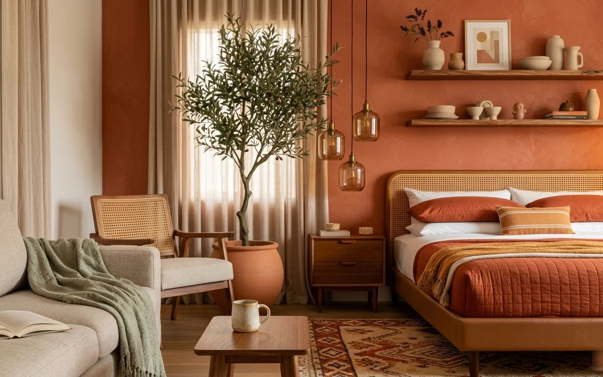
7 earthy swaps for a $600 bedroom refresh
A $600 bedroom refresh built around warm terracotta, cane textures, and move-friendly swaps. See seven layer-by-layer upgrades that pack in…
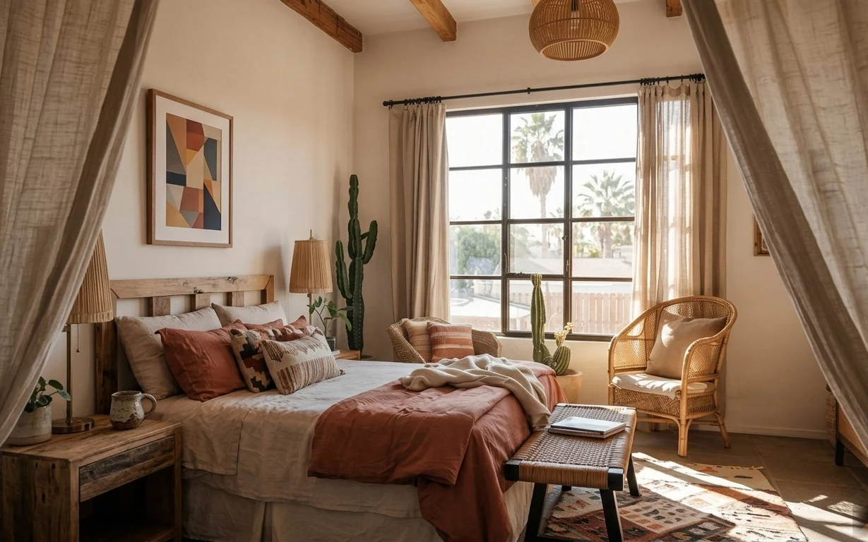
Warm terracotta sunlit-bed-corner refresh, $1500
A sunlit bed corner is all about layering: a patterned rug, breezy beige curtains, and warm terracotta accents. This weekend refresh is bui…