
- Best for
- Move-friendly bedroom refresh
- Time
- 1–2 weekends
- Total cost
- $530 (planned) / up to $600 ceiling
- Renter-safe
- No-drill, boxes-up decor
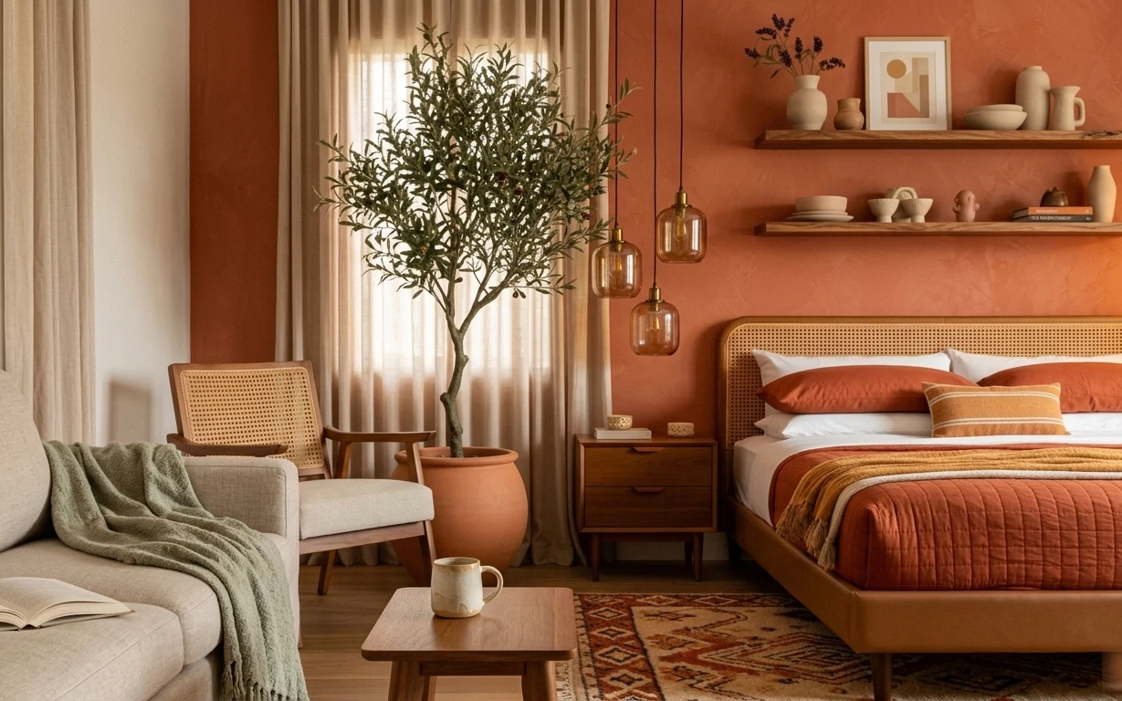
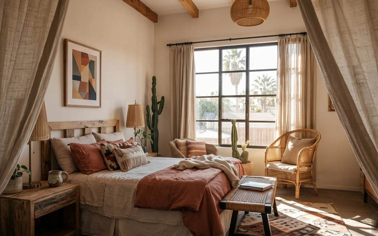
Why terracotta-and-cane bedroom is the move-friendly bedroom of 2026
The photo’s palette is basically terracotta-orange walls plus warm woods, then softened by cream and that woven cane headboard. The green throw and rust quilt add enough contrast that the room doesn’t feel flat, even with the strong wall color. A patterned area rug anchors everything at floor level, while the tall potted indoor tree gives height without needing a built-in shelf. This is achievable for shared housing because the “big visual moves” are textiles, removable decor, and freestanding furniture.
I used to over-buy small decor to “fix” a room, and I’d end up with a dozen items that didn’t change the layout. Here, the difference is choosing one strong color story (terracotta) and supporting it with texture: cane, quilted cotton, and the rug’s warm pattern. Once those foundations sit in place, the room feels finished even when the rest is simple.
Layer 1 — rectangular coffee table ($60) Brings a flat surface in the middle
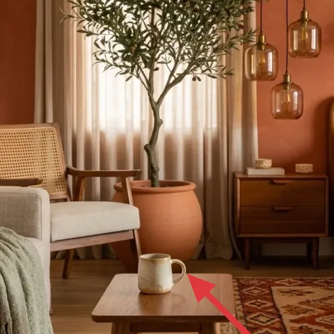
A rectangular coffee table is the organizing anchor in this bedroom’s shared-living zone: it gives a real landing spot for a mug, a paperback, and whatever you’re doing while half in bed and half out. In this style, the trade-off is choosing “simple shape, warm tone” over ornate details, so the rug and wall color can do the storytelling. A low table also keeps the tall potted indoor tree from feeling visually boxed in. If a table like this feels like a splurge, thrift the base and keep the finish consistent with your wood nightstand.
Keep it close to the bed edge
In shared spaces, a table that sits within easy reach cuts down on clutter piles on the nightstand.
Layer 2 — area rug with rust and cream pattern ($150) Grounds both bed and seating
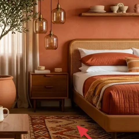
This rug’s rust-and-cream pattern is doing two jobs: it ties into the terracotta wall and it makes the floor look finished without matching every shade exactly. The geometric motif also adds structure, so the room doesn’t read “all texture, no order.” A larger rug helps the bed feel like it belongs to the room rather than floating on wood. The trade-off is maintenance—pattern hides the small spills, but you still want a rug pad for easier vacuuming and less shifting.
Size for what will stay under your chairs
When the seating and bed overlap in one photo, picking a rug that reaches under at least the chair front matters.
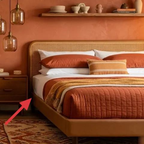
Layer 3 — rust orange quilt/comforter ($50) Turns the bed into the color anchor
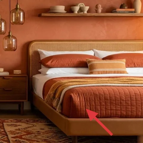
A rust orange quilt/comforter is the quickest way to “read” the terracotta theme even if the wall color is only temporary or shared. Quilt-like texture adds dimension, so it doesn’t look flat against the warmer wall. If you’re moving often, the decision is practical: choose something that packs flat and still looks good wrinkled after a long day of hauling. The trade-off is contrast management—too much orange everywhere can feel loud, so keep pillows and throws in cream, warm brown, or muted green to balance it.
Pick a rust that leans warm, not red
Warm rust harmonizes with terracotta walls better than cooler brick tones.
Layer 4 — wood nightstand ($70) Adds storage without a permanent install
A wood nightstand keeps daily life simple: water, chargers, a book, and a small tray all live at one height. In this photo the nightstand’s warm tone echoes the wood floor and bed frame, so the room feels cohesive without needing matching sets. The trade-off is footprint—choose a narrower top if the shared pathway is tight. One of the best moves here is keeping the styling “small and spaced,” so the tabletop doesn’t turn into a clutter shelf for everyone in the apartment.
Skip anything that wobbles
A slightly unstable side table makes it harder to keep books and cups from sliding—especially in shared households.
Layer 5 — tall potted indoor tree ($70) Brings vertical calm with zero wall work
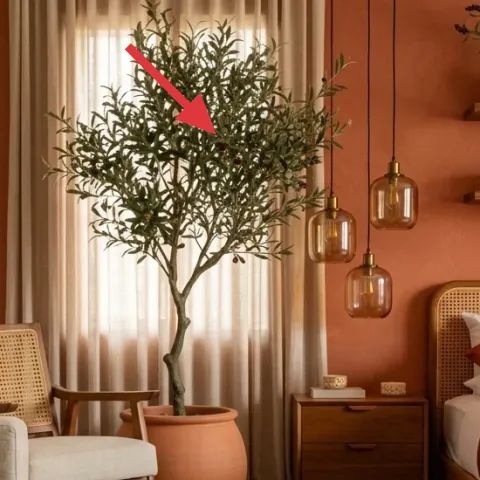
A tall potted indoor tree gives height and breath, which is exactly what a bedroom needs when you’re also fitting a seating corner. It also softens straight lines—both the bed frame and the shelf edges—so the whole room looks more organic. The trade-off is scale: if the tree is too small, it just looks like a decoration; if it’s too big, it blocks light and makes the room feel crowded. The sweet spot is a tree that visually reaches about the same height as your headboard area, then sits slightly off-center from the bed.
Let the pot anchor the palette
A terracotta-toned pot repeats the wall color without forcing more paint or wallpaper changes.
Layer 6 — armchair with cane back ($60) Adds texture you can feel
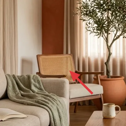
An armchair with cane back is a texture multiplier: it echoes the woven cane headboard and makes the room feel intentional even when everything else is relatively simple. Cane has visual “breathing room,” so it prevents the bedroom from feeling heavy next to the rug pattern and quilt color. The trade-off is comfort—cane backs can be a little firm, so pairing the chair with a green throw blanket (as shown) helps it feel usable, not just pretty. For moving, the key is choosing a chair that’s manageable for one person to load, or at least a light frame.
Add a soft layer to make it daily
If a chair isn’t comfy with a throw, it turns into extra storage instead of real seating.
Layer 7 — framed art print on wall shelf ($70) Keeps the shelves from looking bare
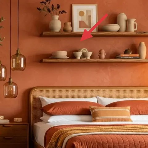
The framed art print on the wall shelf gives a tidy focal point at eye level, which matters in a room that already has a bold quilt and a strong wall color. Even in shared housing, wall-mounted art can be risky because it implies drilling—this is a smarter move because the shelf display lets you swap art quickly at move-out. The trade-off is scale: small prints can get lost between vases, so pick one with enough contrast to stand alone for a second, even from across the room. Once the print sits, style the shelves with two to three ceramics so nothing competes.
Make it instead of buying it
DIY a hand-painted abstract on cardstock to lean on the wall shelf, so you get the framed-print look without paying for a second framed piece.
Materials
- Cardstock sheets — 2 — craft store — $10
- Acrylic paint set — 1 small set — craft store — $6
- Painter’s tape — 1 roll — hardware store — $4
Steps
- Cut cardstock to the same general rectangle size as the existing print.
- Tape off two or three simple shapes (stripes or blocks) for crisp edges.
- Paint one section terracotta-orange and one section warm cream, leaving small gaps for paper.
- Remove tape and add a thin line detail in deep brown for definition.
- Let the paint dry fully, then repeat with a second sheet if you want a backup.
- Place the finished cardstock art on the shelf, using its backing to hold it upright.
Total DIY cost: $20 — saves about $50 over buying.
The cost, layer by layer
| Layer | Item | Cost |
|---|---|---|
| 1 | Rectangular coffee table | $60 |
| 2 | Area rug 5×7 with rust-and-cream pattern | $150 |
| 3 | Rust orange quilt/comforter | $50 |
| 4 | Wood nightstand | $70 |
| 5 | Tall potted indoor tree | $70 |
| 6 | Armchair with cane back | $60 |
| 7 | Hand-painted abstract on cardstock (DIY substitute) | $70 |
| Total | $530 | |
If the budget has to drop, swap the cane-back chair for a simpler folding chair and choose a smaller rug (still patterned). Keep the rust quilt and add one tall plant—those three pieces carry the whole palette.
What worked, what didn't (across the whole room)
This room works because it layers texture in a consistent warm spectrum: terracotta-orange, rust, cream, and cane. The only times it could slip is if the rug pattern competes with too many bold objects on the shelf.
What worked
- The rust quilt anchors the color story so the terracotta wall doesn’t feel like an isolated paint job.
- The patterned area rug adds structure and hides daily wear from shared-house living.
- The tall potted indoor tree brings height and softness without any wall hardware.
- The wood nightstand keeps small essentials visible and easy to grab in the morning rush.
- The cane textures echo each other across bed and seating for an intentionally calm look.
- The framed art print on the shelf gives the eye a clear resting point.
What didn't
- If the coffee table stays empty, the middle zone feels unfinished and people start stacking items elsewhere.
- Too many small ceramics on the shelves can make the framed art print feel visually “shrunk.”
- A rug that’s too small makes the bed look like it’s floating on wood instead of belonging to the room.
- If the chair throw is missing, the cane-back armchair reads more decorative than usable.
What we'd skip if we did it again
Skip replacing anything fixed and pricey (like built-ins or permanent wall hardware). For this look, the heavy lifting comes from textiles, freestanding furniture, and shelf decor that can be packed into boxes when the lease ends.
Skip “all-solid” styling where every surface is the same warm color. The quilt and rug need their own contrast, so keep at least one calmer cream element and one muted green textile in rotation.
Skip over-styling the shelves. In a bedroom that already has a bold bed textile and a patterned rug, two or three ceramics plus one framed art print keeps the eye relaxed and makes the room feel put-together without effort.
Frequently asked
How long does this bedroom refresh take?
Most of the time is spent sourcing and styling: choosing the rug, getting the quilt color right, and placing the tall potted indoor tree so it doesn’t crowd the bed. If everything is already on hand, the actual swap-and-style work is usually a single weekend. The “slow part” is tweaking shelf spacing so the framed art print isn’t competing with every small ceramic.
What if I’m in shared housing and my bedroom furniture has to stay simple?
Lean on pieces that serve multiple purposes: a coffee table that becomes a study surface, a wood nightstand that holds chargers and books, and a rug that defines the bed zone. Textile swaps (quilt and throw) are the easiest to rotate later. Shelf displays can be changed quickly at move-out, which is exactly what keeps this style feasible for roommates.
Can I do the look with a smaller bedroom?
Yes—make the rug proportionate and keep the tall potted indoor tree a bit farther from the bed so it doesn’t block walking paths. In smaller rooms, choose a narrower coffee table and stick to one main chair instead of two seating pieces. The key is maintaining one strong color anchor (rust quilt) plus one pattern anchor (the rug), then repeating texture with cane and wood.
Where should I shop differently to stay on budget?
Rugs and larger furniture are easiest to hunt for thrifted or secondhand because color and pattern can be found at wide price ranges. For the quilt/comforter and throw blanket, fabric resale and discount stores help a lot. For the framed art print look, consider the DIY hand-painted cardstock and lean it on the shelf rather than buying another frame.
What’s the biggest mistake people make on this kind of terracotta bedroom?
Overdoing the number of small objects—especially on shelves. If every surface is busy, the room loses the calm “earthy-modern” rhythm. Keep shelf styling to two or three ceramics plus the framed art print, then let the rug and quilt do the visual work.
Will this style hold up after a year or two of moving?
That’s the point of this plan: rug, quilt, throw, plant, and freestanding tables pack into boxes and can be re-used in the next layout. The terracotta-forward look travels well because it’s mostly textiles and accessories. Even the shelf art can be redone quickly, so it doesn’t lock you into one permanent arrangement.
More in Bedroom
7 earthy swaps for a $600 bedroom refresh
A $600 bedroom refresh built around warm terracotta, cane textures, and move-friendly swaps. See seven layer-by-layer upgrades that pack in…
Warm terracotta sunlit-bed-corner refresh, $1500
A sunlit bed corner is all about layering: a patterned rug, breezy beige curtains, and warm terracotta accents. This weekend refresh is bui…
6 renter-friendly swaps that make an earthy bedroom feel finished, $600
Earthy-green walls, rust bedding, and layered textiles make this bedroom look intentional without permanent changes. This $600 move-friendl…