
- Best for
- Layering a sofa area with no-drill decor
- Cost
- Under $600
- Difficulty
- Beginner-friendly
- Time
- About 1 weekend
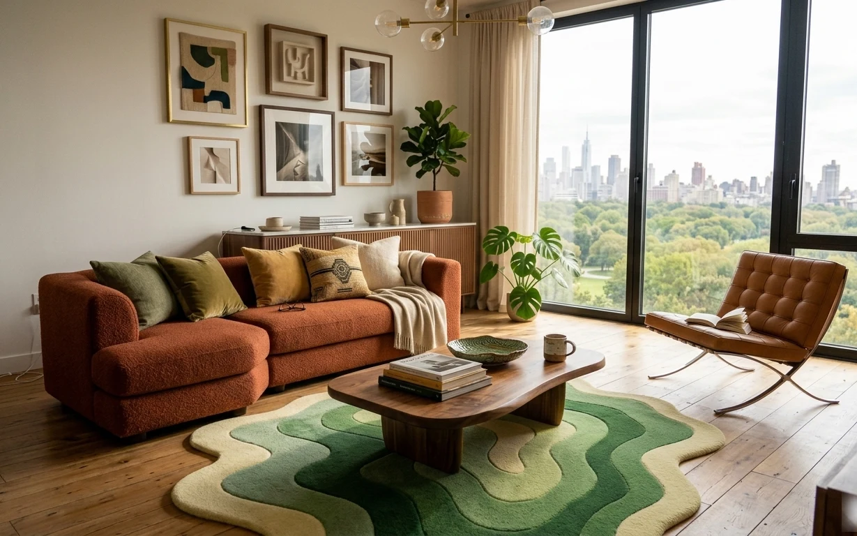
Why warm terracotta-and-green living room is the bright style moment of 2026
Start with the foundation: that green-and-cream rug anchors the whole sofa area and makes the wood floor feel intentional. From there, the beige throw blanket and the green-and-tan pillows add the “soft landing” you want when the room is otherwise clean and modern. On the wall, a gold-framed abstract print ties into the warm, clay tones coming from the terracotta planter. This is a renter-friendly way to copy the look without touching landlord fixtures or permanent wall changes.
I used to think gallery walls only worked when every frame matched perfectly. Then I tried mixing frame styles in my own place and realized the art matters more than the hardware—especially when the colors repeat (green, cream, terracotta). The plant placement also helped me: once I gave it a real spotlight spot by the window, the whole room stopped feeling flat.
Layer 1 — green-and-cream area rug ($200) Defines the sofa zone in one piece
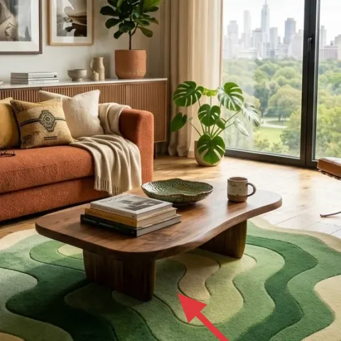
A patterned area rug is the fastest way to make a renter living room feel designed, and this one does exactly that in the photo. The green shapes echo the pillows while the cream background keeps the look airy against the light wood floor. If you try to “cheat” by using a plain rug, you lose the mid-century-leaning rhythm that makes everything else look styled. The trade-off is scale: go big enough for the front sofa legs (and usually the coffee table) to feel grounded.
Pick a rug that anchors the front legs
Measure for overlap with the sofa so the rug reads as furniture, not decoration.
Layer 2 — beige throw blanket ($60) Adds texture against boucle-like upholstery
This beige throw blanket draped across the sofa is one of those small choices that changes how “finished” the whole seat looks. The light neutral keeps the terracotta cushions from getting too heavy, while the soft fabric edge breaks up the upholstery’s bumpy texture. A heavier knit can feel cozy but may fight the room’s bright daytime light, so a lighter, drapier throw usually looks closer to this photo. If you’re limited on budget, prioritize the throw before adding more accent furniture—textiles do more than you’d expect.
Let the throw fall off one side
That little asymmetry is what makes it look styled instead of just “covered.”
Layer 3 — throw pillows in green, tan, and cream ($30) Repeats color without matching every cushion
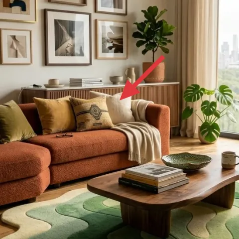
The pillow mix is doing double duty: it’s pulling in the rug’s green and adding warmer tan and cream tones that harmonize with the terracotta plant pot. Instead of buying a full matching set, this approach keeps the sofa from looking like a showroom—each pillow reads as its own texture. The trade-off is that you have to edit: too many colors at once will make the room feel busy with all the window light coming in. Keep the palette tight and vary only one thing per pillow—color, pattern, or weave.
Use one patterned pillow max
A single accent pattern keeps the room from competing with the abstract art.
Layer 4 — gold-framed gallery wall of abstract prints (one framed print) ($80) Makes the wall feel intentional
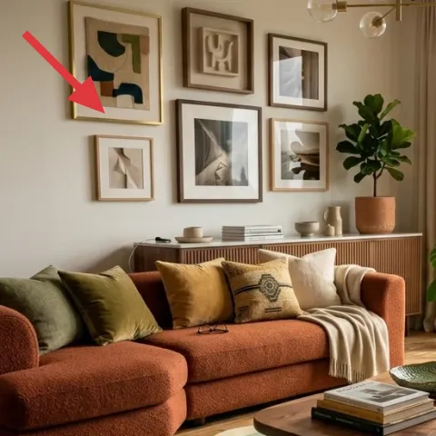
This framed abstract print is where the wall gets its personality. The gold frame warms up the neutral wall, and the abstract shapes let you repeat the room’s color story—green and cream—without needing to match exact objects. A gallery wall can be expensive, so focusing on one new, high-impact print (and using what you already have elsewhere) is the move. The trade-off is placement: if the print sits too high or too low relative to eye level, it will feel like a random add-on.
Make it instead of buying it
DIY a small hand-painted abstract on cardstock to replace one framed print, then slide it into a simple frame for the same warm gold look.
Materials
- Cardstock (8.5×11 or 9×12) — 1 sheet — craft store — $6
- Acrylic paint set — small assortment — art store — $12
- Paintbrush (set or 1–2 sizes) — 1 pack — craft store — $8
- Clear acrylic sealer spray (light coat) — 1 can — craft store — $15
- Frame (8×10 or size match) — 1 — thrift or discount — $10
Steps
- Sketch simple blocks and curves in pencil on the cardstock.
- Paint the largest shapes first with cream and deep green.
- Add a warm terracotta accent as smaller islands, not full coverage.
- Layer a darker line or dot detail for depth and contrast.
- Let the paint dry fully, then seal with a light clear acrylic coat.
- Insert the finished print into the frame and check the color against your rug.
Total DIY cost: $51 — saves about $29 over buying.
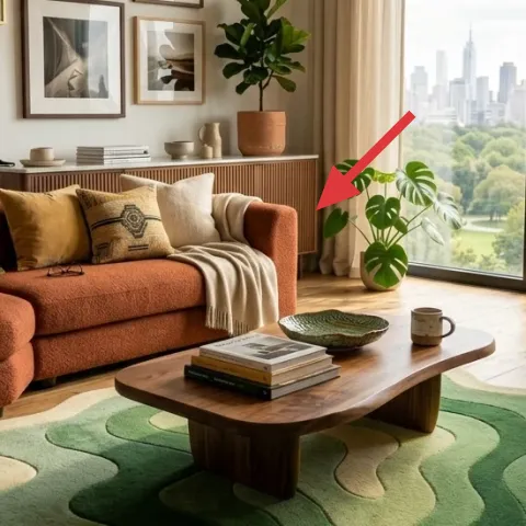
Layer 5 — large potted indoor plant in a terracotta pot ($80) Adds height and softens the window wall
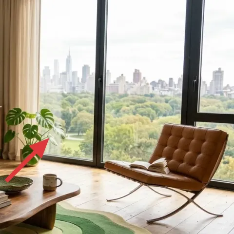
This tall indoor plant is doing what a lot of floor decor tries to do—adding life and scale—without clutter. The terracotta pot pulls warmth into the room, and the green leaves echo the rug and pillows, so everything feels connected rather than “decorated.” If you go for a tiny plant, you’ll lose the visual weight near the window, especially with all that bright outdoor light. The trade-off is care: choose a plant you’ll actually keep alive, and use a saucer to protect your floor.
Don’t buy the biggest pot first
Pick a plant with the right root size; oversized pots can slow growth.
Layer 6 — decorative tray with books and bowl ($35) Keeps the coffee table from looking random
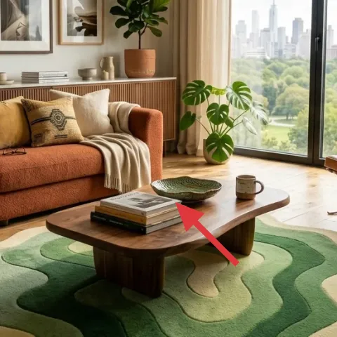
A coffee table styled in “small stacks” reads calmer than scattered items, and that decorative tray is the organizer behind the look. Books add height and a horizontal rhythm, while the bowl and small planter create visual variety at a similar scale. The reason to choose a tray over loose pieces is simple: it gives you a reusable container you can lift off the table when you’re cleaning. The trade-off is that tray styling rewards restraint—aim for three groupings max so the table still feels open next to the sofa.
Group by height, not by category
Books for vertical interest, then one small object to balance the negative space.
Layer 7 — beige curtains ($80) Flows at the window so the room feels taller
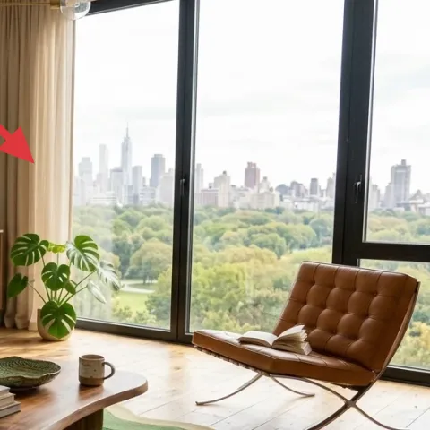
Beige curtains make the window treatment look soft and expensive while still staying neutral enough for a renter-friendly refresh. Their color keeps the room airy, and the vertical folds visually stretch the black-framed door and pull the gaze upward. If you’re tempted to use sheer-only panels, you’ll lose that grounded warmth you see here. The trade-off is length: too-short curtains make the window feel chopped off, so hang them as high as your hardware allows without drilling.
Hang high and let fabric pool slightly
Even a small amount of extra height changes how the room reads.
The cost, layer by layer
| Layer | Item | Cost |
|---|---|---|
| 1 | Green-and-cream area rug | $200 |
| 2 | Beige throw blanket | $60 |
| 3 | Throw pillow covers in green, tan, and cream | $30 |
| 4 | Gold-framed abstract print (DIY option) | $80 |
| 5 | Indoor plant in terracotta pot | $80 |
| 6 | Decorative tray for books and bowl | $35 |
| 7 | Beige curtain panel pair | $80 |
| Total | $565 | |
If a full patterned rug feels like too much, choose a textured solid rug (cream or oatmeal) and keep the color repeat through pillows and art so the room still looks cohesive.
What worked, what didn't (across the whole room)
The biggest win is the color repeat: green shows up in the rug, pillows, and plant, while terracotta warms the neutrals. Layering textiles (rug, throw, and pillows) keeps the sofa from looking flat, and the framed print gives the wall a clear focal point. The only part that can go wrong is scale—under-sized rugs and short curtains make the whole room feel smaller.
What worked
- The green-and-cream rug anchors the sofa area and prevents the room from feeling unfinished.
- Beige throw placement softens the upholstery texture without adding visual clutter.
- Pillow mix brings in multiple neutrals while repeating green for cohesion.
- One warm gold framed print makes the wall feel curated, not accidental.
- The tall plant adds height and balances the window wall in bright daylight.
- A tray on the coffee table keeps books and small objects grouped and easy to reset.
What didn't
- Trying to match everything exactly can make the sofa feel more staged than lived-in.
- Short curtains tend to cut the window height and make the room look less open.
- Overstyling the coffee table with too many small items makes the palette feel busy.
- Small plant sizes near a large window can leave a noticeable visual gap.
- Choosing a rug pattern that’s too loud can fight the abstract art on the wall.
What we'd skip if we did it again
Skip replacing any landlord hardwired fixtures or built-ins. This look is built from textiles, art, and placement—swaps you can pack up at the end of the lease—so you don’t have to spend effort or money on permanent changes.
Skip buying a bunch of coordinating “sets” at once. Matching everything can flatten the room; it’s the repeated palette (green, cream, terracotta) plus varied textures that makes it feel collected.
Skip under-measuring your rug and curtains. A rug that doesn’t reach under the front sofa legs and curtains that don’t hang high enough will make even great decor look smaller than it is.
Frequently asked
How long does this renter living room refresh take?
Most of the time is spent on rug delivery and figuring out curtain length/placement. Styling the sofa with the throw and pillows, hanging one new framed print, and arranging a tray on the coffee table are quick wins. Budget 1 weekend for purchases plus setup, with a little extra time for getting the rug and curtain height to look right.
Can this look work in a smaller living room?
Yes—just downsize the rug while keeping the same color logic. A smaller rug should still reach far enough that the sofa looks “seated” on it; otherwise the layout feels temporary. For curtains, hang as high as possible so the window reads taller, and keep the coffee table styling to a tray plus one small object.
What if my living room is bigger—how do I scale this up?
In a larger room, use a bigger rug and give the plant a clearer corner spot so it has breathing room. Consider one additional framed print on the gallery wall, but keep the palette repetition tight. The goal is consistent color and texture, not filling every surface.
Where should I shop for renter-safe versions of these items?
Look for rugs, throw blankets, and pillow covers at home goods retailers and discount furniture stores, then shop thrift or discount channels for frames and decorative trays. Indoor plants are easiest to buy locally so you can match leaf color and confirm the pot size. For curtains, prioritize fabric weight and length rather than the exact brand.
What’s the biggest mistake people make with this style?
Buying either a rug that’s too small or curtains that are too short is the most common problem. Both shrink the room visually and make the furniture look unanchored. Another frequent misstep is overdoing the coffee table—if everything is “small,” it starts to look random instead of curated.
Is the DIY framed print renter-friendly?
It is, as long as it’s mounted using renter-safe hanging methods like Command hooks or a picture-rail hook (when a rail already exists). The DIY itself is lightweight and packs up easily because you’re swapping the art inside a standard frame. Keep a note of the frame size so the next lease doesn’t require a new project.
More in Living Room
6 renter-friendly living room swaps for a $600 refresh
A bright renter living room refresh under $600: rug + throw + layered pillows, with one framed print, curtains, and a terracotta plant for …
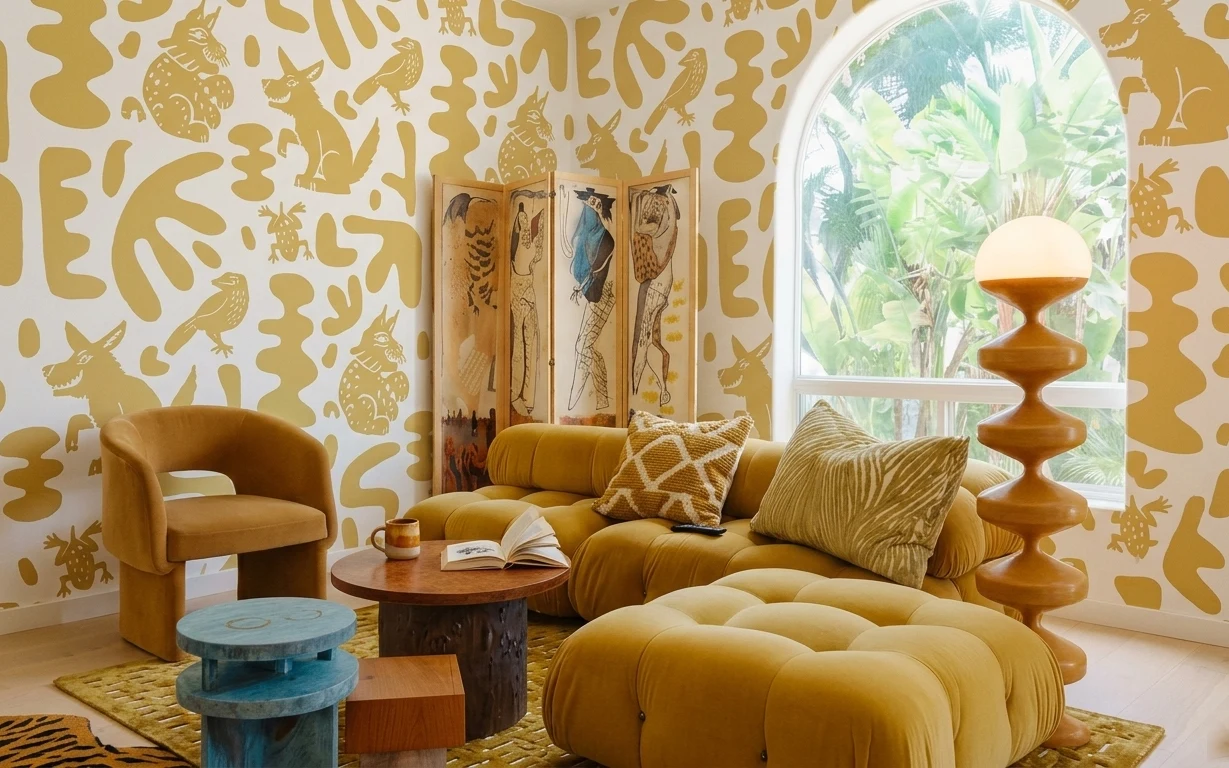
7 no-drill ways to build a mustard jungle living room
A mustard jungle living room, made renter-safe with no drilling and pack-away styling. This $1000 budget focuses on one bold wallpaper wall…
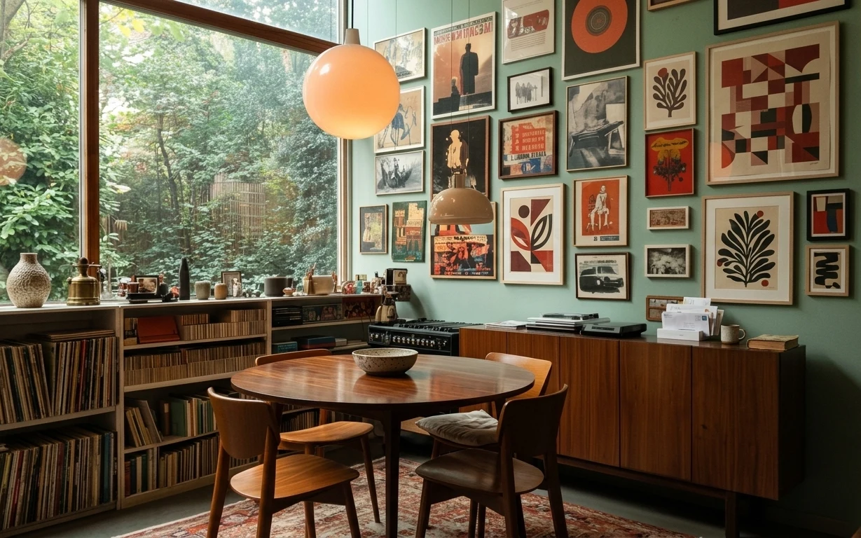
8 weekend upgrades for a dining corner, $1000
A dining corner refresh built around a patterned area rug, warm amber pendant lights, and a tight framed art cluster—plus one paint update.…