- Best for
- anchoring a dining zone with light + art
- Cost
- about $1000
- Difficulty
- Confident DIY
- Time
- one weekend, 6–10 hours
Why warm-amber accents are the dining corner of 2026
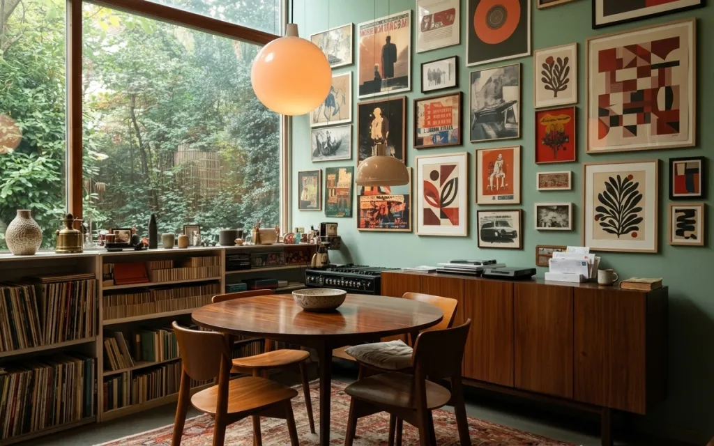
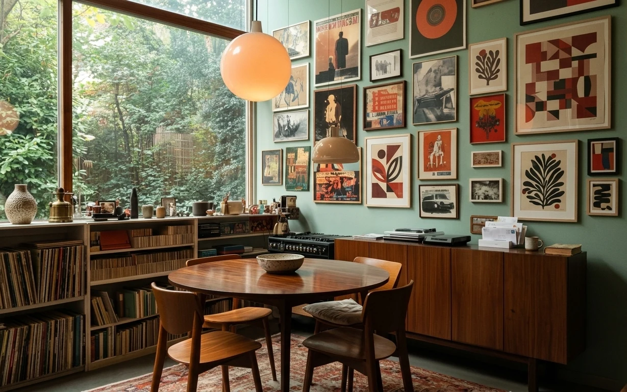
The easiest way I’ve found to “fix” a dining corner is to stop treating it like a table plus vibes and start building it like a vignette. In this space, the patterned area rug, the walnut-toned round table, and the two amber glass pendants all pull the eye toward the center. The framed art prints on the light teal wall add rhythm, while the wood sideboard gives storage and visual weight. For homeowners, the big win is choosing one paint and committing to it—same weekend, more cohesion.
I used to overthink gallery walls and buy matching frames first, then panic when the wall color didn’t cooperate. The moment I picked a teal hue I actually liked and kept the frame lineup to a manageable grid, the whole room suddenly made sense. The warm lighting matters, too: when the pendants are amber, they flatter both wood and printed art. This is the kind of refresh you can do even if you don’t love “big renovation energy.”
Layer 1 — Patterned area rug ($200) anchors the legs-and-light look
This patterned area rug sits under the round table and immediately turns the dining zone into a defined area instead of a random floating table moment. The mix of warm tones works with the walnut-colored furniture and keeps the light teal wall from feeling too cool. I like this choice over going for a plain solid rug because the pattern hides everyday signs of life—crumbs, dust, and the occasional coffee ring—without looking messy. The trade-off is that the rug demands a confident palette, so keep table styling limited and let the art wall handle the rest.
Use a rug pad if your floors feel springy
Underfoot stability helps the chairs stay aligned and makes the rug pattern look crisp instead of slightly wrinkled.
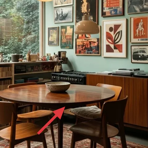
Layer 2 — Round wooden dining table ($180) makes the center feel effortless
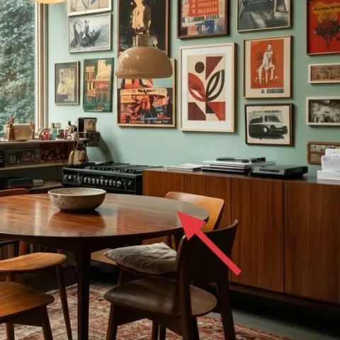
A round wooden dining table is one of those shapes that makes a room feel friendlier instantly, because it eliminates the “hard corners” of a rectangular plan. Here, the tabletop reads warm and smooth, which balances the graphic wall of framed art prints and the organic shapes outside in the window greenery. Going with a round table is a smart alternative to a long dining table when the space isn’t huge—everyone still gathers, but the layout breathes. The trade-off is that it’s less ideal for serving very long platters, so style with bowls and smaller plates centered on the middle.
Match the table scale to your chair footprint
Leave enough clearance for chairs to slide without grazing the rug pattern.
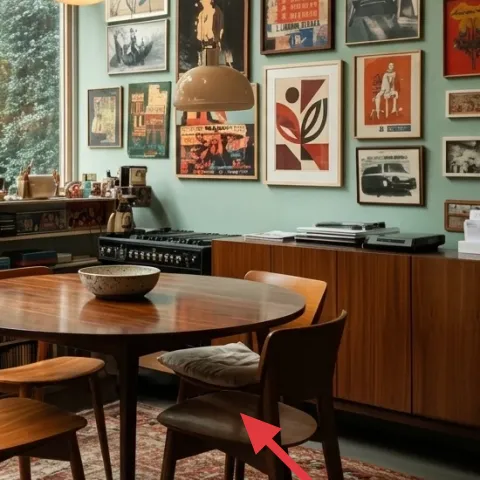
Layer 3 — Wood dining chairs ($100) tie the rug to the sideboard
The wood dining chairs connect the dining table to the wood sideboard, and that continuity is what makes the room feel intentional instead of assembled from separate purchases. In the photo, the chair design stays simple enough that the framed art gallery can remain the visual “headline.” If the alternative is buying mismatched chairs, you end up with an eclectic look—but it often reads accidental. These chairs give you a mid-century warmth that harmonizes with the amber pendants. The trade-off is that they’ll show scuffs, so keep a small fabric or wood-safe cleaner nearby.
Don’t pick chair colors that fight the rug pattern
If the chair finish is too cool or too red, the rug’s warm tones will look off by comparison.
Layer 4 — Large amber glass pendant light ($80) gives the wall art its glow
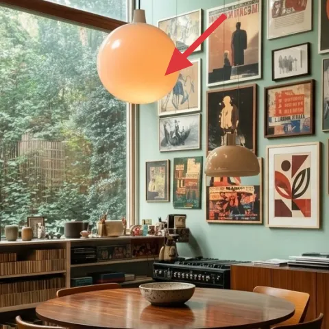
The large amber glass pendant light is doing a lot of quiet work: it warms up the entire dining corner, including the light teal wall and the framed art prints. When you choose amber instead of clear glass, it turns the wall from “cool background” into “a warm display surface.” This is better than relying only on overhead general lighting because it creates a pool of light right where the table and centerpiece live. The trade-off is that the glow highlights texture—so the wall paint finish should be even, and the framed mats should be clean.
Keep bulb temperature warm
Look for a 2700K–3000K feel so the amber pendants read golden, not yellow-green.
Layer 5 — Framed art prints gallery ($180) makes the teal wall feel curated
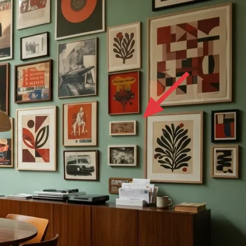
A tightly arranged framed art prints gallery turns a plain painted wall into an image field that feels collected, not empty. In this setup, the frames vary just enough to avoid monotony while still staying within a coherent palette—white mats, black and wood frame tones, and graphics that echo warm reds and creams. The reason this works better than a single large print is that you can tune density: start with a grid, then add one or two “anchor” pieces until it feels balanced. Trade-off: a gallery wall takes patience to measure, so commit to the grid and adjust spacing before hanging.
Plan spacing before you drill
Use painter’s tape squares on the wall to test the rhythm from far back.
Layer 6 — Wood sideboard ($230) keeps storage looking designed
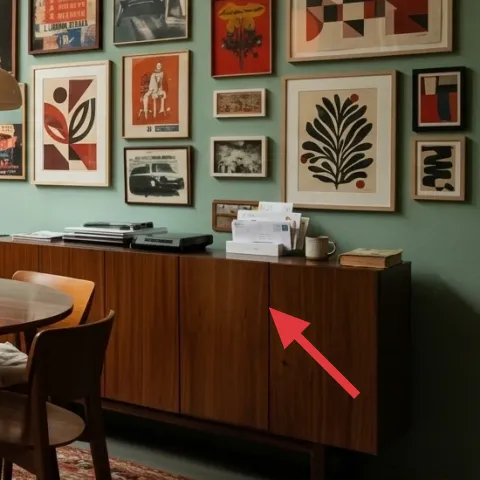
The wood sideboard anchors the back wall and gives you a place to store books and set down everyday items without turning the dining table into a clutter station. It also ties directly into the round wooden dining table, so the room reads consistent even when the framed art gallery is doing the most visual talking. The trade-off with a sideboard (instead of open shelving) is you lose some visual lightness, but the doors and vertical lines create structure that balances the art’s horizontals. If you style it like a museum shelf—books stacked, small ceramics spaced—you get that “lived-in but edited” feeling quickly.
Style in threes, not in rows
Group a small object, a taller book, and a negative-space gap for air.
Layer 7 — Paint, 1 gallon (homeowner only) ($70) pulls teal, amber, and wood into one palette
A single paint refresh is the easiest weekend lever for rooms like this, because the wall color affects how the amber pendant light looks and how the framed art prints read at night. The hero shows a light teal wall, which makes the warm walnut furniture feel richer and keeps the space from going too beige. This is a better move than swapping lots of textiles because paint unifies every future purchase. The trade-off is you have to prep well—skipping patching or sanding can make brush marks show up under the pendant light.
Make it instead of buying it
DIY the light-teal wall refresh by rolling on a soft, even coat so the amber pendants and framed art prints look cohesive.
Materials
- Interior paint (1 gallon) — ~1 gal — store shelf paint — $45
- Painter’s tape — 1 roll — hardware store — $8
- 9" roller cover + tray liners — 1 set — hardware store — $12
- Angled brush (2") — 1 — hardware store — $5
- Plastic drop cloths — 1 roll — hardware store — $10
Steps
- Clean and dry the wall so the first coat bonds evenly.
- Mask outlets, trim, and edges with painter’s tape.
- Cut in around corners and ceiling lines with an angled brush.
- Roll the wall in a W pattern, then level without going back repeatedly.
- Let the first coat dry fully per the paint label.
- Apply a second coat for full coverage, then remove tape while paint is slightly tacky.
- Inspect under pendant lighting and touch up any thin spots.
- Allow full cure time before adding framed art back into direct spot lighting.
Total DIY cost: $80 — saves about $-10 over buying.
The cost, layer by layer
| Layer | Item | Cost |
|---|---|---|
| 1 | Patterned area rug (5×7–8×10) | $200 |
| 2 | Round wooden dining table | $180 |
| 3 | Wood dining chairs (set) | $100 |
| 4 | Large amber glass pendant light | $80 |
| 5 | Framed art prints gallery (10–15 prints) | $180 |
| 6 | Wood sideboard | $230 |
| 7 | Paint, 1 gallon (homeowner only) (DIY equivalent) | $70 |
| Total | $1,040 | |
If the rug or table budget has to shrink, buy the rug first and swap the table only if there’s a noticeable scale mismatch. A less expensive frame set and a single focal pendant still keep the dining zone cohesive.
What worked, what didn't (across the whole room)
The biggest win is the match between warm lighting and warm wood—those two things make the framed art gallery look intentional instead of “decor added later.” The patterned rug also prevents the chairs from feeling like standalone pieces. The only friction point is that any uneven paint finish shows up fast when amber pendants cast light downward.
What worked
- The patterned rug grounds the dining corner and keeps the chairs visually connected.
- The amber glass pendants warm the teal wall and make the framed prints feel richer.
- The round table shape improves flow and avoids the heavy feel of sharp corners.
- The sideboard provides storage without needing extra shelves or baskets in the center.
- The framed art density creates a clear focal wall behind the table.
What didn't
- If the rug pattern feels too loud, styling needs more blank space around the tabletop.
- Wall paint that’s patchy or slightly glossy reads under pendant light in the afternoon.
- Buying random frame sizes without measuring can make the gallery wall look uneven.
- If chairs don’t match the table finish, the dining center stops feeling unified.
What we'd skip if we did it again
Skip repainting multiple walls on a first refresh. One color that works with warm wood and amber light is enough to create cohesion, and it’s easier to notice what you actually like instead of chasing “satisfaction” across every surface.
Skip oversized statement lighting with a cool finish. A clear or silver pendant makes the teal wall read colder, and the framed art prints can look flatter, especially at night.
Skip a cluttered tabletop. With a strong rug and a framed wall behind, the centerpiece and one small stack on the sideboard should do the heavy lifting; extra objects start competing fast.
Frequently asked
How long does this kind of dining-corner refresh take?
Most of the time goes to measuring the framed art prints gallery and doing careful paint prep. If the gallery is already close, plan a couple hours to test spacing, plus a slow hang session. Painting one wall is often a single-day job with a second coat; drying time is the only reason it stretches. Total time usually lands around 6–10 hours over a weekend.
What if I rent—can I still get this look?
For renters, you can keep the warm pendant effect with plug-in lighting or a cord-cover, and use removable picture-hanging options for the framed art prints gallery. Skip painting and instead use peel-and-stick wallpaper on just the wall behind the table, then keep the rug and lighting unchanged. The goal is to keep one “anchor wall” so the framed prints read as a curated set.
My space is smaller—should I scale down the rug and table?
Yes, at least for the rug. In a tighter dining corner, aim for a rug that sits fully under the chair bases, not just under the table. The table can stay similar if you keep chair spacing reasonable, but round tables generally scale well because there are no corners to bump into. If you notice chairs scraping, swap to a slightly smaller chair footprint rather than forcing the layout.
Where can I shop differently to save money without losing style?
Start with the rug and pendant first, then shop the gallery frames as a second priority. For frames and prints, thrift and estate sales work well because you can mix frame finishes as long as the mat or print size stays consistent. For the sideboard, look for mid-century style pieces with solid wood fronts or simple veneers—then style it like a shelf: books stacked, ceramics spaced, and one taller object.
What’s the biggest mistake people make in this kind of dining corner?
Overbuying “matching sets.” When every piece is too similar, the wall art can’t stand out, and the teal background won’t look intentional. The fix is to pick one unifying choice—warm amber lighting, a warm wood palette, or the teal wall—and let the other items vary in texture and shape within that palette.
More in Living Room
8 weekend upgrades for a dining corner, $1000
A dining corner refresh built around a patterned area rug, warm amber pendant lights, and a tight framed art cluster—plus one paint update.…
A shelf-styled living room for $600
A renter-friendly sofa corner refresh inspired by olive, mustard, and botanical shelf styling—built from 7 no-drill layers for about $600. …
7 weekend swaps for a living room refresh for $1000
A living room refresh built around a bold black spirograph wallpaper wall, cream curtains, and green textiles—plus lighting that keeps it w…