- Best for
- sofa corners with busy shelves
- Cost
- about $575 total
- Difficulty
- easy swaps (mostly textiles + plug-ins)
- Time
- 1 long weekend afternoon
Why olive-and-mustard botanical shelf styling is the sofa corner of 2026
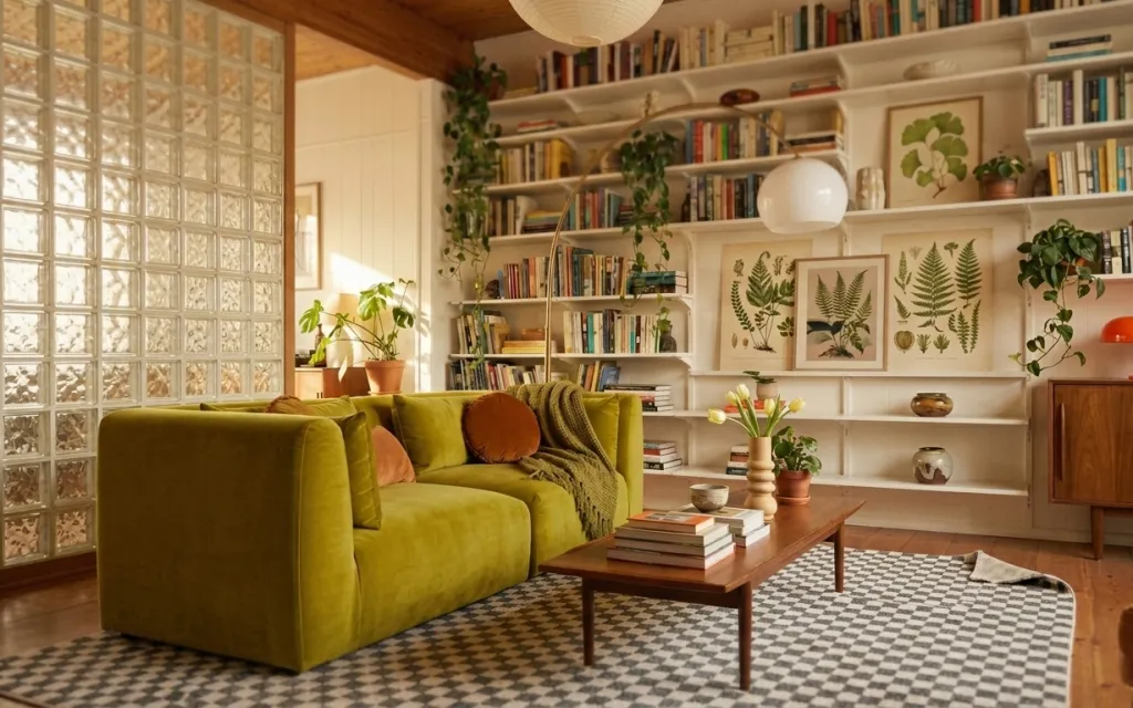
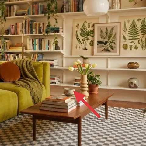
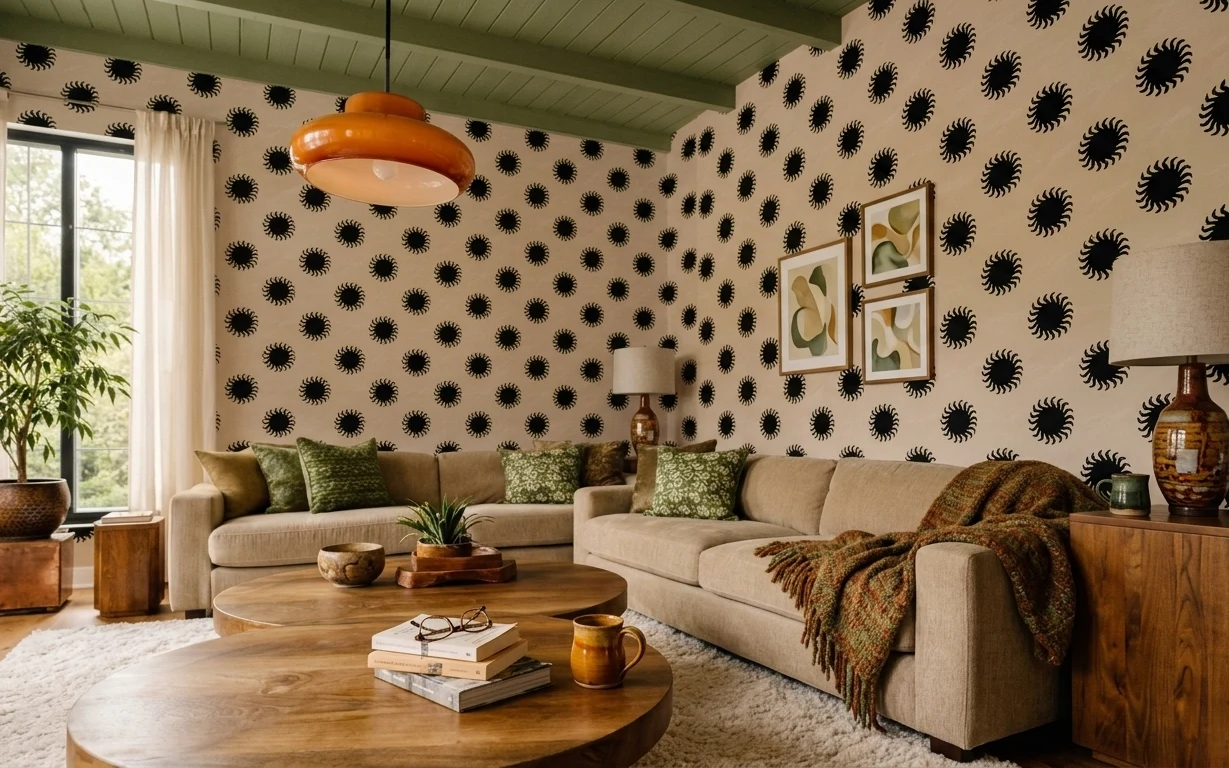
The hero here is the contrast: a bold olive-green sofa sits under warm, lived-in lighting and a patterned area rug that anchors everything. In the shelf styling, cream and wood tones keep the whole scene from getting too saturated, while the layered textures—green throw blanket, velvet-like pillows, and the rougher rug pattern—make it feel intentional. It also nods mid-century: the wood coffee table and the orange table lamp bring that retro warmth without needing any wall changes.
I used to overdo the “matchy” part of a room—same colors, same shapes, same spacing—until I realized it made my own place feel flat. This is the opposite: you can repeat a color (olive + burnt orange) while mixing materials (smooth ceramic, printed paper, and woven rug texture). Once I saw that on the page, the rest of the styling made sense: build the base with textiles, then let the shelves and table do the talking.
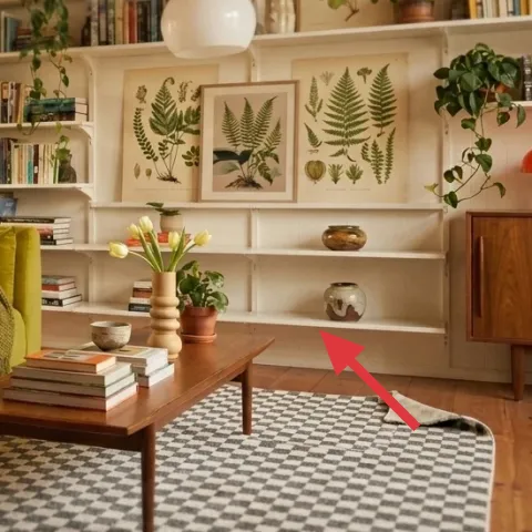
Layer 1 — patterned area rug ($200) Anchors the sofa with pattern and contrast
The patterned area rug is the first domino because it establishes the room’s visual rhythm from the floor up. In the photo, the black-and-cream graphic pattern frames the base of the sofa and makes the wood coffee table look grounded, not floating. It also helps the green upholstery feel brighter—your eye doesn’t get stuck on one solid color block. The trade-off: a bold rug means you should keep other textile patterns (like pillow shapes) smaller or fewer, so the room doesn’t compete with itself.
Pattern rule for renters
Let the rug carry the loudest pattern; keep pillows and throws to one texture or one color family so you can refresh without repainting anything.
Layer 2 — green throw blanket ($35) Adds softness over strong upholstery
The green throw blanket layered over the sofa is a simple way to keep the upholstery from looking too flat. Visually, it repeats the olive tone already on the sofa, but the knit texture reads different—like a second material layer. That texture is especially helpful in daylight rooms where the sofa’s sheen can dominate. I’d choose this over swapping out the sofa (or reupholstering), because renters can replace a throw fast and it packs for a move. Keep it slightly rumpled, not perfectly spread, to match the casual shelf-energy of the room.
Why it works next to shelving
When shelves are busy with books and plants, a single-texture blanket gives the eye a break between objects.
Layer 3 — burnt-orange throw pillow ($30) Ties the lamp color into the seating
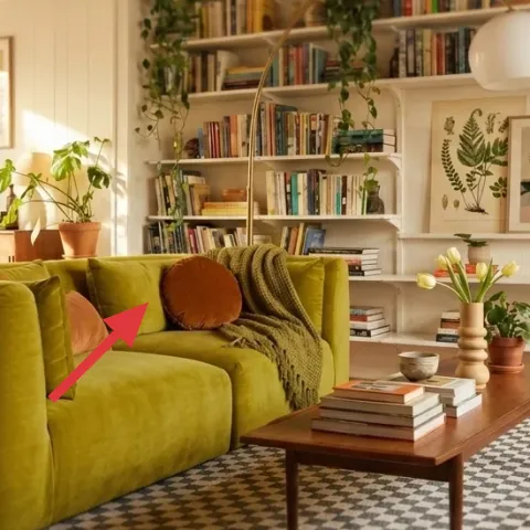
The burnt-orange throw pillow is the warm punctuation mark that makes the olive-green sofa feel intentional, not just dark. It echoes the orange table lamp on the right, so your attention bounces between light, color, and the coffee table styling. The trade-off is that orange can skew too bright if you add multiple competing accents, so one pillow does the job here. If you want to be even more move-friendly, look for a pillow cover you can switch seasonally while keeping your core color scheme stable.
Fast color math
Pick one warm accent color and repeat it in at least one other place (here: lamp + pillow) to make the room feel “collected.”
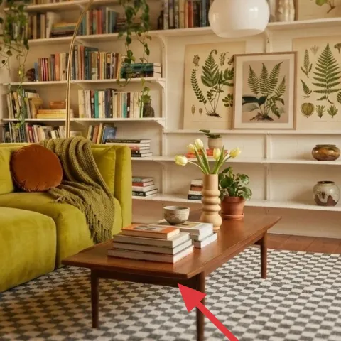
Layer 4 — wood coffee table ($160) Brings the mid-century line to the center
The wood coffee table keeps the room from reading too boho-only by adding clean mid-century structure in the middle. Its warm wood tone also harmonizes with the cream shelving backing and makes the orange lamp feel richer instead of harsh. This is one place where it’s worth spending, because a low, sturdy table helps the whole vignette look finished—especially once books and small plants stack on top. The trade-off is that a table is harder to move than small decor, but it’s still a renter-safe layer: choose something with a simple shape and neutral wood so it works in future layouts.
Don’t overload the tabletop
With a patterned rug and detailed shelves, keep the coffee table to a tight cluster (books + one plant + one vase) to avoid visual clutter.
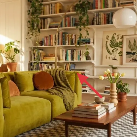
Layer 5 — orange table lamp ($45) Adds warm light without hardwired changes
The orange table lamp is doing two jobs: it supplies a warm pool of light and it repeats the burnt-orange accent color that shows up in the sofa pillows. Because it’s a plug-in option, it’s renter-friendly—you can place it exactly where the shelf light needs support and then pack it up when the lease ends. I’d pick a table lamp with a bold base over a neutral shade if the room already has strong upholstery color; otherwise the lamp disappears into the background. For the bulb, choose a warm tone so the cream shelves read soft rather than blue.
Placement matters more than height
Set the lamp so its glow lands across the coffee-table surface, not just up into the shelves.
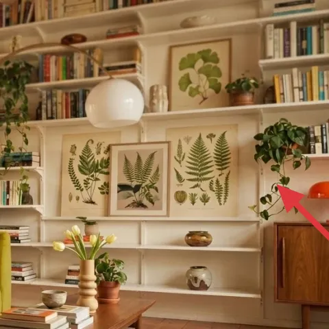
Layer 6 — framed botanical art print ($60) Makes the shelves feel curated, not crowded
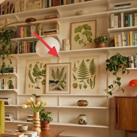
The framed botanical art print gives the shelf wall a focal point that still plays nicely with plant life. In the photo, the leaves echo the greenery on the shelves and the warm cream background makes the print read crisp next to books spines. This is the swap I’d choose over hanging large-scale art that requires extra hardware, because framed prints are easy to remove and rehang with renter-safe methods (like Command strips) only if your landlord allows. The trade-off is that botanical prints can look busy if they clash with other patterns—so keep the rug pattern and pillow palette steady and let this be the visual “statement.”
Match leaf tones, not every leaf
Look for green undertones that sit between your plants and your sofa—olive-green works well with both.
Layer 7 — brown vase on the coffee table ($45) Brings height to the tabletop cluster
The brown vase on the coffee table adds vertical structure to the styling cluster, making the books and small potted plant look like part of a designed stack. It also softens the wood coffee table with a warmer, slightly organic shape, which helps the room feel less like “shelves only.” Since this is a small object, it’s one of the easiest layers to swap out at the start of each season—fresh stems in warm months, dried or foraged branches later. The trade-off: dried arrangements look best when they’re spaced out rather than tightly packed, so resist the urge to cram in extra stems.
Why height beats more clutter
A single taller vase can replace extra small decor, keeping the tabletop readable from across the room.
The cost, layer by layer
| Layer | Item | Cost |
|---|---|---|
| 1 | patterned area rug | $200 |
| 2 | green throw blanket | $35 |
| 3 | burnt-orange throw pillow | $30 |
| 4 | wood coffee table | $160 |
| 5 | orange table lamp | $45 |
| 6 | framed botanical art print | $60 |
| 7 | vase for dried arrangement | $45 |
| Total | $575 | |
If the rug price feels steep, look for a similar black-and-cream geometric rug in a smaller size first, then go up later—same pattern vibe, less upfront cost.
What worked, what didn't (across the whole room)
The strongest win is the layered repetition: olive and burnt orange show up across the sofa textiles, the orange table lamp, and the tabletop accents. The second win is contrast—cream shelving and framed botanicals keep the green upholstery from feeling heavy. The main miss is that it’s easy to over-collect small objects on the coffee table when shelves are already busy, which can make the center feel crowded.
What worked
- The patterned area rug grounds the sofa and makes the wood coffee table look intentional.
- The green throw blanket softens bold upholstery and adds a knit texture that reads even in daylight.
- The burnt-orange throw pillow and orange table lamp repeat the same warm accent color.
- The wood coffee table adds mid-century structure in the visual center of the room.
- The framed botanical art print unifies shelves and plants without needing any hardwired lighting changes.
- The brown vase adds vertical balance so tabletop styling doesn’t flatten the space.
What didn't
- Adding multiple small tabletop pieces next to books can compete with the shelf details.
- If the throw blanket is too perfectly folded, it fights the room’s casual, layered look.
- Choosing a lamp with a cool bulb can make the cream shelves look a little washed out.
- Picking a second accent color beyond burnt orange can make the palette feel scattered.
What we'd skip if we did it again
Skip replacing the sofa or trying to reupholster it. When the upholstery color already matches the palette, the faster path is adding textiles and warm lighting around it—throws, pillow covers, and a plug-in lamp do that job without landlord paperwork.
Skip adding too many tabletop objects. Books, one small plant, and one vase keeps the center crisp; anything beyond that tends to blur together once the shelves (and glass block light) are already doing the most.
Skip big, hardware-dependent wall art. A framed botanical print is easier to move and swap, and it lets the shelves stay the hero. If there’s one statement to buy first, make it the framed print—not a whole gallery arrangement.
Frequently asked
How long does this kind of sofa-corner refresh take?
Plan for about 3–5 hours for the first pass: rug placement, throw + pillow styling, lamp set-up, and a quick tabletop “cluster.” If framed botanical art needs renter-safe mounting, add 30–60 minutes. The second pass is usually only 15–20 minutes—just stepping back, adjusting pillow height, and moving the lamp slightly so the light lands on the coffee table.
Is this renter-friendly if I have to pack everything up at the end of the lease?
Yes—most of the layers are portable: a patterned area rug, removable textiles (throw blanket and pillow covers), a plug-in orange table lamp, and framed art that comes down with renter-safe hardware. The only “semi-sticky” item is the coffee table, but it’s still movable. When you leave, remove the table, lift the rug, pack textiles and decor, and unmount the frames.
What if my room is smaller than the photo?
Go smaller in two places: choose a rug size that still fits under the front legs of the sofa, and keep the coffee table styling to fewer items (one stack of books plus one vase). You can also use a narrower framed print or hang it slightly higher to open up sightlines. The palette still works—just reduce object count.
What if my room is bigger or brighter?
Use the same color logic, but scale up texture and coverage. A slightly larger rug helps the sofa feel fully grounded, and the lamp base can be placed closer to the center of the coffee-table surface so it reads clearly. If your shelves feel empty, add one extra framed botanical print or a second warm accent (like another small ceramic) in the same burnt-orange family.
Where should I shop for these items without fighting the look?
For the rug and textiles, look for black-and-cream geometric patterns and olive-green throw blankets rather than trendy colors that won’t match later. For lighting, prioritize a plug-in orange table lamp with a warm bulb. Botanical framed prints are easiest to match if you choose one consistent leaf tone. Thrift for the coffee table only if the wood tone already fits warm neutrals.
What’s the biggest mistake people make in this room type?
Over-adding accents. When the shelves are already dense with books and plants, the coffee table needs restraint. If everything is “small and cute,” nothing reads. Keep the tabletop to a cluster and let the rug pattern do the heavy lifting for visual interest.
More in Living Room

A shelf-styled living room for $600
A renter-friendly sofa corner refresh inspired by olive, mustard, and botanical shelf styling—built from 7 no-drill layers for about $600. …
7 weekend swaps for a living room refresh for $1000
A living room refresh built around a bold black spirograph wallpaper wall, cream curtains, and green textiles—plus lighting that keeps it w…
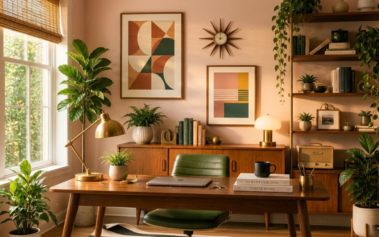
7 no-drill style swaps for a home office nook
A warm, mid-century home office nook can look styled (and still moveable) on a generous $600 budget. This plan uses seven no-drill upgrades…