- Best for
- High-impact wall + lighting changes
- Cost
- About $820 for the full look
- Difficulty
- Weekend-friendly, paint + no-demolition
- Renter-safe
- Yes (peel-and-stick + no drywall damage)
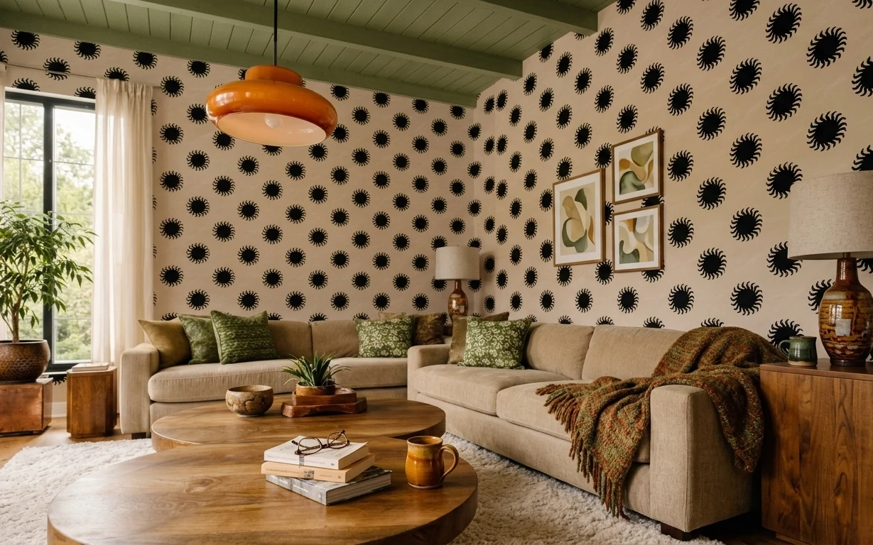
Why warm-wood and sage styling is the living room of 2026
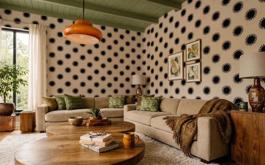
The first thing I notice is how the patterned wallpaper wall (black spirograph shapes on cream) makes everything feel intentional, even with simple pieces. The cream shag rug anchors the seating area, while the green patterned throw pillows and green throw blanket pull the eye across the beige L-shaped sofa. On top of that, the orange glass pendant plus the drum-shade floor lamp create layered lighting without harsh glare. For homeowners working on a weekend budget, you get big visual payoff by swapping the “background” (wall + window) before chasing smaller accessories.
I used to buy art first and then wonder why it looked pasted on. In rooms like this, the wall pattern sets the tempo, and the art has to live in that same rhythm—same scale, same earth-toned palette, no competing shapes. The other mistake I’ve made: choosing a rug that’s too thin, so the seating looks floating instead of grounded. Here, the plush shag does the work of making the whole scene feel soft underfoot.
Layer 1 — cream shag area rug 5×7 ($200) Rounds out the beige sofa
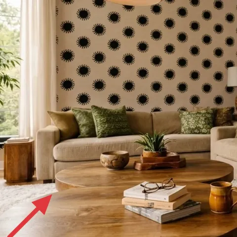
This cream shag rug under the round wooden coffee table is what keeps the seating area from looking flat. In a room with bold wallpaper and busy pillows, a high-pile neutral gives your eyes a place to land, especially when your sofa is a warm beige tone. The round coffee table also helps—soft texture plus curved edges makes the whole layout feel less angular. The trade-off is practical: shag shows footprints more than a low-pile rug, so a quick vacuum pass matters. If you want the look without the fuss, choose a rug with a dense pile and a rug pad for grip on the wood floor.
Hide-when-needed durability trick
Choose a cream that leans slightly warm (not icy white) so coffee drips and daily dust blend in better against the rug’s texture.
Layer 2 — cream curtain panel pair (84") ($80) Balances the wallpaper
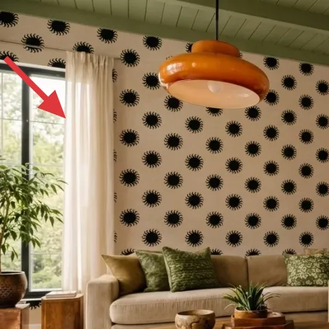
Cream curtain panels frame the left window and soften the wallpaper wall’s strong black pattern. Because the fabric reads sheer-to-lightweight, it lets natural daylight wash across the wood floor instead of turning the room into a cave. This matters in rooms that already have a strong focal point—if the curtains are too heavy or too sheer-to-float, the window becomes either visually loud or invisible. The trade-off with cream is that you’ll want them to be a clean off-white, not gray-tinged, or they’ll clash with the warm wood tones. Hanging them floor-to-ceiling also keeps the eye moving upward toward the orange pendant.
Length is more important than fabric name
Even budget-friendly curtains look custom when they puddle slightly at the bottom; aim for a consistent hang height across panels.
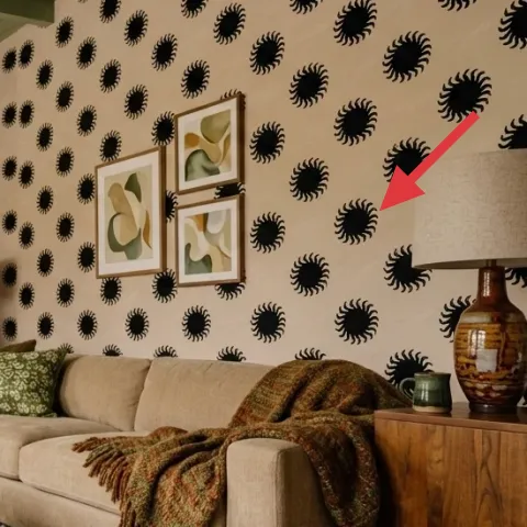
Layer 3 — black spirograph-pattern peel-and-stick wallpaper (one wall) ($150) Gives the room its focal point
The black spirograph-pattern wallpaper is the entire “design engine” here. Peel-and-stick is the weekend-friendly way to get that high-contrast graphic wall without dealing with paste, fumes, or a long dry-cure process. Visually, the repeating circles make the beige sofa feel curated instead of plain, and the pattern stays busy enough that you can keep the rest of the decor more relaxed. The trade-off is alignment: you’ll want to take your time at the seams so the repeat looks intentional rather than slightly off. If the wall isn’t perfectly flat, press firmly with a plastic smoothing tool and work in small sections.
Don’t wallpaper over deep texture
If the wall has heavy bumps or peeling paint, the adhesive won’t fully grip and the pattern can lift at corners.
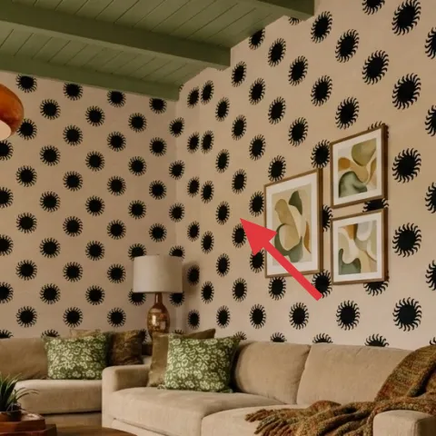
Layer 4 — three framed botanical prints ($180) Complements the wall pattern
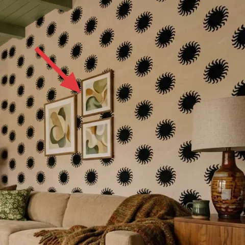
Those three framed botanical prints are scaled to the patterned wall, so they read like part of the same collection rather than separate decor. Because the wallpaper already has movement, the frames need a clean, solid border and consistent spacing; that keeps the center-right cluster cohesive. The choice to use botanical imagery also plays nicely with the green pillows and the green glass vase on the wood sideboard, which creates repeat color without adding another black-and-white graphic layer. DIY is a good move here because the retail “set” price can be higher than you expect. The trade-off: DIY framing takes patience with straight edges and print sizing.
Make it instead of buying it
This version uses thrifted frames you repaint, then adds printable botanical art sized to match the set spacing.
Materials
- Wood picture frames (3) — matte white or light wood — thrift/cheap frames — $60
- Printable botanical art sheets — 8.5×11 or A4 paper — online printables — $15
- Chalk or acrylic paint — small can — craft store — $12
- Clear acrylic topcoat — small can — craft store — $10
- Sandpaper + foam brush set — assorted grits — home center — $8
Steps
- Prep frames: remove glass/backing, then sand to dull the existing finish.
- Paint the frames in light coats, letting each coat dry before the next.
- Lightly sand between coats if you want extra-smooth coverage.
- Print botanical images to fit the frame’s inner dimensions.
- Apply the clear acrylic topcoat and let it dry fully.
- Reassemble with the prints, then set the frames in a 3-up layout for spacing.
Total DIY cost: $105 — saves about $75 over buying.
Layer 5 — floor lamp with drum shade (plug-in) ($120) Adds warm light at the right height
The plug-in floor lamp with a drum shade on the right side keeps the lighting layered, especially after dark. With the orange glass pendant overhead, the floor lamp adds a lower light source that makes the sofa and throw blanket feel dimensional instead of shadowy. A drum shade matters here because it diffuses the bulb into a softer pool rather than creating sharp hotspots—great next to patterned wallpaper. The trade-off is that drum shades can look visually bulky, so placement is everything: keep it near the sideboard so the lamp supports the whole grouping. If you’re matching the look, choose a warm bulb temperature so the sage greens read rich, not washed.
Dial in the color temperature
Use a warm white bulb so the green pillows stay earthy instead of turning blue.
Layer 6 — green patterned throw blanket ($60) Pulls the palette onto the sofa
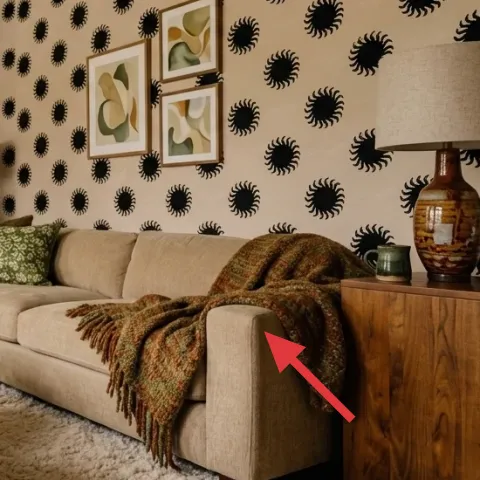
A green patterned throw blanket draped over the beige L-shaped sofa ties the room’s palette together, bridging the green pillows, the botanical art, and the green glass vase on the wood sideboard. The blanket’s texture gives the sofa a more lived-in surface, which is especially important when the wall has a dense repeat pattern. The trade-off is that patterned throws can compete if they’re too busy—this one works because it’s in the same family as the pillows and keeps the greens muted rather than neon. Drape it casually over the sofa’s front edge so it looks intentional but not tightly styled. That loose placement also makes it easy to swap for another color later.
Use the “one green, two textures” rule
Keep pillow colors close to the blanket and vary textures—pattern plus solid reads rich without feeling chaotic.
Layer 7 — green glass vase on wood sideboard ($30) Makes the styling feel finished
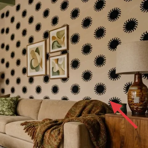
The green glass vase on the wood sideboard is small but it matters because it repeats the green note from the textiles and art. Even without fresh flowers, the shape catches light and adds a reflective highlight against the warm wood surface. This is a better choice than adding another framed piece because the vase plays the role of “object styling”—it introduces shape and shine at table height where your eye naturally rests. The trade-off is that glass can look streaky; keep it clean and wipe it dry so the light from the orange pendant and floor lamp reads clearly. Place it near the edge of the sideboard so it shows in the room’s main viewing angle.
Cluster by height, not by theme
Pair a single glass piece with a book stack or small dish so the heights vary, but the color family stays consistent.
The cost, layer by layer
| Layer | Item | Cost |
|---|---|---|
| 1 | Cream shag area rug 5×7 | $200 |
| 2 | Cream curtain panel pair (84") | $80 |
| 3 | Black spirograph-pattern peel-and-stick wallpaper (one wall) | $150 |
| 4 | Three framed botanical prints (DIY-ready set) | $180 |
| 5 | Floor lamp with drum shade (plug-in) | $120 |
| 6 | Green patterned throw blanket | $60 |
| 7 | Green glass vase on wood sideboard | $30 |
| Total | $820 | |
If you want a cheaper route, start with the wallpaper wall (the biggest visual hit), then go minimal on art: use two framed botanical prints instead of three and choose a low-pile cream rug. Keep the floor lamp, since warm lighting is what makes the green accents look natural.
What worked, what didn't (across the whole room)
This setup works because it layers three anchors: a graphic wallpaper wall, soft neutral textiles, and warm lighting that holds the palette together. The green accents read cohesive rather than random because they show up in multiple places—pillows, a throw blanket, and a green glass vase.
What worked
- The black spirograph wallpaper created a focal wall so the sofa area never felt plain.
- Cream shag rug texture grounded the beige sofa and softened the high-contrast pattern.
- Curtains added height and daylight, keeping the room bright even with bold wallpaper.
- Botanical art echoed the green accents without adding another heavy graphic element.
- Floor-lamp lighting at sofa height made the green throw blanket look rich after dark.
- The green glass vase tied together textiles and wall art through repeated color.
What didn't
- If the curtains were a cooler white, they would fight the warm wood and sage greens.
- Oversized artwork would compete with the wallpaper repeat and make the wall feel crowded.
- A low-pile rug would make the sofa look like it’s floating on the wood floor.
- Blue-tinged bulbs would dull the green pillows and make the room feel less inviting.
- A second tall decor object near the floor lamp would crowd the right-side grouping.
What we'd skip if we did it again
Skip buying a whole “matching set” of decor. A single strong wallpaper wall plus textiles and lighting beats coordinated bundles that end up looking flat when you live in the room.
Skip replacing the sofa first. Even a basic beige sofa becomes styled when the rug, curtains, and wall art match the same palette and scale; spend the money on the visible anchors.
Skip cool-white bulbs. If you want sage green and warm wood to look natural, use a warm bulb and let the floor lamp and pendant do the heavy lifting.
Frequently asked
How long does this living room refresh usually take on a weekend?
Most people can finish the big moves in 6–10 hours total. Wallpaper prep and careful trimming takes the longest, usually 2–3 hours. Curtains and art placement are typically another 2–4 hours combined. Lighting and styling can be done in the final hour or two—once the wall is done, everything else becomes easier to scale.
Is peel-and-stick wallpaper really renter-friendly for a patterned wall?
For most renters, yes—peel-and-stick is the easiest path to a graphic wallpaper look without permits or removal headaches. The key is surface prep: clean, dry walls bond best. If the wall has peeling paint or heavy texture, test a small corner first. Also plan seams carefully so the repeat looks intentional, not misaligned.
What if my living room is smaller than the photo?
If the room is tight, keep the wallpaper on one wall and scale down the framed cluster to two prints instead of three. Choose the same cream curtain color for brightness but shorten the curtain height only if it matches your ceiling height—don’t visually chop the window. A smaller rug still works as long as the sofa sits fully on it for a grounded look.
What if my living room is larger and needs more visual weight?
In a bigger space, go bigger with the rug or add a second light source at a different height. The wallpaper wall remains the anchor, but you can lengthen the curtain panels and add one more green throw pillow to balance the sofa. Keep the art cluster centered at eye level so the wallpaper doesn’t swallow the frames.
Where can I shop to get this look without blowing the budget?
Start with the highest-impact items: peel-and-stick wallpaper and a cream shag rug. For art, look for affordable framed sets or thrift frames and print botanical sheets. The floor lamp is usually best bought new because you want proper wiring and a shade that matches the diffusion style. Finish with textiles—throw blanket and pillows are the easiest to swap for the right shade of green.
What’s the biggest mistake people make in rooms like this?
They pick the wallpaper pattern and then ignore scale. If the framed prints are too small or too far apart, the wall can feel busy instead of styled. The fix is simple: keep the art cluster tight, match the palette (muted greens, cream, warm wood), and choose warm lighting so the greens read natural rather than gray.
More in Living Room
7 weekend swaps for a living room refresh for $1000
A living room refresh built around a bold black spirograph wallpaper wall, cream curtains, and green textiles—plus lighting that keeps it w…
7 no-drill style swaps for a home office nook
A warm, mid-century home office nook can look styled (and still moveable) on a generous $600 budget. This plan uses seven no-drill upgrades…
7 no-drill ways to style a living room for $350
A renter-friendly living room seating area refresh for $350: swap in a patterned rug, update textiles, and add move-friendly decor on the c…