- Best for
- Renter-friendly living room refresh
- Cost
- $350 budget, ~$314 before tax
- Difficulty
- Easy (mostly textiles + art)
- Time
- 1 weekend afternoon
Why warm cream-and-terracotta accents is the living room seating area of 2026
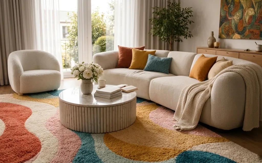
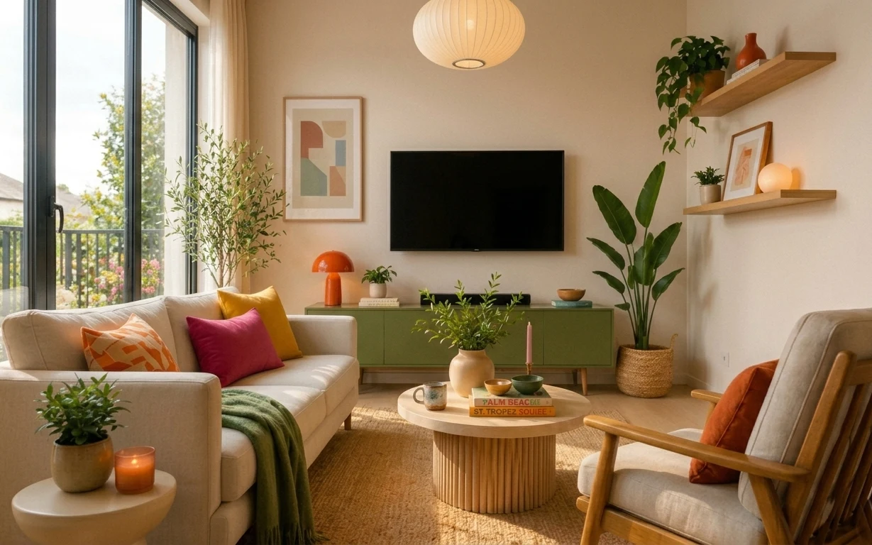
Start with the textures you can feel: the soft cream sofa, the grounded multicolor rug, and the chunky throw draped over the arm. That combo nods to the way Scandinavian living rooms mix pale upholstery with woven and patterned layers (think Swedish catalog spreads). The ceramic vase with white stems and the small glass candle jar add “still life” energy without cluttering the coffee table. This is doable for renters because every change sits on the floor, on textiles, or on wall-safe mounting.
I almost made the mistake of over-matching everything to the sofa color. Then I remembered what always looks more intentional in real homes: letting one warm accent (terracotta rust) and one cool accent (teal) do the talking. By keeping the throw and pillow in the same family as the rug tones—rather than trying to match the whole room—I got the layered look without making the space feel themed or precious.
Layer 1 — multicolor area rug ($150) Pattern anchors the whole seating zone
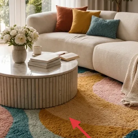
This multicolor area rug is the anchor because it ties together the room’s warm terracotta rust and teal accents under the coffee table and sofa. The rounded, curved shapes in the pattern visually echo the round chair and coffee table, so the layout feels softer than straight-line decor. Choosing a rug with multiple earth tones is better than a single-solid rug because it creates color rhythm with fewer styling objects. The trade-off is that you’ll want a simpler cushion and throw palette (cream with one accent), so the rug stays the hero and nothing else gets noisy.
Color-pull rule for faster styling
Pick two rug colors to repeat once on the sofa (like teal and rust), and keep the rest of the upholstery neutral.
Layer 2 — throw blanket draped over sofa arm ($25) Adds weight without another piece of furniture
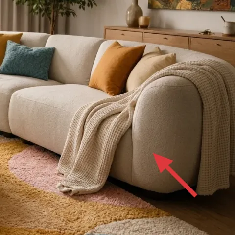
The throw blanket draped over the sofa arm adds texture and depth right where your eye lands when you walk in. Because it’s laid across the corner of the seating, it frames the pillows and makes the sofa look styled rather than “waiting for company.” This works better than adding another decorative blanket because you’re using the existing sofa as a surface—no extra storage or side table needed. The color is also key: a warm cream knit keeps the room bright in daylight while still letting the rug’s terracotta rust show through. The trade-off is keeping the fold neat; messy drapes can read accidental in photos.
Why draping beats stacking
Draping creates vertical movement; stacking creates a block that can hide the sofa’s shape.
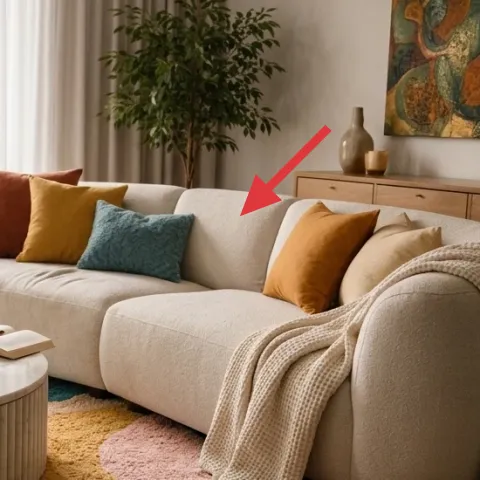
Layer 3 — teal throw pillow ($12) One cool accent for instant balance
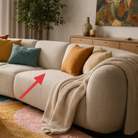
The teal throw pillow is a small change with big payoff because it balances the rug’s warm rust tones and prevents the sofa from reading flat against the cream upholstery. It’s placed near the center of the seating, so it shows in the hero view and adds that “styled but lived-in” contrast. This choice beats adding a second throw blanket because pillows are cheaper, easier to swap seasonally, and they visually separate the cream sofa from the patterned rug. The trade-off: stick to one teal piece, not three—too many teal hits can overwhelm the warm, airy daylight feeling.
Make it a one-pillow accent
Repeat teal once in a pillow (or decor object) so it feels intentional, not scattered.
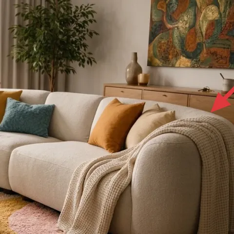
Layer 4 — framed abstract wall art ($60) Brings the palette up to eye level
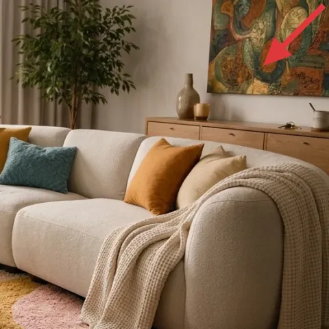
The framed abstract wall art is what makes the room feel finished, because it carries the same earthy palette upward and turns the wall into part of the color story. Keeping it abstract is smart with a patterned rug—your eyes get variety without fighting for attention. This works better than adding a shelf of small objects because framed art gives you one clear focal point. The trade-off is spacing: if the art feels too high or too low, the room can feel off even when the rest is right. Hang it where the center aligns roughly with eye level for most standing viewers.
Avoid mismatched frame colors
If the frame hardware conflicts with your table hardware, the art reads decorative instead of cohesive.
Layer 5 — small glass candle jar ($15) The coffee-table punctuation mark
The small glass candle jar is a styling “punctuation mark” on the coffee table next to the vase and books. In daylight it looks like a clear accent object; in the evening it adds warm glow (even with the smallest burn). Choosing a jar in clear glass is more renter-friendly than a colored container because it works across different seasons and rug patterns without clashing. It also fills negative space so the tabletop doesn’t feel like it’s only for books and flowers. The trade-off: real candles need occasional cleanup, so wipe glass smudges before photos.
Placement tip
Set it with a little breathing room from the vase so the table styling stays airy.
Layer 6 — ceramic vase with white flowers ($12) Softens the warm palette
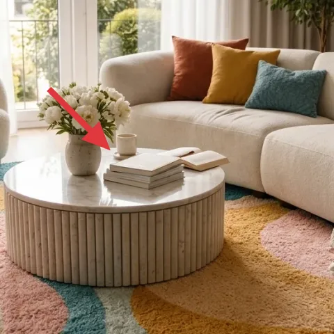
The ceramic vase with white flowers keeps the whole setup from becoming too earthy and heavy. Whites sit between the warm terracotta rust and the cool teal, so they act like a visual “buffer” for the patterned rug and colored pillows. This is better than adding a second vase in a matching color because you’d lose that balancing effect and the coffee table would feel themed. The ceramic texture also matters: it adds subtle surface variation that reads well in natural light. The trade-off is that stems need refreshing, but even a small bouquet keeps the room feeling styled rather than staged.
Choose one focal arrangement
Keep flowers to one spot on the table so the rest of the decor stays quiet.
Layer 7 — tall leafy indoor plant (painted terracotta planter set) ($40) Adds height and movement near the window
Make it instead of buying it
This DIY paints a terracotta planter set in warm, earthy tones so a tall leafy plant looks cohesive with the rug—without needing any permanent changes.
Materials
- Terracotta planter set (2 small planters) — 2 planters — craft store — $18
- Acrylic paint (earthy rust or clay) — 1 small bottle — art store — $9
- Foam brush — 1 — craft store — $3
- Plastic gloves — 1 pair — hardware store — $2
Steps
- Rinse and dry the terracotta planters so paint grabs evenly.
- Put on gloves and lay down newspaper to protect the surface.
- Use a foam brush to apply an even base coat in the earthy tone.
- Let the first coat dry completely to avoid streaking.
- Add a second coat only where coverage looks thin.
- Optional: dab a darker rust shade around the rim for depth.
- Let the paint dry fully before handling.
- Set the finished planters aside until they’re completely touch-dry.
- Transfer the plant (or pot insert) into the painted planter.
- Place the plant in the window-side spot where it can show its full height.
Total DIY cost: $32 — saves about $8 over buying.
Materials to match the room’s palette
Warm terracotta tones echo the rug’s rust while keeping the plant’s foliage looking fresh in daylight.
The cost, layer by layer
| Layer | Item | Cost |
|---|---|---|
| 1 | Multicolor area rug (5×7 or 8×10) | $150 |
| 2 | Throw blanket draped over sofa arm | $25 |
| 3 | Teal throw pillow cover | $12 |
| 4 | Framed abstract wall art | $60 |
| 5 | Small glass candle jar | $15 |
| 6 | Ceramic vase with white flowers | $12 |
| 7 | Tall leafy indoor plant (DIY-painted planter) | $40 |
| Total | $314 | |
If the rug is out of budget, choose a 5×7 version in similar rust-and-teal tones and put it under the front legs of the sofa and the chair. The seating will still look grounded; the rest of the layering can stay the same.
What worked, what didn't (across the whole room)
The room’s best feature is how the patterned rug sets up a warm-but-balanced palette, then the throw, pillow, and wall art bring it to eye level. The coffee table styling stays readable because it’s mostly one vase, one candle, and books—nothing competing for attention.
What worked
- The multicolor rug anchors the sofa and chair so the seating area looks intentional from day one.
- Draping the throw over the sofa arm adds softness without blocking sightlines or adding bulk.
- The teal pillow gives a cool contrast that keeps the warm palette from becoming one-note.
- Framed abstract wall art connects the rug tones to the wall without needing shelving or clutter.
- The candle jar and vase create a simple “still life” that looks styled even in daylight.
- The tall plant adds height and movement near the window, balancing the horizontals of the table.
What didn't
- Trying to match every object to cream made the room feel too flat against the patterned rug.
- Adding multiple small decor pieces on the coffee table made the styling look crowded.
- Skipping wall art left the room feeling weighted low, as if the palette stopped at the sofa.
- A planter in a completely different undertone from the rug made the plant look pasted-on.
What we'd skip if we did it again
Skip a second patterned textile. With a multicolor rug already doing the work, another busy print (especially on the throw) turns the room into a visual sprint.
Skip oversized framed art. A small print feels like decoration, but a huge one can overpower the coffee-table scale—aim for framed art that sits comfortably beside the plant and dresser.
Skip mismatched undertones in small decor. When the candle jar, vase, and planter don’t share a warm or cool bias, the palette fractures even if colors look “close” in a listing photo.
Frequently asked
How long does this kind of living room refresh take?
For most renters, plan on about 3–5 hours total. The rug placement and pillow/throw styling are quick, and framed art hanging depends on whether you’re using existing hooks or removable mounts. The DIY planter step adds the most variability, mostly because you’ll want paint to dry fully before moving the plant back into place.
Is this actually move-ready when my lease ends?
Yes—every change here is designed to come with you. Rugs, textiles (throw and pillow covers), tabletop objects (vase and candle jar), and framed art can be packed up without leaving holes. The DIY-painted planter is also fully portable, so the look can shift with your next neighborhood.
What if my room is smaller than the photo?
Go smaller on the rug only if you still anchor the front legs of the sofa and the chair on the rug surface. Keep the throw and pillow proportions similar, but consider one fewer small object on the coffee table (for example, one book stack instead of two). The framed abstract art should stay the same height range so the wall doesn’t feel empty.
What if my living room has less daylight?
Use the same structure, but lean on brighter neutrals for textiles—cream or oatmeal throws read well in low light. A clear glass candle jar also helps because it catches whatever light you do have. If the wall art feels too dark, choose an abstract print with warmer cream backgrounds instead of deeper browns.
Where should I shop for the rug and wall art if I want this palette?
For the rug, look for rust-and-teal “earth tone” patterns in natural fibers or fiber blends. For the framed abstract art, search for prints that include off-white and muted greens/teals rather than high-saturation colors. Local thrift shops can also be great for candle jars and vases if the shapes match the rounded coffee-table feel.
What’s the biggest mistake people make with this look?
The most common issue is trying to match everything: cream upholstery, exact cream accessories, and a second patterned textile. This style works because it repeats only a couple of tones (like teal and rust) and lets different textures—rug pile, ceramic glaze, knit throw—create depth. Keep the palette controlled and let one pattern do the heavy lifting.
More in Living Room

7 no-drill ways to style a living room for $350
A renter-friendly living room seating area refresh for $350: swap in a patterned rug, update textiles, and add move-friendly decor on the c…
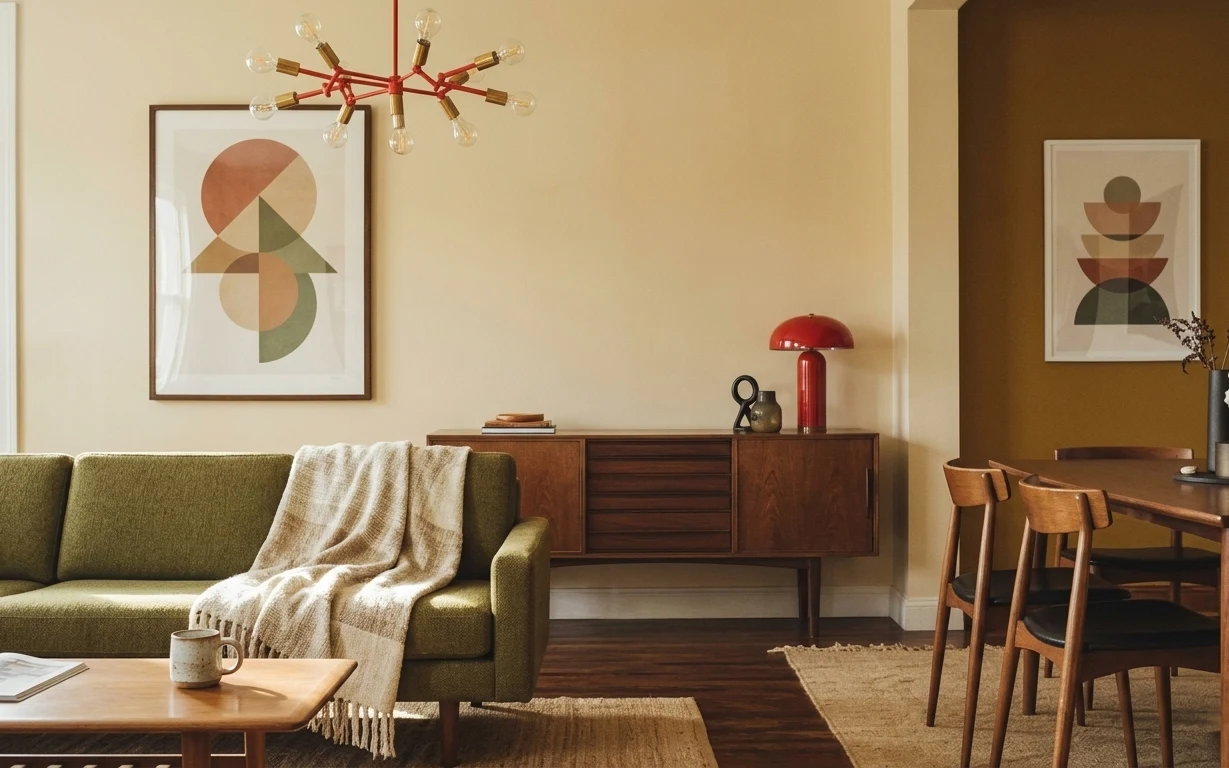
How to style a mid-century living room for $500
A move-friendly living room refresh built around warm walnut tones and olive textiles, all for $500. Seven swaps focus on rug, throw, art, …
How to refresh a living room for under $400
A renter-friendly living room refresh on a $400 budget: a jute-look rug, airy sheers, and small styling upgrades around the coffee table. T…