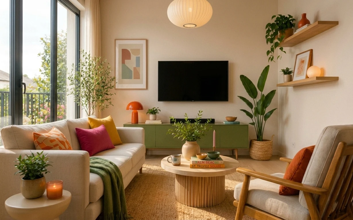
- Best for
- Shared-house living room refresh
- Time
- One weekend (about 4–6 hours)
- Total cost
- $460
- Renter-safe
- All swaps pack into boxes
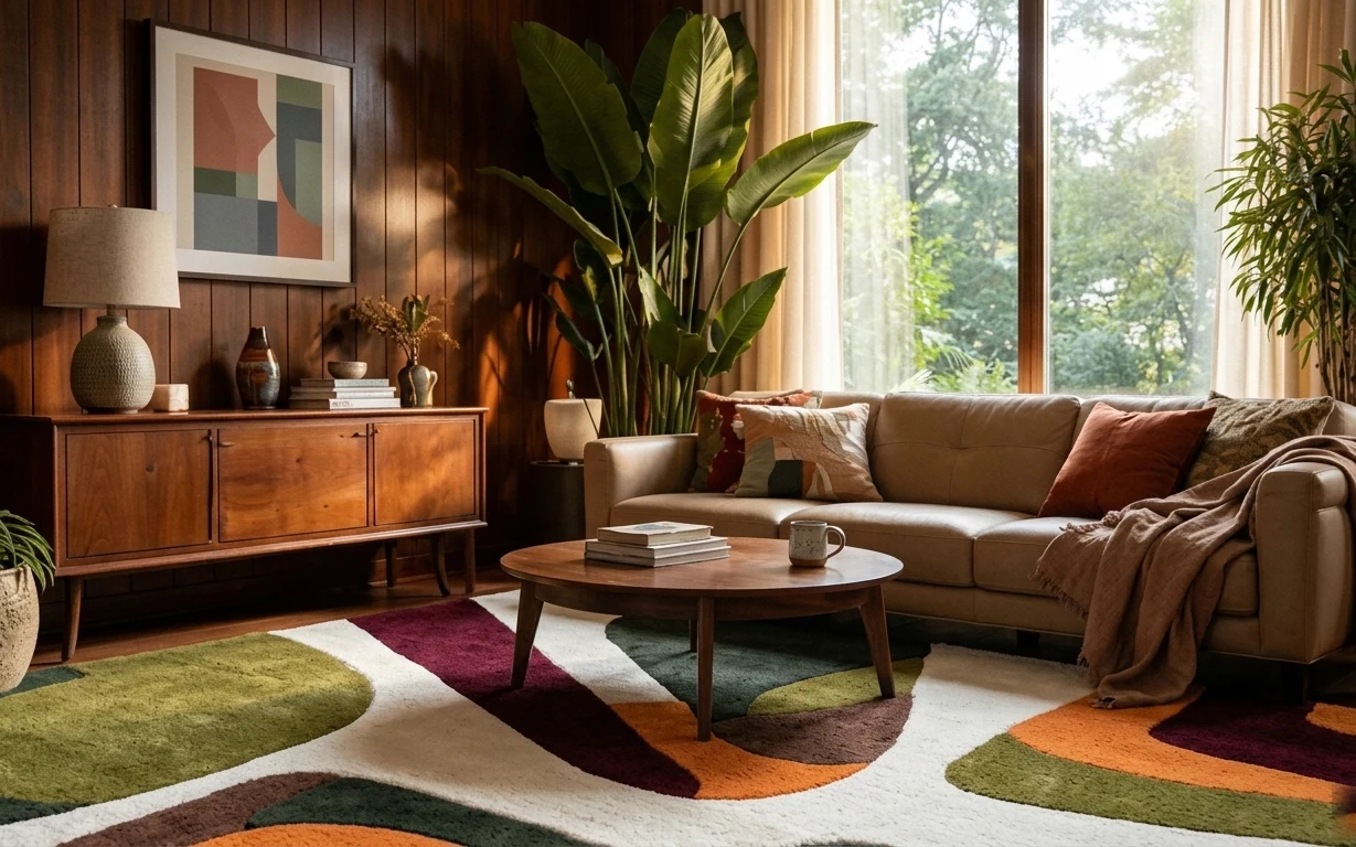
Why warm walnut-and-olive styling is the living room of 2026
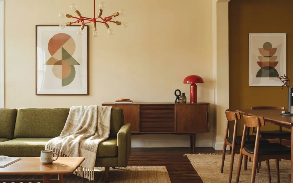
The first thing to notice here is how the textures do the heavy lifting: a jute area rug grounds the wood floor, and a light throw drapes where your eye wants to rest on that green sofa. The framed abstract print keeps the cream walls from feeling blank, while the red dome lamp gives a controlled, warm accent. That mix of matte fibers, smooth ceramic, and polished wood is straight out of the “warm minimal” pages you see in places like Domino. The best part for shared housing: every element is removable and boxable, not fixed.
I used to think “statement” meant one big expensive piece. Then I watched my own place fall flat when I bought a cool lamp but forgot the rug and the wall art scale. What changed my mind was treating the room like a set of layers: rug on the floor, art at eye level, and one warm accent lamp—so the rest can be simpler. This photo works the same way: it’s coordinated, not complicated.
Layer 1 — jute area rug ($150) textured underfoot that hides wear
A jute-style rug in a light, sandy tone brings the same laid-back texture you see under the dining side and coffee-table zone. It reads warm against wood flooring and helps the olive sofa feel intentional instead of “barely there.” The trade-off is that jute isn’t as stain-proof as synthetic runners, so the real move is to pick a size that fully captures the coffee-table footprint and use a simple blot-clean routine. Compared with a low-cost flat-weave that looks too gray in daylight, this keeps the palette earthy and creamy.
Layer for friction, not just softness
A rug that lands under the front legs of the sofa makes the whole room feel more “held” together.
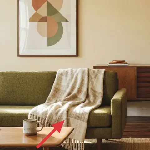
Layer 2 — light-colored throw blanket ($25) draped texture over green upholstery
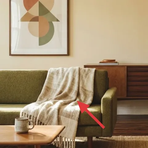
This light throw blanket works because it adds contrast without fighting the palette: it’s bright enough to lift the olive sofa, but neutral enough to keep the room from looking busy. Drape it casually over the sofa arm or seat cushion, like the photo, so the folds create dimension. The obvious alternative is a dark throw, but that would pull focus away from the wall art and the red lamp. Fabric matters here—choose something with visible weave or a soft knit so it looks styled even when you’re not.
Pick a weave you can see from across the room
When texture reads at a distance, the throw looks “designed,” not just thrown there.
Layer 3 — framed abstract art print on left wall ($80) eye-level color made to swap
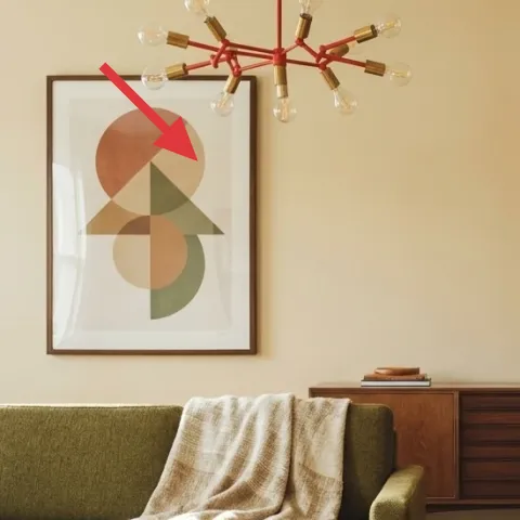
The left framed abstract art print balances the room’s warmth: its shapes and muted tones echo the cream walls and the walnut furniture without matching them too closely. Because it’s a frame, it’s renter-friendly—swap prints later when your taste shifts or when the next lease starts. The trade-off vs. hanging a large canvas is scale control: a framed print keeps the composition crisp and easy to move. This also lets the starburst pendant and the red lamp stay the “lights,” while the wall stays visual calm.
Make it instead of buying it
This DIY makes a hand-painted abstract on cardstock to slide into the same style of frame, so you get the look without paying for a ready-made print.
Materials
- Cardstock (thick) — 1 sheet — craft store — $5
- Acrylic craft paint set — 1 small set — craft store — $12
- Small sponge/foam brush — 1 pack — craft store — $8
- Painter’s tape — 1 roll — hardware store — $3
Steps
- Cut cardstock to fit the frame opening with a small, test-fit margin.
- Tape off 2–3 geometric areas for simple shapes.
- Paint each section in muted tones that echo the room (cream, rust-red, sage/olive).
- Lightly blend edges with a sponge for softer transitions.
- Let the paint dry fully, then remove tape to reveal clean lines.
- Slide the finished cardstock into the frame.
Total DIY cost: $28 — saves about $52 over buying.
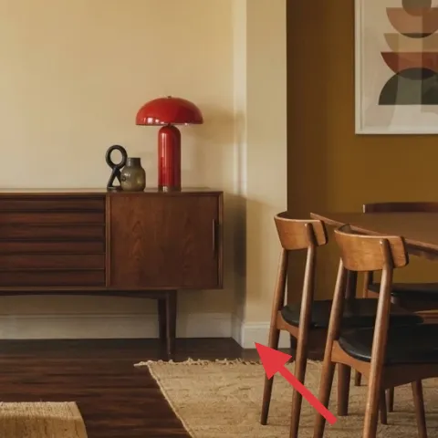
Layer 4 — red dome table lamp ($40) warm accent glow on the credenza
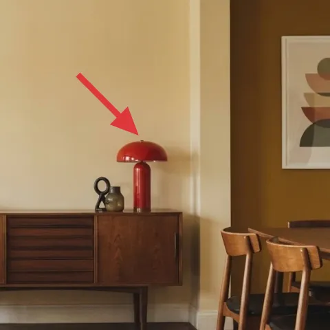
The red dome lamp is doing double duty: it adds color where the room otherwise stays neutral, and it keeps the lighting mood warm at night. On a wooden sideboard, that glossy red reads intentional—not random—because the lamp sits among small decor objects and books. A plain neutral lamp shade would be the easy alternative, but it would lose the punch the photo has when daylight fades. This is also plug-in and portable, so it packs with you. Look for a stable base so it doesn’t get knocked during shared-house chaos.
Don’t size the lamp like you’re staging a showroom
If the base is too tall for your credenza clearance, you’ll end up blocking the sightline to the dining table.
Layer 5 — vase with white flowers on right side ($30) airy contrast against walnut
A vase with white flowers adds that “fresh air” feeling the photo gets without adding more weight to the furniture. The white stems break up the warm walnut brown in a way that colored florals can’t—especially next to the red lamp and the cream wall. The trade-off is seasonal realism: fresh stems mean upkeep, so choose a simple branch arrangement (or swap in dried stems later) to keep it looking good between grocery-store runs. A ceramic vase also survives moves better than delicate glass, and it’s easy to pack flat with tissue paper.
Keep the vase height proportional to the table
If it’s too tall, it blocks conversation; too short, and it disappears.
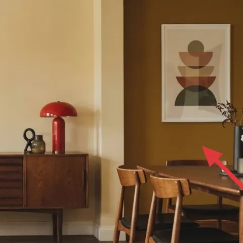
Layer 6 — small red bottle decor on dining table ($15) a tight color echo of the lamp
Small red bottle decor on the dining tabletop ties the palette together because it repeats the lamp’s color without demanding attention. It works like a visual “note” rather than a focal point, so the rest of the styling can stay calm. The obvious alternative—buying a full set of matching decor—usually looks too curated for a shared living room. Instead, this is a single object placed near a mug or small tray, which is easier to keep consistent across moves. Pick one with a slightly irregular shape so it reads handmade, not uniform.
One color repeat beats three different accents
Echoing red once keeps the room from turning into a mood board.
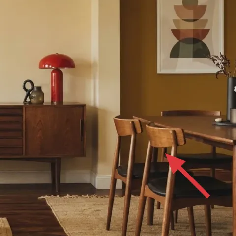
Layer 7 — wood coffee table ($120) the anchor that makes the sofa feel finished
The wood coffee table is the anchor for the whole living zone: it visually connects the green sofa to the walnut tones on the sideboard and dining table. A table with clean lines keeps the look mid-century-modern, while the warm finish supports the cream-and-olive palette. The trade-off vs. a round thrift find is practicality: a rectangular or square tabletop gives more placement options for a mug, a book, and a small decor object. If space is shared, this also helps because it “organizes” the coffee-table surface without adding shelves or installations.
Style the surface like it’s a tray, not a spill zone
Use one small grouping (mug + book + object) and leave the rest empty.
The cost, layer by layer
| Layer | Item | Cost |
|---|---|---|
| 1 | Area rug (jute look, 8×10) | $150 |
| 2 | Throw blanket (light neutral) | $25 |
| 3 | Framed abstract art print (DIY cardstock inside frame) | $80 |
| 4 | Plug-in red dome table lamp | $40 |
| 5 | Vase with white flowers | $30 |
| 6 | Small red bottle decor | $15 |
| 7 | Wood coffee table | $120 |
| Total | $460 | |
If you want a cheaper version, swap the coffee table for a $80 thrifted wood side table (same height) and choose a smaller rug that still lands under the coffee-table legs.
What worked, what didn't (across the whole room)
This look works because the palette repeats in small, intentional ways: olive seating, warm walnut wood, and one controlled red accent. The textures also do the job—rug underfoot and a draped throw soften all the hard surfaces. The only place it can fall apart is if one layer is scaled wrong (art too small, rug too tiny) or if the red objects aren’t limited to one “cluster.”
What worked
- The jute-look rug grounds the wood floor and makes the dining and living zones feel connected.
- The light throw adds contrast on the olive sofa without turning the room into a mixed-color fight.
- The framed abstract print gives the cream wall a focal point at eye level.
- The red dome lamp repeats a single accent color, keeping lighting cozy after dark.
- The vase with white stems breaks up warm browns while still feeling airy and simple.
- The small red decor object ties the dining tabletop to the lamp without cluttering the surface.
What didn't
- A rug that’s too small makes the coffee table feel floating instead of anchored to the sofa.
- Over-styling the dining tabletop can compete with the art and pendant light.
- Trying to match every decor piece in the same red tone can look costume-y fast.
- Skipping wall art leaves the room feeling unfinished even when textiles are on-point.
What we'd skip if we did it again
Skip a second big “main character” on the wall. With mid-century shape and a starburst pendant overhead, the wall already needs one clear focal point—one framed print is plenty.
Skip a tiny rug. It’s tempting to save money, but the visual payoff comes from the rug footprint: if the coffee table and sofa legs don’t sit convincingly on it, the whole room reads unsettled.
Skip matching red decor sets. The photo works because red shows up in a lamp and a small supporting object; adding three more red things pulls attention away from the green-and-walnut warmth.
Frequently asked
How long does this refresh take?
Plan for about 4–6 hours total. The rug swap and blanket styling take the least time, while framing the abstract print (or making the cardstock DIY) is the most fiddly part. If the new coffee table is involved, budget an extra hour for delivery day and leveling. The whole point is: no drilling, no curing—just replace, arrange, and style.
Can I do this if I can’t change the walls?
Yes. The framed art can be swapped in and out of the same frame type, and the tabletop + textiles do the rest of the work. You can also keep existing wall art and still follow the layer logic: rug for grounding, throw for softness, and a warm plug-in lamp for night. Those pieces are portable and don’t rely on permission from a landlord.
What if my living room is smaller than this?
Use the same palette, just shrink the footprint. Go for the smallest rug size that still fits under the coffee table and front legs of the sofa. Keep the throw blanket drape simple and avoid extra decor piles on the dining side. One framed print stays your eye anchor—multiple prints can overwhelm a tight layout.
What if my space is bigger and feels empty?
Go up one size in rug and add a second supporting object cluster on the coffee table—still only one color repeat (red, in this case). Consider a wider framed print or a second smaller frame on the opposite wall. The trade-off is keeping styling restrained: too many small items can make warm minimal look cluttered.
Where can I shop for these items differently?
Rugs and throws are easiest to shop quickly online, but coffee tables and lamps can be found cheaper in thrift stores or resale apps if you filter for the right tone (walnut or warm wood). For the framed art, buying a ready-made frame online and swapping in a DIY cardstock print can be less expensive than searching for a specific original print.
What’s the biggest mistake to avoid for this room type?
The biggest miss is scale mismatch: art that’s too small, a rug that doesn’t reach the coffee-table zone, or a lamp base that’s awkwardly tall for the credenza. When one layer is off, the entire palette feels off too. If the proportions are right, the colors can stay simple and still look intentional.
More in Living Room

How to style a mid-century living room for $500
A move-friendly living room refresh built around warm walnut tones and olive textiles, all for $500. Seven swaps focus on rug, throw, art, …
How to refresh a living room for under $400
A renter-friendly living room refresh on a $400 budget: a jute-look rug, airy sheers, and small styling upgrades around the coffee table. T…
Under $1000: warm wood-and-olive sofa seating area refresh
A warm, wood-paneled sofa seating area gets a more intentional look with a multicolor rug, layered window curtains, and a cohesive console …