
- Best for
- renter living room anchors + small styling
- Cost
- about $395 total
- Difficulty
- easy (mostly textiles + styling)
- Time
- 2–3 hours weekend refresh
Why warm japandi seating is the living room of 2026
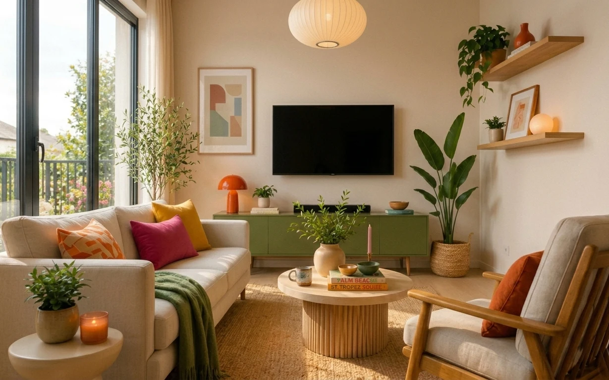
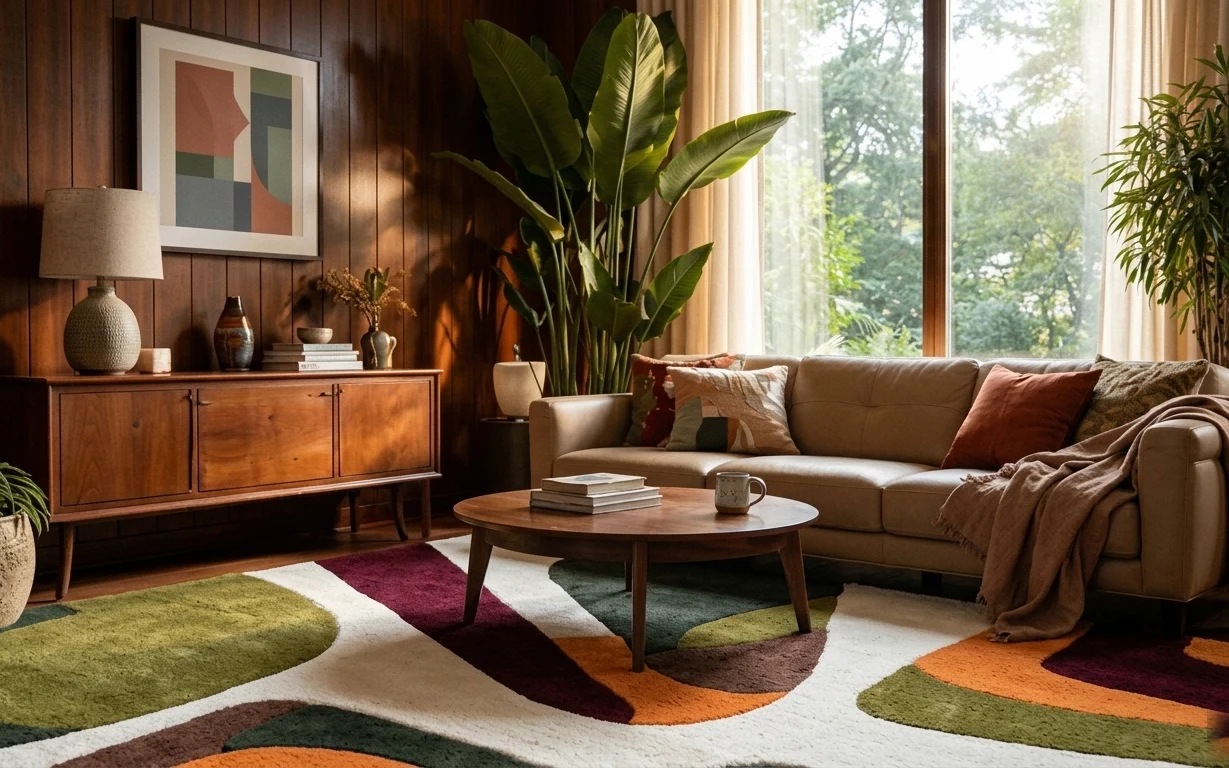
That cream-and-sage palette looks effortless, but it’s really built from simple materials doing heavy lifting. A jute-look rug grounds the wood floor, while sheer curtains keep the daylight feeling airy instead of blocked. On top of that, the green throw and the cushion stack add that “lived-in” texture without needing new furniture. This is the kind of styling you see in Danish pages and Japanese interiors at once—neutral bases, then small color accents. For renters, the beauty is that it’s all removable at move-out.
The first time I tried a japandi-style room, I overcorrected and ended up with everything matching too closely. I remember standing in front of my own coffee table thinking, “Where’s the warmth?” The change for me was adding one imperfect element at a time: a slightly imperfect throw, a candle you can actually smell, and a plant that looks happy in its pot. This room nails that balance—clean lines, but nothing sterile.
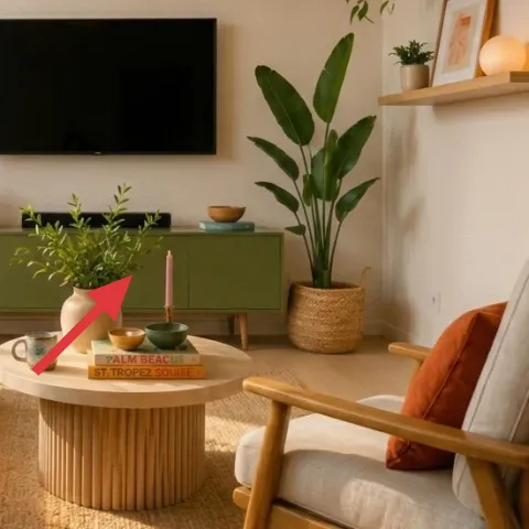
Layer 1 — jute-look area rug 5×7 ($180) jute texture that hides wear
A jute-look rug is the fastest way to make wood floors feel softer, especially in a living room where you’re doing everyday life: walking, dropping mail, and stretching out on the sofa. In the photo, the rug’s warm neutral tone keeps the cream furniture from blending into the walls, and its woven texture is what makes the space feel tactile. Choosing a 5×7 size also helps anchor the coffee table and both seating pieces without boxing the room in. The trade-off is that a rug this natural-looking needs a bit of spot care, so a low-shed, easy-clean option matters.
Ground the room first
Pick the rug tone before any pillows—jute-y neutrals are the “permission slip” for adding color later.
Layer 2 — green throw blanket on sofa ($25) adds a seasonal color pop
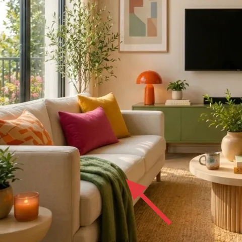
This green throw is small visually, but it’s doing a lot: it breaks up the sofa’s cream upholstery and echoes the plant life in the room. The blanket is draped rather than folded flat, which keeps the whole couch from looking overly styled. It also gives you that lived-in look without changing the furniture. The obvious alternative would be another pillow-only approach, but throw + pillows reads warmer at a glance and lets your eyes move across textures. The trade-off is that fabric gets snagged by zippers and pets, so keeping it neatly tucked when you’re leaving helps.
Match undertones, not exact colors
The green here feels slightly muted, so aim for sage or olive rather than a bright, blue-leaning green.
Layer 3 — sheer curtain panels pair ($80) keeps daylight soft and renter-safe
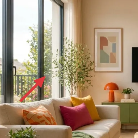
Sheers are the secret to making a room feel calm, even if the furniture is bold with color. In the hero image, the curtains filter the window light so the space stays bright without glare, and the vertical lines visually “lift” the room. Because they’re hanging textiles, renters can swap them quickly without touching the landlord’s window hardware. The trade-off is privacy: sheers alone read more open than opaque, so evening privacy comes from shades already in the space or a second layer if your lease allows it. Still, the payoff is worth it for that airy, japandi-friendly look.
Don’t hang them too low
If the sheers pool near the floor, they can make the whole room feel shorter; aim for a clean drape that grazes the sill or just below.
Layer 4 — framed wall art print above TV ($25) repeats the room’s warm geometry
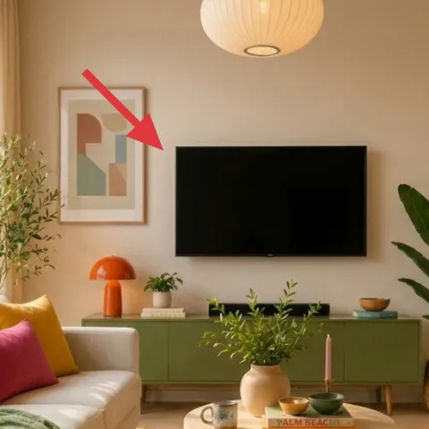
The framed print above the TV keeps the wall from feeling empty and ties the room’s color story together. The art in the image uses warm blocks and a muted palette that plays nicely with cream upholstery and sage-green accessories. For renters, framed art is also a low-commitment move: it can be placed using picture-rail hooks or Command Strips, depending on what your rental already has. The trade-off is that cheap frames can look flat, so choosing a slightly heavier frame (even if the art is modest) helps it read intentional from across the room.
Use a simple mat
A clean mat makes abstract prints look more “styled” than crowded gallery sets.
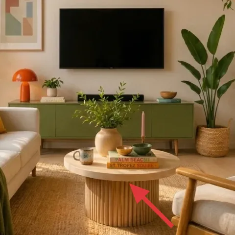
Layer 5 — ribbed coffee table tray ($20) makes small objects look curated
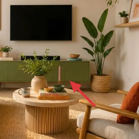
A tray on the coffee table turns a pile of small things into a single design moment. In this room, the tray’s warm, textured look matches the mid-century feel of the ribbed table and gives the candle and small decor a defined home. Without it, the coffee table tends to look like “stuff,” even when it’s pretty stuff. The tray also helps for everyday clutter: remotes, coaster rings, and little planters all feel more controlled when they live in one boundary. The trade-off is height—pick a tray that doesn’t block sightlines to the TV.
Choose one texture, not five
Here, the tray texture echoes the table’s ribs, so the rest stays mostly smooth and matte.
Layer 6 — terracotta jar candle on tray ($35) candlelight with warm earth tones
This terracotta jar candle gives the room that “evening-ready” warmth you can’t fake with bright overhead light. It’s also placed where it matters: on the coffee table, next to books and a small bowl, so it visually reads as part of the styling, not a random purchase. If there’s one thing I always do wrong, it’s going too safe with candles—plain white jars can look like an afterthought. This warm color works because it matches the room’s terracotta accents and the wood tones. The trade-off is choosing scent carefully so it doesn’t fight the plants.
Make it instead of buying it
DIY a poured candle jar in a warm terracotta tone so it matches the coffee-table styling without a trip to the fancy candle aisle.
Materials
- Soy wax flakes — about 1 lb — craft store — $12
- Wick + wick stickers — 1 set — craft store — $3
- Heat-safe glass jar — 1 medium jar — thrift or craft store — $6
- Candle dye (terracotta range) — 1 small bottle — craft store — $5
- Fragrance oil (warm, light) — 1 small bottle — craft store — $2
Steps
- Clean and dry the jar; wipe the inside so the candle surface cures smoothly.
- Press the wick sticker to the jar center and attach the wick, then trim the wick to stay centered.
- Measure wax flakes by weight and add them to a heat-safe melting vessel.
- Warm the wax gently until fully melted (stir slowly to keep texture even).
- Stir in fragrance oil, then add dye a little at a time until the terracotta shade looks right.
- Pour wax into the jar, then let it set without moving the jar.
- Once the surface is firm, let it cure fully in a cool spot until the melt pool is stable.
- Trim the wick to about 1/4 inch before styling on the tray.
Total DIY cost: $28 — saves about $7 over buying.
Layer 7 — potted floor plant in woven basket ($30) greenery that reads like architecture
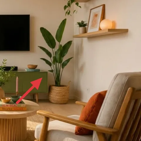
A floor plant in a woven basket gives the room instant height, which makes the seating feel more intentional and frames the wall shelves on the right. The leaves in the hero photo look full and slightly glossy, so the plant reads lively without stealing focus from the TV or art. Choosing a woven basket is a practical styling move too—its texture matches the rug and tray and makes the whole room feel consistent. The trade-off is logistics: large plants can be heavy to move, so keeping the pot size within your “can carry safely” range matters for renters. Watering schedules stay simple as long as there’s a tray underneath.
Rotate for even growth
Turn the pot a quarter turn every couple of weeks so the leaves keep a balanced silhouette.
The cost, layer by layer
| Layer | Item | Cost |
|---|---|---|
| 1 | Jute-look area rug 5×7 | $180 |
| 2 | Green throw blanket | $25 |
| 3 | Sheer curtain panels pair | $80 |
| 4 | Framed wall art print 16×20 | $25 |
| 5 | Ribbed coffee table tray | $20 |
| 6 | Terracotta jar candle | $35 |
| 7 | Potted floor plant in woven basket | $30 |
| Total | $395 | |
If the budget needs to dip, swap the rug for a smaller 5×7 in a tighter weave, choose one pillow color instead of multiple, and use thrifted jars for the candle styling while keeping the same warm terracotta palette.
What worked, what didn't (across the whole room)
The overall win here is the texture balance: woven rug, sheer light, and matte accessories keep the room from looking flat. The plant styling also helps because it adds both height and organic movement without requiring new furniture. The one area that can go wrong is color clarity—if the green or terracotta reads too bright, the calm japandi feel disappears.
What worked
- The rug’s warm weave anchors the sofa and armchair so the seating feels “set” together.
- Sheer curtains soften daylight and make the space feel brighter without glare.
- The green throw adds muted contrast that matches the plant tones instead of fighting them.
- The framed print above the TV gives the wall structure and keeps the palette cohesive.
- The tray organizes small objects, preventing coffee-table clutter from looking random.
- The terracotta candle adds evening warmth and repeats the room’s earth tones.
What didn't
- If the rug is too dark, the cream sofa can start to feel heavy and less inviting.
- Sheers that hang too low can make the room feel shorter and visually “messy.”
- Too many bright throw colors at once can erase the calm, minimal baseline.
- Skipping the tray can make stacked decor look accidental rather than curated.
- A candle with an overpowering scent can clash with the fresh plant vibe.
What we'd skip if we did it again
Skip a “matching set” approach for the coffee table items. The room works because the candle, books, bowl, and plant read like a styled moment rather than a coordinated product lineup.
Skip bright, high-saturation color swaps. Keeping the green muted (sage/olive) and the terracotta warm but not neon keeps the look calm and consistent with japandi styling.
Skip heavy, opaque window treatments. Even if privacy is needed, start with sheer panels first—then add only what’s necessary so the light stays soft and the room doesn’t feel boxed in.
Frequently asked
Is this renter-friendly if my lease doesn’t allow hooks?
Yes—most of the visible changes here are removable textiles and tabletop styling. The rug can roll up and travel with you, sheers hang on removable hardware, and the coffee-table tray and candle go into a box. For wall art, use whatever your rental already supports: picture-rail hooks (if a rail exists) or Command Strips on painted walls where permitted.
How long does the whole refresh usually take?
Expect about 2–3 hours for the core setup: rug placement, hanging sheers, and styling the sofa and coffee table. The framed print placement adds a little time depending on the wall method. The candle pour DIY adds cure time, so it’s best done the day before—or choose a prep-and-cure window and style everything around it after.
What if my living room is smaller than this one?
Go smaller without changing the logic. A 5×7 rug can still anchor a compact seating zone, and you can reduce visual bulk by using only one throw blanket color and fewer pillows. Keep the sheer curtains, because they help a smaller room feel taller. For wall art, choose one framed print instead of multiple pieces so the wall stays calm.
What if my living room is larger and feels empty?
Lean into proportion: use a larger rug size if you have the floor space, and consider adding one more plant grouping on the console or shelving. A single framed print may look too small, so choose a slightly larger size while keeping the same warm abstract palette. The tray trick still works—just scale up the tabletop arrangement so it doesn’t feel lost.
Where’s the best place to shop for the big-ticket items here?
For a jute-look rug and sheers, department stores and home goods retailers often have the easiest sizes for renters. For framed art, look for print sizes like 16×20 that fit common frames, then keep the frame finish warm (wood or warm black). Candle and tray items are easiest at thrift stores or home decor shops where you can match terracotta tones.
What’s the biggest mistake people make with this style?
They pick colors that are too saturated or too cool-toned at the same time. Japandi reads best when neutrals stay warm—cream, tan, and honeyed wood—and accents stay muted: sage green and warm terracotta rather than bright lime or cherry red. Once the palette is right, everything else (textures, plants, tray styling) becomes easier.
More in Living Room
How to refresh a living room for under $400
A renter-friendly living room refresh on a $400 budget: a jute-look rug, airy sheers, and small styling upgrades around the coffee table. T…
Under $1000: warm wood-and-olive sofa seating area refresh
A warm, wood-paneled sofa seating area gets a more intentional look with a multicolor rug, layered window curtains, and a cohesive console …
7 no-drill swaps for a plant-filled living room corner, $500
A plant-filled living room corner can look styled (not cluttered) with $500 of move-ready swaps. This plan leans on patterned rug grounding…