
- Best for
- Countertop + shelf styling in a renter kitchen
- Time
- About 60–90 minutes
- Difficulty
- Easy (no-drill swaps)
- Cost
- $300-ish refresh budget
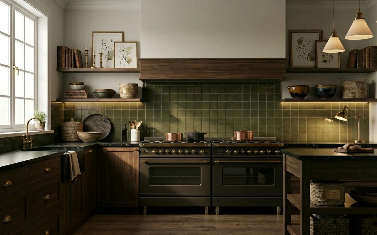
Why olive-and-copper countertop styling is the galley kitchen of 2026
What I love here is how the green tile and dark wood get softened by simple, repeated materials: copper hardware-like shine, warm ceramics, and the everyday usefulness of a dish towel. The open shelves give you “surface area” for styling—stacked books, a couple of bowls, and framed botanical prints—so the kitchen feels curated even when you’re just making coffee. With wood countertop + tile backsplash already doing the heavy lifting, renters can add texture with woven storage, ceramics, and a tighter color story without asking permission.
I almost overstyled my own kitchen after move-in—too many small objects on every shelf—then realized the counters needed breathing room. This layout works because the main props stay clustered near the range and sink, while the rest stays intentionally calm. Once I grouped the copper pieces and repeated that same palette in the framed print, everything started to look planned instead of accidental.
Layer 1 — draped dish towel in front ($30) Texture you can swap with one tug
{{LAYER_1_FIGURE}}
A draped dish towel is the quickest “done” detail in a renter kitchen because it’s functional and it reads instantly from across the galley. In the photo, the towel hangs low in front of the counter zone, adding softness against the tile backsplash and dark wood cabinets. Choosing a neutral weave (linen-like texture) matters more than the color—too-bright towels can fight the green tile. The trade-off: towels aren’t permanent styling, so the trick is to rotate them often and keep the rest of the counter styling simple.
Layer for texture, not clutter
Keep the towel as your main textile; use fewer small objects on the counter so the fabric can do the visual work.
Layer 2 — black coffee/tea kettle on counter ($35) Dark metal that anchors the palette
{{LAYER_2_FIGURE}}
The black kettle acts like a grounding line between the green tile and the copper cookware. It sits on the countertop within the range-sink corridor, so it’s visible all day long without needing extra wall decor. A dark vessel also helps your eye separate countertop items—without it, copper pieces can look “floating.” The trade-off is that black metal can show smudges faster than light finishes, but that’s part of the look: it feels lived-in rather than precious.
Repeat the “dark” once
If the kettle is the only dark piece, the rest can stay copper and ceramics without turning muddy.
Layer 3 — copper pots by the range ($60) Warm sheen in the center lane
{{LAYER_3_FIGURE}}
Copper pots give you that warm, artisan feel without needing any renovation. In the hero, they’re grouped near the range, so they read as a curated moment instead of random countertop items. The best move for renters is to treat cookware like decor: keep the set cohesive in finish and scale, and arrange them so handles don’t fight each other. Trade-off: you may need to store a couple of pieces away so the display stays intentional, not cluttered—especially in a galley where everything is seen from multiple angles.
Don’t block the work zone
If the pots sit too close to where you actually cook, the look becomes annoying fast—keep them decorative but reachable.
Layer 4 — ceramic bowls on open shelf ($35) Curved shapes soften tile and wood
{{LAYER_4_FIGURE}}
Ceramic bowls add both color and curvature, which matters in a kitchen like this where so much is straight-edged: tile grout lines and cabinet fronts. The bowls sit on the upper shelf under warm light, so their matte surfaces look calm and rich next to the darker wood. Choosing bowls with glaze variation (not perfectly matching) makes the shelf feel collected rather than staged. Trade-off: bowls are smaller than cookware, so they work best when they’re grouped in a tight cluster instead of spread out.
Use two sizes, not five
A pair of bowls plus one small accent reads “styled” while still leaving negative space for light.
Layer 5 — woven basket on floor right ($35) Woven storage that grounds everything
{{LAYER_5_FIGURE}}
A woven basket is the “quiet anchor” that makes a compact galley feel intentional. In the photo, the basket sits low on the right side, visually balancing the higher shelf styling and adding a natural texture that contrasts the tile. This is also renter-friendly: woven storage doesn’t depend on the landlord’s surfaces, and it disappears when you want a clean floor line. The trade-off is that baskets can look messy if overfilled, so keep one basket dedicated to one category (extra linens, produce, or everyday clutter).
Let the basket be the texture
If you already have copper and ceramics, keep other floor items minimal so the weave reads clearly.
Layer 6 — framed botanical print on shelf ($40) A small print that keeps the palette feeling botanical
{{LAYER_6_FIGURE}}
This framed botanical print brings the green theme full circle, but in a softer way than tile. It’s positioned on a shelf zone where you’ll naturally glance while walking the galley, so the art acts like a visual punctuation mark. Pick a print with organic line work and a light background—so it doesn’t compete with the darker wood and the busy copper sheen. Trade-off: art in a kitchen can get dusty, but the shelf placement makes it easier to wipe down than wall-hung pieces.
Choose frames you can swap easily
Using a simple frame format makes it easy to switch prints when you move or seasonalize.
Layer 7 — stacked books on upper shelf ($55) Vertical rhythm for a long, narrow sightline
{{LAYER_7_FIGURE}}
Books add height and editorial texture in a galley kitchen, where you often don’t have room for big furniture changes. In the hero, the stacked books sit along the upper shelf, and their warm spines echo the dark wood and copper tones below. The key is to keep a tight color story—earthy neutrals, olive, and brown—so they don’t become a random rainbow in a small space. Trade-off: books need occasional dusting, but they’re also useful storage, so they don’t feel like pure decor.
Stack by height, not by volume
A taller stack in one spot looks intentional; multiple stacks can make the shelf feel crowded.
The cost, layer by layer
| Layer | Item | Cost |
|---|---|---|
| 1 | draped dish towel in front | $30 |
| 2 | black coffee/tea kettle on counter | $35 |
| 3 | copper pots by the range | $60 |
| 4 | ceramic bowls on open shelf | $35 |
| 5 | woven basket on floor right | $35 |
| 6 | framed botanical print on shelf | $40 |
| 7 | stacked books on upper shelf | $55 |
| Total | $290 | |
If the framed print is the budget stretch, swap it for a set of smaller prints in matching frames you already own. Thrift-store books with similar spine colors can also replace pricier hardcovers while keeping the same warm, curated rhythm.
What worked, what didn't (across the whole room)
The overall win is how the kitchen’s existing tile and dark wood become “supporting cast” for repeat textures: copper shine, matte ceramics, and woven fiber. The styling reads intentional because most items cluster in the central sightline near the range and sink.
What worked
- The draped towel adds soft texture that balances straight tile lines and dark cabinet fronts.
- The black kettle anchors the palette so copper cookware doesn’t feel too bright.
- Grouping copper pots near the range turns cookware into purposeful decor.
- Ceramic bowls bring curvature and matte color variation to open shelves.
- The woven basket grounds the lower half of the galley so the look feels complete.
- Books create vertical rhythm along the upper shelf without taking up countertop space.
What didn't
- Overloading the counter with too many small items makes the galley feel visually narrow.
- Mixing unrelated metal finishes with copper can make the palette look accidental.
- Placing the basket too high (or too near the walkway) defeats its grounding effect.
- Frames with heavy, high-contrast artwork can compete with the tile pattern.
What we'd skip if we did it again
Skip adding extra wall-hung decor on top of already-styled shelf areas. In a galley kitchen, stacking too many “visual anchors” makes the sightline busier than it needs to be.
Skip cookware-and-decor that doesn’t share the same warm metal family. If copper is the hero, keep other shiny pieces minimal so everything reads as one story.
Skip low-shelf baskets that are overfilled. A basket is supposed to look intentional from standing height; once it’s overflowing, it stops reading as storage and starts reading as clutter.
Frequently asked
Can renters do this without changing the backsplash or cabinets?
Yes—this look relies on moveable items: countertop styling, shelf objects, textiles, framed art, and woven storage. The tile backsplash and built-in cabinetry stay as-is, and the palette is carried with copper, ceramics, and dark grounding pieces.
How long does a refresh like this usually take?
Plan for about 60–90 minutes. The fastest part is swapping in one focused dish towel and arranging the copper cookware and ceramics. The slower bit is getting shelf composition right—spacing the books, bowls, and framed botanical print so there’s breathing room between groups.
What if my galley kitchen is smaller (or has less shelf space)?
Downsize the “display footprint.” Keep one cluster per side—like copper pots on the range side and a single bowl or small framed print on the opposite shelf. In tighter layouts, fewer items with stronger repetition (same tones, same finishes) will read more intentional than adding more objects.
Where can I shop for these renter-friendly pieces?
For ceramics, woven baskets, and dish towels: thrift stores, discount home brands, and home resale shops are great. For copper-toned cookware and frames, check kitchen specialty sales and secondhand marketplaces. Books are easiest to source secondhand—choose spines that match your palette.
What’s the biggest mistake people make in a kitchen like this?
The most common miss is mixing too many finishes and tiny items at once. Copper, dark metal, and matte ceramics work because they repeat in a controlled way. When everything is different—too many colors, too many shiny metals, too many small knickknacks—the space starts to feel crowded fast.
More in Kitchen & Dining
6 renter swaps for a $300 galley kitchen refresh
A warm, green-and-copper galley kitchen look you can recreate as a renter for $300. Focus on countertop styling, a framed botanical print, …
5 weekend swaps for a $600 kitchen nook refresh
A kitchen nook refresh with curtain panels, a framed geometric print, and a patterned rug—plus small plant and countertop styling upgrades.…
Walnut-and-emerald kitchen island refresh, $600
A deep-green wall and warm walnut kitchen island make the whole space feel sharper. This weekend refresh leans on 7 specific upgrades—plus …