
- Best for
- Move-ready bedroom color + texture
- Time
- 1 weekend (about 4–6 hours)
- Total cost
- $600
- Renter-safe
- No-drill friendly swaps
Why this warm botanical palette is the move-friendly bedroom of 2026
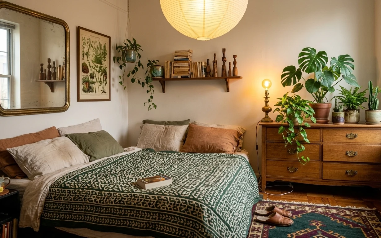
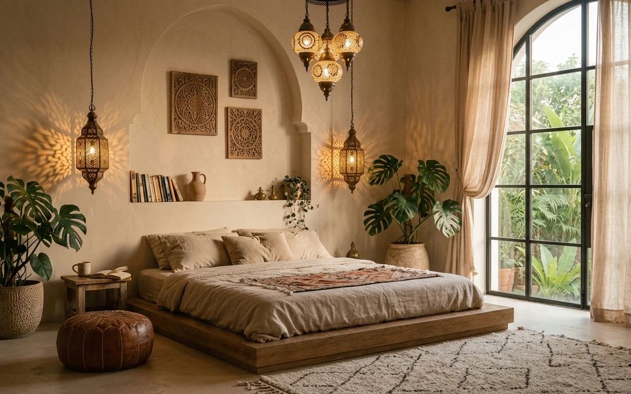
The easiest way to copy this bedroom feel is to match the textures first: that green patterned throw blanket has crisp contrast, the pillows read linen-y, and the hardwood floor keeps everything grounded. Then bring in warm light and one statement surface—here, the multicolor rug anchors the bed area like a floor “frame.” I’ve done this exact order in my own shared places: rugs first, then lighting, then wall stuff. It works in small rooms because each change reads from the doorway.
My usual mistake is trying to start with wall art, then ending up with everything else fighting the colors. I’ve learned to build the color story from what’s hardest to replace later—like the rug pattern and the tone of the throw. Once those two are set, the lamp glow and plant greens stop looking random and start feeling intentional.
Layer 1 — area rug (multicolor tribal pattern) ($200) Brings pattern underfoot
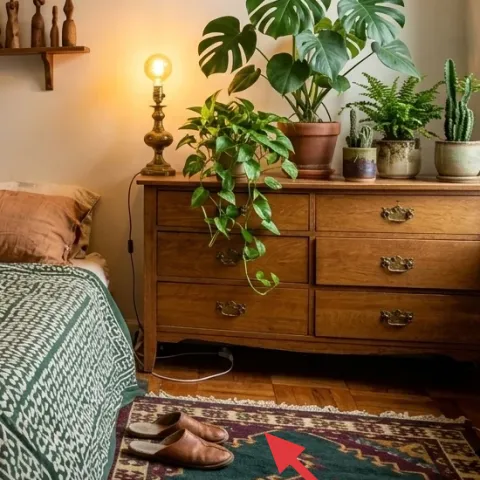
This rug is doing the heavy lifting: the tribal-style motif adds movement, and the mix of deep tones plus muted greens stops the room from feeling flat against the light walls. In a move-friendly setup, I’d rather spend on the rug than on matching “sets,” because rugs pack into a single rolled cylinder and still look good after a few scuffs. The trade-off is that a bold pattern asks for quieter bedding near it—so the throw and pillow colors stay in the same warm-olive range. If you’re sharing, this is also the piece everyone notices first when they walk in.
Anchor the bed zone
Center the rug so the front edge sits a few inches in front of the bed (not under the pillows) to keep it looking “intentional,” not accidental.
Layer 2 — green patterned throw blanket ($50) Adds crisp contrast to the bed
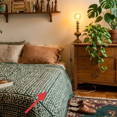
That green patterned throw reads like a graphic layer over the bed’s softer linens, which is why the whole setup looks styled even when it isn’t “perfect.” Choose one with a dark-and-light pattern (not one solid green) so the texture shows in bedroom lighting. The trade-off: patterned throws can feel busy if the rug is also loud—so keep pillow colors closer to solids or subtle weaves. I’ve found this combo works especially well in shared housing because you can re-style the same base with different throws later without re-buying the entire bed look.
Match undertones, not exact greens
Look for olive or sage undertones so the throw plays nicely with plant leaves and brass.
Layer 3 — brass table lamp ($60) Makes the warm tones read
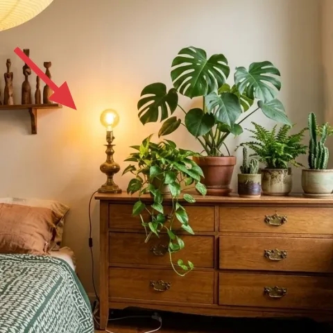
A brass table lamp turns daylight colors into that softer, honeyed glow you see in the photo. Even if you keep everything else neutral, this light source makes the room feel finished because skin tones, wood tones, and green leaves all look better under warm bulbs. The trade-off is practical: you’ll need a plug location that works at your current lease, but the lamp itself is the easiest item to move between rooms. For a renter-friendly approach, aim for a lamp that’s stable, has a washable shade if possible, and comes with a standard bulb base for easy swaps.
Don’t rely on overhead light
If your bulb is cool-white, the rug pattern and plant greens can look dull—switch to a warm temperature when you can.
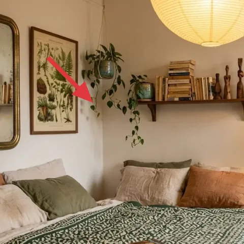
Layer 4 — monstera plant in terracotta pot ($80) Adds a tall, leafy focal point
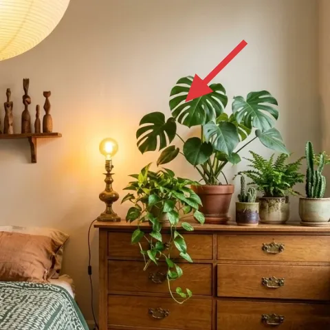
This monstera gives height and shape, which is the missing ingredient when a bedroom is mostly horizontal—bed, rug, shelves, dresser. A large leafy plant also helps your green throw and wall art feel cohesive, because you’re repeating the color in real texture (not just prints). The trade-off is care: plants take light and a quick weekly check, but they’re still fully moveable and don’t require drilling. If your next place has less light, swap to a smaller plant and keep the pot style consistent so the look stays intentional.
Use a consistent pot color
Terracotta reads warm next to brass; even different plants will feel like one styling plan.
Layer 5 — brass-framed wall mirror ($100) Makes the room feel bigger
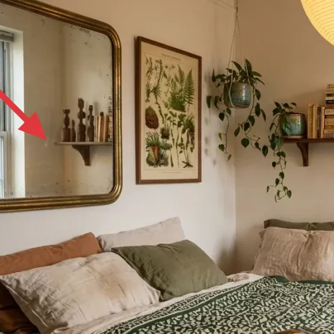
The brass-framed mirror adds brightness and warmth at eye level, which is why this bedroom looks airy even with a busy rug. Mirrors are also move-friendly: you can carry them between leases, and they don’t depend on a specific wall layout the way built-in decor does. The trade-off is safety—glass is glass—so choose a frame that feels sturdy and pack it with padding for travel. In terms of styling, place the mirror so it reflects either the lamp glow or the plant area; that keeps the “botanical” theme alive after dark.
Prefer a lean-and-style moment
If your wall is tricky, use a freestanding lean setup so you’re not committed to a permanent hanging method.
Layer 6 — framed botanical wall print ($80) Repeats the greenery theme
The framed botanical print ties the room together because it repeats the same leaf shapes and green palette you’re getting from the throw and plant. Pick a print with mixed textures (thin stems, layered leaves, and some negative space) so it doesn’t compete with the rug pattern. The trade-off: framed art is one of the trickiest items to hang without damage, so for shared housing, stick to renter-safe hanging that doesn’t pull paint—think removable, wall-safe mounting. Visually, this art works best above or near the bed so the eye moves from linens to wall detail without leaving gaps.
Keep mat colors warm
Choose cream or light tan mats to echo the room’s beige walls, not cool white.
Layer 7 — dyed pillow covers (olive + brown palette) ($30) Brings the bed’s color story to life
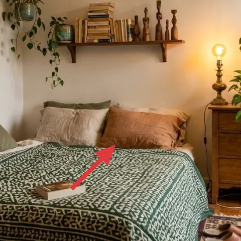
Instead of buying new pillows to match the throw and rug, dye pillow covers so the tones land in the same olive-and-warm-brown family. This is the kind of change that reads instantly—your bed looks more “curated,” even when everything else is the same. The trade-off is unpredictability: dye can run a little lighter or darker than the package suggests, so it’s smartest to start with a test scrap and aim for natural fibers. Done right, you get multiple near-matching pillows from one dye plan, which is perfect for shared housing where your layout changes every year or two.
Make it instead of buying it
Use fabric dye to tint off-white or beige pillow covers toward olive and warm brown, matching the room’s plant-and-throw palette without replacing the whole bedding setup.
Materials
- Fabric dye — 1 kit — craft store — $12
- Plastic gloves — 1 pair — hardware or grocery — $6
- Salt — 1 box — grocery — $5
- Drop cloth or plastic bag — 1 — home goods — $5
Steps
- Pre-wet the pillow cover so the dye spreads evenly.
- Stir dye concentrate in a bucket following the kit instructions.
- Submerge and agitate the cover so color doesn’t pool in one spot.
- Add salt if your kit calls for it, then continue soaking for the recommended time.
- Rinse in cool water until it runs clear.
- Air-dry completely, then fluff and put the cover back on.
Total DIY cost: $28 — saves about $2 over buying.
The cost, layer by layer
| Layer | Item | Cost |
|---|---|---|
| 1 | Area rug 5×7 (tribal-style pattern) | $200 |
| 2 | Green patterned throw blanket | $50 |
| 3 | Plug-in table lamp (brass finish) | $60 |
| 4 | Indoor plant (monstera, terracotta pot) | $80 |
| 5 | Mirror (brass-framed, medium size) | $100 |
| 6 | Framed botanical wall print | $80 |
| 7 | Dyed pillow covers (retail equivalent) | $30 |
| Total | $600 | |
If you want a cheaper version, pick a smaller rug with a calmer pattern and save the budget for lighting and the plant. You can also choose an unframed botanical print and swap to a simple frame that matches the mirror’s warmth.
What worked, what didn't (across the whole room)
The biggest win was building the palette around the rug and the green throw, then reinforcing it with warm lamp light and real plant texture. Wall decor helped, but only after the bed looked right—otherwise it felt like everything was shouting at once.
What worked
- The multicolor rug anchors the bed area and keeps the white walls from feeling empty.
- The green patterned throw adds contrast against linen pillows without needing new furniture.
- Warm lamp glow makes brass details look cohesive instead of yellow.
- The monstera brings vertical balance, so shelves and the bed don’t compete visually.
- The brass mirror spreads light and helps the plants feel like part of the same scene.
- Botanical prints repeat leaf shapes, so the room reads intentional from every angle.
What didn't
- Cool-white bulbs flatten the rug’s colors and make the greens look less natural.
- Matching too many “green shades” at once can make the bed feel chaotic.
- Hanging art first leads to a mismatch, because rug-and-throw tones should set the baseline.
- Skipping a tall element (like a large plant) makes the wall-to-bed ratio feel top-heavy.
What we'd skip if we did it again
Skip buying a full matching bedding set. In shared housing, you’re stuck with the whole look even when your next room layout changes, and coordinating everything usually costs more than one strong throw plus a couple of dyed pillow covers.
Skip cool-white lighting. A warm bulb is what turns brass and terracotta into that honeyed tone, and without it, the room can look flat no matter how carefully you match colors.
Skip risky wall hanging. Start with renter-safe mounting or choose pieces that can lean or sit on furniture, so you don’t end up repainting, patching, or losing time during move-out week.
Frequently asked
How long does this bedroom refresh take in shared housing?
Plan for one weekend if you’re starting from mostly neutral bedding. The rug and throw are fast wins, then the lighting and plant placement take another stretch of time to get “line of sight” right from the door. Wall decor is the final step—especially framed prints—so set aside time to choose renter-safe mounting. Total time is usually 4–6 hours.
What if I’m not allowed to change anything on the walls?
You can still get most of the look without mounting anything. Use freestanding styling: lean the brass-framed mirror, place the framed botanical print on a console or stacked books against the wall, and rely on the rug + throw + lamp to carry color. Plants can stay where they are on shelves or the dresser. When you do move, the mirror and framed print go with you.
Will this work if my bedroom is smaller?
Yes—just scale the rug and keep the lighting compact. In a smaller room, a 5×7 rug is easier to center under the bed than larger sizes that can feel overwhelming. Choose a narrower bedside table or use the existing small bedside table. For wall art, one larger framed botanical print tends to read cleaner than several small pieces.
Where should I shop for these exact pieces?
Start with the rug and throw first because the pattern and undertone guide everything else. Rugs and throws are widely available at big-box home stores and online marketplaces, while brass-finish plug-in lamps and framed botanical prints are also easy to find in thrift, resale, and home retailers. For plants, buy from a local nursery so the monstera looks healthy and doesn’t shed leaves immediately.
What’s the biggest mistake to avoid in this style?
The biggest mistake is matching by “color name” instead of undertone. Green can look totally different under warm lamp light, and matching “forest green” to “sage green” usually ends up looking off. Aim for olive/sage undertones in the throw and dye. Then let the rug’s pattern set the pace so the wall art doesn’t feel like it’s coming from a different palette.
Is the dyed pillow cover DIY worth it?
It’s worth it when you already have a couple of covers or can find inexpensive off-white pillow covers. Dye is most successful with natural-fiber fabrics, and it’s best done in a controlled workspace so the color goes evenly. Even with slight variation, the goal is a coordinated olive-and-brown story, not an exact brand-new match.
More in Bedroom
7 move-ready bedroom swaps for a $600 refresh
A botanical, earthy-bedroom look that still packs up: rug, patterned throw, warm brass lamp, and plant styling—plus renter-safe wall decor.…
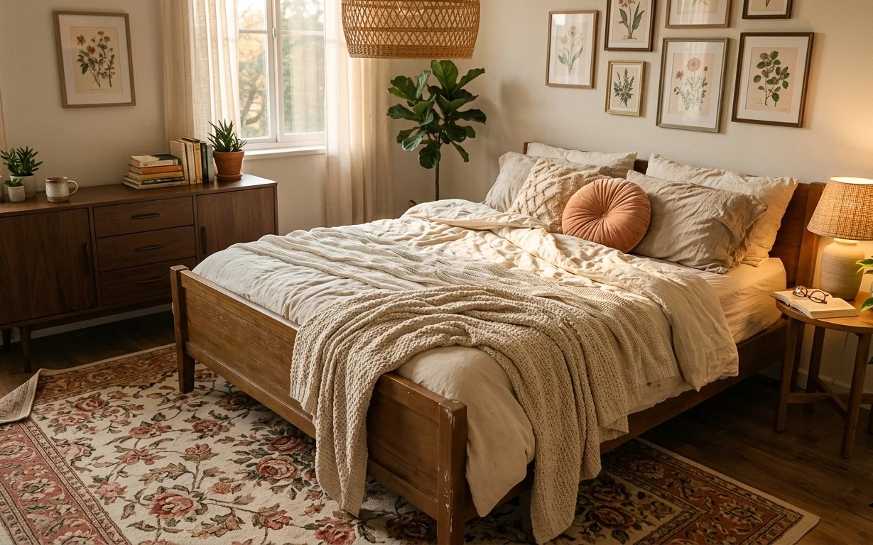
A calmer sunlit bedroom with earthy neutrals for $1500
A sunlit bedroom refresh that leans into warm brass, cream curtains, and textured neutrals—built around seven visible changes. With a $1,50…
6 renter-friendly ways to style a bed nook for $400
Warm walnut-and-cream bed nook, styled with no-drill swaps you can pack up when your lease ends. For about $400, this refresh layers a vint…