
- Best for
- Warm, cabin-style bedroom refresh
- Time
- One weekend (art + shopping)
- Total cost
- $539 for 7 layers
- Renter-safe
- Yes—no drilling, no permanent changes
Why terracotta-and-olive textiles is the wood-paneled cabin bedroom of 2026
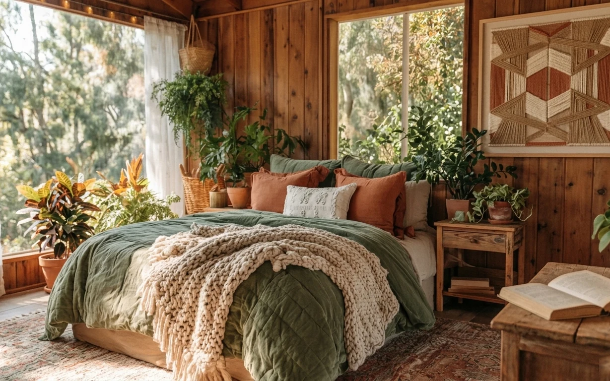
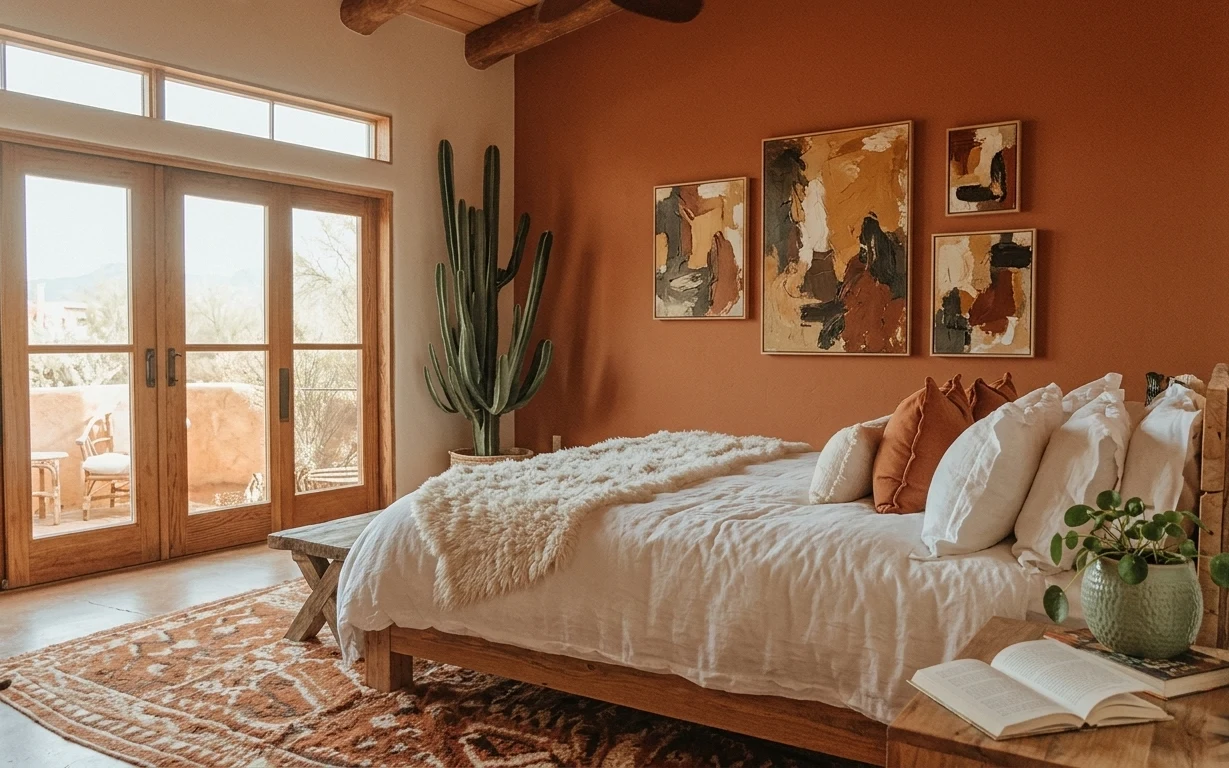
Golden-hour light makes the palette read warm even before any styling decisions: olive green, cream, and honeyed wood. The bed’s layers do the heavy lifting—quilted texture under a chunky cream knit throw—so it feels styled without needing bold wall changes. Outside the window, greenery echoes the plant-filled corners, while white sheer curtains soften the whole scene. For renters, this is achievable because the biggest “style moves” are bedding, rugs, and freestanding furniture that leave cleanly when the lease ends.
I used to think “wood cabin” decor meant committing to expensive furniture and a big wall moment. Then I noticed how this look works when the softness comes first: the rug texture and knit throw make the room feel finished even if the walls stay the same. The second shift was choosing one main color (olive) and repeating it in textiles instead of scattering lots of small accents.
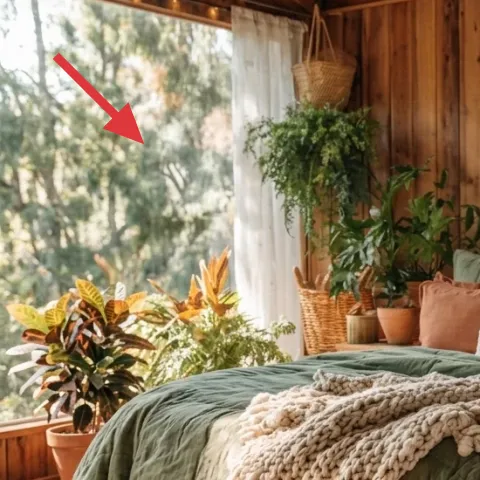
Layer 1 — earth-tone area rug (woven pattern) ($200) Anchors the whole bed zone
A patterned earth-tone rug puts the bed on the same visual “stage” as the wood-paneled walls and windows. In the photo, the rug’s warm pattern reads like rustic fibers rather than flat color, which is what keeps an otherwise simple layout from feeling empty. The obvious alternative—skipping the rug or going for a plain runner—would make the floor feel unfinished and less intentional under all that layered bedding. This rug also helps absorb sound in a bedroom, which matters if the room feels echoey. Pick a size that sits under the bed edge so it frames the whole scene.
Layer it so the rug actually “meets” the bed
Let the rug extend past the bed foot so you’re not visually cutting the bed off at the ankles.
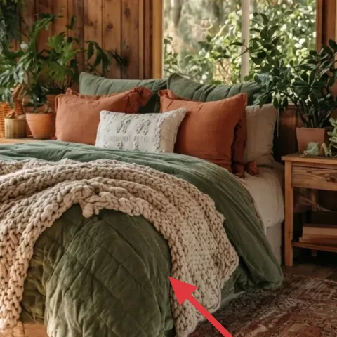
Layer 2 — green quilted bed cover ($90) Sets the olive base
The green quilted bed cover is the color and texture baseline: it gives that cabin coziness without needing matching furniture. In the hero image, the quilting catches light differently across the folds, so the bed reads dimensional even from a distance. If you went with a smooth duvet cover instead, you’d lose that subtle “handmade” effect and the whole setup would look flatter. This is a renter-friendly win too: you can swap covers on move-in day and remove everything with zero tools. Choose a medium olive that leans earthy, not neon.
Quilted beats flat when you can’t repaint
Texture does the work walls can’t change in a rental.
Layer 3 — cream knit throw blanket ($45) Adds the chunky, cozy contrast
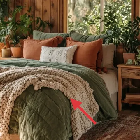
The cream knit throw is what makes the bed look layered on purpose. That chunky weave creates a raised rim over the green cover, and it visually “connects” the lighter tones in the room—cream pillows and the bright sheer curtains. The trade-off is choosing a knit that won’t tangle, because the throw is draped and handled. Compared to a faux-fur throw, this knit reads more natural and works better with rustic wood and plants. Drape it so it covers the front edge but still shows the green quilt underneath.
Drape, don’t tuck
Let the knit spill over the bed’s front for that relaxed, styled look.
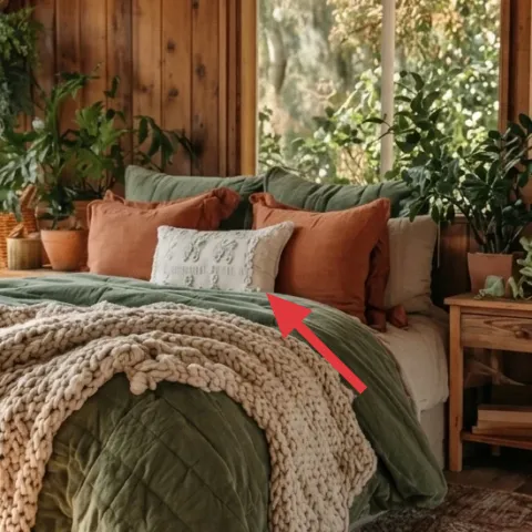
Layer 4 — decorative pillows (brown and sage tones) ($24) Builds depth without clutter
The decorative pillows bring warmth through muted brown and a sage-adjacent tone, keeping the bed from looking like one single green slab. In the photo, they’re clustered behind the main throw, so they frame the quilted cover instead of competing with it. A simple alternative—two matching pillows in one color—would be easier, but it wouldn’t create that gentle gradient from cream to olive to clay-brown. Here, the best move is picking covers that feel similar in fiber (linen-like or soft woven) so they look cohesive even when the colors vary.
Avoid bright colors against wood-paneled walls
If the pillows skew too saturated, they’ll look pasted onto the warm cabin palette.
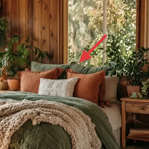
Layer 5 — white sheer curtains ($70) Softens the window light
White sheer curtains make the room feel airy while still giving privacy and softness near the window. In the hero image, they’re not heavy drapes—they’re sheer enough to keep the trees outside glowing, which helps the plants and wood tones feel connected. The obvious alternative is thicker blackout curtains, but those would mute the golden light that gives the whole look its warmth. For renters, a curtain panel pair is also an easy swap: choose a rod-friendly style that hangs without altering walls. Go for crisp white or warm ivory sheers so they don’t read cool against honeyed wood.
Keep the sheer line tall and light
Hanging closer to the ceiling makes the window feel larger and keeps the cabin vibe from shrinking the space.
Layer 6 — bedside table (light wood) ($50) Creates a plant-friendly staging surface
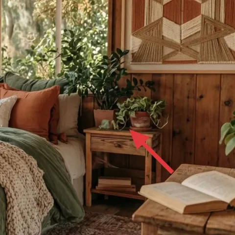
The light wood bedside table acts like a small display pedestal for the book and the potted greenery. That matters because the bedroom’s “style” isn’t just textiles—it’s also the little objects at eye level. A taller nightstand would pull the eye upward too much, and skipping a surface entirely would mean plants and books feel scattered. With this table, the top area becomes a tidy zone for one plant and one book, while the warm finish echoes the paneled wall. Choose a compact scale so it doesn’t overwhelm the bed footprint.
Style with one plant and one purpose
One small pot plus an open book reads calm, not crowded.
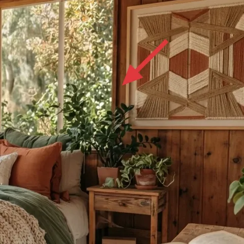
Layer 7 — framed geometric wall art ($60) Adds the final cabin-pattern note
Make it instead of buying it
DIY a framed hand-painted abstract on cardstock to mimic the framed geometric vibe without needing landlord permission.
Materials
- Cardstock, 2 sheets (letter/A4 size) — craft store — $8
- Acrylic paint set (earthy neutrals) — craft store — $12
- Simple frame (fits your cardstock) — thrift store/discount — $25
Steps
- Cut the cardstock to fit inside the frame’s backing area.
- Lightly sketch a loose geometric layout (triangles or blocky panels) with a pencil.
- Paint 2–3 shapes in warm neutrals, letting edges touch for a “panel” effect.
- Paint one accent shape in terracotta-brown or olive-adjacent green for harmony with the bed.
- Let the paint dry fully, then add any tiny line details for contrast.
- Slide the artwork into the frame and hang using removable hooks that match the wall surface.
Total DIY cost: $45 — saves about $15 over buying.
Framed geometric wall art completes the cabin feel without asking you to rework any fixed surfaces. In the hero image, the artwork sits high on the paneled wall, where it adds a graphic “pattern layer” that matches the texture on the bed. The DIY approach keeps the look budget-friendly and move-ready: replace it with something smaller when the lease ends. The trade-off versus a printed gallery piece is time—painting takes an afternoon—but the upside is you can match the colors (olive, cream, warm terracotta) exactly to the textiles already in the room.
Match the art’s warmth to the bed
Pick 1 olive or terracotta tone so the wall and bedding feel like one story.
The cost, layer by layer
| Layer | Item | Cost |
|---|---|---|
| 1 | Earth-tone area rug (woven pattern) | $200 |
| 2 | Green quilted bed cover | $90 |
| 3 | Cream knit throw blanket | $45 |
| 4 | Decorative pillow covers (brown + sage tones) | $24 |
| 5 | White sheer curtains (panel pair) | $70 |
| 6 | Light wood bedside table | $50 |
| 7 | Framed geometric wall art (DIY equivalent) | $60 |
| Total | $539 | |
A cheaper variant keeps the same structure: choose an 5×7 rug (instead of a larger woven look), go with a solid-olive quilted cover instead of a premium one, and swap in a thrifted frame for the DIY art.
What worked, what didn't (across the whole room)
The layout succeeds because texture repeats: quilted green, chunky cream knit, and the warm rug pattern all share the same cozy “handmade” energy. The biggest win is also move-proof—none of these choices require wall changes.
What worked
- The earth-tone rug grounds the bed and makes the wood-paneled walls feel intentional, not accidental.
- The olive quilted cover adds depth through quilting, even when the palette stays limited.
- The cream knit throw creates contrast at the bed edge so it reads styled from across the room.
- Muted pillow tones prevent the bed from looking monochrome while staying calm with warm wood.
- White sheers keep the window light soft, so plants and greenery don’t feel harsh.
- A compact bedside table creates a tidy staging surface for one plant and one reading moment.
What didn't
- If the throw is too thin, the bed loses the cozy front “frame” effect shown in the hero.
- Thick, blackout curtains fight the golden-hour look and make the whole room feel darker.
- Choosing bright decorative pillows adds visual noise against warm paneling and plants.
- Skipping wall art would leave a patterned gap high above the bed, especially with a simple paneled wall.
- An overly large nightstand would crowd the bed zone and make the reading surface feel cluttered.
What we'd skip if we did it again
Skip thick drapes and go for sheer curtains with a warm white tone. In this kind of wood-paneled bedroom, the light is part of the decor—sheers preserve it while still softening sightlines. Blackouts may be useful for sleep, but they flatten the “cabin glow” that makes plants and bedding look richer.
Skip a single-texture bedding setup. A one-layer duvet tends to look flat against the quilting and chunky knit look in the hero. Instead, keep the green quilted cover as the base and add the cream knit throw for contrast at the bed edge.
Skip matching sets that force everything to look identical. The hero works because the tones (olive, cream, clay-brown) stay consistent, but the textures vary. That mix feels lived-in, and it also makes it easier to replace one item later when the lease renews.
Frequently asked
Can I get this look in a smaller bedroom?
Yes—keep the same texture formula, just scale the rug and bedside items down. A smaller area rug is fine as long as it still sits under the bed’s front edge. If the room feels tight, choose a lower bedside table and style it with one pot plus one object (book or tray) so the surface doesn’t crowd your walking path.
What if my bedroom is bigger—should I upgrade anything?
Bigger rooms can handle a larger rug and a slightly wider curtain panel set. The goal is maintaining the “bed zone” boundary—rug underneath and throw spilling over the front edge. For wall art, consider a larger frame or two smaller pieces, but keep them in the same warm neutrals so the palette stays cohesive.
How long does the DIY framed art take?
Plan on about 1–2 hours of making plus drying time, depending on your paint thickness. The frame choice is the shortcut: thrift a simple frame, cut cardstock to size, then paint a loose geometric layout. Because it’s cardstock, you can swap it out later without dealing with bulky materials.
Where should I shop for these renter-friendly swaps?
Look for bedding and throws at big-box home stores and discount retailers, then hunt the rug and bedside table at resale shops or outlet locations. Curtains are easiest to buy in pairs so you get consistent height. For wall art, a thrift frame plus affordable acrylic paint keeps the DIY cost under retail while matching your olive-and-cream palette.
What’s the biggest mistake people make with cabin-style bedrooms?
Overdoing bright colors or mixing too many different textures at once. The hero keeps a tight palette—olive, cream, and warm wood—and repeats it across the bed, rug, and wall art. If everything is different, the room turns busy instead of cozy. Pick one main color for textiles and one warmth note for accents.
More in Bedroom
7 renter-friendly swaps for a $600 wood-paneled cabin bedroom
A move-ready bedroom refresh for a wood-paneled cabin look, built with renter-safe swaps. With a $600 budget, the biggest wins are an earth…
7 rental-friendly bedroom swaps for a $600 refresh
A move-friendly bedroom refresh for renters under $600, built from 7 specific swaps visible in the photo. Focus: a patterned rug, warm beds…
Under $500: move-friendly bedroom refresh with warm art + textiles
A move-friendly bedroom refresh for shared housing built around a patterned rug, cozy cream throw, and warm terracotta accents. This plan k…