- Best for
- renter-friendly bathroom vanity styling
- Cost
- about $400 total (most items pack away)
- Time
- one weekend afternoon
- Renter-safe
- yes—no drilling, no fixture swaps
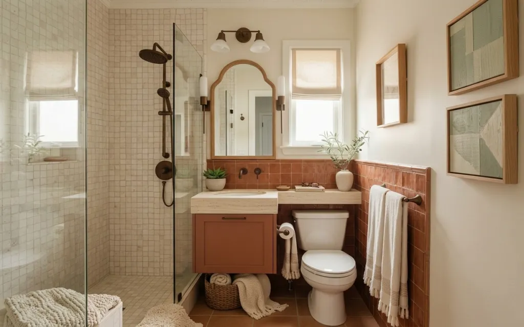
Why warm terracotta-and-cream details are the bathroom vanity nook of 2026
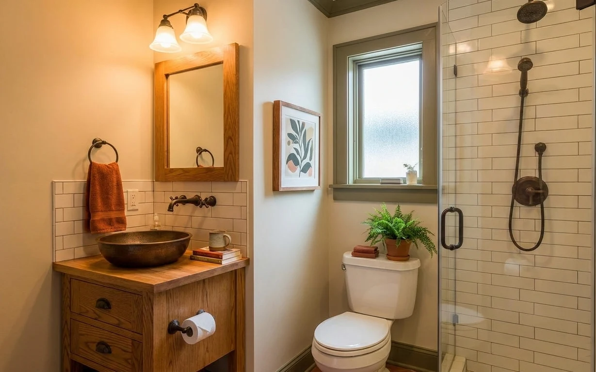
The fastest way to get a room like this is to respect the materials already there: the tile’s warm tone, the wood-look vanity cabinet, and the arched mirror’s framing. Then you soften everything with one plush texture underfoot (the beige bath mat), plus a couple of lived-in shapes: a woven basket and two small potted plants. Finally, the wall art on the right brings in that “collected” feeling, instead of leaving the space flat. For renters, that mix is doable because every change packs up at move-out.
I used to think bathrooms needed one big statement—usually a matching set of towels and a bold print. But in practice, that often makes things look busy beside all the hard edges of tile. What changed my mind was noticing how the small choices here repeat: same warm palette, same height variation, and the jars get to look intentional instead of accidental. When the details echo each other, the whole nook feels designed, even on a modest budget.
Layer 1 — beige bath mat ($80) softens the tile at your feet
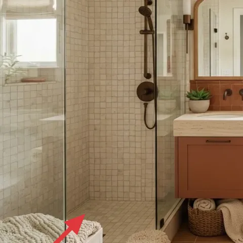
A bath mat in a light beige reads like a “pause” button between the tile and the vanity zone. In the photo, it sits right where you’d step in and out, so it does more than decoration—it absorbs visual noise from the hard floor. The trade-off: you’ll want to pick something with a low-profile look so it doesn’t bunch up next to the tile grout lines. If the rest of the bathroom is terracotta and warm white, a neutral bath mat is the safer alternative to a high-contrast color that could fight the tile.
Anchor the palette with one neutral textile
Choose a beige that matches the bathroom’s warm undertone, so the mat doesn’t look “added-on” against the tile.
Layer 2 — woven basket on bathroom floor ($40) gives texture where towels disappear
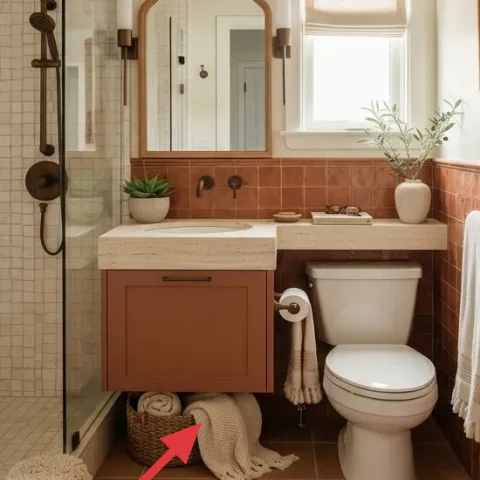
This woven basket is doing double duty: it creates a natural, rounded silhouette and it quietly holds the everyday stuff that usually clutters a bathroom floor. In the hero, it’s tucked between the vanity zone and the toilet area, so it feels like part of the layout instead of a random accessory. I like baskets better than plastic bins here because the weave picks up the room’s warm materials without adding shine. The trade-off is keeping it dusted—woven texture shows dust sooner than smooth storage.
Keep it low enough to stay “grounded”
Place baskets on the floor with a gentle shape—too tall can make the nook feel visually heavier.
Layer 3 — small potted plant on left side of vanity ($25) adds calm height to the counter
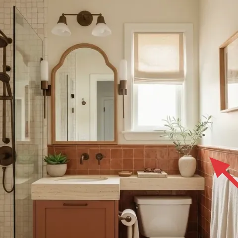
A small potted plant on the left side of the vanity makes the countertop feel lived-in without making it look crowded. The leaf shape is airy, so it softens the straight lines of the mirror and the tidy edges of the tile behind. I’d go for a compact plant like this rather than a tall floor plant because the bathroom is already visually “vertical” from the shower glass and mirror. The trade-off is water and light: choose something that tolerates typical bathroom light, and keep it rotated so it doesn’t lean.
Match the plant scale to the counter
Pick a plant that sits on the countertop comfortably—short enough to avoid blocking the arched mirror line.
Layer 4 — small potted plant on right side of vanity ($25) balances the mirror and wall art
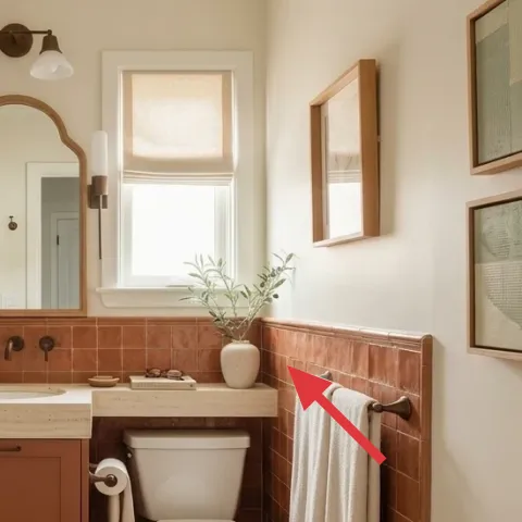
Putting a second small plant on the right side creates the symmetry your eye expects from an arched mirror. It also keeps the right wall styling from looking disconnected: the plants echo the warm natural vibe of the framed art. The trade-off is that two plants mean two spots to wipe down, especially around watering. Still, the payoff is worth it because the bathroom shifts from “clean but flat” to “clean and curated” fast. If only one plant fits, the alternative is using a single plant and leaning more on the wall art.
Repeat one motif for instant cohesion
Two matching plant textures are easier than trying to coordinate five different accents.
Layer 5 — small countertop jars ($25) makes the everyday look collectible
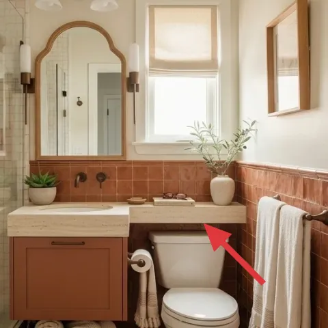
These small jars on the countertop are where the bathroom can look intentional without any fixture changes. Jars give you a place to bundle small items, and their neutral shapes match the warm tones already in the tile and vanity cabinet. The key here is styling: the jars should look “set” rather than random containers, which is why labels matter. The trade-off is that you’ll need to keep the labels readable—sticky-on labels can peel if they get wet, so let the countertop dry after wiping.
Make it instead of buying it
This DIY adds apothecary-style labels to the small countertop jars so they look curated without replacing anything in the bathroom.
Materials
- Printable label sheets (sticker paper or label paper) — 1 pack — store stationery aisle — $6
- Printer-friendly paper or cardstock for testing — 1 sheet set — craft store — $4
- Clear tape (for extra sealing if needed) — 1 roll — office store — $5
- Fine-tip marker or printer ink (if hand-touching) — 1 set — craft store — $3
Steps
- Choose the jar text layout (jar name + small note) and pick a simple serif-style font.
- Print one test label on regular paper and tape it temporarily to a jar to check spacing.
- Print final labels on sticker sheets, then trim with a sharp pair of scissors for clean edges.
- Wipe the outside of each jar so the label sticks evenly, especially around corners.
- Apply the labels starting from one edge, smoothing as you go to avoid bubbles.
- Seal only if you need to (a light clear-tape edge, not full coverage), then let it set flat.
Total DIY cost: $18 — saves about $7 over buying.
Layer 6 — wood-framed wall art (top right) ($80) brings warmth to the tile backdrop
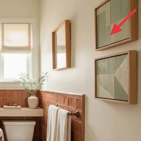
The wood-framed wall art on the right wall is what keeps the bathroom from feeling like a showroom of tile and fixtures. Because the room already has warm beige and terracotta tones, you want the art to echo that “natural” direction—wood framing does that instantly. The trade-off with framed art is that you may need to measure height carefully so it doesn’t feel too high beside the mirror. In a bathroom, a wall piece also has an advantage over accessories: it makes the space feel finished even when the counter is clutter-free.
Don’t over-saturate the color story
When tile is already busy, go for warm, muted tones in framed art instead of bright primaries.
Layer 7 — hand towel hanging on right wall ($30) adds a soft, repeatable color accent
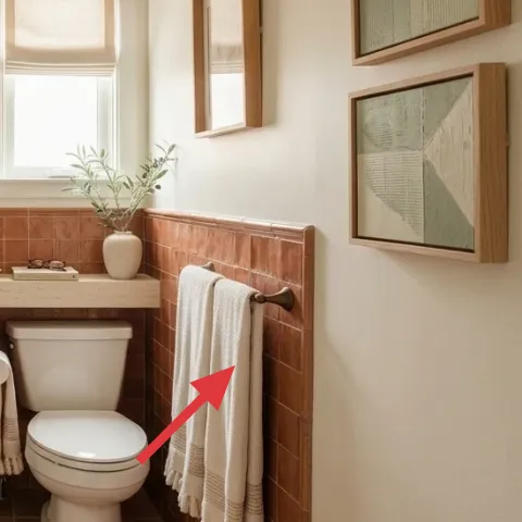
A hand towel hanging on the right wall is small, but it’s high-visibility—so it becomes a quiet pattern in the room every day you walk through. In the photo, the towel’s light neutral color reads like a continuation of the bath mat, which makes everything feel more cohesive. I like towels more than decorative baskets here because they’re functional and they look styled without effort. The trade-off is swapping out towels more often than you think; once they look flat or dingy, the warmth disappears fast. A lighter towel color is the safest choice with terracotta-toned surfaces.
Coordinate towels by undertone, not by exact shade
Keep the warmth consistent (cream/beige), and you’ll avoid the “too matchy” look.
The cost, layer by layer
| Layer | Item | Cost |
|---|---|---|
| 1 | Area rug (5×7) in neutral beige used as a bath mat | $80 |
| 2 | Woven basket for bathroom storage | $40 |
| 3 | Small potted plant for countertop | $25 |
| 4 | Small potted plant for countertop | $25 |
| 5 | Small countertop jars with apothecary-style labels | $25 |
| 6 | Wood-framed wall art print for bathroom wall | $80 |
| 7 | Hand towel (neutral) for wall hanging | $30 |
| Total | $305 | |
If this budget needs to drop, start with one plant and one framed piece, then switch the bath mat to a lower-cost textured option with the same beige tone.
What worked, what didn't (across the whole room)
The biggest win here is how the warm palette repeats across different materials: beige textile underfoot, woven storage texture, and wood-framed wall art. Plants and jars add “soft organization” on the vanity, so the room looks cared for even when the counter is functional. The only thing that can go wrong is overdoing the color—tile already has movement, so accessories can’t be too loud.
What worked
- The beige bath mat makes the tile look softer and reduces the stark contrast by the vanity.
- The woven basket adds texture that feels natural beside the wood-look vanity cabinet.
- Two small potted plants balance the arched mirror and keep the countertop from feeling bare.
- Wood-framed wall art warms up the right wall instead of leaving it visually flat.
- Small countertop jars look intentional once they match the room’s warm, collected style.
- A neutral hand towel adds a daily color repeat that reads as design, not clutter.
What didn't
- If the bath mat is too low-contrast (cool gray or bright white), it clashes with terracotta tones.
- Big plants can crowd the counter and block the mirror line, especially in a compact vanity nook.
- Matching everything too closely (same exact fabric shade + same plant) can make the room feel staged.
- Framed art that’s too dark can overpower the tile’s warm light and make the wall feel heavy.
What we'd skip if we did it again
Skip a second patterned rug or any high-contrast bath mat. Tile already has subtle movement, and extra pattern tends to make the vanity nook feel busy instead of calm.
Skip tall countertop clutter. With an arched mirror and framed art, the visual “height” is already covered—small plants and jars should stay compact.
Skip mismatched wall accents that don’t share undertones with the terracotta and warm beige. One wood frame + one warm textile repeat is enough to keep everything cohesive.
Frequently asked
How long does this bathroom refresh take?
Most of the time is styling: setting the plants, placing the jars, and getting the towel height right. If wall art is already covered by removable hanging hardware, the whole refresh is usually doable in 2–4 hours. The DIY labels are quick if the countertop is dry and you’re printing from a simple layout—plan another 30–60 minutes for test prints and trimming.
What if my bathroom is smaller than the photo?
In a smaller bathroom, keep the same warm undertone but scale the volume down. Use one plant instead of two, choose one framed piece (or overlap the two frames by swapping only one), and keep the towel folded so it doesn’t visually extend. The bath mat choice is especially important: low-profile, neutral beige reads more spacious beside tile.
What if my bathroom has cooler tile colors?
Cool tile (leaning gray or blue) needs warmer textiles and wood accents to avoid a mismatch. Swap the neutral beige to a warmer cream, choose wood-framed wall art with lighter tones, and pick plants that don’t look too silvery. The jar labels also help—keep the palette cohesive with the towel and mat so the vanity nook still feels collected.
Where can renters source these items without replacing fixtures?
Look for the big visual pieces—bath mat, woven basket, plants, and framed art—at home goods stores, thrift shops, and online marketplaces. For renter-safe hanging, prioritize removable methods (like Command-style hanging where appropriate) and avoid anything that requires drilling. For the DIY jar labels, any stationery store or craft shop has printable label sheets.
What’s the biggest mistake people make in a bathroom like this?
Overbuying accessories without repeating one theme. Tile and fixtures already bring structure, so the room needs repeatable warmth: same undertone textiles, similar wood color in the frames, and small items (jars + towel) that look intentional together. When details don’t echo, the bathroom can feel like a pile of unconnected décor.
More in Bathroom

7 renter no-drill ways to refresh a bathroom for $400
A bathroom vanity nook refresh that stays renter-friendly and no-drill, with a warm earthy-neutrals look. For about $400 total, focus on so…
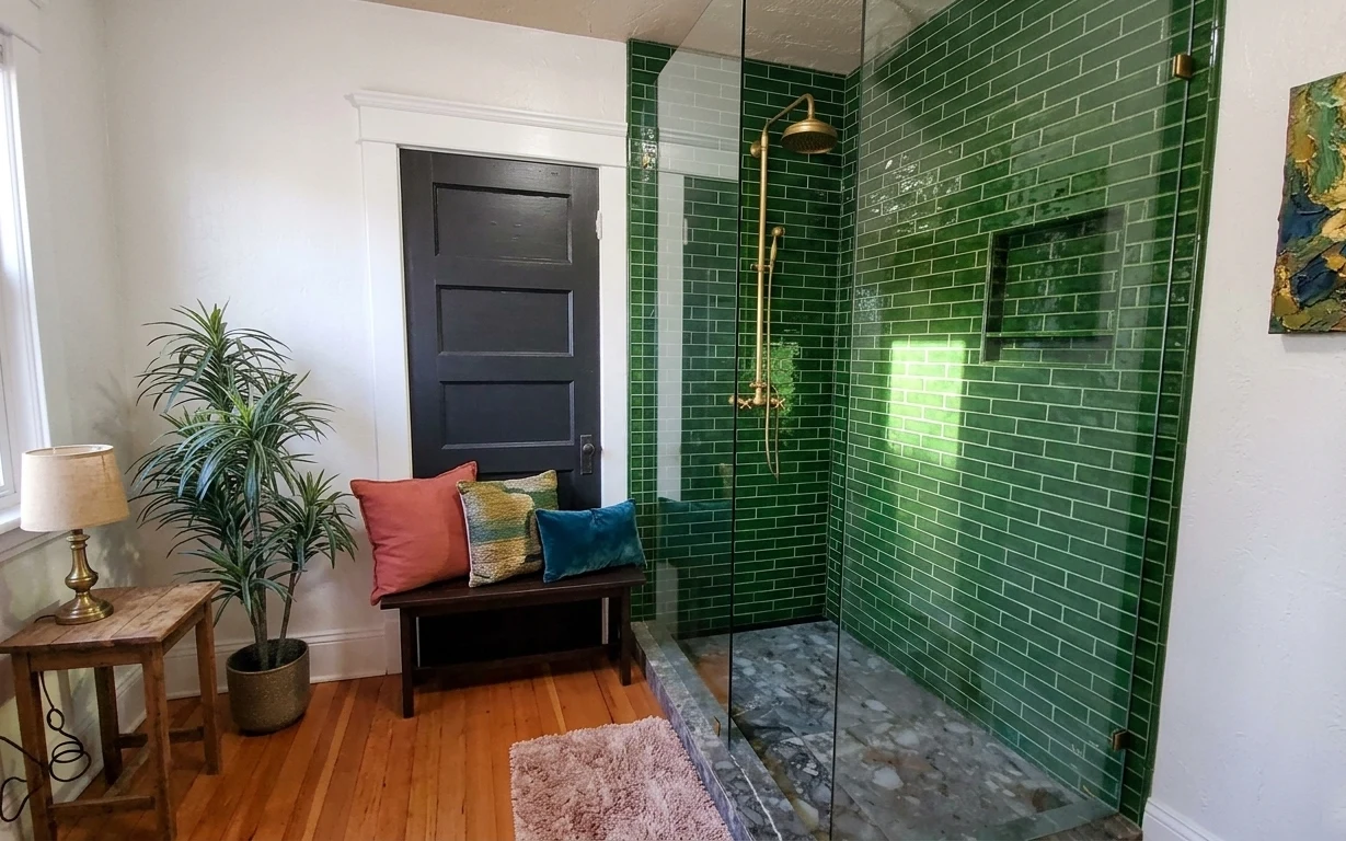
How to soften a shower bench nook for $400
A shower bench nook refresh that works with fixed tile: add a plush pink rug, warm wood, and two accent pillows for a cleaner, calmer look.…
Under $1,000: a modern farmhouse bathroom vanity refresh
A warm off-white bathroom vanity wall can look polished without a renovation. This modern farmhouse refresh uses 7 visible upgrades—from a …